

Review by Tina Koyama
When I first visited Paper-Oh’s site, I was immediately struck by the beauty of its products. The notebook designs all have an elegant Japanese look – refined and understated, even when bold colors and elements are used. (Their promotional information does refer to Japanese gift-wrapping and paper-folding inspiration.) Although they’re just ephemeral softcover notebooks like so many others, they are about as different as any I’ve seen. Unlike stapled stacks of paper, they look like “real” books.
While poking around the site, picking out my favorite products, I found a video talking about their story, and then it all made sense. The designers see themselves as bookbinders – not notebook producers – and their love for the art of bookbinding shows. As a dabbler in book arts myself, I was intrigued by the spark of something different in Paper-Oh.
Although I wasn’t able to find out where the binding is done, the books are designed in Berlin and Vancouver and printed in China.
Paper-Oh (a division of Hartley & Marks) offers seven distinct lines of notebooks in various sizes, colors and binding styles. I chose an A6 Puro (suggested retail $8.95) in Fuchsia, A5 Cahier (two for $12.95) in the Circulo version in black on red, and an A5 Circulo ($12.95) in red on black, all with blank pages. All styles offer the option of blank or ruled, and the Cahier is available in graph, too. As someone who prefers unruled pages for both sketching and writing, I give bonus points to any notebook maker that offers blank as an option.
Before I describe the individual styles I tested, I’ll mention a couple of things about the collection in general. Books in all styles come with a multi-purpose flexi page marker that matches the book’s cover. Rather than an attached ribbon (that many hardbound journals come with), the multi-purpose marker is loose and can be used like a traditional bookmark. It has adhesive on one end with scoring, so it can also be attached permanently to a cover and folded over, allowing for flexibility in use.
You’ve all seen the small accordion-folded booklet that comes in the pocket of every Moleskine, telling of its Bruce Chatwin legacy, etc. Paper-Oh’s insert similarly tells of the company’s design philosophy – but instead of being conventionally accordion-folded, it is irreverently folded asymmetrically, as if tossed in casually to crease on its own. This little insert expressed an insouciance that delighted me no end.

Bonus: The site includes instructions for an origami pencil holder! (OK, so I’m easily amused.)
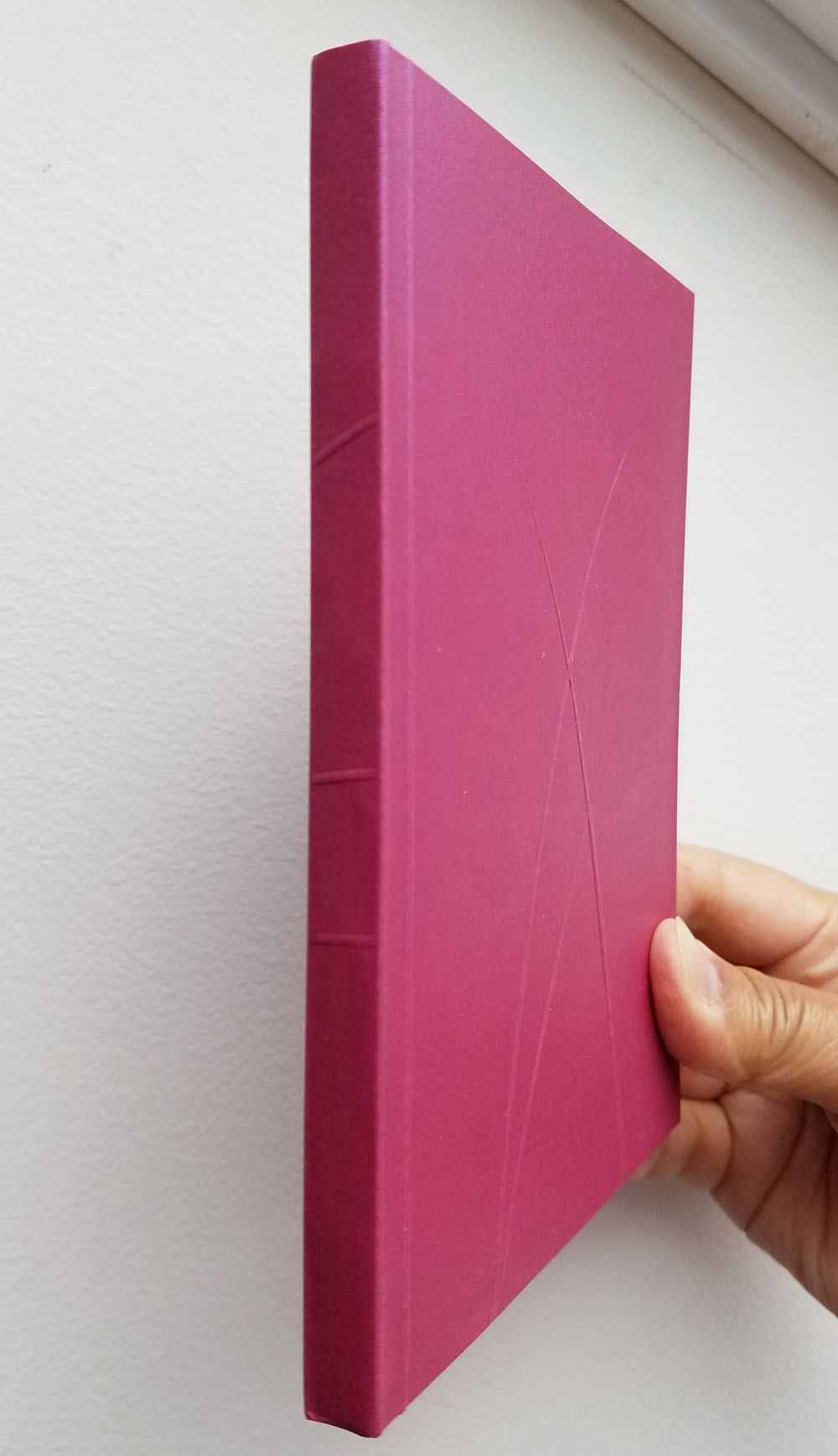
A6 Puro
The Puro line is distinguished by elegant, “scored,” asymmetrical grass blades on slightly shimmery (not glittery) paper covers. The front and back cover motifs are different, and the pearlized surface extends to the inside covers and fly sheets. I love this cover design – it’s my favorite of the collection. The 128-page, square-cornered book has a pocket on the inside back cover. Closest to what I think of as “Field Notes pocket size” (3 ½ by 5 ½ inches), the A6 size is just a smidge larger. I wish more U.S. notebook makers offered this size. It probably doesn’t fit in a shirt pocket, but it fits just fine in the designated notebook pocket of my bag, and I like the tiny bit of extra page space.


The flat spine looks like the glued perfect binding used in some notebooks (Write Notepads and Field Notes’ Black Ice edition come to mind), but instead it’s “Smyth sewn with minimal glue.” This binding method and “’scoring’ along the spine” means that the pages open completely flat (which is important to me when I scan sketches), and the side of the book I’m not using can be folded back (essential for sketching while standing, which I do often). I deliberately treated this binding roughly as I bent it backward during use to see if it would break down eventually, but it hasn’t so far and looks strong. I didn’t want to risk wrecking it, so I didn’t pour coffee on it, but the smooth, double-layer cover feels like it might repel some moisture.


Paper-Oh’s inner paper is “sourced 100% from sustainable forests and is uncoated, meaning it is left natural with no added veneer.” I put the cream-colored pages through my typical paper-testing abuse – a sampling of graphite pencils, colored pencils, fountain pens, markers, brush pens, a ballpoint and a gel pen. While I never expect notebooks of this sort to withstand wet media, I enjoy torturing the pages with water anyway (not with full-on watercolors – I’m not that sadistic – just quick swipes of the waterbrush). The Puro’s slight tooth was pleasant with various pencils and dry media, but the surface lacks the kind of sizing I appreciate when washing water-soluble inks or pencils.


In general, I was disappointed by the paper’s performance. All my (admittedly broad-nibbed) fountain pens feathered and bled through wherever the point paused briefly, and the water-soluble brush pens bled badly where I washed them. Ghosting is also significant and distracting, so I’m not inclined to use both sides of the page. The sketch I made of the motorcycle was done with a Zig Mangaka brush pen, and I was happy that it doesn’t show much feathering. The reverse side of the page, however, looks like a connect-the-dots drawing – the ink bled through whenever I paused, and some dots bled all the way through to the page underneath. I was sad to see this because it means I’m limited to pencil, ballpoint and other writing instruments with fine points that I rarely use to sketch with. (I do use those implements for basic notetaking, however, so this lovely notebook will not go to waste.)


A5 Cahier
The dotted pattern on the black-on-red Cahier is not printed on the cover and spine; the dots are actually holes in the black side of the duplex paper so the red side shows through. I love this clever design! (I know I said the Puro was my favorite; maybe I lied.) Running my hands over the perforation is a tactile delight. Fly sheets matching the inner side of the covers separate the covers from the book’s 80 pages. Compared with Moleskine’s Cahier, Baron Fig’s Vanguard and other softcover notebooks of this size, the cover feels much sturdier and substantial. Although I’m not sure how it would do in a rainstorm or with a spilled beverage, the cover feels hefty.

The “jump sewn” binding in the single signature prevents the stitching thread from being exposed through the spine’s decorative holes. (I love details like this!) The pages open almost as flat as in the Puro (though not completely). As I did with the Puro, I folded back the side of the Cahier I wasn’t sketching on, and the spine felt strong and indestructible. (Not true of the pages in some stitched cahiers, which can tear away from the stitching when folded back this way.)

The surprise with the Cahier came when I compared its inner paper with the Puro’s. Much smoother, the Cahier’s paper reminds me of Baron Fig’s, but thinner and less opaque. Despite having less tooth, I find it pleasant with pencil (with which I usually prefer a toothier surface) and all the other media I tested.


The Cahier paper performed slightly better overall. Although the fat fountain pens still bled occasionally, they didn’t feather, and the markers bled through only where I washed them. As with the Puro paper, the sizing doesn’t allow water-soluble inks to float and wash the way I like them to, but it obviously is sized differently. The reverse side of my café patio sketch still shows quite a bit of bleed-through where my marker paused, and the ghosting is still distracting. As with the Puro, the Cahier is best used with pencil, ballpoint, gel pen and fine nib fountain pens.


A5 Circulo
The Circulo is one of three styles that look like portfolios. A flap with two magnets folds over the front cover. The magnets are not particularly strong, but the flap closes with a satisfying click. The entire wrap-around cover is made of the same perforated, duplex paper as the Cahier – on the one I have, the black side shows through the holes in the red side. The covers feel similarly sturdy, and the fold-over flap gives the whole book a finished look. The binding is squared off like the Puro with 112 Smyth-sewn pages.


Also like the Puro, the Circulo’s pages open nice and flat at any point in the book, even the center where many books with flat bindings have difficulty opening completely. I can also fold back the side I’m not using, although in this case the flap gets in the way a bit, so it has to be tucked in beside the back cover.
The Circulo’s inner paper feels the same as the Cahier’s and behaved the same under my identical media tests. (I wonder why the Puro would have paper different from the other two styles. . . perhaps the paper is being changed, and stock is turning over gradually?)
Final Impressions
My overall feeling is that much care was taken and thought given to design notebooks that are beautiful, functional and unique – books that I want to save on the shelf when they’re full, not toss into the recycle bin. I wish the same care had been taken to select a paper that could be more versatile by withstanding more media. Despite my complaints, I’m really not one of those people who whine, “but is it fountain pen-friendly?” about every sheet of paper I come across; I truly don’t expect something called a notebook to perform like a sketchbook. But just a little extra surface sizing makes a big difference (I’m thinking of Baron Fig’s recent change in paper that was a significant improvement in this regard) that can make a notebook more versatile and therefore appealing to a wider audience. The delightful book designs already elevate the Paper-Oh notebook collection above its competitors; an improved inner paper would do so even more.
Note: Links in this review go to Paper-Oh’s corporate site. Although they are working on it, retails sales are not yet available online. A map on the site can be used to find brick-and-mortar stores carrying Paper-Oh’s products. I was also told that Love Notebooks will soon be carrying them online.
 Tina Koyama is an urban sketcher in Seattle. Her blog is Fueled by Clouds & Coffee, and you can follow her on Instagram as Miatagrrl.
DISCLAIMER: The items included in this review were provided free of charge by Paper Oh! for the purpose of review. Please see the About page for more details.
Tina–Once again, you give me a helpful lesson. I have the Cahier, but haven’t used it yet–want to wait for a special use. As you mentioned, I want to save it on a shelf, not just toss it into recycling. It is great to have such a good understanding of the pluses and minuses before I start to use it.
Glad you found the review useful! I hope you enjoy the Cahier. It’s really a beautiful design!
Tina
Thank you again Tina for the thorough review. We really appreciate it! The feedback we are receiving will help us improve our products and add new products.
Hello Michael! Thank you for your comment! Although we intended for Paper-Oh to be an ephemeral notebook, we put a lot of thought and care into the design details, so we really appreciate you wanting to save it on your shelf. Btw, our cahiers are 80gsm and our notebooks are 100gsm
I really love the exterior of these notebooks, but had a lot of bleed through using fountain pens in the A5 Cahier Circulo Ruled, even with a fine nib. Bummed out because the exterior design details are definitely my favorites out of almost any similar notebooks that I’ve tried.
Hello Kim! Thank you for your comment! We offered high quality notebook paper which is loved by the pencil community, but we are seeing a lot of other mediums that creatives are using or wanting to use, including fountain pens, watercolours & markers. This is encouraging and we hope to add more variety in the formats we offer.