Ink Review: Diplomat inks

Ink Review: Diplomat inks

Diplomat inks just became available through Vanness Pens, so of course I grabbed samples of each. But this is not a small lineup of inks. 15 inks actually.

I’ve broken the inks into groups of five so the colors can be compared to each other and to already familiar inks.

The first group is Black, Sepia Black, Pine Tree, Caramel, and Orange.

Diplomat Black is much more accurately called a blue-black ink.

Sepia Black is very close to Kobe Antique Sepia but has more shading.

Diplomat Caramel is quite close to the ever-popular KWZ Meet Me In St. Louis from 2019 – Butterscotch. the colors are nearly identical but Caramel has great shading.

Diplomat Pine Tree was actually tough to match. Not only is it a strange-ish color but also looks different in every light. Bungubox Nostalgia was the closest I could find that is similar in more lighting.

Diplomat Orange is just like Bungubox Fresh Oranges. Orange is a good option since it is cheaper, not to mention the fact that Fresh Oranges is currently not produced!

The second set of inks includes Diplomat Moss Green, Deep Green, Caribbean, Royal Blue, and Deep Blue.

Diplomat Moss Green has a base color identical to Diamine Ultra Green but the shading and sheen are close to Monteverde Green.

Diplomat Deep Green has a base color just like that of Monteverde California Teal with shading and sheen similar to Lamy Crystal Peridot.

Diplomat Caribbean is a touch darker than Kobe #48 Water Source Marche.

Diplomat Royal Blue and Deep Blue have the same base color which is close to Monteverde Blue (now called Malibu Blue). Royal Blue is closer to a washable blue while Deep Blue is what I would call a Royal Blue.

The final set of Diplomat inks contains Red, Burgundy, Orchid, Purple, and Lilac.

Diplomat Red is a slightly more saturated version of Diamine Classic Red. A bit on the pink side of a true red.

I believe Diplomat Burgundy is closer to true red than Diplomat Red. Diamine Red Dragon is a close match.

Diplomat Orchid would be better named Hot Pink. It is nearly identical to Bungubox Sweet Love Pink, complete with gold halo sheen.

Diplomat Purple is a bit less saturated than Manyo Akebi but has a hint of the same sheen.

Diplomat Lilac is a wonderful purple similar to Papier Plume Violet although a touch less blue.

So that concludes the overview of all 15 Diplomat inks. I swatched each ink in both Tomoe River 52 gsm Paper and Cosmo Air Light 83 gsm paper to give you an idea of the colors on each paper type.

I covered up one swatch which made it into these pages but isn’t part of the Diplomat ink line. Oops!

Finally, here are all 15 Diplomat ink swatch cards. In my opinion, Lilac and Orchid are absolutely the best inks in the line, with Sepia Black and Pine Tree being the most original colors. Other than disputing the color names, I have nothing bad to say about the new Diplomat inks! As I use them further, I’ll post other reviews diving deeper into individual colors and their performance in a pen. Hopefully, though, this helps when browsing for a new ink!

DISCLAIMER:  The inks in this review were provided at a discount by Vanness Pens for the purpose of this review.  All other items in this review were purchased by me.  Please see the About page for more details.

Link Love: Come for the Pens, Stay for The (Bodega) Cats

Link Love: Come for the Pens, Stay for The (Bodega) Cats

You come here for the pen and ink reviews but I know you want to see the bodega cats. It’s okay. I’m here for you. These kitties are super cute.

Seriously, this week has been crazy and this Link Love is paper crazy. I am kitty crazy. Stay crazy, pen people. Love you all!

Pens:

Ink:

Pencils:

Notebooks & Paper:

Art & Creativity:

Other Interesting Things:

We need each other. Please support our sponsors and affiliates. Your patronage will let them know you appreciate their support of the pen community. Without them, and without you, we could not continue to do what we do. Thank you!

GIVEAWAY: Shibui Leather Stationery Cases

In case you missed it, last week Ana reviewed some Leather Stationary Cases from Shibui. This week we’re excited to offer two of those cases for giveaway!

We have one of each of the following, and each will go to one lucky winner:

3-Pen Case XL (₱2,350, approx. $48.50USD)

The Shibui 3-Pen XL case is designed to hold longer and/or larger pens, the ones that many standard 3-pen cases can’t accomodate. Featuring a Pull-Tag detail, snug leather loops and an interior pocket.

Shibui 3-Pen Case XL

Life Organizer A5 (₱3,995, approx. $82.60USD)

An A5 case with a sturdy plastic zipper and pull tab. Room for a notebook, interior pockets (large enough to hold a standard credit card!), pen loop, and smaller zippered compartments.

THE DETAILS: Two lucky winners will be selected from the comments on this post to win their choice of either the 3-Pen XL or the A5 Life Organizer.

TO ENTER: Leave a comment below and tell us which case you’d prefer to win and what you would put in your new case! Play along and type in something. It makes reading through entries more interesting for me, okay? One entry per person.

If you have never entered a giveaway or commented on the site before, your comment must be manually approved by our highly-trained staff of monkeys before it will appear on the site. Our monkeys are underpaid and under-caffeinated so don’t stress if your comment does not appear right away. Give the monkeys some time.

FINE PRINT: All entries must be submitted by midnight CST on Friday, April 30, 2021. All entries must be submitted at wellappointeddesk.com, not Twitter, Tumblr or Facebook, okay? Winner will be announced on Saturday. Winners will be selected by random number generator from entries that played by the rules (see above). Please include your actual email address in the comment form so that I can contact you if you win. I will not save email addresses or sell them to anyone — pinky swear. If winner does not respond within 7 days, I will draw a new giveaway winner. Shipping via USPS first class is covered. Additional shipping options or insurance will have to be paid by the winner. We are generous but we’re not made of money. US and APO/AFO only, sorry.


DISCLAIMER: The items included in this review were provided free of charge for the purposes of this giveaway. Please see the About page for more details.

Ink Overview: Coloverse The Standard Model

Ink Overview: Coloverse The Standard Model

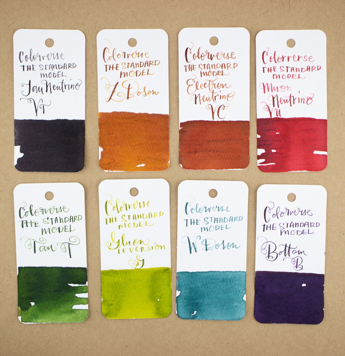
All of us at The Desk keep trying to outdo ourselves with our ink reviews. Last week, Jesi posted a full overview of all the new Colorverse Series 7 inks. This week, I’m kicking it all off with an overview of the Colorverse Standard Model ($200 for seventeen-15ml bottles). This set, based on The Standard Model of Particle Physics, includes seventeen bottles of ink, each themed around particle physics. I know ZILCH about particle physics except what I can glean from watching sci-fi movies so I will not even pretend. If anything, playing with this ink set is teaching me a little bit about particle physics — just enough to attempt to guess a question on the NYTimes crossword puzzle and not much else. But I digress…

The Packaging:

Colorverse Standard Model box close-up

First and foremost, who doesn’t want an ink set that comes in a Halliburton-style plastic suitcase (okay, it’s more like a Pelikan case) with perfectly cut out foam slots for each bottle? Let’s just say I’ve been living out various James Bond-esque “saving the world from a dangerous color conspiracy” storylines over the last week. (I’d like to blame pandemic isolation for this level of goofiness but alas, I would have been doing it no matter what the state of the world.)

Colorverse Standard Model Interior

Colorverse Standard Model Packaging Material

Inside the case is also some stickers, a card on a larger sheet and a three-page brochure with information about the set in a manner consistent with previous Colorverse releases.

Colorverse Standard Model Booklet 1

Each page in the booklet features a picture of the ink bottle, a swatch of the color and a breakdown of the RGB, web hex number and Pantone color matches as well as surface tension and Ph. I have, in the past attempted to verify the accuracy of the Pantone values (FYI: they are not all the accurate) but have never bothered with the RGB or hex numbers. The only place that would be useful is when entering inks into the FPC database.

The Quarks sub-collection are blues and purples and the Leptons are mostly warm reds plus a green and grey.

Colorverse Standard Model Booklet 2

Colorverse Standard Model Booklet 3

Of the seventeen bottles, five feature red caps. These are the Bosons sub-collection. These colors are a more diverse range of colors.

Colorverse Standard Model Leptons

The bottles included in the Standard Model are the “mid-sized” 15ml bottles from Colorverse. Not the giant 60ml bottles included in their regular sets nor the tiny sip sized 5ml (essentially sample) sized bottles. In this day and age, with new inks coming out on an almost daily basis, I think 15 to 20ml sized bottles are just about perfect.

Colorverse Standard Model Quarks

Colorverse Standard Model Bosons

The Swatches:

Colorverse Standard Model Quark Swatches

I organized the initial swatch photos by sub-collection: Quarks, Leptons and Bosons. The first set, pictured above, is the Quarks. It’s a good range of blues and violets.

Colorverse Standard Model Leptons Swatches

Next up is the Leptons, shown above, which is four reds, a green and a grey.

Colorverse Standard Model Bosons Swatches

The Bosons sub-collection colors are quite the range of colors. I will continue to assert that I know nothing about particle physics so maybe there’s a reason that Colorverse chose these colors for these particles? Let me know in the comments.

Colorverse Standard Model All The Color Swatches

Finally, I put all the colors in the set together to show the full range of hues. It breaks down like this:

  • 3 greens
  • 5 blues/teal/turquoise
  • 2 purples
  • 1 grey
  • 4 reds
  • 2 orange/browns
Colorverse Standard Model High Chroma
High Chroma colors
Colorverse Standard Model Low Chroma
Low chroma colors

None of the Standard Model inks contain glistening particles. A couple of the inks show a bit of sheen — mostly the deep blues —  but many colors show a range of shading. There is also a nice range of high chroma and low chroma colors. I’m not suggesting that any of the inks are under-pigmented but rather that about half of the colors are earthier tones while the other half are bright, vivid colors.


Colorverse Gluon comparison

Colorverse Photon comparison

Only three ink colors included in the set have been previously released by Colorverse — Photon, Gluon and Electron (Poor Selectron got left out of this party).  This version of Gluon does not include the glistening particles which makes the color a little lighter and more green than yellow. The LE version of Photon is a bright shamrock green not the more teal blue-green of the original Photon No. 23 and the LE Version of Electron is more tomato red than the orangey color of the original Electron No. 31.

Colorverse Electron comparison

While a collector of ink might have initially been bothered by the duplicates, the change in hue for the LE set will set their minds at ease.

Keep going for ink swatch color comparisons and my conclusion…

Read More

Pen Review: Pilot Shunpitsu Pocket Brush Pen – Soft

Review by Tina Koyama

I have a few brush pens. (To understand what I mean by “a few,” see Part 1, Part 2, Part 3 and Part 4 of my review series. And those are only the ones I’ve reviewed.) I tend to divide all brush pens into two categories – the ones with hair-like bristles and the ones without. The latter category of formed felt or nylon tips includes various sizes and degrees of firmness. The Pilot Shunpitsu Pocket Brush Pen with a soft tip ($4.90) belongs in the formed tip group, but I think it may be unique in one way: its length.

Looking through my formed-tip brush pens, I pulled out all that are made of the same type of soft, flexible material, and the Shunpitsu is the only one with a standard-size pen body. All the rest (some of which are double-sided) are about 2 ½ inches longer than a standard pen because they are designed to emulate traditional Asian calligraphy brushes. For artists and calligraphers trained to use traditional brushes, perhaps the longer brush pens feel more natural. For the type of sketching I do, however, I’ve often found the length inconvenient, especially when carrying them out and about. The Pilot Shunpitsu puts the same flexible tip in a compact body.

The Shunpitsu’s brush tip puts out a wide range of expressive thick and thin marks. The dye-based ink is not waterproof, but knowing that, I take advantage of its water-solubility (see sketch of hand below). JetPens’ description says that the specially formulated ink “dries to the touch in just one second,” which makes it ideal for a lefty like me. (I haven’t had problems with other brush pens smearing much, but that could be because I usually draw with them rather than write, so my hand’s not moving very quickly.) (Writing and scribbling samples made in Col-o-Ring “Oversize” book.)

Like memory foam, the Shunpitsu’s soft tip is very flexy but pops right back up when released.

In the sketch below (which was made with my right hand during a couple of weeks of non-dominant hand practice), I used a water brush to wash the water-soluble ink slightly for soft shading. (Sketch made in gray Stillman & Birn Nova sketchbook.)

A few days later, I pocketed the Shunpitsu and a Field Notes notebook to catch a quick sketch of a blossoming cherry tree during my daily walk. (The white ink used was a Sakura Gelly Roll.) The fine marks it can make work well on a small page, and the pen’s length is ideal for easy carrying. So no matter how many brush pens I have, I need this one, too.


Tina Koyama is an urban sketcher in Seattle. Her blog is Fueled by Clouds & Coffee, and you can follow her on Instagram as Miatagrrl.


Ink Review: ColorVerse Season 7 Full Line

Ink Review: ColorVerse Season 7 Full Line

Many people have probably heard about the newest Season 7 inks from ColorVerse; six sets of inks that have been expected for the last month or so. Eye On The Universe was released last week and quickly sold out at many retailers; I was able to purchase three sets from Vanness and the other three from Pen Chalet.

Trying to photograph all six boxes was just too much for my small light box setup. Above is a photo of the top of all six boxes (showing the large bottle color) and below is the side view of all six boxes (showing the small bottle color). Season 7 consists of numbers 82-93.

First, to review the warnings with these inks, especially the third. Store out of reach of children. Do not eat.

Please, don’t eat your children.

With that addressed, here are #82 Hubble and #83, HST.#82 is very similar to Pilot Bishamoten but heavier gold sheen. HST is a close match to Van Dieman’s Hailstorm – a dusty dark green.

#84 SM1 is close to KWZ Baltic Memories but includes a heavy matte red sheen while #85 Costar is a unique brown-gray close to Montblanc’s Elixir Wood & Tobacco scented ink.

#86 eXtreme Deep Field has a matte pinkish sheen with a base color near Diamine’s Smoke on the Water. #87 NGC 1850 has a base color nearly identical to ColorVerse #63 Map of Mars but includes red sheen and green and gold glitter. I compared it to Emerald of Chivor here but NGC contains more glitter and sheen.

I predict that #88 Pillars of Creation and #89 Mystic Mountain will be by far the most popular in this season. Pillars is a bright red leaning purple that contains a massive amount of green sheen (although oddly enough it shows as a gold sheen on Cosmo Air Light paper) while Mystic Mountain a beautiful dusky blue with pink shimmer.

Just to answer the question that everyone is thinking, here is Pillars next to Lamy Dark Lilac. Pillars is a touch more blue and the sheen is green rather than the gold of Dark Lilac. Personally, I think purple and green are the better way to go!

#90 Crab Nebula and #91 Horsehead Nebula will, I think, be the second in popularity in this lineup. Crab Nebula is a forest green with a matte purple-black sheen, close to Pilot Hoteison while Horsehead Nebula is a medium rose with slightly understated silver or multicolor sparkle. it is close to ColorVerse #52 Anita but darker.

Last in the series is #92 Hippocamp and #93 Comet SL9. This set is the most understated set in Season 7 but still beautiful. Hippocamp is a bright medium to light blue close to Sailor Konagi while SL9 is close to ColorVerse Brunch Date but with more orange.

To summarize the whole Season 7 lineup, here are all 12 inks together, this time sorted by color rather than number. SM1 and eXtreme Deep Field are very close in color, but SM1 has a shiny red sheen while eXtreme Deep Field has a matte pink sheen. The base color on Crab Nebula is similar to HST but Crab is much darker and contains more yellow.

I know today’s review is not a deep dive into any of these inks – that will come soon. Hopefully this helps when looking to choose which ink(s) to purchase. Around here, we don’t judge if you find yourself caving into all twelve!

  • Swatch Cards: Col-o-ring cards (100 for $10)
  • Ink: ColorVerse Season 7 Eye on the Universe ($36 for set of two inks, 65mL + 15mL)

DISCLAIMER:  The inks in this review were all purchased by me. Please see the About page for more details.