Ink Series Review: Monteverde Jungle Collection

Ink Series Review: Monteverde Jungle Collection

Monteverde recently released their newest ink set – the Jungle ink collection. I’m always excited when Monteverde comes out with a new collection – ten new inks around a central theme all contained in a nice box with a magnetic closure. I have three of these collections and they store beautifully on a bookshelf!

* This photo is from Vanness Pens

The Jungle set – well, I haven’t been able to purchase this set yet. I’m pretty certain it has sold so quickly because the animals are incredibly cute.

I did purchase several samples of the inks and Ana sent me the rest of the samples so I could review them all together. So here we go! (These samples were all purchased from Vanness)

The first ink here is Monteverde Jungle Toucan. It is a slightly blue-leaning black, and not incredibly dark. It’s an average black ink.

Jungle Elephant is a dark blue-ish purple. It’s close to Kobe #32 but has more blue undertones.

Jungle Chameleon surprised me when I swatched it. It’s close to KWZ Brown Pink or a dark, slightly less pink version of Monteverde Rose Noir.

Jungle Crocodile comes in as a forest green with a touch of black sheen on the edges and is very close to Vinta Elysium. it could definitely work in an office setting as an adventurous black.

Jungle Zebra is a beautiful navy/blue-black. It looks greenish next to true blue inks and blue when it’s compared to greens. Lovely color.

Jungle Turtle is slightly lighter than Pilot Ebisu. I think it’s too light for me to use in most pens, but would be amazing in a highlighter pen. Also, it is absolutely my favorite illustration on the Jungle set!

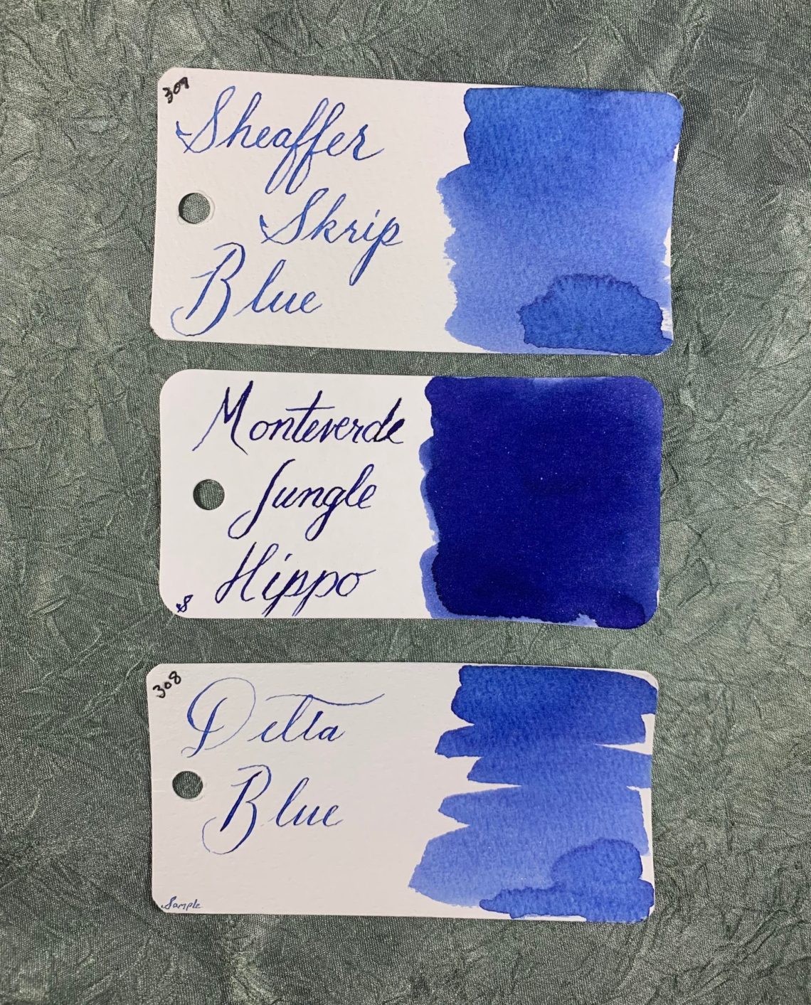
Jungle Hippo is a medium blue in hue but darker than most blues I have in my library. I’m not typically a huge fan of blues like this but Hippo is dark enough to be pleasant. A touch of purple undertone helps!

Gorilla is an interesting orange-ish burgundy. It has a touch redder than Urushi Red. I did see some feathering on the Col-o-Ring card here which I will discuss more in a bit.

Jungle Giraffe has plenty of orange in the mix – very close to Papier Plume Red Beans and Rice. This ink had significant feathering on the swatch card but I love the color.

Jungle Lion is my favorite of the entire Jungle set. It also has an adorable lion on the bottle! It’s an interesting orange-yellow-brown mixture that is unique to my collection so far, like a lighter version of 3 Oysters Hwangto. I love how the ink color looks in writing – light enough to see the unique color but still dark enough to be legible.

Now to talk about the feathering I’ve seen in this set. Giraffe is by far the worst with Gorilla coming in second. Could there be an issue with the red dye in the batch? This is typically worse when I use a dip nib as I did here, so I’m hoping in a fountain pen it won’t show as much. But this is not something I’ve seen before with Monteverde inks!


The second batch of feathering inks in the Jungle set is Turtle and Zebra. The feathering is not nearly as obvious as Giraffe and Gorilla, but still concerning. Could Monteverde have changed their typical ink formulation here? Extensive testing will be in order along with contacting the company.


Overall, I love this set. I will be testing the feathering inks further and investigating what has happened. But between the adorable illustrations and the colors of Lion, Hippo, and Chameleon, I think the set is a great new one. If the feathering problems can be remedied, I would recommend purchasing the set wholeheartedly. As of this writing, an individual bottle or three would be the better call.


DISCLAIMER: Some items included in this review were purchased by me and some by the Well-Appointed Desk for the purposes of this review and I was not compensated to write this post. Please see the About page for more details.

Link Love: SF Pen Love

Link Love: SF Pen Love

Friends of the blog… okay, lots of friends of the blog… are headed to the SF Pen Show this weekend. We wanted to remind you that there are classes and workshop all weekend. We’d like to particularly point out, our pal Julia is teaching a class on Sunday but there has been some confusion about how to register and pay for the class. So… we thought we’d straighten things out right here.

Julia is teaching Inkwash Workshop: Painting with Ink, Sunday from 9:00-11:00am. Tuition is $75. The class is limited to ten people so sign-up ASAP. Julia needs a minimum number of attendees in order hold the class so if you were thinking about taking this class, email her TODAY to sign-up. There’s a link on the SF Pen Show web site to email her and register for the class. If you take the class, say hello to Juila for me.

Don’t forget to ask Julia about the best kept taco secret of the SF Pen Show.

Pens:

Ink:

Pencils:

Notebooks & Paper:

Art & Creativity:

Other Interesting Things:

We need each other. Please support our sponsors and affiliates. Your patronage will let them know you appreciate their support of the pen community. Without them, and without you, we could not continue to do what we do. Thank you!

Pen Review: Kuretake Karappo Empty Brush Pens

Pen Review: Kuretake Karappo Empty Brush Pens

Earlier this year, the ladies of the Desk descended on the new Kuretake Karappo Empty Pen Sets like 17-year cicadas. Now, Kuretake as released a more deluxe version of these “empty pens”. There are two options available, a felt tip style ($7) and a brush pen style ($9.75). The new versions feature a longer pen barrel — similar to a paint brush in length. The brush pen features individual nylon fibers for a very soft natural brush tip. The felt tip pen has a softer, more flexible felt tip. Both pens ship with two empty fountain pen cartridges and a pipette to fill the cartridges with any ink of your choosing. At the bottom of the pen barrel are two ball bearings. After filling the cartridge, place one of the ball bearings in the opening of the cartridge before seating it into the feed. It will pop into place with a satisfying click as the cartridge is seated guaranteeing a proper, secure fit.

Kuretake Karappo Empty Brush Pens

Unfortunately, once the ball bearing is in place, these cartridges are not reusable.It is possible to buy a set of empty cartridges (5 cartridges for $4.75). Theoretically, Platinum converters are interchangeable with Kuretake and have been known to work with other brush pens though I have not tried it yet with these pens. Since the pens ship with two cartridges, I’ll test these first while I wait for a Platinum converter to arrive in the mail. I am sure I must own a dozen of them but can’t find one.

Kuretake Karappo Empty Brush Pens Filled

Each pen comes with a pipette to aid in filling. Though I recommend filling over a towel near a sink because I still managed to drip ink down the cartridge.

I filled the felt tip with Colorverse Extreme Deep Field and the brush pen with Hubble from the new Colorverse series.

Kuretake Karappo Empty Brush Pens
Testing the Kuretake Karappo on Profolio Oasis Notebook

The brush pen version has very soft bristles. Because it has actual nylon bristles, it can achieve extra fine lines as well as bend to lay down a thick, wide stroke.

The felt tip is much finer but still has some give and play in the tip allowing it to achieve a range of thicks and thins.

Kuretake Karappo Empty Brush Pens
Testing the Kuretake Karappo Empty Brush Pens on Tomoe River paper.

I tested the empty brush pens on Tomoe River because both of the Colorverse inks have been known to sheen and I wanted to see if it was noticeable in a brush pen. In the finer felt-tip marker pen, I did notice the sheen of the Extreme Deep Field ink. In the softer brush pen, the sheen of the Hubble ink was not noticeable.

Both pens performed smoothly. Ink wicked to the tips quickly and both the felt-tip and brush pens kept up with my writing speeds without missing a beat.

Kuretake Karappo Empty Brush Pens with the Karappo Wicking Pen

I have been regularly using the Kuretake Karappo “wicking” felt tip pens which have been going strong since the day I filled them. I use them at work for writing on post-it notes, adding notations to my task list, etc so I thought I’d also compare the performance of the wicking pen to the newer cartridge-based designs.

Comparing Kuretake Karappo Brush Pen to "Wicking" Pen

The tip of the wicking pen is firmer and finer than the cartridge felt-tip. I would compare the cartridge style to a Fudenosuke soft pen and the wicking pens are more like a traditional fine tip marker pen — think Paper Mate Flair but with the ink of your choosing.

Because the cartridge-based Kuretake Karappo Empty Brush Pens are softer and more flexible than the wicking pens, I would recommend these to anyone interested in using their fountain pen inks for art making, calligraphy or other more creative uses. If your goal is to have new, different ways to write with your fountain pen inks, then stick with the wicking versions.


DISCLAIMER: The items included in this review were provided free of charge by JetPens for the purpose of review. Please see the About page for more details.

Ink Series Review: Visconti Van Gogh Series

Ink Series Review: Visconti Van Gogh Series

Visconti has released a line of pens over the last few years in the Van Gogh line where each pen is styled after a Van Gogh painting and uses the same palette.  To accompany these pens, Visconti came up with six inks: Café Terrace at Night, Orchard in Blossom, Old Vineyard with Peasant Woman, Wheatfield with Crows, Souvenir de Mauve, and Wheatfield under Thunderclouds. Previously these inks were only available with the purchase of their matched pen, but the entire series has now been released and is available as a set of six or as individual bottles. This set was purchased by Well-Appointed Desk from Pen Boutique and I was the fortunate person assigned to reviewing them! Someone there must know I enjoy ink…

I love the colors in this series – it contains both bright, fun colors and office-safe gray and blue. The colors on the top of each box are good approximations of the ink.

All six inks have great shading on Tomoe River paper:

And even better shading on Cosmo Air Light paper:

I took a photo with both Tomoe River paper (on the right) and Cosmo Air Light paper (on the left) to show the differences – the gray and purple show the most color change. CAL brings out the blue undertones dramatically.

Kobe released a Van Gogh-inspired blue a few years ago – I was pleasantly surprised to see that it agrees well with the Visconti Wheatfield with Crows blue! It is a deep blue with a faint hint of a sheen.

I love the Old Vineyard with Peasant Woman grey ink. The undertones here are blue making the overall color more of a dusky purple. The camera shows a much stronger difference between these inks than in person.

Of course, the best ink in the series is Orchard in Bloom – purple is always the best. Visconti has produced a beautiful purple with this ink! It isn’t so light as to be illegible but it isn’t so dark that you can’t see the purple in your writing.

Wheatfield Under Thunderclouds is a fabulous bright leaf green – nearly a perfect match for my favorite bright green ink of all times – Scribo Verde Prato! This is a color that grabs your attention but doesn’t hurt your eyes when reading.

Souvenir de Mauve is also a very bright ink. Montegrappa Fuchsia and Monteverde Deep Magenta are very close, but Souvenir de Mauve is a touch brighter in writing, and there’s a touch of gold sheen even in small amounts of ink. Where was this ink when I was 8?  I’ve kept this Mauve inked in a pen since I received the ink. A glow-in-the-dark pen in keeping with the 8-year-old theme.

Be careful with this Mauve – it does have the potential to stain very light-colored pens. However, the ink was very easy to clean up when compared to other highly saturated pinks.

I was surprised at the Café Terrace at Night orange ink. I thought it would be much closer to orange rather than yellow. Café is a great shading ink and close to Stipula Sapphron and Bungubox Sweet Potato Yellow – two of the best orange-yellow inks ever.

Here is a photo of the entire ink line – in my opinion, Visconti did a great job with these.

I am thrilled with this new lineup from Visconti! You can purchase the entire set for $114 from Pen Boutique or $18.95 for a single bottle – about $0.63 per mL. This puts the cost in the luxury category but not as high as Sailor and Montblanc special editions. For an ink line from Visconti that was previously only available with a high-priced pen, I am happy to accept that price.


DISCLAIMER: The items included in this review were purchased by the Well-Appointed Desk for the purposes of this review and I was not compensated to write this post. Please see the About page for more details.

Link Love: It’s all DC, GB, and Digits

Link Love: It’s all DC, GB, and Digits

This week, there are a couple posts about British-specific products, thoughts on the recent DC Supershow Pen Show and quite a few digit-focused posts — “5 Ways”, “15 Journaling…”, “41 Questions…” and more. If you divide 15 Journaling Tips by 5 Ways to Sharpen a Pencil and add 41 Questions… what do you get? I don’t know either so maybe we should just brew a pot of tea and read about the DC Supershow?

Pens:

Ink:

Pencils:

Notebooks & Paper:

Art & Creativity:

Other Interesting Things:

We need each other. Please support our sponsors and affiliates. Your patronage will let them know you appreciate their support of the pen community. Without them, and without you, we could not continue to do what we do. Thank you!

Eye Candy – Cholla Cactus Wood Turned Pen

Last week my boss sent me a small gift that turned out to be a fountain pen! Sadly I have very few details so mostly I’ll be sharing photos and what I can surmise. I’m still on the hunt and I’ll update if/when I get more!

I was surprised to open my package and find a wood-turned pen. I believe it came more or less from a kit because it came with a standard fact sheet from The Woodturner’s Catalog. My boss purchased it at an art show local to her.

The pen itself is made from Cholla Cactus wood, that I believe has been filled/enhanced with resin. It looks like shimmery pink and purple have been poured into the resin as well. The pen comes with a standard iridium point nib manufactured in Germany. It’s not specifically labeled as Bock or Jowo. It feels like a fine to  me and I haven’t gone into the nib/feed housing to check.

The pen is really beautiful to look at, but a bit of a chonker. It comes in at 43g. It’s 5 1/8″ capped, and 4 3/4″  uncapped. The cap is a screw cap and I kept wondering why the “peg” at the end. It turns out the threads there are so you can post the cap by screwing it onto the back end. However, given the weight of this pen, that just makes in unbalanced.

Again, I wish I had more details about this lovely gift, but for now I’m content to just get to know my new pen!

PS for those who ask if I match my pens to my knits (I’m talking to you Brad!) the answer is not intentionally, but apparently sometimes yes!

Giveaway Winner: Ayush Paper from Peyton Street Pens

Thanks to all of you who entered the giveaway for the Ayush A4 and A5 notebooks from Peyton Street Pens. I loved hearing about your favorite papers and have a few new ones to try now! Today’s winner is Dave:

I hear you Dave. Tomoe River is pretty great, but I have to say it’s not my favorite. I know… blasphemy. What can I say? I like paper with a little more tooth!