I have a few brush pens. (To understand what I mean by “a few,” see Part 1, Part 2, Part 3 and Part 4 of my review series. And those are only the ones I’ve reviewed.) I tend to divide all brush pens into two categories – the ones with hair-like bristles and the ones without. The latter category of formed felt or nylon tips includes various sizes and degrees of firmness. The Pilot Shunpitsu Pocket Brush Pen with a soft tip ($4.90) belongs in the formed tip group, but I think it may be unique in one way: its length.
Looking through my formed-tip brush pens, I pulled out all that are made of the same type of soft, flexible material, and the Shunpitsu is the only one with a standard-size pen body. All the rest (some of which are double-sided) are about 2 ½ inches longer than a standard pen because they are designed to emulate traditional Asian calligraphy brushes. For artists and calligraphers trained to use traditional brushes, perhaps the longer brush pens feel more natural. For the type of sketching I do, however, I’ve often found the length inconvenient, especially when carrying them out and about. The Pilot Shunpitsu puts the same flexible tip in a compact body.
The Shunpitsu’s brush tip puts out a wide range of expressive thick and thin marks. The dye-based ink is not waterproof, but knowing that, I take advantage of its water-solubility (see sketch of hand below). JetPens’ description says that the specially formulated ink “dries to the touch in just one second,” which makes it ideal for a lefty like me. (I haven’t had problems with other brush pens smearing much, but that could be because I usually draw with them rather than write, so my hand’s not moving very quickly.) (Writing and scribbling samples made in Col-o-Ring “Oversize” book.)
Like memory foam, the Shunpitsu’s soft tip is very flexy but pops right back up when released.
In the sketch below (which was made with my right hand during a couple of weeks of non-dominant hand practice), I used a water brush to wash the water-soluble ink slightly for soft shading. (Sketch made in gray Stillman & Birn Nova sketchbook.)
A few days later, I pocketed the Shunpitsu and a Field Notes notebook to catch a quick sketch of a blossoming cherry tree during my daily walk. (The white ink used was a Sakura Gelly Roll.) The fine marks it can make work well on a small page, and the pen’s length is ideal for easy carrying. So no matter how many brush pens I have, I need this one, too.
Many people have probably heard about the newest Season 7 inks from ColorVerse; six sets of inks that have been expected for the last month or so. Eye On The Universe was released last week and quickly sold out at many retailers; I was able to purchase three sets from Vanness and the other three from Pen Chalet.
Trying to photograph all six boxes was just too much for my small light box setup. Above is a photo of the top of all six boxes (showing the large bottle color) and below is the side view of all six boxes (showing the small bottle color). Season 7 consists of numbers 82-93.
First, to review the warnings with these inks, especially the third. Store out of reach of children. Do not eat.
Please, don’t eat your children.
With that addressed, here are #82 Hubble and #83, HST.#82 is very similar to Pilot Bishamoten but heavier gold sheen. HST is a close match to Van Dieman’s Hailstorm – a dusty dark green.
#84 SM1 is close to KWZ Baltic Memories but includes a heavy matte red sheen while #85 Costar is a unique brown-gray close to Montblanc’s Elixir Wood & Tobacco scented ink.
#86 eXtreme Deep Field has a matte pinkish sheen with a base color near Diamine’s Smoke on the Water. #87 NGC 1850 has a base color nearly identical to ColorVerse #63 Map of Mars but includes red sheen and green and gold glitter. I compared it to Emerald of Chivor here but NGC contains more glitter and sheen.
I predict that #88 Pillars of Creation and #89 Mystic Mountain will be by far the most popular in this season. Pillars is a bright red leaning purple that contains a massive amount of green sheen (although oddly enough it shows as a gold sheen on Cosmo Air Light paper) while Mystic Mountain a beautiful dusky blue with pink shimmer.
Just to answer the question that everyone is thinking, here is Pillars next to Lamy Dark Lilac. Pillars is a touch more blue and the sheen is green rather than the gold of Dark Lilac. Personally, I think purple and green are the better way to go!
#90 Crab Nebula and #91 Horsehead Nebula will, I think, be the second in popularity in this lineup. Crab Nebula is a forest green with a matte purple-black sheen, close to Pilot Hoteison while Horsehead Nebula is a medium rose with slightly understated silver or multicolor sparkle. it is close to ColorVerse #52 Anita but darker.
Last in the series is #92 Hippocamp and #93 Comet SL9. This set is the most understated set in Season 7 but still beautiful. Hippocamp is a bright medium to light blue close to Sailor Konagi while SL9 is close to ColorVerse Brunch Date but with more orange.
To summarize the whole Season 7 lineup, here are all 12 inks together, this time sorted by color rather than number. SM1 and eXtreme Deep Field are very close in color, but SM1 has a shiny red sheen while eXtreme Deep Field has a matte pink sheen. The base color on Crab Nebula is similar to HST but Crab is much darker and contains more yellow.
I know today’s review is not a deep dive into any of these inks – that will come soon. Hopefully this helps when looking to choose which ink(s) to purchase. Around here, we don’t judge if you find yourself caving into all twelve!
We are featuring an Instagram pic from @neilhimself (aka Neil Gaiman). If this image comes up as an empty box, you owe it to yourself to go over to Instagram right this second and follow him. 1. Because he writes delightful books full of wonder and 2. because he occasionally waxes poetic about pens. I’ll wait for you to come back…..
So, now that you can see the delightful photo from Neil Himself (and I’m sure you read the caption too) can we all just delight in the amazing wrapping paper that Choosing & Keeping uses? It is a true treat to order delectable new inks and paper and have them wrapped like gifts to yourself. I recommend we all order from Choosing & Keeping or from anyone else who makes sure that each parcel is a true gift.
We need each other. Please support our sponsors and affiliates. Your patronage will let them know you appreciate their support of the pen community. Without them, and without you, we could not continue to do what we do. Thank you!
Usually by now I’m knee deep in inks that match the Pantone color of the year, but I admit that this year I’m a little meh on the ink options. I do love grays, but a few years ago for Inktober I did a “31 Shades of Gray” theme and got all my grays in. And yellows? Well yellows don’t seem terribly practical to me because often they don’t translate well to every-day writing.
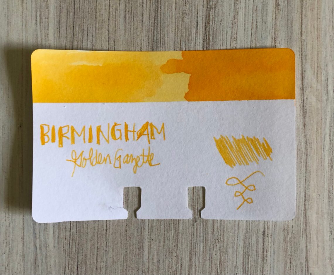
However, since it’s my schtick, I’m leaning in and here we go. Today I decided to try Birmingham Pen Company’s Golden Gazette (30mL for $11). Golden Gazette is kind of an egg yolk yellow – that orangey-yellow that makes me think of days full of sunshine.
This one is somewhat of a shader – the darker it gets the more orange it leans. I’m not sure this one is really practical for every-day writing because while you can definitely see it, I think a full page of writing in a narrow nib probably wouldn’t be super easy to read.
I really don’t have much in the way of yellows in my collection. You can see the closest one is the Pen BBS #111 which I probably would have called a light orange. The only true lemony yellow that matches the Pantone color of the year would be the Ban Mi Yellow. The remainder of my yellows are more gold – Robert Oster Honey Bee and Olive Green (which doesn’t really remind me of green olives at all?). Clearly this is a hole in my collection, but again I’m not sure how practical it is to fill this one.
Golden Gazette is one of Birmingham’s Swift inks which are designed to start easily, write wet and function in a variety of pens. This one was a wet writer, but it dried fairly quickly and I didn’t have any trouble with it at all.
Are there yellows you would like to see me review this year? Let me know about your favorites or ones you’d like to see in the comments!
DISCLAIMER: Some of the items included in this review were provided to us free of charge for the purpose of review. Please see the About page for more details.
Shibui recently contacted me about reviewing a few of their leather stationery cases. The company was started by a husband and wife team in 2017 as a result of their own enthusiasm for fountain pens and journaling. They struggled to find the perfect leather pen case — something simple yet functional that would age well while also being flexible enough to evolve as a pen collection grew and changed. Out of their efforts to fill a gap in the market, they developed the Pull-Tag™ which does not use elastics to hold pens but utilizes slots and a leather strap to secure pens into a case.
Upon receiving the package, I noticed a few things about the cases right away and I have to admit that my reaction is completely related to already owning several leather pen cases from Galen Leather. The first thing I noticed was that the exterior leather did not feel like the leather on the Galen cases. This is not good or bad, just different. Galen offers smooth leather as well as their beloved “crazy horse” treatment. I’ve handled both repeatedly and love the look and feel of the “crazy horse” material.
I also noticed right away that, while the packaging says that all the zippers are YKK brand, on all but one case, the zippers are plastic teeth rather than metal. I have a tendency to overstuff a pen case or notebook case so heavy-duty metal zippers seem more likely to withstand abuse but I can’t definitely say that the plastic zippers will be less reliable. Plastic zippers just don’t feel as durable.
Other overall reactions to the cases were that they featured lots of pocket extras in each of the cases making them appear, at first glance to be competitive products to Galen — regardless of my feelings about the leather used — at lower prices.
So, let’s now review each case individually.
9-Vial Case:
The 9-Vial Case is similar in size to the 3-Pen XL Case. It’s a long slim case that comfortably fits into the hand.
The case features stitched leather strap that has been designed to perfectly hold 5ml sample vials. While not many people have need of a case to carry samples, Jesi pointed out that she uses the 5ml sample vials to store spare nibs which do warrant a good case.
The stitching is neat and clean and the zipper has a metal, branded pull.
The reverse side of the flap leather looks pressed and fabric-y as if the leather may have been processed and backed with a thicker material. It’s not what I think of as cowhide on the back. The leather used for the strap looks more in keeping with leather I am familiar with.
Sample vials do fit perfectly and would definitely make a statement at your next pen meet-up or pen show.
A6 Hobo/Notebook Journal Cover:
The A6 Hobo/Notebook Journal Cover is another unique case. It features a carrying handle along the spine which makes the case a good option for toting your Hobonichi around the office (or home office). This notebook does feature a metal zipper. It was the only one of the four cases that did.
Inside, the cover features slots for cards but the slots were too narrow for a standard US “credit card” size. The reinforced stitching is nice though.
The pockets and slots behind the notebook are not reinforced, except for the horizontal slot for the actual notebook.
The Pull-Tag inside lays alongside of the slots for cards.
The downside of this placement is that when there is a notebook inside the case and a pen, the pen presses against the notebook. Looking down at the cover, there appears to be space along the spine that would perfectly nestle a pen but the Pull-Tag loop is just a bit too far to the left on the inside cover.
Overall, I found the A6 Hobo. Journal Cover to be the most disappointing.
3-Pen Case XL:
I saved the 3-Pen Case and the Life Organizer A5 for last because I have Galen covers that are very similar and wanted to compare the cases.
The Pull-Tag inside the case works great to keep the pens snug. Of all the cases, the Pull-Tag in the 3-pen case is the most effective.
My Galen 3-Pen Case ($39) is my oldest and most beloved pen case and it’s got some miles on it. It is a standard size versus the Shibui 3-Pane XL case which is designed to hold longer and/or larger pens. Size difference aside, the Pull-Tag detail on the Shibui case is a good feature. In my Galen, the elastic is not snug enough for my thinner pens like the Kaweco Special. Both feature an interior secretary pocket on the left-hand side. Without the metal zipper, the Shibui doesn’t look quite as polished.
Life Organizer A5:
The large A5 Life Organizer is so similar to the Galen Leather A5 Notebook Folio ($119) that it was hard to not immediately start comparing them. The Shibui case features a two-way zip but its a plastic zipper compared to the Galen Folio.
Galen Leather case on the left, Shibui Life Organizer A5 on the right, and a close-up of the two-way zip on the Shibui on the bottom right.
Again, the Shibui has a plastic zipper and the Galen features a metal zip.
Inside, both cases feature pockets for cards and, this time, the Shibui case pockets are large enough to hold a standard credit card.
Shibui Life Organizer (top) and Gale Leather A5 case (bottom)
The Shibui A5 case a zipper pocket inside as well as a zippered coin pocket. The Galen Folio has a 4-pen panel that can be removed as well as elastic loops for cords and other miscellaneous items. Galen also includes a ket chain with fish hook clasp.
The downside of the zipper pocket is that it bumps into the pen in the pen loop. The zipper head is metal and could potentially scratch or dent a pen, depending on the material the pen is made of.
Shibui Life Organizer A5 on the left and Galen Leather A5 on the right
Inside the back cover, the Shibui cover has a card pocket and a cable loop holder with snap. Galen’s back cover is a fleece felt material with a slot to make it easier to slide a notebook cover in and out of the cover.
Final Perspective:
The Shibui pen and notebook cases photograph much better than they feel in hand. I know it’s weird to say that but the leather material doesn’t feel leathery. It has an odd texture and feels almost plasticky. I had to ask some local material experts if the cases were real leather. They felt confident that it was but thought it was a very inexpensive hide, possibly bonded to other material. (I had it confirmed by Shibui that their material is indeed leather. 100%.)
Some of the design decisions in the Shibui cases seem odd or just not as well-considered as the Galen cases.
Initially, I thought people might be inclined to consider the Shibui cases because they are less expensive than Galen and other cases. However, after looking more closely at the cases and the price differences, the Shibui cases are not necessarily less expensive or lesser by much than the Galen cases.
However, the 9-Vial case is a unique item and, should you have need for such an item, this is probably my recommendation from Shibui.
Shibui Leather Cases are available from Pen Gallery (Malaysia), Cityluxe (Singapore), Pierre Cardin (HK), and Endless Pens (USA) and soon more locations will be added in the USA and Taiwan.
DISCLAIMER: The items included in this review were provided free of charge by Shibui for the purpose of review. Please see the About page for more details.
The Lamy Notebook (Notizbuch in German) A5 (€13.97, the color I got for review does not appear to be available at present but other color options are available) is a hardcover notebook with a brushed silver cover and features a contrasting elastic closure, built-in elastic pen loop, and interior back pocket (with gusset) and two coordinating ribbon bookmarks.
The ribbon bookmarks feature finished ends so they won’t fray and one matches the book details and the other is highlighter yellow.
The pen loop will, of course, fit a Lamy Safari or AL-Star but is stretchy enough to accommodate a more slender pen and may fit a slightly wider pen as well.
The Lamy Notebook features edge painting on the pages that matches the elastics and bookmark. The ribbons are also long enough to open the book by sliding the ribbon to the corner and lifting which is a plus in my column (I’m looking at you, Baron Fig Confidant and your shorty ribbons!).
This is a close-up of the line/grid combo printed on the pages which Lamy has dubbed “Lamy Ruling”. It features 5mm grids between 10mm lines. For bullet journaling or note-taking, the combination seems to work really well. When writing the details, I like the 5mm spacing but for making titles or call-outs, the 10mm lines are a great option.
Fountain pen ink, even in a Fude nib pen, performed well on the paper. I had no surprises in the writing performance. Fine nibs look fine, stubs retain line variation… So, my initial reaction to the paper is good.
I am surprised that I quite like the grid/line format. I don’t normally prefer grid or lined paper but the printing of the grids and lines is light enough not to detract from the writing, even with light bright colors like the orange ink.
A close-up shows no splining (where ink travels along paper fibers to create weird artifacts) and only slight feathering with the Sharpie Pen which is a wet fiber-tipped pen with liquid ink.
When I really pushed the notebook with extra large nibs like the Fude and brush pens, there is the hint of bleedthrough and very noticeable show through. However, under most normal writing circumstances, it appears that the paper is pretty good. I would place it higher than Leuchtturm1917 in terms of weight and durability. So, if you are looking for an upgrade for bullet journaling or a more visual journaling method, the Lamy Notebook appears to withstand a good variety of tools though you may occasionally need to avoid using the back of a page if your ink coverage is particularly heavy.
I decided to test a few more pens that might be used in bullet journaling to see how well the paper performed. Once again, no feathering. The paper is just slightly more toothy than Clairefontaine paper. In terms of pen feel, again, I would compare it most closely to Leuchtturm1917.
The very heavy application of fountain pen ink had some minor bleedthrough but none transferred to the next page and all the large pen marks had slight show through though at this size and heavy application, its to be expected at some level.
The last 8 pages in the 192 page notebook are perforated should you want to remove a sheet or two for other purposes. The thread stitched binding allows the book to lay flat as well.
If you are looking for an upgrade to Leuchtturm1917 or the much-maligned Moleskine notebooks, the Lamy Notebook is a good option. There are lots of color combinations available for the covers for a look that might best suit your tastes.
This is not a notebook designed to compete with the Tomoe River and Cosmo Air Light notebooks designed for maximum ink sheening and other “fountain pen fanatic” specific requirements. The Lamy Notebook is a good all-around notebook at a competitive price designed to shine in the market against other mass market notebooks.
DISCLAIMER: The items included in this review were provided free of charge by Appelboom for the purpose of review. Please see the About page for more details.
Kyo-no-oto recently released two new inks – Ruriiro and Ryokuyuiro – a deep blue ink and a dark, dusty green. But these two inks contain a surprise – sparkle. Thank you to Dromgoole’s for sending these inks for review!
Kyo-no-oto is known for releasing ink colors inspired by places or cultural items in Japan. Ruriiro refers to Lapis Lazuli or Ultramarine. Ryokuyu is green leaves and I’ve found day spas associated
The sparkle in these inks looks purple and green in the bottles, but as far as I can tell, it’s actually silver in both.
Here are swatches of Ruriiro and Ryokuyuiro:
Ruriiro is a beautiful ultramarine blue.
Ruriiro is in-between Diamine Regency Blue and J. Herbin Bleu Myosotis. In the swatch there is evidence of shading but not present unless there is a large amount of the ink.
I’ve shown writing samples on both Cosmo Air Light 83 and Tomoe River 52gsm. Both are from Musubi.
Cosmo Air Light:
Tomoe River:
Ruriiro was not dry in writing – not what I would expect at all from a shimmer ink or an ink from Kyo-no-oto. After about 15 or 20 minutes of writing, the shimmer did clog slightly. I was able to restart by agitating the pen, however.
Now for Ryokuyuiro; a dusty, soft green.
Ryokuyuiro is close to Sailor Studio 462 in color (although it has a touch more blue) and looks about as shimmery as J. Herbin Vert Atlantide.
Writing with Ryokuyuiro is noticeably drier than Ruriiro but not nearly as dry as other Kyo-no-oto inks.
Cosmo Air Light:
Tomoe River:
Again, I did have some clogging after 15 minutes of writing. I was able to get the pen unclogged fairly easily, but I noticed Ryokuyuiro was much drier than Ruriiro.
Both inks are listed as $30 for 40mL – on the expensive side but not as pricy as Sailor Studio. One or both may be worth this, depending on how you use ink. These are beautiful in very wide nibs – Pilot Parallel pens (which were used in these samples), dip pens, folded nibs – would be perfect. Finer nibs would probably have a tough time keeping up.
My favorite here is absolutely Ruriiro. The deep blue-violet is beautiful!
DISCLAIMER: The inks in this review were provided free by Dromgooles for the purpose of this review. All other items in this review were purchased by me. Please see the About page for more details.


 Tina Koyama is an urban sketcher in Seattle. Her blog is Fueled by Clouds & Coffee, and you can follow her on Instagram as Miatagrrl.