Ink Review: Robert Oster Pen Chalet Exclusives

Ink Review: Robert Oster Pen Chalet Exclusives

Recently, Pen Chalet released an exclusive Robert Oster ink – Antelope Canyon. But the Chalet didn’t stop with just one special edition. Three more exclusive RO inks were added to the lineup to make a beautiful Arizona-inspired palette. I purchased a sample of each from Pen Chalet.

I have tried to balance colors so these are shown as accurately as possible, but I finally gave up attempting to do so with the four colors together. The best way to communicate the actual colors is to show a comparison with other inks you may have or may have seen in person.

Each ink color is named after a sight you may see in Arizona. I had several stock image credits that need to be used up, so I hope you enjoy the photos!

Antelope Canyon

First, for Antelope Canyon. Pen Chalet has a poetic description of each color: “This Pen Chalet Exclusive fountain pen ink encapsulates a piece of the majestic and iconic Antelope Canyon in Northern Arizona (Pen Chalet’s home state in the USA). The magnificent slot canyon’s tall, winding walls create a monumental sandstone, wave-like structure that transforms into a supernatural experience when light beams shine directly down into the openings of the canyon.”

Antelope Canyon is a beautiful brownish orange that shades wonderfully. It is close to Robert Oster Burned Orange but uses more yellow and brown. It’s a unique color and I love using it in an italic nib.

Monsoon Sky

Pen Chalet has this to say about Monsoon Sky:

“Arizona’s Sonoran Desert produces some of the most beautiful sunsets in the world…especially during monsoon season. Arizona’s monsoon sky is a surreal combination of clouds and colors that bring an otherworldly filter to notoriously blue skies for just a few months each year.”

Monsoon sky is an interesting color that doesn’t fit well in green or blue – it’s a greenish teal that has a strange yellowish undertone. The ink is beautiful and I smiled at how closely it matched another Pen Chalet special edition – Monsoon Storm by ColorVerse!

Sedona Red

Again, the poetic description from Pen Chalet:

“Inspired by Sedona’s eclectic atmosphere and the red rock phenomenons that made the area famous, Sedona Red fountain pen ink is a small piece of the fiery passion of the Southwest. With daring red hues hinting at spicy undertones and a bit of firepower paired with subtle color variations similar to the understated shades of the desert landscape, Sedona Red fountain pen ink emulates the fearless spirit of the West that still calls to adventurers from Sedona’s red rock formations.”

Sedona Red is a darker version of Robert Oster Burgundy and is close to J. Herbin Rouge Grenat. The sheen is a very dark greenish-black that shows up in writing and looks great.

Saguaro Green

Pen Chalet says:

“Saguaro Green fountain pen ink is an ode to the iconic Saguaro Cactus. Native to the Sonoran Desert of Arizona, the Saguaro Cactus is the largest cactus in the United States. Saguaro Green fountain pen ink is an olive-like color that mimics the Saguaro Cactus’s ability to break up the muted, desert landscape with energy and life.”

Saguaro cactus is a very odd plant. Beautiful, but otherworldly. Saguaro green is one of my new favorite ink colors. It’s a darker, slightly more yellow Tolstoy. Olive juice would be a good description. Like a green olive oil. Great color.

The theme around these four inks have made me long for vacations and camping. Arizona sounds like a great place for both!

To show the ink in writing, I’ve shown all four – first on Tomoe River paper:

Now on Cosmo Air Light 83:

Finally, both side by side:

I encourage you to grab one or four of these colors. Luckily, there’s a sample pack available from Pen Chalet if you want to try the bunch – 4mL of each ink for $11.99.

DISCLAIMER:  All of the items in this review were purchased by me.  Please see the About page for more details.

Link Love: First Day Jitters

First, I want to remind everyone that this weekend, Laura is participating in a knit-a-thon to raise money for food charities. She’ll be knitting for 12 straight hours and you can still help support her efforts. Looking forward to cheering her on from my bench seat.

Second, today is my first day at a new job. I’m nervous to start a new job with new people in a new place. I want to do a good job, be creative and clever and all those things. But… I am also worried about a lot of the dumb stuff that you worry about on your first day too like will there be a place to microwave my lunch or should I bring a salad instead? Do we get a lunch break or does everyone eat at their desk? Should I take anything to put on my desk like, you know, GOOD pens and a nice notebook? And then there’s modern day concerns like which mask should I wear? Plain or something with a pattern that shows a bit of style? I know it’s crazy to worry about this kind of thing but I do. Doesn’t everyone? So, while you all are tucked up at home working in your jammies or going about your daily routine, send me a little good luck mojo. Thanks!

Pens:

Ink:

Pencils:

Notebooks & Paper:

Art & Creativity:

Other Interesting Things:


We need each other. Please support our sponsors and affiliates. Your patronage will let them know you appreciate their support of the pen community. Without them, and without you, we could not continue to do what we do. Thank you!

Ink Review: KWZ Raspberry

A while ago I got a small sample of KWZ Raspberry ($15 for 60mL) and I loved it. I always meant to go back and purchase a whole bottle. When I got my Kaweco Hello Kitty edition, I decided Raspberry was the perfect ink for it.

I’ve used several KWZ inks in the past and they perform well. Some folks don’t like the slight smell of KWZ inks; when I opened the bottle for this review it reminded me a bit of the extracts I use in baking (vanilla, almond, etc.)

Raspberry is a reddish pink. I found it close to the pinky parts of Iroshizuku Yama Budo (without the sheeting) and to two of the Colorverse inks. It leans red with a touch of blue, and is a nice shading ink.

Can’t wait to use it more!

DISCLAIMER: Some of the items included in this review were provided to us free of charge for the purpose of review. Please see the About page for more details.

Can’t wait to use it more!

Pen Review: Archer & Olive Acrylograph 3.0mm Warm Fall Collection Paint Pens

Pen Review: Archer & Olive Acrylograph 3.0mm Warm Fall Collection Paint Pens

Archer & Olive Acrylograph

Archer & Olive Acrylograph

Archer & Olive Acrylograph

There are a lot acrylic paint pens and markers available (Posca, Molotow, Krink, Montana, Sharpie, etc) but the Archer & Olive Acrylograph water-based acrylic markers ($35, the set I bought is currently sold out but this link will take you to the page where the other sets are available) have been created and marketed specifically for the bullet journal and planner market. While that shouldn’t matter, there are certain types of art (and/or craft) supplies that just don’t make it to consumers who don’t have knowledge or access to art supply stores.

The Archer & Olive Acrylograph collect a set of curated colors of water-based acrylic marker pens into a beautifully presented set with inspiring (or maybe aspirational) graphics and instructions for use. If you’ve never tried acrylic paint pens before, these Archer & Olive Acrylograph pens are a great way to start.

I got the Warm Fall Collection which included eight colors plus an opaque white and an empty pen for blending. The set cost $35 (about $3.80 per pen). There are several other sets available including sets that feature a finer 0.7mm tip which I think would be an interesting option.

The package included a couple extra tips should the tips get frayed or bent. To switch tips, use a pair of tweezers or pliers to keep your hands from getting too messy.

Archer & Olive Acrylograph

Like with all paint pens, they need to be shaken to get the paint properly mixed and then to get the paint to flow, use a scrap sheet of paper and press the tip down until it retracts into the pen. Don’t worry about damaging the pen. As long as you are pushing  just hard enough to retract the point and pushing straight down, you will not damage the tip. Once the tip is fully coated with the paint color, it should be good to go. Repeat this process with each pen.

Archer & Olive Acrylograph

Archer & Olive Acrylograph

The package included an empty pen for blending but I was not savvy enough to figure out how to blend colors. I think that the paint dried too quickly to blend. To be honest, I think it would be difficult to blend colors in a smooth way with these relatively fine paint pen. 

Archer & Olive Acrylograph
Lame effort at blending
Archer & Olive Acrylograph
Empty pen used for blending

Maruman Sketch

I tested the colors on a sheet of Maruman Sketch 100gsm paper first to get the pens moving and just to see the colors.

Archer & Olive Acrylograph
The Warm Fall Collection included a smoky blue, a bronze, a sherbet orange, a midnight blue, a lavender, a burgundy and a pastel pink and a deep plum plus opaque white.

It’s really fun to make dots with these pens!

Archer & Olive Acrylograph

There was no show through on the reverse side of the Maruman paper which is not particularly thick which is a good sign.

Archer & Olive Acrylograph
The plum looks more bluish and the bronze looks more golden on the black paper. The midnight blue looks a little bit teal-y.

I used a sheet of paper from a Flow Paper magazine to test to see how opaque these pens were. The colors were reasonably opaque. If I layered them or applied a few more coats of color, they probably would be more opaque.

I really liked the colors though for a fall color collection, I would have liked more green but that is just me.

Overall, I think these pens are a good introduction into using acrylic paint pens. The colors are rich, opaque and dense. They can be layered when dry and can bee applied to a lot of different kinds of surfaces which is great if you like to do collage or paint on other surfaces (wood, cardboard, plastic, etc).

DISCLAIMER: Some items included in this review were provided free of charge by JetPens for the purpose of review. The Acrylograph pens were purchased with my own funds. Please see the About page for more details.

Paper Review: Stonehenge Legion Mini Artist Pad Sample Set, Part 2

Paper Review: Stonehenge Legion Mini Artist Pad Sample Set, Part 2

Review by Tina Koyama

If you missed Part 1 of my review of the Stonehenge Legion Mini Artist Pad Sampler Set, you might want to start there. Part 1 gives an overview of the whole collection and includes a review of seven papers. Today I’ll cover the remaining papers.

Although six pads in the sample set remain to be tested, it’s complicated. The papers are Yupo Translucent, Yupo Medium, Yupo Heavy, Stonehenge Colors, Stonehenge Kraft, and Stonehenge Aqua Coldpress Black. The pad of Stonehenge Colors, however, includes five tones – Natural, Warm White, Cream, Fawn, and Pearl Gray – so you’ll see tests of a total of 10 papers. To further complicate matters, Natural, Warm White and Cream are fairly close in color, and since the individual colors are not identified in the sample pad, I had to guess based on somewhat ambiguous images found on various retailers’ sites. As if that weren’t enough, the Warm White included in the Colors set is slightly different from the standalone Warm White that I showed in Part 1! Note to Legion: I would have appreciated having the paper names printed directly on the sample sheets.

On one side of most samples, I tested student-grade Van Gogh watercolors, a Winsor & Newton Watercolor Marker, a Sakura Koi Coloring Brush Pen, and a Caran d’Ache Museum Aquarelle pencil. (I placed a small piece of graph paper beneath half the Yupo Translucent sample so that the degree of translucency could be seen.)

2 - media tests - side 1

On the reverse side, I used a Pentel Pigment Ink Brush Pen, my Sailor Naginata Fude de Mannen fountain pen with Pilot Iroshizuku Yama-budo ink, a Staedtler Mars Lumograph H graphite pencil, a Tombow Mono 100 6B graphite pencil, a Caran d’Ache Luminance colored pencil, and a Faber-Castell Polychromos colored pencil. 

For Aqua Coldpress Black, I picked out some especially opaque media to see how they popped: two colors of Caran d’Ache Museum Aquarelle pencils, a Sakura Gelly Roll gel pen, a Caran d’Ache Fibralo metallic marker, an East Hill Tombstone white brush pen, a Prismacolor Premier pencil, and Uni Posca Paint Markers. (I didn’t have any gouache paints to test, but I bet they would be cool on both black and Kraft.)

3 - media tests - side 2

First, some thoughts on Yupo: It’s the weirdest “paper” ever. A synthetic material, Yupo is “recyclable, waterproof and tree-free,” according to Yupo. It’s closer to plastic than paper. The most experience I’ve had with Yupo is the Field Notes Expedition notebook, which I use to sketch in the rain (yes, of course, I do). I usually use a soft graphite pencil, which skates silently on that completely frictionless surface and looks as almost as dark as a Sharpie!

4 - Yupo medium sketch

Other materials behave just as surprisingly. Since Yupo doesn’t absorb moisture at all, watercolors and other wet media sit on the surface until they dry, which can take a long time (a few hours for some of my tests). I’ve seen some watercolor painters create fantastic effects by taking advantage of this unique quality. But some materials will never dry, like gel pens, and can be rubbed off months later.

The Pentel brush pen’s pigment ink looks rich and solid. On the other hand, the Koi coloring brush pen looks flat and dull. The most surprising effects came from the two colored pencils I tried. The soft, wax-based Luminance could barely be applied; the pigment felt like it was simply sliding around. The oil-based Polychromos, however, had much better results. The best thing to do with Yupo is to try it with as many media as possible! It will likely surprise you, no matter what you use.

After Yupo stole the drama show, all the other samples behaved exceptionally normal by comparison. Although weights were not given on any of these samples, the Aqua Coldpress Black and Stonehenge Kraft feel like 140 pound. The Colors are lighter (I’m guessing about 90 pound). 

The Black Coldpress has a strong tooth similar to its white counterpart (reviewed in Part 1). All the Colors have a much lighter texture that feels the same as the Lenox Cotton and White (Part 1). 

5 - black sketch

6 - Fawn sketch

Overall, the subtle tooth on the lighter papers (Lenox Cotton, Warm White and White in Part 1; Kraft and Colors in Part 2) is probably what stands out as most distinctive about the Stonehenge Legion collection. It’s smooth enough not to cause problems with fountain pens, but it also has enough tooth to make pencilers happy. At least, this penciler: I’m looking forward to using the 9-by-12-inch pad of White I just bought for a colored pencil class I’ll be taking soon.

7 - all sketches

DISCLAIMER: The item in this review include affiliate links. The Well-Appointed Desk is a participant in the Amazon Services LLC Associates Program, an affiliate advertising program designed to provide a means for sites to earn advertising fees by advertising and linking to Amazon. Please see the About page for more details.

tina-koyamaTina Koyama is an urban sketcher in Seattle. Her blog is Fueled by Clouds & Coffee, and you can follow her on Instagram as Miatagrrl.

Paper Review and Giveaway: Musubi Cosmo Air Light Notebook

Paper Review and Giveaway: Musubi Cosmo Air Light Notebook

(I promise the giveaway is real and not an April Fools joke. Just happens to fall on the 1st!)

Tomoe River has been a paper that is loved by the fountain pen community due to the unique interaction between the paper and ink. Ink shows incredible shading and sheening properties on Tomoe River paper and the paper can take a large amount of ink before bleed through is an issue. New Tomoe River paper is manufactured in a slightly different way and the comparison between the two does show differing properties (although the pros and cons of this change are debated).

Since the announcement that the manufacturing process of Tomoe River paper was changing, the interest in new paper types has increased dramatically as stock of the older version of Tomoe River paper dries up. This interest has driven an increase in notebooks using a variety of paper types.

Musubi recently released a notebook using Cosmo Air Light 83gsm paper.

The exterior of the notebook is covered in a light colored cotton and matches the other notebooks in the Musubi lineup of Tomoe River paper and Bank paper notebooks. Each notebook is a slightly different neutral color.


The Cosmo Air Light folio notebooks are available in blank, 7mm lined ruling, and crossgrid paginated. my Cosmo Air Light is the blank notebook (blank is best!)

As with all of the Musubi folios, the notebook is only branded on the lower right corner of the front cover.

Musubi CAL lays flat and stays open to your page although new notebooks might need a bit of encouragement at first.

The Cosmo Air Light paper has a very slight color – somewhere between white and ivory. It was hard to notice this color during use.

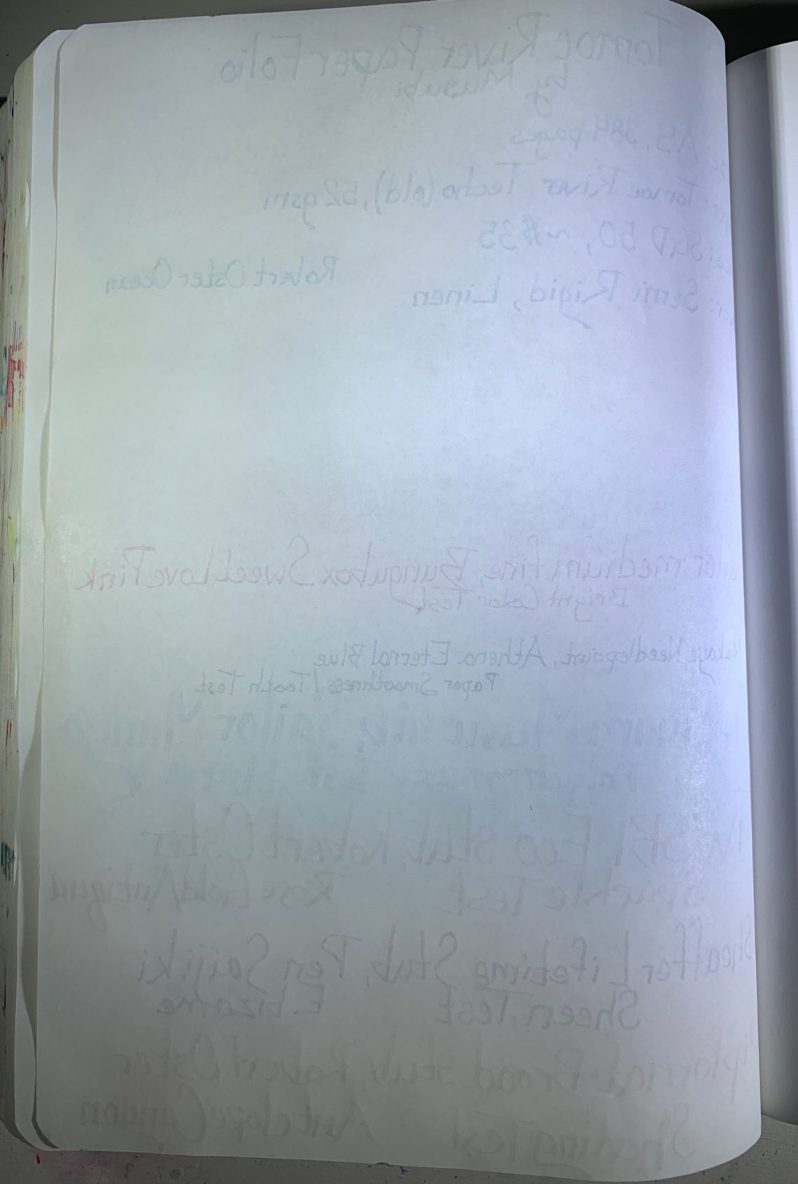
I tried to test many different characteristics on this paper – bright colors, shading, showing multiple ink colors, sparkly inks, sheening inks. Above is the front side of my testing page, below is the back of the same page.

There is a slight bit of show-through with Cosmo Air Light 83gsm, but very little. The camera actually picks up more show-through than what is seen in-person. Sheen is another piece that is hard to show here – it is quite high in-person.

To show this comparison a bit more clearly, I ran the same tests on a Musubi Tomoe River folio.

Above: Front side

Below: Back side

Cosmo Air Light paper:

Cosmo Air Light paper with watercolor, front (above) and back (below)

Tomoe River paper:

Musubi Tomoe River paper with watercolor, front (above) and back (below)

Cosmo Air Light paper is thicker, less show-through, doesn’t wrinkle as much with water, and shows brighter colors than the Tomoe River paper. I did notice that the back side of the Cosmo Air Light paper appeared shiny after the watercolor had dried:

The back side of the paper with watercolor was still great for writing – the shininess didn’t affect the quality.

After the writing and watercolor, the pages only showed slightly when the notebook was closed – no major wrinkling even with the water.

To wrap up the comparison, here’s a short list (TR for Tomoe River, CAL for Cosmo Air Light):

Size: TR A5, 384 pages; CAL A5, 208 pages

Price: TR $35; CAL $25 (approximate pricing from Singapore currency)

Paper weight: TR 52gsm; CAL 83gsm

Sheen: More from CAL

Shading: Crisper shading from CAL

Color brightness: Slightly brighter on CAL

Multiple ink colors: More from TR

Shimmer: Equal

Show-through: CAL has significantly less

Watercolor: Brighter colors from CAL, easier to blend on TR

Water resistance: CAL superior

Smoothness: CAL has more tooth, TR smoother

I love this new Cosmo Air Light folio. Downsides include number of pages – TR has nearly twice the number of pages, although the CAL does reflect this with a lower price. CAL also shows ink as crisp – very crisp. This could be good or bad – to me it is just different.

I am incredibly impressed with the quality of this new folio and the paper. I do mourn the loss of traditional Tomoe River paper, but at the same time, I’m very happy that this change is motivating new notebooks. I have expanded my daily notebook pile to include a Cosmo Air Light folio and I expect to replace it as soon as it fills up – I’ll also be expanding ink reviews to cover the ink on CAL in addition to TR. This new paper won’t take the place of TR in my heart, but I couldn’t be happier with the quality of the new Cosmo Air Light notebook. Thank you so much, Musubi!

Another thank you is due to Musubi as well. They recently contacted the Well-Appointed Desk to ask if we would give a new Cosmo Air Light notebook to a reader of the blog! In order to enter to win, leave a comment with your favorite feature of the new CAL paper. Details and rules are listed below.

DISCLAIMER: The item in this review was purchased by me and no affiliate links are provided in the post. Please see the About page for more details.


TO ENTER: Leave a comment below and leave a comment with your favorite feature of the new CAL paper. Play along and type in something. It makes reading through entries more interesting for me, okay? One entry per person.

If you have never entered a giveaway or commented on the site before, your comment must be manually approved by our highly-trained staff of monkeys before it will appear on the site. Our monkeys are underpaid and under-caffeinated so don’t stress if your comment does not appear right away. Give the monkeys some time.

FINE PRINT: All entries must be submitted by 10pm CST on Monday, April 5, 2021. All entries must be submitted at wellappointeddesk.com, not Twitter, Tumblr or Facebook, okay? Winner will be announced on Monday. Winner will be selected by random number generator from entries that played by the rules (see above). Please include your actual email address in the comment form so that I can contact you if you win. I will not save email addresses or sell them to anyone — pinky swear. If winner does not respond within 5 days, I will draw a new giveaway winner. Shipping via USPS first class is covered. Additional shipping options or insurance will have to be paid by the winner. We are generous but we’re not made of money. US and APO/AFO only, sorry.