Fountain Pen Review: Tibaldi Bononia Martini Olive (M Nib)

Fountain Pen Review: Tibaldi Bononia Martini Olive (M Nib)

Tibaldi is a name spoken in reverence among the fountain pen community. The original Tibaldi brand existed from 1916 to 1965 and were known for beautiful resin material that glowed with its depth of color. Now, having relocated to Bassano del Grappa and come under the direction of the Aquina Family that also owns the Monteggrapa brand, Tibaldi has been reborn. For us who came into the pen collecting community after 1965, we have occasionally seen a Tibaldi pen every now and then but thanks to the relaunch of the brand, we may actually have a chance to see them now.

Tibaldi Bononia Martini Olive packaging

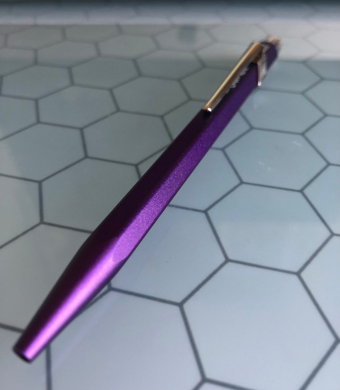
The Tibaldi Bononia Martin Olive fountain pen (M Nib) (€161.16, approx. $195USD) was my first experience with the brand. The material is as luminous as people have described. I am getting ahead of myself but I couldn’t resist peeking at the material as soon as the pen arrived. It is luminous. There’s no other way to describe it.

Tibaldi Bononia Martini Olive Packaging

The packaging is a super-heavy duty paperboard slipcase box with a debossed orange wrap around the exterior. Inside is a suede-like pad with elastic to hold the pen in place. Under the pad is a packet with two cartridges and a black credit card with a place to stamp and date official purchase.

Tibaldi Bononia Martini Olive

Once removed from the box, it’s a lot easier to see how luminous the color of the resin is. The pen itself is a classic tapered cigar shape with a slim clip. The silver hardware is all palladium.

Tibaldi Bononia Martini Olive

Tibaldi Bononia Martini Olive

The branding on the pen is subtle. Just etched under the clip “Tibaldi” and on the opposite of the cap from the clip “Made in Italy”.

Tibaldi Bononia Martini Olive

Holding up the cap up to the light, it becomes apparent how translucent the material in some spots.

Tibaldi Bononia Martini Olive

The nib is stainless steel and etched with the Tibaldi logo.

Tibaldi Bononia Martini Olive

The nib is a larger nib that seems proportional for the pen.

Tibaldi Bononia Martini Olive headline

Tibaldi Bononia Martini Olive writing samples

In my writing tests, the nib is a firm medium nib. It writes will but surprised me with how well it wrote in “reverse writing” which is when you turn the nib upside down with the feed facing up while writing rather than the nib. It was not as wet in “reverse writing” but was still smooth and easy to use.

Tibaldi Bononia Martini Olive pen comparison

When compared to other pens, from left to right: Platinum 3776, Opus 88, Sailor Pro Color, Tibaldi, TWSBI ECO, Pelikan M605, Pelikan M205, the Tibaldi is a bit longer when capped but similar in width to the Opus 88, Platinum 3776 and TWBI Eco. The Sailor Pro Color and the Pelikans are a little slimmer.

Tibaldi Bononia Martini Olive pen comparisons

Posted, the Tibaldi is the longest but still not heavy. The TWSBI is really the longest the cap does not post snugly so I’m not counting it. The Tibaldi weighs 15gms unposted and 23gms posted or capped so it’s very similar in weight to the TWSBI ECO.

pen weight comparison chart

Ollie helps

Overall, the Tibaldi Bononia Martini Olive is stunning. The price for a “made in Italy” pen is quite competitive too. It even has the Ollie “paw of approval”.

Tools:


DISCLAIMER: The items included in this review were provided free of charge by Appelboom for the purpose of review. Please see the About page for more details.

Pen Review: Metaxas & Sins Stylos Green Fountain pen

Pen Review: Metaxas & Sins Stylos Green Fountain pen

When I first picked up the Metaxas & Sins pen, I had two thoughts. First, I immediately noticed the weight of the pen. It’s hefty for its size. Secondly, the shape and size of the pen remind me of mascara. Yes, mascara.

I am learning that one of the interesting things about reviewing pens is that every once in a while a pen arrives from the Desk headquarters that I’ve had no previous experience with and have not researched or heard much about online. In this particular case, I wasn’t even sure of the price point of the pen when I first started using it. I purposely inked the pen and used it for a couple of days before looking into any of the details of the pen online to see how my own perspective might be similar or different to how the pen is advertised and where it fits in the market.

Let’s start with some high points. The pen feels very solid, and as it turns out it is machined from a block of solid aluminum. You can definitely tell. The finish of the metal is also slightly textured and matte, which I think is a really nice touch for an all metal pen. It’s slightly grippy. The branding around the cap isn’t my favorite, but it’s not outrageous or large.

The pen is fitted with a full size #6 Bock nib. One interesting note is that you can only purchase the pen with a medium nib. At the price point of the Metaxas, additional nib options are almost expected. Issues with Bock nibs have been discussed in length, but I’m happy to say I didn’t find any issues with mine in this case. It was a smooth writer and a typical medium width nib. However, one potential issue with the pen for some people is the combination of the short section and the very sharp threads as seen above.

The section is compared to that of a TWSBI Eco and a Franklin Christoph p66 above. It’s not a huge problem for me because I have small hands, but it could be an issue for some- especially with how uncomfortable the threads are if you happen to grip the pen in that area.

Pen comparison (from L to R): TWSBI Eco, Franklin Christoph p66, Metaxas & Sins Stylos, Benu pen, Pilot Metropolitan, Lamy Safari, Pilot Kakuno, Kaweco Perkeo.

Compared to every other pen on the tray above, the Metaxas is the heaviest by far. Comparing it to the Desk common pen weights table below, its significantly heavier than all of the pens listed coming in at 46gms filled.

Overall, at almost $90 the Metaxas has some tough competitors. One of the most utilized pens in my entire collection, the Kaweco Brass Sport comes in around this price point as does one of Ana’s personal favorites the Caran d’Ache 849. The thing that makes this pen unique in this price range is the all metal construction, size, and weight of the pen. I’ve been asked several times at pen shows for the most affordable option for a larger size, heavy pen. In that specific case, this pen may be a good choice especially if the styling of the pen is personally appealing to you.

For me, the overall style of the pen is not one that speaks to me enough to use on a regular basis. But that piece is simply personal taste. Others may really enjoy the style of the pen, and in that case, outside the concern over the threads and the section, I think this pen could be recommended if you are specifically looking for a larger, all metal pen with solid construction and a variety of color options under $100.


DISCLAIMER: Some items included in this review were provided by Appelboom for the purpose of review. Please see the About page for more details.

Ink Line Review: Van Dieman’s Harvest Ink

Ink Line Review: Van Dieman’s Harvest Ink

By Jessica Coles

Van Dieman’s ink seems to be everywhere lately. By that, I mean there are LOTS of Van Dieman’s inks. The newest line up – Harvest – has 16 harvest themed ink colors that are perfect for a fall palette.

With so many inks, I’ll get right down to the photos instead of chatting too much! A couple notes about the overall colors – the inks are all great for fountain pens and are very easy to clean out. They are also not waterproof at all as a general rule. There were two exceptions in this group – Golden Nugget Pumpkin was legible after water was applied and wiped off and Beeswax became lighter with water but was actually water resistant. I have heard that Van Dieman’s inks are sometimes used in watercolor style paintings. Let us know if you have seen any!

First, the Yellows:

Van Dieman’s Beeswax is slightly darker in writing than Montblanc Lucky Pig or Robert Oster Sunrise Yellow.

Van Dieman’s Apple Cider is close to Robert Oster Olive Green in the swatch but slightly more orange in writing.

It was hard to find a close match to Van Dieman’s Apricot. It seems closest to the lighter portions of Lamy Mango.

In writing, Van Dieman’s Peanut Brittle is very close to Noodler’s Golden Brown.

Next up are the Reds and Oranges:

Van Dieman’s Golden Nugget Pumpkin is almost identical to Montblanc Lucky Orange although it looks a bit dustier.

Tasmanian Safron (yes, I checked the spelling) was hard to match exactly. Slightly more red than Monteverde Ruby.

Callifolio Aurora is a bit lighter and a tad more orange than Van Dieman’s Sweetheart Cherry.

Van Dieman’s Pink Radish is a darker version of Ferris Wheel Press Pink Eraser.

Monteverde Mercury Noir is only a touch more red than Van Dieman’s Rhubarb Crumble.

Now the best section, the Purples:

I was pleasantly surprised to find that Van Dieman’s Beetroot Relish (great name) is quite close to Pelikan Edelstein Amethyst although with a bit more blue. But considering how hard it is to find Amethyst, I think Beetroot Relish is a great alternative.

Robert Oster Berry d’Arche is a lighter form of Van Dieman’s Blackberry Jam.

Van Dieman’s Tasmanian Lavender is absolutely my favorite color of the Harvest line. My full bottle of it arrived last week. In writing it is a bit darker than Kobe #57 an Ferris Wheel Press Little Robina but it keeps the same lovely color.


Van Dieman’s Eggplant is a great match to Kobe #32.

Finally, the Greens and Brown:

Van Dieman’s Zucchini is a good match for Monteverde Jade Noir and also shows a hint of sheen.

Van Dieman’s Wasabi is a wonderful bright green and a bit more yellow than both Kaweco Palm Green and Diamine Apple Glory.

Van Dieman’s Nutmeg is one color that I couldn’t find a close match. Pilot Iroshizuku Tsukushi comes close but is darker and contains a bit more red.

It was tough to fit all of the swatches in my light box at the same time, but here they are!


DISCLAIMER:  The inks in this review were purchased by me although the Col-o-rings were provided to me by Ana because she knows she can keep me writing all the time in exchange for the wonderful cards. Please see the About page for more details.

Link Love: In which we discuss pen community goings-on

Link Love: In which we discuss pen community goings-on

As I settle in to my new teaching schedule (5 hours a day, two days a week– all on ZOOM!) blended with freelance design work, blogging, and shop upkeep (shipping, inventory, new designs, etc), I find that it’s easy to get distracted by the new shiny releases that have been trickling into view from the pen community. The first big announcement was the early reveal of the Lamy Safari Limited Edition colors for 2021: Savannah Green and Terra Red. These are both reinterpretations of the original Safari pens released in 1980.

Savannah Green and Terra Red

Original 80s Lamy Safari

But some astute person on Facebook made a unique observation. I can’t find which of the many pen community boards it was posted on but the gist was… do the 2021 Lamy Safari pens remind you of anything?

Vintage Tupperware
Photo from Etsy listing

Yeah, me too.

New Pilot ParallelNext, is the release of new Pilot Parallel Pens in 3.0mm and 4.5mm widths ($10 each). These new sizes feature new body color (white which looks like it may be updating the whole line) and cap colors (pink and teal) as well. If you are a fan of Pilot Parallel pens, I feel certain these new additions will get added to your collection too.

More pen news next week.

Onward, to the links this week!

I included the “9 Best Fountain Pens” from My Modern Met just to rile you all up. Feel free to rage at the ineptitude of the recommendations. I certainly did.

After you cool down, there are lots of paper reviews this week from people who actually know a thing or two about what they are talking about as well as gobs of new ink reviews. There’s some joy to be found in “Other Interesting Things” like floral Lego collections, a Maya Angelou Barbie, Sisters with Transistors and Lava Lamp internet security. Then, you can roll your eyes at the sheer volume of mail that the USPS had to process in 2020. What a mess! (I do not blame postal employees. Upper management had to have seen this barrage coming and didn’t plan accordingly.)

Okay, onward. Enjoy!

Pens:

Ink:

Pencils:

Notebooks & Paper:

Art & Creativity:

Other Interesting Things:

We need each other. Please support our sponsors and affiliates. Your patronage will let them know you appreciate their support of the pen community. Without them, and without you, we could not continue to do what we do. Thank you!

Ball Point Pen Review: Caran d’Ache Nespresso 3rd Limited Edition

Ever since I discovered fountain pens, my use of ballpoint pens has been minimal. I love my Retro 51’s, and an impressive collection of gel pens and fine liners, but I’m mostly done with ballpoints. When I saw the Caran d’Ache Nespresso (3rd edition, $45.00), I felt a pang of longing though. For starters, it’s PURPLE and I have developed a deep and abiding love of purple since 2019’s purple forays. Second, the pen is manufactured from recycled Nespresso cartridges. I love how Caran d’Ache has made a gorgeous pen with innovative recycled materials. What could be cooler than that?

However, I still held off purchasing because it was a ballpoint. So you can imagine how tickled I was to receive the Nespresso as a present this holiday season!

The aluminum barrel of the body is actually made of recycled ‘Arpeggio’ capsules, creating a purple body that is super smooth and sleek. The body is Caran d’Ache’s signature hexagonal shape. I should add that all of the packaging for the pen is made of 100% recycled materials as well!

The pen comes with Caran d’Ache’s signature Goliath ink cartridges which are available in 3 tip widths, and 4 colors (mine is in blue). According to Caran d’Ache, the Goliath will write up to 600 pages of A4. Although it writes fairly smoothly, I may be consulting the refill queen to find out if I can add a gel refill to this baby and make it all mine.

I will say that there are uses for ballpoints – sometimes a fountain pen just isn’t the best for every situation. I’m excited use my Nespresso at those times!


DISCLAIMER: Some of the items included in this review were provided to us free of charge for the purpose of review. Please see the About page for more details.

Fountain Pen Review: Pelikan Classic M205 Moonstone Fountain Pen Set

Fountain Pen Review: Pelikan Classic M205 Moonstone Fountain Pen Set

While the Pelikan M205 Moonstone Fountain Pen Set (€123.14) was supposed to be the “Ink of the Year” for 2020, due to the pandemic, the pen and ink shipped late in the calendar year. This is not such a bad thing as Pantone chose grey was one of the two colors chosen as “Color of the Year” for 2021. Way to be ahead of the curve, Pelikan!

2021 Pantone Color of the Year

The M200-series feature stainless steel nibs. This makes the M200-series the least expensive of their “Souveran” pen line. The set, with ink, purchased for the EU is considerably cheaper than buying it domestically because of some weird pricing strategies for the US and North American market.

The Pelikan Moonstone is available in a range of nibs sizes and also as a ballpoint if your fountain pen collection has reached critical mass.

After my fuss about pen companies (that should not be named) that do not include converters with pens over $50, I am inclined to prefer piston pens which do not require converters. As such, the M205 is one of the best “next step” pens when you are looking to upgrade to a more upscale fountain pen.

Pelikan M205 Moonstone Packaging

The Star Ruby M205 was a huge success last year so Pelikan played it safe and made the Moonstone M205 in a similar translucent plastic embedded with glitter. To be honest, I like the look of the Moonstone, even more than the Star Ruby. The Moonstone 205 has a subtle bling to it where the Ruby is much flashier.

The Pelikan M205 Moonstone Pen and Ink Set (€123.14) ships in a paperboard box and includes the pen and a full bottle of the Pelikan Edelstein Moonstone ink.

Pelikan M205 EF Moonstone

Pelikan M205 EF

Pelikan M205 EF Moonstone speckle detail

Upon close inspection, the microfine sparkles embedded in the translucent grey material are opalescent creating a sort of stardust effect. This effect definitely reinforces the gemstone vibe that Pelikan set out with the naming and theme of the inks.

Pelikan M205 EF and Moonstone ink nib close-up

The nib is steel but the M200-series steel nibs from Pelikan are some of the softest steel nibs I’ve used. Early in my fountain pen days, they were too soft for me but over the years, my writing style has changed. I think I write with a lighter touch and are therefore more able to appreciate the Pelikan steel nib. Depending on your writing style, the softness of this nib may be difficult for some writers to use.

It’s not a flex nib but if you write with a heavy hand, it is possible to choke the ink flow.

Pelikan M205 EF and Moonstone ink


The Ink:

Pelikan Moonstone comparison

Pelikan Edelstein Moonstone is a pleasant change in the “ink of the year” from this ink line. The color is a beautiful mid-range, cool-neutral grey. It’s dark enough to be legible even in a fine nib but not so dark that it starts to look like a faded black.

Performance-wise, the ink is smooth and largely odorless. (Some inks have a distinct smell and I don’t notice any with the Pelikan Edelstein inks).

Pelikan M205 EF writing smaple

When used with a large folded nib, the shading and range of shading is stunning. It reminds me of the range of color of the moon in photos from the Apollo program.

Pelikan M205 EF writing close-up

There is a little color shifting in the ink between a cool blue and a warm golden undertone.

Pelikan M205 EF writing

In regular writing samples, even with the M205 EF, the ink is still legible. With slightly wider nibs, the ink color really starts to show its character.

Pelikan M205 EF writing close-up

This close-up image shows the slight flex of the nib as well as the non water-proofiness though the ink does stain the paper just a bit. The shading it visible quite well here.

Pelikan Moonstone on Tomoe River

On Tomoe River paper, the ink appears slightly darker and the swatch shows a bit more of the color-changing effects.

Pelikan Moonstone comparison

When compared to other grey ink options, there are a lot of similar shades. Lamy Agate has a greenish undertone that makes it notably different. Montblanc Heritage Spider Metamorphosis Web Grey is more blue-violet in its undertone. Montblanc Oyster Grey  is slightly darker. Kaweco Smokey Grey is probably the closest match.

Pelikan Moonstone comparison


Pelikan M205 EF and Moonstone ink

Tools:


DISCLAIMER: Some items included in this review were provided by Appelboom for the purpose of review. Please see the About page for more details.

Pencil Review: Caran d’Ache Fixpencil 884 and M+R Lead Pointer

Review by Tina Koyama

1 - Fixpencil full size

First, I must begin by admitting that I am not a huge user of mechanical pencils. Though I use clutches with certain art materials, I’ve always preferred woodcased pencils to write with. Call me fussy, but many mechanicals I’ve tried are either too heavy, too light, too cold, or just too engineer-y. 

That’s why I surprised myself when I discovered that I love the Caran d’Ache Fixpencil 884 ($22). Also known as the “Junior” model, the Fixpencil 884 takes 2mm leads. It’s available with a green, red or blue barrel. (A similar Fixpencil model comes in matte black with colored knocks.) 

According to The Gentleman Stationer, “The history of the Caran d’Ache Fixpencil begins in 1929, when an engineer in Geneva invented this unique clutch pencil as a hedge against potential wartime disruption of the woodcase pencil supply. After launching a year later, the Fixpencil became a global success. The Caran d’Ache Fixpencil was the world’s first modern mechanical pencil.”

Something about its sleek, classic design and especially the clip evoke Seattle’s mid-century Space Needle. 

2 - Fixpencil clip end

The plastic aluminum barrel  (A pencil community member corrected me: The Fixpencil is made of powder-coated aluminum, not plastic.) is lightly textured, which makes it comfortable to hold. Its well-balanced weight is also comfortable – not too heavy, not too light. Most significant, however, is its hexagonal shape, which was obviously designed to mimic the woodcased pencils that were expected to be in short supply during the war. 

3 - Fixpencil texture

It’s probably no coincidence that the 2mm lead it takes is also close to the size of a standard woodcased pencil core. All of this explains why the Fixpencil appeals to me: It’s the woodcased pencil of mechanical pencils!

As is true with most mark-making implements that wander into my hand, my first impulse was to draw with it. I was told that the graphite lead that comes with the Fixpencil is about a B grade, which is harder than I like for sketching, but the barrel is pleasant to draw with, and the 2mm lead size has the same line variation as a woodcased pencil. (I’m going to put a Uni Mitsubishi 4B lead in it to draw with, and then I’ll be happy.) 

Bonus: 2mm is the size of the Caran d’Ache colored leads! (Drat – if the Fixpencil also came in yellow, I could get one of each color to match the four leads. Really, Caran d’Ache, you didn’t think of this? Why doesn’t anyone ever consult with me on these important matters! I guess the replacement buttons will have to do.)

4 - Fixpencil sketch sample

Writing is equally pleasant as drawing. One of my objections to writing with most mechanical pencils (such as those with .05 mm leads) is that the line stays perfectly consistent (which is one of its benefits for drafters and other technical people who require a consistent line and those who prefer it), thereby eliminating subtle line variations that can be expressive for both writing and drawing. With a 2mm lead, however, my writing shows some thicks and thins.

5 - Fixpencil writing sample

As for the Fixpencil’s mechanics, they are as streamlined as its appearance: Push the knock on the end, and the lead advances. Pull the knock off, and there’s a convenient lead pointer inside. It will do in a pinch. However, to get a smooth, beautiful point, I recommend the Möbius + Ruppert brass lead pointer ($6), which has two holes to accommodate 2mm and 3.2mm leads.

6 - pointer hole 1

7 - pointer hole 2

8 - sharpened lead

Finally, a mechanical pencil that I can love!

9 - Fixpencil, pointer, sticker


DISCLAIMER: The items included in this review were provided free of charge by Gentleman Stationer for the purpose of review. Please see the About page for more details.


tina-koyamaTina Koyama is an urban sketcher in Seattle. Her blog is Fueled by Clouds & Coffee, and you can follow her on Instagram as Miatagrrl.