Many weeks ago I was browsing JetPens (like you do) and I was stopped in my scrolling by the words “fude nib.” For those not in the know, a fude nib is a nib where the tip is somewhat bent. This means that depending on the angle at which you are holding the pen, you’ll see distinct line variation. I was ridiculously thrilled by the idea and immediately ordered the Moonman N6 Fountain Pen with an Extra Fine Fude nib/Glass dip nib in Iris Blue Swirl ($21).
Now what I didn’t read was the fine, or not so fine print, that the fude nib was an extra fine. When I discussed the purchase with Ana, she informed me that since it was a nib that was bent to be an extra fine, I probably wouldn’t get the results I was looking for. However, it wasn’t an expensive purchase so I decided to wait and see what I got.
I have a few dip nib pens and I enjoy playing with them, but I find they really shine when I want to sample inks. Years ago I bought a dip nib pen on ebay that came with a glass nib and 5 other interchangeable nibs (XF, F, M, B, XB) and I have used those with a fair amount of success to this day.
So let’s start by talking about what you’re getting when you buy a glass nib. When you’re investing in a more expensive model of pen, you might be getting a true glass nib. For these less expensive versions, you’re most likely getting a clear acrylic nib. The nib itself may be a variety of shapes (often bulbous or swirling) and will have lines etched in the sides of the nib. When you dip the glass nib in an ink bottle, these grooves will hold more ink than a standard nib, enabling you to write for longer on a single ink dip.
For this particular N6, I admit I’m a little disappointed in the glass nib. For starters, it isn’t as thin as my Delike Glass Signature Pen, and I really like the thin lines I can get with that one. Second, this one has a few imperfections. In the photo above I managed to capture where there’s extra acrylic – it didn’t come out of the mold cleanly? And there’s another small section where there appears to be a chip. Neither of these imperfections really affect the performance of the glass nib itself. They might possibly result in less ink being held in the channels, but of course I’m just using the tip to write with. That said, it was a bit disappointing.
For the extra fine fude nib, it’s a nice nib that wrote cleanly and fairly thin (more like a western extra fine, but that’s ok). There is a definite angle to it, and that will take a little playing with to get used to. I do appreciate that this particular pen also includes a converter, meaning if you want to use this pen as an everyday writer with the fude nib, you can fill it with ink. My other dip pen has a purely decorative handle; no room for storing ink.
So overall, I would say you could probably skip the N6 unless you’re interested in trying out an inexpensive dip pen.
DISCLAIMER: Some of the items included in this review were provided to us free of charge for the purpose of review. Please see the About page for more details.
Since my first visit to The SF Pen Show in 2015, I have made this event the destination for my annual vacation. (2020, I’m not talking to you). Its tag line is “The Fun Pen Show” and it has certainly been very fun for me.
The draw of the show is, of course, getting to see beautiful, rare, or custom-made pens, notebooks and stationery ephemera in person. It is also about getting to meet vendors and artisans we have only seen online. And it is about going to classes, meetups and seminars to learn more and meet more people.
There is always more to the show than advertised.
When I turned off the freeway exit and onto Twin Dolphin drive to arrive at the hotel, I had tears. “I have returned home.”
Ready and pen show bound
I knew this year would be different, and I was prepared for it to not be quite as I remembered. The tables were spread out farther, and I really liked the wider aisles. While there were many who could not come and were missed, there were also first-time pen show attendees and vendors that I had not seen there before. For safety and community health, we wore masks unless eating. But you can recognize the smiles under masks just fine.
Pen Show “uniform” for 2021, obligatory hotel room mirror selfie
Here’s what I did this year:
Worked at Rick’s table
This was the first pen show where I saw the pen show floor from the eyes of a vendor. I signed up to help Rick Propas, otherwise know as The PENguin.
It was a joy to see first-time pen show goers discovering the floor, and I experienced a flood of emotions seeing pen friends and familiar faces- ok, familiar foreheads- for the first time in two years.
Sitting behind the table, I discovered it is not just about selling the pens. Rick answered many questions, and did some on the spot repairs. I learned a lot in proximity to his knowledge and experience. It was definitely fun for me to help people find the models they wanted to see, and to answer some general questions. I made sure to sit in front of my favorite tray. Beauties!
the view from here is fine! …and medium, broad, semi-flex, oblique…
Shopping around
Of course, I did take time to shop the show myself. I loved seeing favorites and known to me vendors, and although not everyone from years past could make it, these were well represented. I tagged along with a friend getting a nib grind from Gena Salorino (Custom Nib Studio) who was one of several nib-grinders able to come and provide services.
I participated in a bit of a flurry-buying episode at the Plotter, Traveler’s Company and Maido tables. Refills for my Filofax, Traveler’s notebooks, inks and more fun notebooks! Wow, look at this interesting grid! Does it come in Personal size??? No, I want that one!
The rest of the time I was able to peruse at a calmer pace, and took a number of lying-down breaks. It was a slower paced show for me, and this is a good thing.
My “mission”? Enjoy all the grids!
Teaching a Class
This is the second year I have offered a class in ink wash painting techniques. I like the Sunday morning time slot as it allows me to enjoy the action of the show Friday and Saturday, and then have a quiet, focussed morning sharing a meaningful pursuit with my beloved pen community.
It is always so rewarding to see the students discovering new ways to express themselves with brush, ink and paper.
Class demo setup
Pen Show Traditions
I lost my hotel room key, almost immediately after checking in. I put my things in the room, went out again and realized the key was not the item in my pocket, that was my phone. The hotel employee said “already?” when I asked for a duplicate. Pretty sure I over-achieved this tradition!
Tacos at Taqueria El Metate. This spot is, in mileage, very close to the hotel, but because its California, you have to go past it, over an overpass, around a curlicue, and then merge suddenly to get off at the first exit to swoop into a parking spot right out front. Inside, its bright colors, Pen Friends, and excellent tacos.
Saturday night Dinner at Grill House. Just a tired and small group of 3, but all of us happy to be there. We did this in 2019 and again this year. “Let’s make this a tradition!” You don’t have to twist my arm.
Fondling gorgeous urushi/maki-e pens and then seeing the price tag. Right! This year it was a Danitrio goldfish that caught my eye. Also I am a fool for the “eggshell” finish. Future goals.
My Pen Haul
All vintage this year, with the most recent one being from the ’80s or ’90s.
The Delta “sterling”? Purchased from a fellow pen show attendee. I don’t actually know the name of this model, but it looks to be an early one in their lineup. This might be the first bi-color metal pen that I have wanted to buy, and is my first Delta pen. The nib is a “fusion” nib that Delta was known for, and the writing experience of this pen is glorious.
Pelikan 500N tortoise, of course purchased from Rick’s table. I believe this one is from 1956. The 500’s had the gold-filled cap. I really haven’t seen them around much. After a day and a half staring at it on the table in front of me, I knew it was The One.
Kaweco NOS, again from Rick. The story is that there were a bunch of parts “sitting around” from the ’30s, and so they made them into pens. This one has a distinctive celluloid finish, which ensnared me with its siren song. Oh, did I not mention it has a lovely stub nib? [heart eyes]
Waterman Pansy Sterling, semi-flex Ideal nib. Again with the sterling. I bought this from John Strother’s table during my last pass around the floor on Sunday. I had some budget left and thought I’d use it if I found “something special”. Well, sometimes you find the pens, and sometimes the pens find you. I was looking at the lovely ring top models next to this one in the tray, and decided to just hold this one in my hand for comparison of size in hand. Oh. No. This one. The flex nib was all the rest I needed to know.
In summary:
While the draw is pens and stationery, and they are wonderful, what keeps us coming back to these events is always the people. Our pen community is special. It is open and accepting, enthusiastic. It is as excited about newcomers as much as it celebrates the known names and characters. Navigating a convention-sized event can be a physical and sensorial challenge, but I drive home each year with a giant-sized grin on my face. I am coming back again next year. Pen Shows are Love.
‘Till next year! I am still kind of thinking about that case with the cross stitch embroidery on it…
Julia is an artist, classical musician, knitter, and lover of the outdoors. She resides in Santa Cruz, California, where she can draw Pelicans with Pelikans, and brag about the weather. Follow her adventures on Instagram @juliavdw or Twitter @juliavdw.
Yes I realize that it’s only September 3, but Halloween candy is already in the stores! Actually, what really happened is I showed my current knit to a few friends and one exclaimed “ooooo Halloween colors.” So that’s the post.
Pattern: Positive Vibrations by Marin Melchior (Ravelry link)
Yarn:Zen Yarn Garden Superfine Fingering in New Navy, Scallions and Tangerine
People often tease me that “back-to-school” season is my favorite holiday and I fully own this. So much so that when I get emails about the Sept. 1 launch of Hobonichi’s 2022 line-up, I get the same giddiness that we got as kids when the Sears Christmas Catalog would arrive and we would start dog-earing the pages and circling what we hoped Santa would bring.
Well, its on! Hobonichi day is here! If you are not a Hobonichi fan, don’t worry. This is just the starting gun for planner season. There’s a link below for Yoseka’s planner available. And a reminder that big box stores will be moving the school supplies to the clearance aisle this week and filling those prime spots with Halloween merchandise this weekend.
We need each other. Please support our sponsors and affiliates. Your patronage will let them know you appreciate their support of the pen community. Without them, and without you, we could not continue to do what we do. Thank you!
I know it sounds like a tired cliche, but pride goeth before the fall. You may have noticed that I didn’t post last week on my regularly scheduled Tuesday. Ana noticed and reminded me that even though I had just finished bragging about how reliable I was at knit night, I completely forgot to do last weeks post. Oh, the irony.
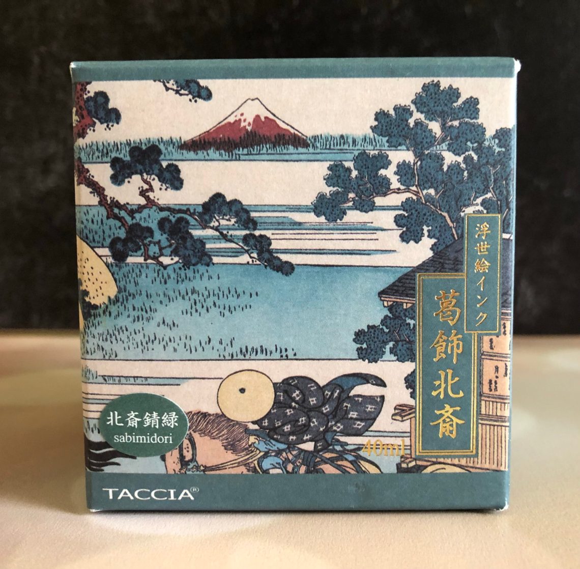
So today I’m making up for it with something special. I know I’m a bit late to the party, but a few weeks ago I watched Mike’s Friday stream in which he showed Taccia Sabimidori. This ink is FUN! It has a few tricks up its sleeve and ends up in my favorite color family.
So I went ahead and ordered a bottle of Taccia Hokusai-Sabimidori (40 mL, $23.00) so I could play on my own. Sabimidori is a rusty green invoke by the opera “The Village of Sekiya on the Sumida River.” The Taccia inks come in gorgeous packaging inspired by Japanese paintings and Sabimidori is no exception.
The surprise is that when you open Sabimidori, it’s all teal blue. And yet, as you watch it dry (and it’s pretty quick) it slowly fades to a rich green with hints of blue and yellow and almost a rust-colored sheen. It reminds me of iron oxidizing, and indigo dyeing in the way it changes colors.
The ink itself is sort of average in terms of the wet/dry spectrum. It goes down nicely with some shading and dries quickly, all without being too dry. I decided it was a good color for my Diplomat Traveler in Flame.
In comparison to other inks in my collection, I did find a few that were close, but nothing quite the same. Diamine Twilight had the right shading but was definitely bluer. Starry Night Silent Corderite has the right colors, but is a bit light and of course also has sparkle, which Sabimidori doesn’t. KWZ Iron Gall Turquoise is a bit similar, but again too blue.
The Pilot Hi-Tech C Coleto, the only customizable multi pen in this review, is nearly mind-boggling in its potential versatility. I was kind of scared to look through all the possibilities – 72 gel pen, pencil and eraser components compatible with its four available slots! (Don’t even get me started on the Uni Style Fit Meister, which has 214 components!) I stayed up a little too late choosing my refills (violet and green 0.5mm gel, 0.5 mm pencil and eraser). The body is a smooth, metallic-colored plastic with a shape that’s comfortable to hold, although the surface can be a bit slippery.
The refills are easy to place into the body. The hinged top flips open, and a component slides into each chamber. (It’s only tricky if you try to put one in backwards as I did! The tab must face out.) It’s fascinating to see all the hingey, springy parts on the components that make the multi pen operate smoothly. The selector tabs push down flawlessly and stay engaged in use until released by slightly pushing another tab. The larger tabs on the eraser and pencil units enable easy loading of additional eraser or lead by pushing repeatedly.
One reason I chose the Coleto is for its eraser unit. While most multi pens with a pencil unit include a refillable eraser at the top, the Coleto is the only one I found with a conveniently retractable eraser – and it’s just about the same diameter as my favorite Tombow Mono Zero. Although it doesn’t erase quite as well as the Zero, it’s still a very good eraser. I like that the eraser itself is refillable. Similarly, the mechanical pencil unit can be refilled with any 0.5 mm leads. The gel pen units are competent and come in oodles of colors. My only wish is that they were available in 0.7 mm, my favorite writing size. (All scribble swatches made in a Col-o-Ring Oversize notebook.)
Another Pilot, the Acroball Spotliter is unique in a different way: In addition to three 0.7mm ballpoint pen units (black, blue and red inks), this multi pen comes with a highlighter in either pink or yellow at the top. I was pleased that it came with 0.7mm ballpoints, and the ink doesn’t smear when highlighted. The highlighter can be refilled along with the ink units.
I like the grippy rubberized body, which is comfortable to hold and use. It’s fun to look through the translucent barrel and watch the inner mechanism move when a color is selected. (I admit, one reason I love multi pens is being able to see their intricate mechanical parts.)
I have some quibbles, however. To select an ink color, the barrel must be twisted, and a small colored line indicates which color you have chosen (a ring on the pen tip also indicates the ink color). However, the barrel goes only so far, and then it must be reversed. When I get to the stopping point, I always want to keep going in the same direction. My preference is retractable tabs as on the Coleto.
A second quibble is the cap over the highlighter. Intuitively, I want to pull off the cap, but when I do, the whole highlighter unit comes off, revealing the chamber for refilling the pen components. To open the highlighter, the cap must be twisted off. Maybe from a lifetime of pulling caps off highlighters, this twisting motion is not at all intuitive to me.
The third multi pen in this review is not a pen at all – it’s the Uni Color 3 multi pencil. It comes with 0.5 mm Uni NanoDia Color Erasable leads in red, blue and orange. When the top cap is removed, a refillable eraser is revealed. The translucent barrel makes it easy to see which color is being selected.
I didn’t have high expectations of coloring with these leads, but I made a valiant effort at sketching a peach anyway (I used a smooth Stillman & Birn Epsilon sketchbook). Although all three colors are pale by colored pencil standards, the orange is especially light. Adequate for writing, the red and blue would be a handy alternative to a woodcased bicolor pencil. All three colors do erase well with the attached eraser.
Of the three (and of most multi pens I’ve tried), the Uni’s body feels the least sturdy. Although the sliding selector mechanisms are smooth, they feel bouncy instead of secure when pushed. Although a fully detachable cap over the eraser seems standard for multi pens and pencils, I wish more could be hinged like the Coleto’s. I’m certain that I’ll lose that tiny cap.
The Uni 3 is one of few multi mechanical pencils I know of. Since the components will accommodate any 0.5 mm leads, here’s what I might do: Fill the three units with H, 2B and 4B graphite leads (Pentel Ain Stein and Pilot Neox are some good ones). That would make the Uni 3 a handy and compact writing/drawing multi – and with a decent eraser, too.
Do you know the joy of finding a paper tube printed to look like a pencil in your mail box? Sheer and complete bliss. The tube is the new Musgrave Heritage Collection “one dozen of our favorite pencils” ($12.75).
Inside the pencil tube, is an assortment of Musgrave classics like the The Bugle and the Test Scoring 100 as well as the new favorite. Tennessee Red Cedar. There are some school age classics like The Cub, The Choo-Choo and The Tot in the set too.
There are also some unique specialties like the Hermitage (red lead), the News 600 and the Unigraph F.
Finally, some lesser known pencils are included like the Ceres 909 and the Harvest 320.
My first round of tests were trying all the pencils on two kinds of paper — a smooth stock (comparable to Rhodia but its actually Profolio Oasis Notebook) and a toothier paper (similar to regular sketchbook paper). On the smoother paper, the harder pencils appeared lighter than on the toothier stock. If you use a toothier more textured paper but are looking for a lighter line, consider a harder graphite pencil. Alterntely, if you are using super smooth stocks normally, an HB or darker may be your preferred pencil.
I decided to break up the pencils into smaller sets. First up are the hex-shaped pencils. I think standard hex pencils are the most classic pencils. The Harvest 320, the Test Scoring 100 and the Tennessee Red Cedar are all HB with smooth, dark lead. I found the hex shape on the Test Scoring 100 to be the sharpest. So of the three dark, smooth hex pencils, the Tennessee Red Cedar is my absolute favorite but the Harvest 320 is a close second with its classic yellow paint. The Ceres is a harder lead option but still with a smooth lead. The Unigraph is available in a wide variety of hardnesses from 6B-6H and comes with an eraser. I received an F which is a smooth, light lead with good point retention.
Several of the pencils are wider than normal, considered jumbo pencils. According to the Musgrave web site, My-Pal 2020 is 8.5mm, the TOT is 10mm. The Choo-Choo appears to be the same diameter as the TOT and the CUB seems to be the same diameter as My-Pal. MY-Pal and the TOT don’t have erasers on the end while the Cub and the Choo-Choo both have erasers. I found the graphite in My-Pal and CUB to be a bit smoother than the wider diameter Choo-Choo and TOT. I also found the Choo-Choo and TOT to be a bit too big for my hands.
The final grouping were the odd balls: the Bugle which is a round barrel with a beautiful clear varnish on natural wood. The Hermitage which is a red pencil with an eraser. It doesn’t erase well but it writes with a good deep red color — perfect for editing or preliminary sketches. Finally, there is the News 600 which reminds me so much of the Ebony pencils we used for sketching on newsprint in life drawing classes in college. It’s a super dark, super soft graphite. If you’re looking for a great sketching pencil or the softest, darkest lead, then the News 600 is for you.
If you are just getting in to pencils, the Heritage Collection is a perfect sampler and the tube is worth the entry fee!
DISCLAIMER: The items included in this review were provided free of charge by Musgrave Pencil Company for the purpose of review. Please see the About page for more details.


 Julia is an artist, classical musician, knitter, and lover of the outdoors. She resides in Santa Cruz, California, where she can draw Pelicans with Pelikans, and brag about the weather. Follow her adventures on Instagram


 Tina Koyama is an urban sketcher in Seattle. Her blog is


