Product Review: William Hannah A5 Notebook

Product Review: William Hannah A5 Notebook

After reading Jaclyn’s post a few weeks ago about her customized William Hannah A5 discbound notebook cover (starting at £99), I realized how much I had always wanted one. Compared with other discbound systems, the William Hannah covers are definitely on the luxury end of the spectrum. The covers are leather, with durable metal rings and the option to customize the overall look of the covers, making the higher price seem a little more understandable.

There are two levels of customization: Bespoke/full customization (choosing cover and inside material colors as well as stitching) and partial customization (adding pen loop, £6 upcharge and/or adding a monogram, £10). In either option, the cover comes with 50 sheets of paper that can be lined, dot grid or blank or a combination of all three. There is also an option to choose the color of the lines or dots to coordinate with your covers. There is also an accessory Pen Band (£29) that is a leather sheath on an elastic band that can be wrapped around the cover vertically to keep one pen as well as securing your notebook closed.

The packaging for the William Hannah products is excellent. There is great care taken in the packaging but it’s all paper and paper board so it’s fully recyclable. I ended up keeping the wraps and extra sheets in the packaging as it was beautiful and durable.

There is even a lovely little booklet included about caring for your notebook.

I ordered my cover in Dark Chocolate & Lime with the pen loop.
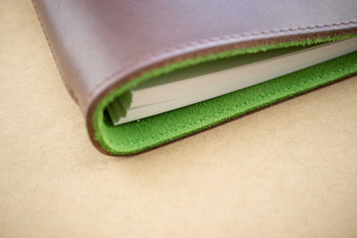
Look at the delightful pop of lime visible around the edges. If I had custom ordered a cover, I might have changed the stitching to be lime green as well which is why I didn’t really bother with a custom design because Chocolate and Lime are pretty much perfect for me. There are several other leather cover choices (black, whiskey brown, red, deep teal called Agave and a few others) and an assortment of rich suede colors for the inside lining.

The cover is supple. I wouldn’t describe it as stiff or floppy. It’s in the middle. I think the inner lining provides added stability for a soft leather cover.

The pen loop is pretty slender and barely wraps around my Caran d’Ache 849 fountain pen. The loop was definitely designed to hold a standard gel or ballpoint point or even a pencil. If you are inclined to use large diameter fountain pens, I’d skip the pen loop.

The Pen Band, on the other hand was designed to hold a larger pen. However, I discovered that its not too big either. I put my Diplomat Esteem MadC in it and it just barely fits.

Because the MadC has a snap cap, when I was attempting to pull the pen out, I ended up with the cap in my hand and the pen still in the band. Of course, unbeknownst to me, the pen was nib down and I immediately got a stain of orange ink on the beautiful lime lining. You’ve been warned.

Both the front and back insides include a sheet of clear plastic as an overlay to protect both the paper and the cover from rubbing. The front piece is a “my name is” page. The discs are 0.75″ and 303 gauge stainless steel. They are securely attached to the cover with a long rod and the discs are completely enclosed by the leather.

As far as I can discover, the 0.75″ ring is the only option available, even in the Bespoke designed covers.

I chose green dot grid (10 sheets), grey lined (10 sheets) paper and blank (40 sheets).

I’ve been using the blank paper most to do some of my ink sampling. I love blank paper and this paper is aces! I know other people have commented on how durable and fountain pen friendly this paper is but I thought they were just being generous. Nope. It is the BOMB.

Heavy swatches of ink will case the paper to ripple a little but there is no bleed-through. Seriously.

As you can see in the close-up photos, the writing is crisp and the paper has a little texture/tooth. According to William Hannah, the paper is 115gsm and I believe it. It’s definitely hefty.

There are lots of other inserts available including several planner/calendar options. They all appear to use the same 115gsm paper so it will all stand up to liberal applications of fountain pen ink.

I have a disc-style hole punch held over from a previous disc system and it works just fine with the William Hannah notebooks. I’ve cut some other papers down to fit into the cover though I have not actually tested the other papers yet. It’s just nice to know that the hole punch works and I can add other papers, printed or from other sources as needed. However, I now understand why other people loyal order more paper from William Hannah. It’s really nice.

So, between the delicious covers and flexible system, I can definitely see this becoming my notebook of choice.


DISCLAIMER: Some items included in this review were provided free of charge by William Hannah for the purpose of review. Please see the About page for more details.

12 Days of Inkmas: Ferris Wheel Press Ink Timeless Blue Special Edition 2020 (We forgot Day 8!)

12 Days of Inkmas: Ferris Wheel Press Ink Timeless Blue Special Edition 2020 (We forgot Day 8!)

Huge apologies for skipping Day 8 on Inkmas this year. Thankfully, one of our readers noticed the oversight. So, we have decided to bump this out to be our post-Boxing Day Inkmas post.

There’s no reason that the holiday festivities can’t continue, right? The Ferris Wheel Press Ink Timeless Blue Special Edition 2020 ($18 for 38mp) is a great gift. As a Special Edition ink, its a good end-of-year celebration, for as much as any of us want to celebrate 2020. We just want to celebrate that it’s over.

The packaging and bottle is lovely. There is gold foil stamping on both the box and and the bottle. The bolt cap is heavy metallic painted a brushed gold. Inside the cap is a rubber gasket which keeps the ink from leaking.

The 38ml bottles are flat on the front and back providing good real estate for branding and labelling the ink colors. This is an upgrade from the larger 85ml bottles which are almost completely spherical but are more difficult to label once removed from the box. As such, I much prefer the 38ml bottles. Not to mention, when am I ever going to use 85ml of any one ink?

The color is a bright, vivid Ultramarine blue. It doesn’t have a ton of shading but there is some sheening. Not as much as the new Krishna S Series Paakezah but it does sheen.

Even on Rhodia paper, the sheen will show with wider strokes and heavier ink coverage.

In regular writing, there is very little evidence of the shading and, with an EF nib, very little evidence of sheen. But the color is deeply saturated and bright.

The ink is water soluble. And when wet, the ink shows some evidence of a soft lavender undertone.

On Tomoe River, the results regarding the color are consistent to the results on Rhodia — not much shading, a little sheen. Timeless Blue is a little dry, it’s good for EF nibs and everyday paper since it is not likely to spread as much as other wetter inks. The ink has a little bit of a gritty quality which is more noticeable on smooth paper or with pens that have particularly smooth nibs. The ink adds a little tooth to the writing experience. If you prefer wetter, more lubricated ink, the Pilot Iroshizuku Asa-Gao would probably be a good alternative.

When compared to other inks, as mentioned above, Pilot Iroshizuku Asa-Gao is a good option as well as Monteverde Sapphire, Penlux Cobalt Blue (a Sailor made ink so it’s probably lubricated as well), Private Reserve Cosmic Cobalt and Monteverde 2018 DC Supershow Blue (which is very hard to tell apart from Sapphire Blue).

I don’t have a swatch of the white whale of the ink world: Parker Penman Sapphire but the swatch Jesi included in her review can be cross-referenced here too:

I think Parker Penman Sapphire has more sheen and is a little less violet in hue, even with the sheen.

This is definitely an ink color category that is thick with competition. These colors are all very similar. If I inked up seven pens with each of these colors, I think I’d be hard-pressed to know which ink was which. If you haven’t acquired any of these inks, Timeless Blue is a good option, albeit a bit more expensive than Monteverde or Private Reserve (at least in the US). If I was trying to find a good substitute for Parker Penman Sapphire, I don’t think Timeless Blue is quite there but its probably close enough for many who have not seen the Parker ink in person.

Side note: I created my own version of the Ink Journal Ink Collecting Guide Sheet (FREE) for the Traveler’s Notebook. If you are interested, I can add it to the Guide Sheets. Let me know in the comments if you’d like my version.


Tools:


DISCLAIMER: The items included in this review were provided free of charge by Vanness Pen Shop for the purpose of review. Please see the About page for more details.

These are my working conditions! Cute, but quite the Ollie-obstacle.

12 Days of Inkmas: Krishna S Series Paakezah (Day 12)

12 Days of Inkmas:  Krishna S Series Paakezah (Day 12)

Today is our final day of Inkmas! Thanks for following our crew as we have shared a fun bunch of inks.

On day 12, I’m presenting a fun new ink that is beginning to show up at various retailers – Krishna Paakezah. This ink is a bright blue with slightly turquoise undertones and medium-high sheen. The sheen shows up more in the writing than it does in large swatches which surprised me. Usually I find the opposite.

The accompanying ink well is what sets Paakezah apart from other inks. This package has the ink well inside a can surrounded by foam (it was tough getting it out – I recommend removing the foam with the ink well first, then separating the two) and the ink is packaged separately – this is to ensure that if there is accidental breakage, the ink won’t make that a disaster. An eyedropper is included to help get the ink into the ink well. I will be reviewing the ink well separately later on.

I’ve compared Krishna Paakezah to some highly sheening inks so you can see that, while the sheen is definitely present, it isn’t overwhelming the main ink color. The base color is close to Robert Oster Blue Sea.

I did notice how close Paakezah was to Parker Penman Sapphire. No one would mistake one for the other, but both are a beautiful jewel tone blue.

I am thrilled to report that Paakezah showed no signs of smearing that are usually present in sheening inks. I did allow the ink to dry for 10 hours before I tried to smear it in this case, however. In tests where I let the ink dry only 1 minute, I could get it to smear slightly on Tomoe River paper, noticeably on Cosmo Air Light paper and not at all on Bank Paper. (For the smear test, I rubbed the ink as hard as I could with my finger for about 10 seconds)

Sheen on Tomoe River Paper:

Smearing on Tomoe River Paper

Sheen and (no) smearing on Bank paper:

Sheen on Cosmo Air Light paper:

Smearing on Cosmo Air Light paper:


Tools:


DISCLAIMER: The items included in this review were purchased with my own funds. Please see the About page for more details.
12 Days of Inkmas: A Robert Oster Holiday Part 2 (Day 11)

12 Days of Inkmas:  A Robert Oster Holiday Part 2 (Day 11)

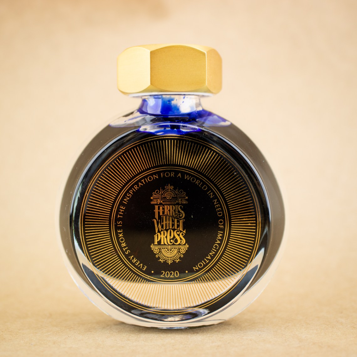
Yesterday, I made a Col-o-wreath of the Robert Oster limited edition 2020 Holiday inks from Vanness Pens: Santa’s Hangover, Choc PuddingSilent Nite, and Elf’s Cap. Today, I’ll show off the inks a little more with different tools and papers.

For the tools, I used a few of the unconventional tools I’ve become fond of since I went off the inky deep end for this post.

I also used two different sizes of glass ink pens from Shigure Inks and Fire Spider Glass, which really deserve their own post sometime soon.

I tested the inks on three different papers to cheer me up while I watched a very sad Purdue basketball game last night.

Cosmo Air Light

Tomoe River

Rhodia

Overall, it’s a nice holiday set. Each of the colors has just enough subtle complexity to make it interesting. Silent Nite and Choc Pudding are my favorites, and I’ll be inking them both up next week. If you need a last-minute idea to gift yourself for Inkmas, I think any of this set would make a great choice even after the 12 days of inky fun have come and gone.

Tools:


DISCLAIMER: The items included in this review were purchased with my own funds. Please see the About page for more details.


Link Love: Don’t Panic

Link Love: Don’t Panic

We are all anxiously awaiting our holiday package deliveries but, to quote Douglas Adams:


If your shipper sent a tracking number, you have as much information about the status and location of your package as the sender. If you don’t think you got a tracking number, remember to check your spam folder in case it got shuffled off to the email DMZ. Then, contact the sender and ask them to send (or re-send) your tracking information.

As a seller, I have customers who have been waiting 10+ days to receive their package and, as a recipient, I have waited 18+ days for a package. You are not alone and, by now, most of the world will understand if their gift is late. Just take a screen grab of the item, print it out and tuck it in an envelope. If you want to really play it up, put the photo in an appropriately sized box and wrap it and stick it under the tree.

There’s a link below with more detailed information from the USPS and an article from the Washington Post about some of the reasons they see that has caused the delays and bottlenecks. I hope you have a panic-free holiday.

Pens:

Ink:

Notebooks & Paper:

Art & Creativity:

Other Interesting Things:

We all need each other. Please support our sponsors and affiliates. They help keep this blog going. Without them, we would not have products to review or a server to house our content. Your patronage of their shops, services and products will let them know you appreciate their support of the pen community. Without them, and without you, we could not continue to do what we do. Thank you!

12 Days of Inkmas: A Robert Oster Holiday Part 1 (Day 10)

12 Days of Inkmas:  A Robert Oster Holiday Part 1 (Day 10)

Yes, I know. Robert Oster has already been featured several times (Day 2, Day 4, and Day 7) in our Inkmas countdown. But when I finally opened my package from Vanness Pens and remembered I had ordered the new, limited edition Robert Oster 2020 Holiday inks, I couldn’t resist. It’s now or never.

Earlier this year, I sent Ana a photo of my Col-o-ring cards all laid out in a circle. I believe it was Bob who cleverly pointed out they looked like a Col-o-wreath. I’m not sure how you can possibly get more inky and festive than that, so I thought it would be fun to make a mini Col-o-wreath with the Dippers in my collection that were nearest in range to the new Robert Oster colors and break the wreath down section-by-section.

The new holiday colors include Choc Pudding, Santa’s Hangover, Elf’s Cap, and Silent Nite.

Overall, the set shares some commonalities with the Robert Oster Australis set that Ana reviewed on Day 2. Especially for a holiday-themed set, the colors are subdued and a bit “dusty”- with very little sheen and a healthy amount of shading. What I like about the set is that they work as holiday colors, but also aren’t so “holiday” as to knock themselves out of contention for day-to-day use well into 2021.

Choc Pudding is a light brown with grey or pink undertones. I reach for brown inks a surprising amount these days, so I’m glad to see a brown included in the collection.

Santa’s Hangover is a light but bright red that leans heavily into pink. In fact, three of the six Dippers that I pulled for comparison were classified as “pink.” I’ve always liked the shade of the Pilot 100th anniversary Benzaiten but wished it was a little darker in writing. I’m interested to ink this up because it appears to be almost exactly that in first “dip.”

Elf’s Cap is a classic-ish green with some lime undertones. I usually prefer my greens either dark and leaning brown or bright and lime. This range was especially difficult to capture in photos, but the color is like a very classic green with a splash of Akkerman 28 added for good measure.

Finally, Silent Nite is purple-grey. Is grey the single most underrated fountain pen ink color? Greys were the multi-chromatic-shaders of inks before that became the latest ink trend, and the colors in this range show just how complex grey-leaning inks can be.

That’s the Col-o-wreath preview of the Robert Oster Holiday 2020 inks. Tomorrow, I’ll dig into the details of how these perform with different inky tools and different paper types.