12 Days of Inkmas: A Robert Oster Holiday Part 1 (Day 10)

12 Days of Inkmas:  A Robert Oster Holiday Part 1 (Day 10)

Yes, I know. Robert Oster has already been featured several times (Day 2, Day 4, and Day 7) in our Inkmas countdown. But when I finally opened my package from Vanness Pens and remembered I had ordered the new, limited edition Robert Oster 2020 Holiday inks, I couldn’t resist. It’s now or never.

Earlier this year, I sent Ana a photo of my Col-o-ring cards all laid out in a circle. I believe it was Bob who cleverly pointed out they looked like a Col-o-wreath. I’m not sure how you can possibly get more inky and festive than that, so I thought it would be fun to make a mini Col-o-wreath with the Dippers in my collection that were nearest in range to the new Robert Oster colors and break the wreath down section-by-section.

The new holiday colors include Choc Pudding, Santa’s Hangover, Elf’s Cap, and Silent Nite.

Overall, the set shares some commonalities with the Robert Oster Australis set that Ana reviewed on Day 2. Especially for a holiday-themed set, the colors are subdued and a bit “dusty”- with very little sheen and a healthy amount of shading. What I like about the set is that they work as holiday colors, but also aren’t so “holiday” as to knock themselves out of contention for day-to-day use well into 2021.

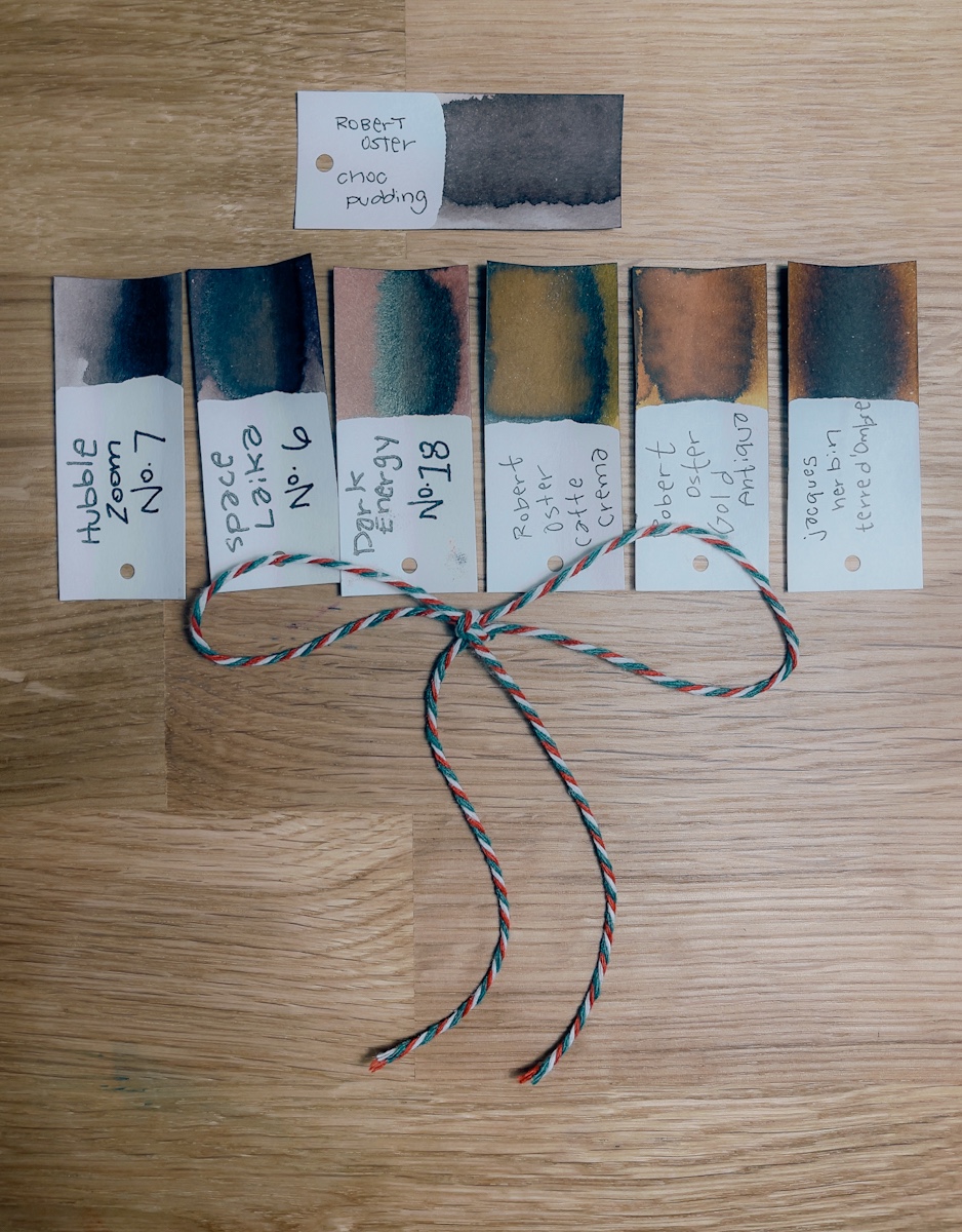
Choc Pudding is a light brown with grey or pink undertones. I reach for brown inks a surprising amount these days, so I’m glad to see a brown included in the collection.

Santa’s Hangover is a light but bright red that leans heavily into pink. In fact, three of the six Dippers that I pulled for comparison were classified as “pink.” I’ve always liked the shade of the Pilot 100th anniversary Benzaiten but wished it was a little darker in writing. I’m interested to ink this up because it appears to be almost exactly that in first “dip.”

Elf’s Cap is a classic-ish green with some lime undertones. I usually prefer my greens either dark and leaning brown or bright and lime. This range was especially difficult to capture in photos, but the color is like a very classic green with a splash of Akkerman 28 added for good measure.

Finally, Silent Nite is purple-grey. Is grey the single most underrated fountain pen ink color? Greys were the multi-chromatic-shaders of inks before that became the latest ink trend, and the colors in this range show just how complex grey-leaning inks can be.

That’s the Col-o-wreath preview of the Robert Oster Holiday 2020 inks. Tomorrow, I’ll dig into the details of how these perform with different inky tools and different paper types.

12 Days of Inkmas: Callifolio Sepia (Day 9)

Today, I wanted to warm up with some hot cocoa, gingerbread or a peppermint mocha. So, I chose an ink that reminded me of all those things — Callifolio Sepia.

Callifolio Sepia

Callifolio Sepia is a warm brown ink that is reminiscent of chocolate, gingerbread and all those warm beverages that keep us toasty during these long winter days.

Side note: For an in-depth analysis on sepia, check out our post, Let’s Talk About Sepia Ink.

Callifolio Sepia

Callifolio Sepia

Callifolio Sepia is a lighter, less saturated ink and definitely puts me in mind of milk chocolates when looking at a writing sample.

Callifolio Sepia

Amusingly, every time I tried to write Callifolio, I wrote “caffeinated” by mistake. Clearly the ink reminds me of coffee and chocolates or I am in desperate need of caffeine.

Callifolio Sepia

Compared to other brown inks, like shown above,  Callifolio Sepia is a lighter, albeit more neutral brown. Diamine Gingerbread, from the 2019 Diamine Inkvent calendar,  is much more golden and Diamine Roasted Chestnut has a more orange-y tint. J. Herbin Café des Íles is probably closest in tone though more saturated.

Callifolio Sepia

When lined up, from top to bottom —  Callifolio Sepia, J. Herbin Café des Íles,  and then Diamine Roasted Chestnut and Gingerbread — the difference in hue is clear to see.

If you’re looking for a reasonably priced, warm brown ink, Callifolio is an often overlloked option. This particular shade is a little lighter than I anticipated but might be suitable for you. Regardless, Callifolio is a great brand of ink and one of my favorites though it’s not mentioned often.

Tools:


DISCLAIMER: The items included in this review were provided free of charge by Vanness Pen Shop for the purpose of review. Please see the About page for more details.

12 Days of Inkmas: Robert Oster Shake & Shimmer Blood Rose (Day 7)

12 Days of Inkmas:  Robert Oster Shake & Shimmer Blood Rose (Day 7)

In keeping with the red theme from yesterday, I chose Robert Oster Shake & Shimmer Blood Rose for today. Blood Rose is a warm shimmering red that is perfect for the holiday season. The holidays are really the only time I search for the perfect shimmery red ink to address holiday cards and for general seasonal cheer.

I would have assumed there was a good shimmery red in last year’s Diamine Inkvent calendar but, alas, there was not. Blood Rose, with a different name, might have made a good holiday addition. Maybe for Inkvent 2021?

Robert Oster Blood Rose

Robert Oster Blood Rose

Robert Oster Blood Rose

On close inspection, it’s easy to see the silvery shimmer of the Blood Rose ink, shown above on Tomoe River paper.

Robert Oster Blood Rose

Even in my writing sample, the shimmer is visible, so much so that it overshadows any possible shading or sheen.

Robert Oster Blood Rose

On William Hannah blank paper, the rosy pink is more evident in the ink. Overall, flow performance of the ink is pretty good. Blood Rose is a smoother, wetter ink than many Oster inks which is a pleasant change.

Robert Oster Blood Rose

Compared to other shimmer inks and standard inks, the pinky undertones of Blood Rose become more apparent. Ancient Charm Phoenix Seeking Mate has a similar base ink but uses gold shimmer instead of silver. Robert Oster Rivers of Blood appears to be the same base ink color without the shimmer. Ancient Charm Song of the Wanderer is a deeper magenta with a gold shimmer. Diamine Matador is a more true red, almost a touch on the orange-y side.

Robert Oster Blood Rose

Lined up above from top to bottom, Diamine Matador, Ancient Charms Song of the Wanderer, Robert Oster Rivers of Blood and Ancient Charms Phoenix Seeking Mate, then Robert Oster Blood Rose.

It’s much easier to see the color differences above. I just don’t have many shimmer reds in my collection to compare Blood Rose against but I think this combination of shimmer and traditional inks provides a good range.

If you need to add a little sparkle into your holiday season, Robert Oster Shimmy & Shake Blood Rose is a lovely option.

Tip:

Like all shimmer inks, continually moving the ink around in the bottle or pen will help to keep the shimmer particles evenly distributed. I recommend rolling your pen on the table, not shaking it. If you’re planning to use a shimmer ink with a dip pen, transfer a bit to a smaller vessel and stir it regularly as you use it.


Tools:


DISCLAIMER: The items included in this review were provided free of charge by Vanness Pen Shop for the purpose of review. Please see the About page for more details.

12 Days of Inkmas: “Mystery” Cheery Red (Day 6)

12 Days of Inkmas: “Mystery” Cheery Red (Day 6)

For the sixth day of Inkmas, I thought it would be fun to do one of my favorite inky activities- matching ink to a specific pen. To begin the pairing, the pen choice was pretty simple. Inkmas demands one of my merriest pens- the Platinum 3776 Carnelian.

For the ink, I did a quick sweep of reds in my inventory. Sailor Jentle Irori is the obvious first choice of “red reds,” but I wanted some comparison options. The Carnelian has some orange undertones, so I wanted to make sure to get some orange/red options in the mix. Along with Irori, I ended up with Kobe #55 , Kyo-iro 03 Fushimi’s Flaming Red , Franklin Christoph’s 2019 Show Ink, Pennonia Róka Koma (Fox Friend), and Bungubox Tokyo Metro M.

The next step to selecting the perfect match always involves lining up the options and dunking the Col-o-ring Dipper in each contender down the line.

If it’s a particularly difficult choice, or some of the colors seem very close in color- I usually pull out my Col-o-ring “Oversize” and swab all of the contenders on a single page.

These reds are hard to capture on camera. The first photo is more accurate to the actual color of the ink but completely misses all this sheen!

Once my Dippers have dried, it’s time to make a decision. And this one was difficult. In fact, I literally inked this pen three times. The first time, I went immediately for the Pennonia Roka Koma. It’s difficult to see in these photos, but it has more orange undertones than any other ink in the group. But once it was in the Music nib of my Carnelian, it was a bit too orange for my liking (although, I’m going to have to revisit this color in a different pen because overall I really like it!). So next I swung to the opposite end of the group to the Kyo-iro 03 Fushimi’s Flaming Red– which has the strongest pinkest undertones of the group. Even in the music nib, it was just a little too light in actual writing to be a “perfect match” for this specific pen.

So what did I do? A slightly unadvisable choice that seems obvious only to ink addicts. I tried a mixture. Not all ink brands necessarily play nice together, but it’s Inkmas. This is the time to go wild. So I put 1mL of the darkest ink in the group (Franklin Christoph Ink ’19) and 4mL of the Pennonia Roka Koma in a sample vial and let it sit for 24 hours.

Nothing exploded or grew eyeballs- so off I went swatching my new Mystery “Cheery Red.” It’s not really a mystery since I literally just told you how I made the ink, but now maybe I will remember it’s not an actual ink I can search for in my collection.

In the end, I ended up with a red that has just enough orange but maintains its red “punch” through and through. A Very, Merry, Cheery Red. Happy Inkmas!

12 Days of Inkmas: Sailor Manyo Ume (Day 5)

12 Days of Inkmas:  Sailor Manyo Ume (Day 5)

Sailor Manyo Ume is one of my favorite inks lately – a burgundy with a touch of sheen, a bit of brown mixed in, one that sometimes shades, showing a pinkish red underneath.

In comparison to a few other sheening burgundies, Ume doesn’t show much sheen and when it does, it isn’t bright.

But this subtlety can be great when trying to pass off Ume in the office.

I love how Ume looks in a fine nib.

Ume isn’t waterproof nor is it water resistant. But it does hold the information conveyed in writing even with a soak. The red washes away but the writing should still be legible.


DISCLAIMER: Some of the items included in this review were provided to us free of charge for the purpose of review. Please see the About page for more details.

Link Love: Say Hello to Dave

This morning, this delightful calendar popped up in my email.Dave 2021 Calendar

Dave is the shop cat at my “local pen shop” Wonder Fair. Dave is Ollie’s doppelgänger so if you were hoping for an Ollie Calendar this year, this is as close as it gets. That image in the bottom center? Ollie sleeps just like that, paws curled in. Every time I see the images I do a double take because the similarity is strong. Ollie has more of a white beard but otherwise… twinkies.

If you’re fascinated by doppelgängers, there’s a link in “other interesting things” about human doppelgängers called “Identical Strangers”.

Keeping this week’s Link Love a little freeform, here’s a cool video:

As if we all needed any of reason to want a new Aurora pen, this lovely “How it’s made” video from Appelboom was recorded from inside the Aurora factory from design to packaging.

Pens:

Ink:

Pencils:

Notebooks & Paper:

Art & Creativity:

Other Interesting Things:


We need each other. Please support our sponsors and affiliates. They help keep this blog going.  Your patronage will let them know you appreciate their support of the pen community. Without them, and without you, we could not continue to do what we do. Thank you!

12 Days of Inkmas: Robert Oster Fire & Ice (Day 4)

12 Days of Inkmas: Robert Oster Fire & Ice (Day 4)

Robert Oster’s Fire and Ice (50mL for #$17) isn’t new, but I find myself reaching for it every holiday season. Something about that tealy blue and the red sheen feel perfect for addressing all of my holiday cards. So even if I haven’t seen it all year, it’s out and in a pen with at least a medium nib. This year I have the double duty of addressing my own personal cards AND the office cards. I know Fire & Ice is up to the task!


DISCLAIMER: Some of the items included in this review were provided to us free of charge for the purpose of review. Please see the About page for more details.