12 Days of Inkmas: Vinta New Ink Colors (Day 1)

12 Days of Inkmas:  Vinta New Ink Colors (Day 1)

To start this year’s annual Inkmas tradition, it was so hard to choose just one ink. So, I decided to feature four of the new inks from Vinta.

I’m also mixing up how I do my reviews. I started these on my standard Rhodia testing pad but the inks kept feathering and bleeding and I think its time I retire the Rhodia in favor of a more commonly used (at least amongst the inknoscenti) Tomoe River (in this case, a Curnow Backpack Journal) along with the tried-and-true Col-o-ring cards for swatching. I also used the Ink Journal Ink Collecting Template (Free).

Vinta inks

The original release from Vinta included much-loved magic, description-defying colors like Maskara, Perya, Armada and Sirena. Many of the colors in the newest offerings are richer, more lush colors. They remind me of the colors of velvet. The colors I chose are Ubi Mulberry, Damali Terrcotta, Makopa Malayan Apple and Kayangan Elysium.

Vinta Damali Terracotta writing sample

First up is the Damali Terracotta. Terracotta is a reddish orange ink that goes down brighter, more like a tomato red when wet and dries to a darker, copper orange. I find all the Vinta inks to be very smooth flowing and the Terracotta is no exception. There is some light shading but no evidence of sheening.

Vinta Damali Terracotta

When compared to other inks, Robert Oster Red-Orange is a pretty close comparison. The limited edition Monteverde LA Pen Show 2019 Coral is a little brighter. Monteverde Mandarin Orange and Diamine Fire Embers (Inkvent 2019) are progressively brighter red oranges.

Vinta Damali Terracotta

Vintae Malayan Apple writing sample

Usually with samples, I will swatch the ink, write my review and then file the ink sample. With Makopa Maylayan Apple, though, I keep pulling the sample out and using the ink. The color is a vivid raspberry red-violet with a ton of green-gold sheen.

Even with all this sheen, Makopa Malayan Apple is a smooth writing ink. It feels silky.

Vinta Apple

This is the sheen from Makopa Malayan Apple above on Col-o-ring paper.

Vinta Malayan Apple

And this is the sheen of Malayan Apple on Tomoe River. No kidding.

Vinta Malayan Apple

Going through our swatches, there are several other inks that also feature a reddish purple with gobs of sheen like Diamine Robert, Troublemaker Grapevine and Pilot Iroshizuku Yama-Budo. They are each slightly different, Robert is more grape purple, Grapevine is a more reddish purple and Yama-Budo is a similar color but not quite as sheeny.

Vinta Malayan Apple

This close-up photo shows the color variations a bit better.  For a different view on Makopa Malayan Apple, check out Jesi’s review.

Vinta Mulberry writing sample

Next up is Ubi Mulberry. This is another smooth writing ink. There’s not a ton of shading but Ubi Mulberry is a rich dark violet that reminds me of a purple-black. It’s an interesting color but totally work-appropriate.

Vinta Mulbeerry

There is a little bit of sheen with Mulberry but it won’t be evident on most papers. Even on the Tomoe River, it was only marginally noticeable.

Vinta Ubi Mulberry

There were several other comparable violet inks but they did not show the same tiny bit of sheen. Montblanc Lavender Purpler has a slight yellow-gold sheen but its even less pronounced sheen than Ubi Mulberry.

Vinta Ubi Mulberry

This close-up image shows in a little more detail in the color variation. Ferris Wheel Press Grape Ice is a bit brighter.

Vinta Kayangan Elysium

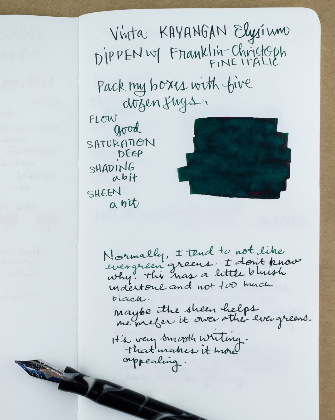
Finally, Kayangan Elysium is a deep evergreen green with a bit of sheen. The ink is smooth and the combination of sheen and deep green makes it an appealing dark green. As much as I love green, evergreens tend to miss the mark for me. Kayangan Elysium is an exception. There is a bit more blue in the color than most evergreen inks.

Vinta Kayangan Elysium

In comparison, Lamy Peridot is a darker ink, Interstellar Space is a little more saturated and bright and Diamine Holly is almost the same color except for the sheen.

Vinta Kayangan Elysium

This detail photo shows the color comparison a bit more closely. The sheen on Diamine Holly is very evident in this image.

These four colors continue to show that Vinta is capable of making well-behaved inks with a wide range of color properties. So, whether you are someone who likes shading inks, sheening inks, shimmer inks or traditional fountain pen inks, Vinta is making something to satisfy your needs.

Tools:


DISCLAIMER: The items included in this review were provided free of charge by Vanness Pen Shop for the purpose of review. Please see the About page for more details.

A (Draft) Notebook Set-up for 2021: Planners, Journals, and Blank Pages

A (Draft) Notebook Set-up for 2021: Planners, Journals, and Blank Pages

It’s December (…how?) and after a year that deviated from plans more than anyone could have anticipated, apparently I still feel compelled to “plan” for the upcoming year.

I say apparently because it wasn’t until earlier this week that I realized I had five different notebooks that I intended to continue using in the new year or purchased specifically for the purpose of using in 2021.

I say “plan” because I am using the term in its broadest and loosest possible sense. If 2020 has taught me anything, it’s the need to develop systems that are resilient. And for me personally, resilient systems must at their core be flexible.

However, there is a very thin line that separates flexibility from chaos. So, even though I may look back and laugh in six months, I grabbed my stack of notebooks and spent some time reflecting on the possible use cases of each one.

William Hannah: the notebook I’m already using

I was gifted a William Hannah a couple of months ago, and I’ve been using it almost every day since. The official William Hannah paper is outstanding even for fountain pens, and I usually have a few pages of that paper in one section of the notebook. The rest of the book, however, is filled with all types of different papers. Inspired by Jesi’s previous post, I have primarily been punching my own refills with an Atoma punch.

This allows me to have Tomoe River, Clairefontaine, Cosmo Air Light, Bank Paper, Col-0-ring paper, and other sketchbook papers all in the same tiny notebook. I use whatever paper I’m feeling in the moment, and take the page out and move it to the back of the notebook when I’m finished. At the end of the day, I review the pages I’ve used- transfer important tasks or items to another notebook or a digital system, hold on to the pages or sketches that I want to keep and get rid of the rest. Each day I’m starting with a new, fresh notebook.  I never thought a ring-based system would work for me, but if the last couple of months are any indication, I couldn’t have been more wrong.

In previous years, I may have a notebook that’s planned to be catch-all for any “exceptions” or things that didn’t belong in the other yearly planners and journals. But after using the William Hannah for a couple of months, I think that mindset was backward. This notebook is the catch-all where nearly everything begins. All the other planners and journals are the “exceptions” meant for specific use cases.

I may jot down a quote here and write more about it later in my journal. I may write notes from a meeting here and retain the tasks by adding them to my planner later. But anything and everything belongs here. It may end up somewhere else in the end (and that’s the beauty of a ring-based system with removable pages), but I never feel like I need to grab any other notebook before I write something down or sketch something or doodle or test an ink. Just get it down on paper, and figure out what to do with it later.

Hobonichi Techo Weeks: the only planner I used at all in 2020

When March rolled around I stopped using all planners for a while in favor of a single Musubi notebook. I wrote about that experience here. But once I finished that notebook, the Hobonichi Weeks is the planner that I picked back up. There’s a large section of months in the middle that went unused, but that doesn’t bother me. The format of the Weeks is the only planner format that seems to actually make sense to my brain for planning purposes.

I tend to use it on Sunday nights or Monday mornings to plan for the upcoming week, and when I do so I find it immeasurably helpful. Will I use every page in 2021? Probably not. But will I get more value from the notebook than I invested in it? Absolutely. Because I’ve used it for the same purpose repeatedly over time- I have a strong mental association with this format. Productivity, when it exists, comes to life for me on the pages of this notebook.

Musubi Folio Notebook- A5: the stockpiled staple

I mentioned I finished an entire Musubi notebook during early quarantine months because I was using it for every single thing I was writing down. While I don’t plan to do that this year, I still love Musubi notebooks. So when the old Tomoe River paper was getting scarce, I purchased a small stockpile of the Musubi folio notebooks.
 This is the notebook that would come with me to pen shows. If productivity lives in the weeks, creativity lives in the Musubi. When I want to spatter ink all over the page, this is the notebook where that happens. If I want to retain a sketch or quote from the William Hannah- I either re-write it or literally wasabi tape it into this notebook. I don’t use it every day, and it’s something I want to use more in 2021.


Hobonichi Techo- A6: the notebook I can’t NOT buy

This is where things admittedly start to get ridiculous. The above three notebooks are more than enough to meet my needs for 1) writing down literally everything, 2) productivity and planning, and 3) creativity and reflection. Those are the main analog spaces I need in my life. But when I go to buy a Hobonochi Weeks, somehow the original A6 Techo always ends up in my cart. Every.single.year.

If I am completely honest, I don’t use it nearly enough to justify it. I want it to be a beautiful tiny art journal with perfect sketched summaries of my day. That is probably never going to happen.

So recently, I’ve been using it at the very end of each workday. I review the William Hannah pages for the day and condense the most important notes and tasks for that day onto a single page of the Hobonichi. The repetition seems to help me retain the things that matter, and the summary sets me up well for the next day. We will see if this practice sticks in 2021, and if my success or failure relates in any way to whether or not I choose to purchase the Techo again in 2022.


Fleurir lab 2021 purana sérénité- A6: the new kid on the block

After hearing about the Fleurir lab notebook several times on The Stationery Cafe podcast, I couldn’t resist checking it out for 2021. It’s similar to the Hobonichi Techo, in that it has a one-page-per-day format. But the details of the book are a little different. I just got it in hand this week, but what I can already say is that the notebook is absolutely beautiful and extremely well made. It’s the kind of product that inspires you when you hold it in your hands. But what will I do with it? Honestly, before I started thinking about all these notebooks I had literally no idea. But as I’ve been “thinking out loud” through the writing of this post, I think I have a bit of a hypothesis about why some of my notebooks tend to get used and some tend to sit empty.

 In the past, I’ve sometimes limited notebooks to specific use cases. Planning goes in a certain notebook, journaling goes into a separate book, meeting notes go into another. What happens if I want to journal, but I’m away from my desk and my “journaling” notebook? And what happens if I sit down with my “journaling” notebook, and don’t really feel like journaling and suddenly feel more like sketching or feel the need to get planning out of my head before I can journal about anything else? I think limiting a notebook to one specific use-case can be what keeps me from using them. 

So maybe a time-based system instead of a use-case-based system would be less limiting and more flexible (and thus, resilient) for me. On Sunday evenings when I plan for the week, I use the Hobonichi Weeks. At the very beginning of the day, I use the Hobonichi Techo, and at the very end of the day, I use the Fleurir lab. On the weekends, days off, vacations, and trips I use the Musubi. And literally any and every other time I use the William Hannah. Whatever I need the notebook for at that specific time is how it gets used. 

The downfall of this particular system is the potential for the “Where did I write that down?” conundrum. But most notes that I would need to find again would end up in the catch-all William Hannah, and I already have a system that’s working for reviewing those notes and putting them in their proper home. I still need to mull this over a little more, but that kind of system seems to work for where my brain is at the end of this crazy year we’ve all been through. I will have to follow-up on this later in the year so we can all laugh together about my ambitious “plans.”

How did 2020 change how you used your analog tools, and do you have any “plans” about how you will use them in 2021?

Eye Candy: Solstice BLACK OUT

Eye Candy: Solstice BLACK OUT

As we approach the solar solstice, sunset comes earlier every day. Since the sun is gone by 4:30 around here, it seems like a good time to bring out black pens. Not just any black pens, however. Black pens with black trim as well.

Above (top to bottom): Strathmore 500 Series Multi Media paper sketchbook; Pilot Vanishing Point Matte Black; Retro 51 Solar System; Yookers Gun Metal; Leonardo Matte Black Momento Zero; Aurora Black Mamba; Blackwing 33 1/3.

As I pulled out any items in my collection that might have black trim, a few stood out from the rest. My favorite group was this:

Above (left to right): Aurora Black Mamba; Pilot Vanishing Point Matte Black; Yookers Gun Metal; Blackwing 33 1/3 on top

Another group seemed to separate itself out as well. Those with a Ruthenium or black ionized coating to the trim.

Above (left to right): Leonardo Momento Zero Matte Black; Nakaya Decograph Twist; Sailor Sweet Love Pink.

A few pens had matte black fittings but plenty of color to offset the trim that seems to suck up any light around.

Above (left to right): Retro 51 Bump in the Night; Diplomat Aero Factory; Diplomat Aero Green; Diplomat Aero Flame; Retro 51 Zodiac.

The pens from Pilot looked so nice together (even though I couldn’t balance both the model type and the color):

Above: Pilot Vanishing Point Metallic Green; Pilot Explorer Green; Pilot Vanishing Point Matte Black.

Another bonus picture with a few more black trim pens:

Top: Leonardo Momento Zero Matte Black

Middle (left to right): Retro 51 Solar System; Spoke Pens Purple; Monteverde ; Monteverde Ritma Red and Gun Metal, Retro 51 Monarchs

Bottom: Opus 88 Bela Blue

You may be a person who enjoys mixing up your colors with pen and ink combinations, but in keeping with today’s BLACK OUT theme, here are some great choices for black inks:

Above (left to right): Platinum Carbon Black (pigmented, permanent, and true black); Aurora Black (incredibly wet ink); Sailor Kiwa-Guro (pigmented, drier ink)

Above (left to right): Kyo-no-oto Nurebairo (very dry, silvery sheen); Omas Black (vintage); Kingdom Note Stag Beetle (greenish sheen); Franklin Christoph Graphite 4B (lighter, pencil-like finish)


DISCLAIMER: Some items included in this post were provided free of charge by Appleboom for the purpose of review. Please see the About page for more details.

Link Love: Planner Optimism and End-of Year Wrap Ups

Link Love: Planner Optimism and End-of Year Wrap Ups

The end of the calendar year is a busy time for the stationery community. We are inundated with last-minute product releases (which is probably true for most retail businesses) plus the final selections of planners for the coming new year. Add in the requisite end-of-year wrap ups, best of’s and top ten lists and there is a flurry of activity.

This week’s Link Love shows the start of the end, so to speak. There are top ten lists for books as well as inks. There were lots of wonderful animal posts so they got their own category this week. And finally, there is a wonderful Tiny Desk Concert by Dua Lipa that might brighten your afternoon. Even if you are not familiar with her music, it’s joyful and she is kind to her bandmates. It put a smile on my face.

Pens:

Ink:

Pencils:

Notebooks & Paper:

Art & Creativity:

Our Animal Kingdom:

Other Interesting Things:


We need each other. By supporting our sponsors and affiliates you help keep this blog going. Without them, we would not have products to review or a server to house our content. Your patronage of their shops, services and products will let them know you appreciate their support of the pen community. Without them, and without you, we could not continue to do what we do. Thank you!

Notebook Review: Fabriano EcoQua Gluebound A5 Notebook

I seem to have quite the notebook collection. I know it’s a problem many of us have. I don’t exactly hoard them, but I do purchase for reviews and to try them out and see if I like them. I suppose I’m in search of that elusive PERFECT notebook (more on that in a future post!)

So when I saw the Fabriano EcoQua Gluebound A5 Notebook ($8.50) which comes in dot grid (which is totally my jam) I added one to my cart immediately!

To start with, I would say that this is more of a notepad than a notebook. The Fabriano notebook comes with a sturdy card-stock cover with woven texturing. It’s available in a variety of colors including blue, wine, stone, lemon, raspberry, orange and black.

The paper is advertised as acid free, FSC-certified and fountain pen friendly. It’s 85 gsm and comes in 4mm dot grid (light grey dots) on white paper. The notebook includes 90 sheets.

The reason I consider this more of a notepad than a notebook is that the paper itself is glue-bound across the left edge of the pad. Sheets are easily torn from the pad so you can save notes and share with friends. When I think of a notebook, I think more of a collection of pages that are meant to be stored together. The glue on this pad is very thin and even trying to turn the page mostly separated it from the remainder of the pages. While this is a total plus if you want a tear and share pad, it’s not a notebook meant to keep the pages all together. None of this is specifically a detractor – I just want you to know what you’re getting!

I actually did really like the paper. It’s a little toothy, and was pleasing to write on. I tested my ball points, fountain pens, gel pens, brush pens and more. The only thing that “failed” the test was the Sharpie of course – bleed-through city! The paper is fairly thin, so there is plenty of show-through, but I got no bleeding or feathering with anything but the Sharpie. I also kind of dig the smaller grid – you could fit a LOT on this page if you’re a small writer.

Overall, the Fabriano is going to end up being a desk pad for me. I like the paper and I know I’ll use it to dash off notes on phone calls and meetings, and to write daily to do lists. However, I won’t use it for anything of permanence, and that means I probably won’t end up buying it again as I prefer to keep most of my notes organized together. I do think it’s a reasonably priced product of good quality, but it just doesn’t fit my needs as much as I would like.

DISCLAIMER: Some of the items included in this review were provided to us free of charge for the purpose of review. Please see the About page for more details.

Ask The Desk: Planner for Medical Editor, Waterproof inks and Cross Porous Point Pen Options

Ask The Desk: Planner for Medical Editor, Waterproof inks and Cross Porous Point Pen Options

Angela asks:

Hello–I’m a freelance medical editor. I have to keep track of jobs for ±6 clients each day. For years, I’ve used a spiral notebook and pencil. I’ve been upgrading my notebooks, and now I think I’d like to use a daily planner so I have a more orderly view of finished projects. I would need something that at least 8 inches wide because I have to record client job numbers and project descriptions, as well as the amount of time each job takes. Do you have a recommendation for a nice but moderately priced planner or notebook? I wouldn’t need extra pages for long-range planning or goals.

I think your best bet would be to start with Agendio.com. This site allows you to completely customize a planner to meet your needs. This takes a bit of decision-making on your part but it also means you can get what you want and nothing you don’t. You can save your design and change it or update it next year if you find that there was something you didn’t like about your layout this year. And you can start any month. You can even choose if you want a spiral binding or just what your pages punched to fit into a binder you already own.

Lisa asks:

Hi, I’m thinking of buying a TWISBI ECO to accent my watercolor sketches with ink. What kinds of ink can the ECO use? I’m interested in experimenting with acrylic inks, for example. PS – total newbie. Thanks!

Lisa,

NO ACRYLIC INK!!!

I don’t mean to yell but I want to make sure you don’t miss my comment. Fountain pens use fountain pen ink ONLY. However, there is waterproof (bulletproof, archival, etc) ink that can be used in fountain pens that will work with your fountain pens. I did a post awhile back about some of my favorite waterproof fountain pen inks and urban sketcher Liz Steel is a big fan of using fountain pens for her artwork too. Our own resident urban sketcher Tina also uses fountain pens for her artwork and has lots of recommendations as well. And, of course, my favorite will always be Platinum Carbon Black.

If you want to play with acrylic inks, I would recommend using a dip pen and nib like a Speedball dip nib. These are available for about $1 per nib and a holder is anywhere from $5 and up depending on how fancy you want to be. Using acrylic ink with a dip nib means if the ink dries on the nib, you have only damaged a $1 nib. No big deal. You can throw the nib out (or recycle it with a metal recycler) and use a new one.

John asks:

Hello, I was wondering if you know what pens are compatible with the cross porous felt pen refill. I truly love that you porous refill tips from Cross and looking for a similar experience with a different pen body. I was wondering if you knew of any.

The Porous Point (felt tip) refill from Cross is part of their “Selectip” line which fit in the Cross Century Classic. Any of the BigiDesign capped designs like the Ti Ultra, Ti Arto EDC, and Ti Arto. Pretty must any of the BigiDesign models with a cap. I realize that’s not a lot of options but at least it will give you a pen that will accept other refills should you no longer be able to get the Porous Point or decide you want to use something else.

Colored Pencil Review: Camel 36-Color Mini Pencil Set with Elastic Case

Colored Pencil Review: Camel 36-Color Mini Pencil Set with Elastic Case

The Camel 36-Color Mini Pencil Set with Elastic Case ($40) is a tiny package full of cute, colorful sticks of fun. By fun, I mean colored pencils. These colored pencils are rounded square shaped and arrive in a paperboard box that closes with an elastic strap. The box, when closed, is about the same size as a standard Traveler’s Notebook, making it the perfect companion to your journal.

Camel 36 Colored Pencil Set

Camel 36 Colored Pencil Set

The exterior of the pencils are a soft matte black and the rounded square shape make them comfortable in the hand (even for being so small) and unlikely to roll off the table. Each pencil is numbered with the color and the inside of the box includes a list of color names that correspond with the number. I would have preferred that the ends of the pencils were color dipped for easier identification but I understand the aesthetic choice for all-black. It just makes for a lot of hunting to find the right color.

Camel 36 Colored Pencil Size

The pencils inside are diminutive in size (8.5cm or 3.34″).

Camel 36 Colored Pencil Set compared to full-sized pencil

Compared to a full-sized Prismacolor, it’s clear to see just how small the Camel pencils are.

Camel 36 Colored Pencil Set compared to full-sized pencil

The pencil core is visible from the unfinished end of the pencil. The core is much smaller than a Prismacolor core but that will make these pencils better for detail work.

Camel 36 Colored Pencil Set color swatches

The set of 36 colors includes approximately 3 purple/violets, 6 blues, 6 greens, 5 reds, 4 oranges, 3 yellows, 4 browns, black, white, neutral grey and a metallic gold and silver. The white is, like most colored pencils, best used as a blending tool rather than a highlight white as it is not very opaque.

Prismacolor pencil blend comparison

When compared with Prismacolor for blending, the Camel pencils are not as soft and blendable, particularly on paper with any tooth or texture. However, because of the smaller core, it’s much easier to use the Camel pencils for small details or even to write.

Camel 36 Colored Pencils in watercolor tin

I liked that the Camel pencils are about the same size as my travel watercolor tin making them extremely portable — with or without their box.

Camel 36 Colored Pencil in Staedtler sharpener

I was a little concerned about sharpening them but the square shape means that they fit into a standard-sized pencil sharpener. I used my Staedtler 2-hole sharpener and the Camel pencils sharpened just fine.

Camel 36 Colored Pencil Set

These are probably not artist-grade, fade-proof, top quality colored pencils but for everyday coloring, journaling, doodling fun, they are an adorable set. If you are looking for a last-minute gift for the artist or artist-at-heart, this set of colored pencils would make a delightful gift.

I originally received my set from the now-defunct Fresh Stock Japan but my dearest friends at Wonder Fair in Lawrence, KS (LFK!) are carrying them and would be delighted to ship them to you or your loved one ASAP.


DISCLAIMER: The items included in this review were provided free of charge by Fresh Stock Japan for the purpose of review. Please see the About page for more details.