People often tease me that “back-to-school” season is my favorite holiday and I fully own this. So much so that when I get emails about the Sept. 1 launch of Hobonichi’s 2022 line-up, I get the same giddiness that we got as kids when the Sears Christmas Catalog would arrive and we would start dog-earing the pages and circling what we hoped Santa would bring.

Well, its on! Hobonichi day is here! If you are not a Hobonichi fan, don’t worry. This is just the starting gun for planner season. There’s a link below for Yoseka’s planner available. And a reminder that big box stores will be moving the school supplies to the clearance aisle this week and filling those prime spots with Halloween merchandise this weekend.
Pens:
- Back to basics with round nibs (via mnmlscholar)
- Esterbrook JR Paradise with Scribe architect nib: the feelgood hit of the summer? (via UK fountain pens)
- Pen Review: Esterbrook JR Pocket Pen (Paradise set, Tuxedo and vintage Esterbrook J) (via Macchiato Man)
- Introducing the Caran d’Ache 849 Rollerball (via The Gentleman Stationer)
- Do Your Pens Make You Want To Write? (via An Inkophile’s Blog)
- Fountain Pen Review: Platinum Curidas Gran Red (via Rants of The Archer)
- Epitome Pens Liberty Fountain Pen (via Gourmet Pens)
- Pilot Acroball Spotliter 3+1 Multi Pen and Highlighter Review (via The Pen Addict)
- The Best Pastel Highlighters (via JetPens)
Ink:
- Isn’t grey just wannabe black? (via mnmlscholar)
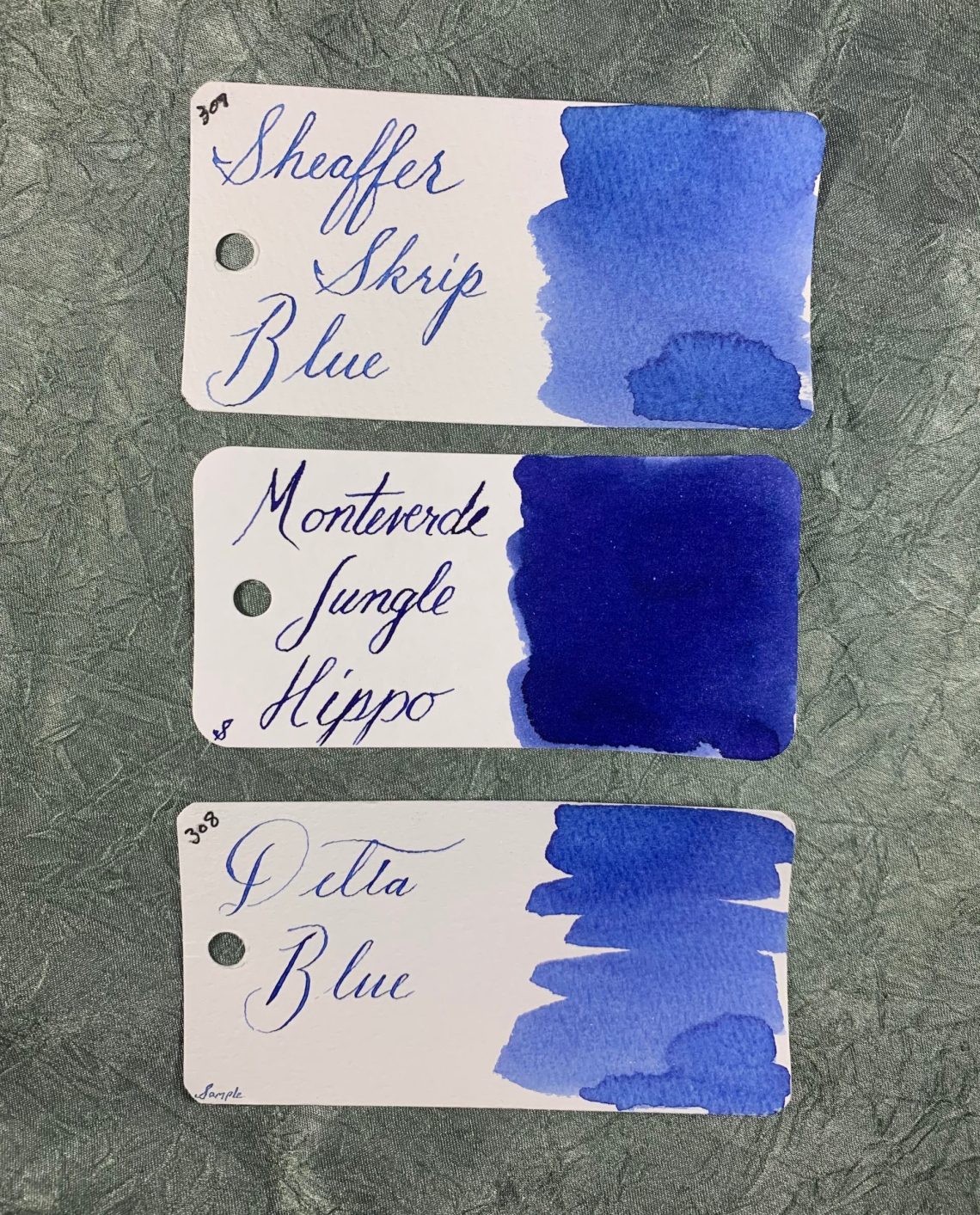
- Birmingham Pen Company ink swatch tests (via FOUNTAIN PEN INK ART)
- Ink Review #605: Tono & Lims Earth Contact Line: Turquoise (via Fountain Pen Pharmacist)
- Ink Review #1628: Van Dieman’s Blackened Seas (via Mountain of Ink)
Pencils:
- Pencil Review: Dixon Metrico 1910 (No. 2) (via Polar Pencil Pusher)
Notebooks & Paper:
- Envelope Art: 8 Easy Ways to Kick It Up a Notch (via The Postman’s Knock)
- 2022 Planner Lineup (via Yoseka Stationery)
- Crown Mill laid writing paper (via Nero’s Notes)
- When is a good time to buy a new Filofax? (via Philofaxy)
- Merging Digital with Analog (via Bullet Journal)
- Lemome Notebook Review (Fountain Pen Love)
Art & Creativity:
- Demonstration Review of the Pilot Shunpitsu Pocket Brush Pen (via RozWoundUp)
- Reflex sketching with Paul Wang (via Liz Steel)
- What is on my table? End of August 2021. (via Apple-Pine)
- Vermeer Restoration, Finally Complete, Reveals a Painting Within a Painting (via Hyperallergic)
- The Superb Pop Collages and Artworks by Rafael Bergamini (via Design You Trust)
- Full Spectrum Q&A with author Adam Rogers (via The Pen Addict)
Other Interesting Things:
- My Experience at the 2021 DC Pen Show! (via Notebook Joy)
- San Francisco Pen Show: Day 1 Recap (via The Gentleman Stationer)
- Back to Work Check-In: What I’m Using (2021 Edition) (via The Gentleman Stationer)
- Nandi Bushell Performs ‘Everlong’ Live With Dave Grohl and Foo Fighters (My Modern Met)
- Zen Gardens by Yuki Kawae Interrupt Doomscrolling with Meditative Patterns (via Colossal)
- A Brief History of Nautical Fashion (via Charm Patterns)
- “I’ve managed to break a few boundaries along the way”: Meet the blind photographer who captured this year’s Paralympians (via It’s Nice That)
- Black Daguerreotypists Highlighted at the Smithsonian (Via Hyperallergic)
- Care Home Residents Recreate Popular Album Covers (via Design You Trust)
- The Endless Life Cycle of Book Cover Trends (via Eye on Design)
We need each other. Please support our sponsors and affiliates. Your patronage will let them know you appreciate their support of the pen community. Without them, and without you, we could not continue to do what we do. Thank you!


 Tina Koyama is an urban sketcher in Seattle. Her blog is