

Its the latest Field Notes edition, Cold Horizon and everyone in the stationery-o-verse is talking about it. How do you feel about the shiny covers? Too shiny? Gritty? How do you like the gradient effect? Love it? Hate it? What about the graph paper in tints of wintery whites_ light grey, light green and light blue?
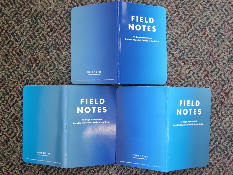
My husband, the printer, insisted on lining the books up to show where each gradient intersected with each other. The spine of one book aligns its gradient to the front cover and back cover of the other two books.
The shine of the covers is quite reminiscent of wet ice along with the crystal blue colors of the covers — the theme is beautifully harmonized in the final product. The covers are a little pebbly from the gloss aqueous coating. Overall, the books show lots of fingerprints and smudges just like a stainless steel refrigerator — for better or worse.
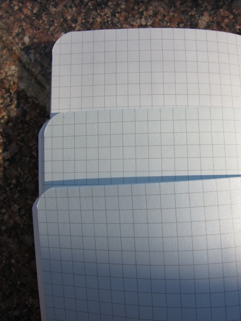
Its hard to get a good photograph of the slight color shift between the books. The paper is lightly tinted in a pale blue, green and grey. The grid marks are the same color grey on all three versions. The minor color shift is pleasant but not dramatic enough to have warranted the trouble and expense to do them each differently.
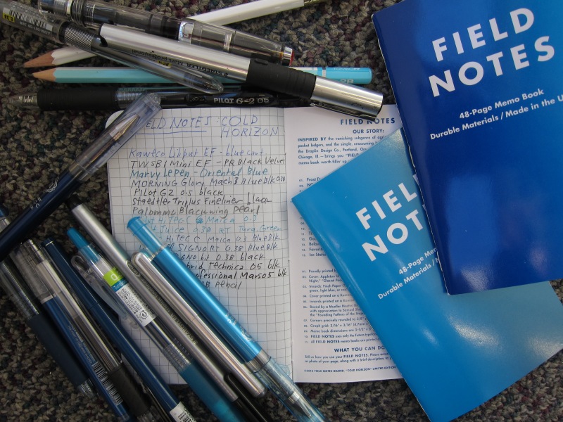
I did my pen test in the light grey paper book. As others have noted, I suspect that tinting the paper made it a little less receptive to fountain pen inks. Field Notes really are best paired with a non-fountain pen pen. I got good results with all the other tools I used but I did get a bit of line railroading (when the edges of the strokes are visible but the ink sort of drops out in the middle like a miniature railroad track) with the Pilot Juice and the Pentel Hybrid Technica pens, both of which are hybrid ballpoint/gel inks. Pilot Hi-Tec Cs and UniBall Signo RTs performed the cleanest with no show through on the reverse of the page. I used all cool blues, black, blue-blacks and graphite as it seemed like a good chance to pair my tool color to the notebooks.
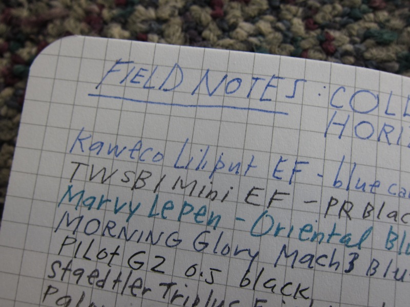
I wanted to provide a close-up to show the feathering with the two fountain pens I tried. It didn’t seem worth the trouble to try even wider nibs or a Sharpie marker. I know they are going to bleed or bead up a little. There’s a reason why we collect so many tools — so we can pair just the write pens with just the right papers for the optimal writing experience.
I will enjoy using these notebooks. They are completely functional and will certainly brighten up the dreary winter days ahead but these are not books I’ll necessarily covet like I do the Traveling Salesman which is my FAVORITE to date. (I wish I had purchased an extra set of those!)
The Field Notes Cold Horizon Color Edition is available in limited supply. A three-pack of the variegated cover and mixed tint paper are available for $9.99.
I like them a lot! The differently colored printing on the interior covers is really…over the top, in a very good way. The ink comes off the covers as they wear, too, producing a nice effect. I wish the graph lines were less dark, though. They get in the way of graphite enough that I’ve resorted to ink on a few occasions. 🙂
I think they’re super-cool and very attractive, though I maintain my position on where they derived the design inspiration. 😀