

I don’t do a lot of art supply reviews these days but after I read Les’s review of the Jane Davenport Petite Palette Watercolor Set in Brights ($31.99), I couldn’t resist trying them out. First thing to note is that since these are sold through a big box craft supply store, always try to get a coupon. I bought this set with a 30% my entire purchase coupon as I also bought several of the other items in the Jane Davenport art supply line (I’ll be reviewing those in the next few weeks, if you are interested).


The first thing to note is this set (and the neutrals set) are in the craft/entry-level price range and designed for journal use and not for archival purposes. The pigments are not archival. Les’s review goes into a lot of detail about the pigments and there are some very detailed information on YouTube about the pigments used and, on Jane’s website, there is the specific pigments. I would not compare the quality to Schmincke, Winsor & Newton or Sennelier pans, rather I’d compare it to the VanGogh, Cotman or Sakura Koi sets.

The other thing to note is that they are definitely cute. The tin for the brights is Tiffany Blue on the outside and has Jane’s signature prominently featured on the tin. The names of the colors are not “warm red” and “opera pink” and such as would be expected but rather things like “70s eyeshadow” and “ladybug.” Of course, once you remove the packaging and swatch the colors on your own card and place your own sticker on the lid, no one is the wiser about the product other than the color of the tin which can just be called “mint.”
The neutrals tin, however, is in a metallic gold tin. Go figure.

I pre-wet the pans as they all looked a bit dry before I swatched them. I keep a Traveler’s Notebook with Sketch Paper for swatching new art materials and started swatching each color. Each one was coming out very granulated in a cheap, chalky sort-of way. I was getting pretty frustrated.

On the opposite page I was doing some one- and two-color mixing to see if the colors muddied. Do you see the weird clumpy granulation? Super irritating! The colors are fun and vibrant and for a lot of the work I do at work, we immediately scan our work so archival-ness is pretty irrelvant. But the clumpiness!
SO, I sat for awhile, literally watching paint dry. Hmmm…

So, then I upgraded my paper. Best advice I ever got was “never settle for cheap paper” because really even expensive paper is cheap. You buy a BIG sheet of expensive paper and you cut it into smaller pieces or fold it into smaller pieces to fit into a little book and its a small investment, comparatively speaking. (Go on… how much did you spend on your last pen, bottle of ink or box of watercolors compared to the tablet or book of paper? See? I rest my case.)


Here’s my close-up comparisons of close-up photos of the same pan of color on the Traveler’s Notebook up top and then on the cold press watercolor paper at varying intensities. No clumps, just lovely watercolor-ness. That’s the color listed as “ladybug,” by the way.

I ended up re-swatching all the colors on watercolor cold press paper. Much better results. No weird clumps.
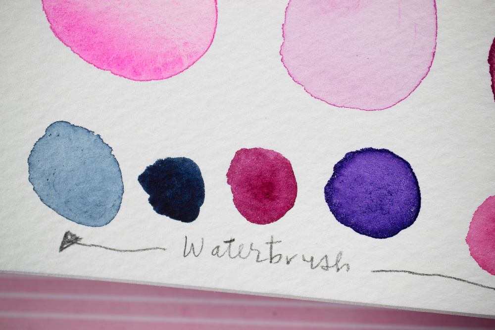
I even tried it with a waterbrush rather than my Silver Black Velvet #8 round brush. I know people love waterbrushes for their portability but I’m still on the fence about them. I prefer a real brush 99.9% of the time. I’m the horrible person who will pollute my water glass at a restaurant. I will leave a good tip though.

So, these are not at all the complete palette I’d recommend to someone starting out with watercolors but if you are feeling like you’re in a rut and need a little creative kickstart, they are pretty fun. Are some of the colors unnecessary? Yeah? Are the sets designed to make you buy the Brights AND the Neutrals? Yep.
I’ll probably end up disassembling both tins and magnet-ing the colors I find most useful into one tin rather than carrying two tins. My Schmincke set only has 14 colors in it so I’m definitely inclined to slim down the Jane Davenport kit. The nice thing with the Davenport paints is that I don’t feel precious about them. They are cheap paints, even if I put them on good paper. I can make bad art with mediocre art supplies. Right? Though I suppose I probably make mediocre art with expensive supplies too. LOL.

Thanks for the review and for confirming my decision to forego this product. Reverse enabling is rare and much appreciated. 🙂
Dang and I just went and bought all the sets.
I suppose these will be used in journals then
The better the paper quality, the better these watercolors performed. Though they will still not be lightfast but few watercolors are.