

By now most pen folks have probably heard of Callifolio inks, if only because of the frequent mentions of a certain shade of pink ink: Andrinople. The French company that makes that ink, L’Artisan Pastellier also makes another line of fountain pen ink called Encre Classique (Classic Ink). There is not a ton of information about the differences between the two ink lines available. I did my best to scout around on the L’Artisan Pastellier website via Google Translate but the general vibe I got was that this operation is probably made up of classic French, more inclined to spend time making their fine art supplies and drinking wine than maintaining a modern online presence with a grand social media strategy and SEO sorted out.
Encre Classique inks are available in about 26 colors and the biggest difference I noticed, other than price ($7 per 30ml bottle vs $12 per bottle for Callifolio inks) and bottle shape (Encre Classique come in a more traditional round bottle to Callifolio’s pie slice triangular bottle) is that the Encre Classique color range feature a wider selection of reds and greens while the Callifolio inks have a wider selection of blues and browns.
If you are looking for a some vivid basics, Encre Classique inks would be a good place to look to build an ink collection as the colors are rich in pigment and well made by a brand I’ve come to trust for their quality in the Callifolio line. I feel pretty confident that the Encre Classique will be equally good. I would place these inks as a competitor to J. Herbin though the inks are a little drier.
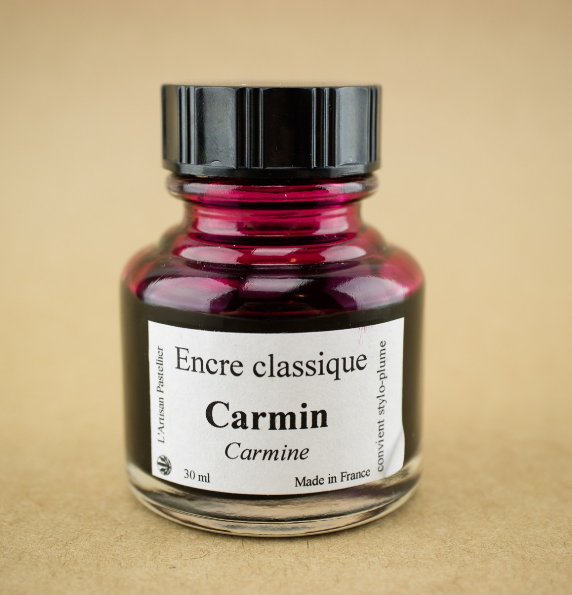
Now, to the specific ink I am reviewing. I got a bottle of the Encre Classique Carmin ($7 for 30ml bottle) which is actually one of the more muted colors in the line. Its a burgundy/red wine color which I discovered had a bit of a gold sheen.


I got a bit messy on my Col-o-dex card but the gold sheen is evident in the upper left. Even with a dip pen, there is evidence of shading to a cherry blossom pink or dusty rose color which is kind of nice.

In writing, I used a fine nib Esterbrook which gave a range of burgundy to dusty rose shaded writing. With a wider nib, the writing is definitely darker when more ink is laid down and the color leans towards more of a red wine/burgundy. The water test shows little-to-no water resistance so spilling your drink is definitely a no-no with this ink.

When cross-referencing with other inks in my collection, it appears I have a real penchant for this dark, smoky pink/burgundy color these days. Carmin is very similar to Colorverse Andromeda with a little less sheen and $28 less price tag. Kobe #41 is a little more purply. De Atramentis Apple Blossom is very similar and it comes with a floral scent. And the Krishna Azaella (Floral) is a bit more fuchsia and is a similar price for a smaller bottle.
I’m very glad I gave Encre Classique Carmin a try. I like the color, the ink is well-behaved and reasonably-priced and I am looking forward to trying more in this line in the future.
Tools:
- Paper: Rhodia Uni-Blank No. 16 with 6mm guide sheet
- Pens: Midori bullet pencil modified dip nib holder with Zebra G titanium nib ($33.50 per 10-pack), Acrylic dip nib pen (Approx. $15), Shawn Newton Esterbrook Nib Holder with #9556 nib
- Swatches: Col-o-Ring Ink Testing Book ($10) and Col-o-dex Rotary Cards (coming soon!)
- Brush: Blick Synthetic Round #0
- Ink: L’Artisan Pastellier Encre Classique Carmin ($7 for 30ml bottle)
DISCLAIMER: The items included in this review were provided free of charge by Vanness Pen Shop for the purpose of review. Please see the About page for more details.
Hi Ana
I looked at the website of L’artisan Pastelier (pastel=woad), and since I’m French it was fairly easy for me to understand what was written… Anyway Les encres classiques can be mixed with other inks to create your own color and can be used in any pen, Les encres végétales are made from trees or small trees, they can used to write but they are better for calligraphy or if you want to imitate the look of old manuscripts.
I also have been really loving the pinky-reds lately and this is definitely now on the list to try!
Oh man, I went to their site and followed the link to their Twitter and they haven’t posted there since 2012. :’D
But the gist I get is that both are ok to use with fountain pens but Callifolio is specifically meant for fountain pens (and not other uses, maybe?). And inks of each line are meant to be mixable with other inks from the same line.
I’m curious how this compares to BSIAR. I’ve had a heck of a time trying to find a comparable color with a better dry time.