

Carol asks:
I wrote Brad Dowdy this question and he didn’t know however thought you might be able to help me understand.
I am looking to find a way to desaturate some of my fountain pen inks.
As an artist I’m looking to add ink lines, marks by drawing on top of my watercolor washes. Most of my inks: Diamine, Noodlers, Birmingham, Faber Castell, Pelikan and Edelstein are great inks yet their values are too saturated. I’m looking for a way to reduce the saturation to create a more muted tone in the line. Birmingham are some of my favorite as Nick and Josh have created inks that are favorable to me by their faded look – yet those are still a bit dark.
Diluted water I have found does little to alter the saturation while it makes the ink obviously wetter – which is a bit defeating as I am also looking for drier inks. A permanent or water resistant quality would be wonderful to maintain as well in those inks that offer this. I love for example Faber Castell Stone Grey and Noodlers Walnut – however both come off severely too dark.
It’s an odd ask I realize. Just thought if any experience has been noted on this. Advise would be welcomed.


Kiera asks:
I’ve been using diamine marine in my hobonichi cousin, but I want to take advantage of the hobonichi’s paper more. Marine is a lovely color, but not a very interesting ink otherwise. Can you recommend some sheening or shading inks that are similar in color? Thank you!
Kiera, most sheening inks tend to sheen because the pigment-to-liquid ratio is considerably higher. As a result, most sheening inks are darker than the lovely aqua Marine because all that pigment doesn’t allow the color to be as translucent. In the fountain pen world, we think of this as an ink’s ability to shade. So, the more pigment, the more sheen, and the less shading.
![]()
At least, up until this point. Someone will figure out how to circumvent this at some point, I’m sure.
That said, there are a few aqua/turquoise inks that have more sheen than Diamine Marine.

As you will see in the photo above, the four other ink colors I found that were in the same color family but had more sheen, are Diamine Aurora Borealis, Colorverse Gravity Wave, Robert Oster Marine and Kaweco Paradise Blue. Some of these colors are considerably darker but will have a red, pink or magenta sheen. The sheen will be more or less noticeable depending on how broad your nib is.

Colorverse Gravity Wave probably has the most sheen and I was able to catch the sheen highlights in the photo above.

There are many other sheening ink options available but they are not necessarily in the turquoise or teal color range. I pulled a few for you to consider.

The classic Organics Studio Nitrogen is the first “super sheener” and it will potentially smudge but if you’re looking for lots of sheen, you can’t go wrong with this one. I would recommend a finer nib for less smudging.

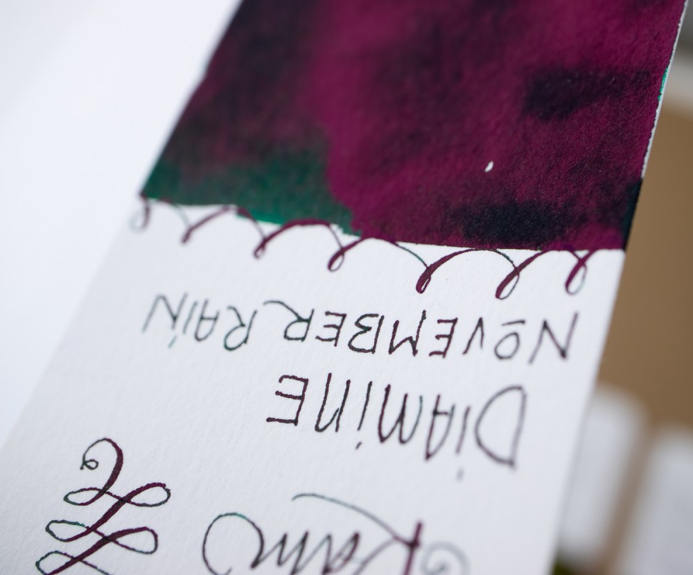
Diamine has created many amazing sheening inks. Some were created as exclusives for European pen shops but others are now available directly from Diamine. The colors are not as smudge-y as the Organics Studio and have some unusual sheening. Robert (and the Pen Gallery Exclusive Manggis) is a purple that sheens green. Skull & Roses is a deep vibrant blue that sheens red. Communication Breakdown is a rust red that sheens green. November Rain is a deep teal green that sheensred-violet.

There are many other sheening inks that will pop up in places you might not expect it like this Lamy Crystal Azurite or even in the most unsuspecting inks like Waterman. I often surprise people when I show them the sheen from Waterman inks, particularly Tender Purple and Inspired Blue. Blows their mind.

I decided to swatch the Waterman inks (and some of the inks on some Tomoe River paper) at the last minute just to show more of the sheen. It’s not all the colors mentioned above, but a lot of them.

This morning it’s overcast so I was able to get the sheen better. The Waterman Audacious Red didn’t show but on some papers, it sheens gold.
Kiera, did I give you enough options?
DISCLAIMER: The item in this review include affiliate links. The Well-Appointed Desk is a participant in the Amazon Services LLC Associates Program, an affiliate advertising program designed to provide a means for sites to earn advertising fees by advertising and linking to Amazon. Please see the About page for more details.
Ana you’re a Godsend!! What an excellent way to make use of those dusty bottles of ink one’s tired of AND have fun concocting new colors. How exciting to be able to use them after all. Thank you for all your intensely detailed research and sharing it….you solved a major problem for me.
Now I want all those inks…
Thank you! I never thought too much about the mechanics of sheen and shading, and definitely never realized how much it affects the base color of the ink. That’s pretty interesting. I am not going to go for the monster sheeners, but that still leaves me with lots of options here. Doesn’t help me decide, but that’s half the fun, picking out what to get. ^_^
What a great question about muting inks! And you know a ton of things that Brad doesn’t know! 😉
De Atrementis has a line of inks called “Document” inks which are specifically formulated to be mixed together. Along with a variety of bright colors they have a white, a black and several Grey’s so you can make virtually any hue by mixing them together.
Oooh! How did you make those rings of ink? Did you use the cap off the ink bottle? and … how did the ink get on the cap and … ? I’m swooning over how gorgeous they are and I just haven’t the brainpower to figure out how you made those fabulous ring swatches. Thank you for such a wonderful post! ^_^
I love a good sheening ink & fell in love with Diamine Robert! A friend recently gave me KWZ’s Sheen Machine & it resembles OS’s Nitro without the smearing. Excellent comparisons!
Oh good, I was able to find the first place I had heard about the De Atrementis Document Inks, from watercolor artist Jane Blundell. She has incredibly thorough posts going through these inks. This one has a chart showing each color of the ink with various amounts of white or black mixed in which might be very helpful in seeing if they would work for the muted colors you were trying to achieve. They are only designed to mix with each other, but I bet if you just mixed the white, or maybe some of the greys, with your existing inks, you could get whatever toned down version you want, probably in a very reproducible manner. I believe others of her posts report on long-term lightfastness of these inks and others it there are people here who care about such things. The second link is to Liz Steel (another watercolor artist)’s post on the Document inks.
https://janeblundellart.blogspot.com/2018/10/de-atramentis-document-inks-revisited.html .
https://www.lizsteel.com/de-atramentis-document-inks/
I am a little late to this party, but I think I read the first question differently than Ana. The question mentioned desaturating the ink while not changing the shade. I relate that to my desire to get the ideal shade of gray for sketching (like Noodler’s Lexington Gray), but in a lighter value to make a less noticeable line while sketching. I don’t like diluting with water to achieve that, but that would give me the desaturating effect.
De atramentis document inks also have a diluting solution to achieve that desaturating effect without making the ink wetter. Of course, it is only recommended for mixing with document ink so first you would have to mix the desired color, then dilute it.
Pineider just released their Ink Alchemy mixing set a couple months ago, which appears to be intended for that kind of experimentation. That could be another way to create the color/saturation desired.
Also, I’m way out of my depth here, but is the base of these inks always pure water? Or are they using some (perhaps small) portion of a polar solvent like methanol or ethanol to speed dry times?
If so, maybe cutting with something like that instead of water might have the desired desaturating effect without making the ink wetter?
I don’t think any heavy solvents are used as a base or the smell would be very evident. Most inks have mild odors, if any.