Yes, I know. Robert Oster has already been featured several times (Day 2, Day 4, and Day 7) in our Inkmas countdown. But when I finally opened my package from Vanness Pens and remembered I had ordered the new, limited edition Robert Oster 2020 Holiday inks, I couldn’t resist. It’s now or never.

Earlier this year, I sent Ana a photo of my Col-o-ring cards all laid out in a circle. I believe it was Bob who cleverly pointed out they looked like a Col-o-wreath. I’m not sure how you can possibly get more inky and festive than that, so I thought it would be fun to make a mini Col-o-wreath with the Dippers in my collection that were nearest in range to the new Robert Oster colors and break the wreath down section-by-section.

The new holiday colors include Choc Pudding, Santa’s Hangover, Elf’s Cap, and Silent Nite.
Overall, the set shares some commonalities with the Robert Oster Australis set that Ana reviewed on Day 2. Especially for a holiday-themed set, the colors are subdued and a bit “dusty”- with very little sheen and a healthy amount of shading. What I like about the set is that they work as holiday colors, but also aren’t so “holiday” as to knock themselves out of contention for day-to-day use well into 2021.

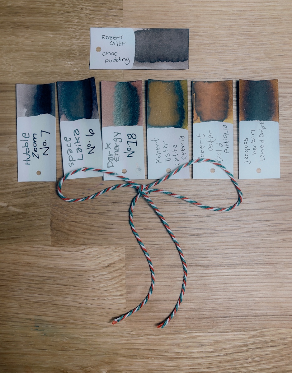
Choc Pudding is a light brown with grey or pink undertones. I reach for brown inks a surprising amount these days, so I’m glad to see a brown included in the collection.

Santa’s Hangover is a light but bright red that leans heavily into pink. In fact, three of the six Dippers that I pulled for comparison were classified as “pink.” I’ve always liked the shade of the Pilot 100th anniversary Benzaiten but wished it was a little darker in writing. I’m interested to ink this up because it appears to be almost exactly that in first “dip.”

Elf’s Cap is a classic-ish green with some lime undertones. I usually prefer my greens either dark and leaning brown or bright and lime. This range was especially difficult to capture in photos, but the color is like a very classic green with a splash of Akkerman 28 added for good measure.

Finally, Silent Nite is purple-grey. Is grey the single most underrated fountain pen ink color? Greys were the multi-chromatic-shaders of inks before that became the latest ink trend, and the colors in this range show just how complex grey-leaning inks can be.
That’s the Col-o-wreath preview of the Robert Oster Holiday 2020 inks. Tomorrow, I’ll dig into the details of how these perform with different inky tools and different paper types.

