

All of us at The Desk keep trying to outdo ourselves with our ink reviews. Last week, Jesi posted a full overview of all the new Colorverse Series 7 inks. This week, I’m kicking it all off with an overview of the Colorverse Standard Model ($200 for seventeen-15ml bottles). This set, based on The Standard Model of Particle Physics, includes seventeen bottles of ink, each themed around particle physics. I know ZILCH about particle physics except what I can glean from watching sci-fi movies so I will not even pretend. If anything, playing with this ink set is teaching me a little bit about particle physics — just enough to attempt to guess a question on the NYTimes crossword puzzle and not much else. But I digress…
The Packaging:

First and foremost, who doesn’t want an ink set that comes in a Halliburton-style plastic suitcase (okay, it’s more like a Pelikan case) with perfectly cut out foam slots for each bottle? Let’s just say I’ve been living out various James Bond-esque “saving the world from a dangerous color conspiracy” storylines over the last week. (I’d like to blame pandemic isolation for this level of goofiness but alas, I would have been doing it no matter what the state of the world.)


Inside the case is also some stickers, a card on a larger sheet and a three-page brochure with information about the set in a manner consistent with previous Colorverse releases.

Each page in the booklet features a picture of the ink bottle, a swatch of the color and a breakdown of the RGB, web hex number and Pantone color matches as well as surface tension and Ph. I have, in the past attempted to verify the accuracy of the Pantone values (FYI: they are not all the accurate) but have never bothered with the RGB or hex numbers. The only place that would be useful is when entering inks into the FPC database.
The Quarks sub-collection are blues and purples and the Leptons are mostly warm reds plus a green and grey.


Of the seventeen bottles, five feature red caps. These are the Bosons sub-collection. These colors are a more diverse range of colors.

The bottles included in the Standard Model are the “mid-sized” 15ml bottles from Colorverse. Not the giant 60ml bottles included in their regular sets nor the tiny sip sized 5ml (essentially sample) sized bottles. In this day and age, with new inks coming out on an almost daily basis, I think 15 to 20ml sized bottles are just about perfect.


The Swatches:

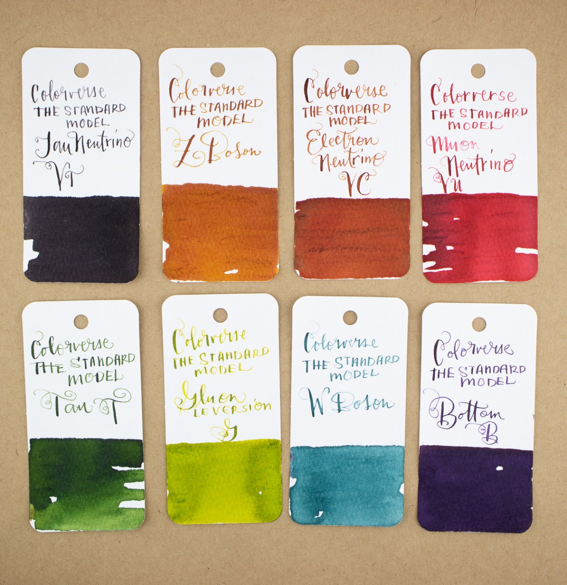
I organized the initial swatch photos by sub-collection: Quarks, Leptons and Bosons. The first set, pictured above, is the Quarks. It’s a good range of blues and violets.

Next up is the Leptons, shown above, which is four reds, a green and a grey.

The Bosons sub-collection colors are quite the range of colors. I will continue to assert that I know nothing about particle physics so maybe there’s a reason that Colorverse chose these colors for these particles? Let me know in the comments.

Finally, I put all the colors in the set together to show the full range of hues. It breaks down like this:
- 3 greens
- 5 blues/teal/turquoise
- 2 purples
- 1 grey
- 4 reds
- 2 orange/browns

None of the Standard Model inks contain glistening particles. A couple of the inks show a bit of sheen — mostly the deep blues — but many colors show a range of shading. There is also a nice range of high chroma and low chroma colors. I’m not suggesting that any of the inks are under-pigmented but rather that about half of the colors are earthier tones while the other half are bright, vivid colors.


Only three ink colors included in the set have been previously released by Colorverse — Photon, Gluon and Electron (Poor Selectron got left out of this party). This version of Gluon does not include the glistening particles which makes the color a little lighter and more green than yellow. The LE version of Photon is a bright shamrock green not the more teal blue-green of the original Photon No. 23 and the LE Version of Electron is more tomato red than the orangey color of the original Electron No. 31.

While a collector of ink might have initially been bothered by the duplicates, the change in hue for the LE set will set their minds at ease.
Keep going for ink swatch color comparisons and my conclusion…
The Swatch Color Comparisons:

Let’s start comparing the ink colors. I’ll start with the inks in the Quarks sub-collection. While the inks are all “in the range” of some fairly common ink colors, there are subtle differences to each. Down is a classic bright blue but hits a slightly different tonal range and color depth than Cross Blue, Sheaffer Blue or Private Reserve Cosmic Cobalt. The color is similar… but different which is a sentiment I will repeat throughout these ink comparisons. Whether the differences were accidental or intentional, I do not know.

Charm hits that coveted almost Parker Penman Sapphire Blue color range. I don’t have a sample of Parker Penman Sapphire but I have Strait’s Pens Poor Man’s Sapphire which is “in the ballpark”. Charm is also close to the 2020 Special Edition Timeless Blue by Ferris Wheel Press.

Strange also leans into that almost/maybe/kind of like Parker Penman Sapphire Blue that folks clamor for. Monteverde Sapphire and DC Supershow Blue (which I think might be the same color) and Penlux Cobalt Blue are similar. Strange does not have the sheen that the Monteverde inks have.

Up is the classic turquoise. It is probably the ink most similar to many other colors like Lamy Pacific Blue/Turquoise, Franklin-Christoph Spanish Blue and Monteverde Caribbean Blue.

Top is the same hue as Monteverde Purple but a much deeper color. Bungubox L’Amant is about the same shade but it skews more pink/red and Noodler’s Purple Martin is darker overall. If I were to guess, Top might be similar to the coveted Montblanc Beatles Psychedelic Purple but I don’t have a sample of that either.

Bob and I spent some time debating the actual shade of Bottom . Purple? Violet? Really dark blue? It’s definitely leaning towards dark violet. It’s similar to the Magnetosphere in the Colorverse Goldspot Special Edition but Bottom is less intense. It’s like an eggplant purple-black. Both Sailor Shigure and Robert Oster Deep Purple are more vivid purples.

Now, for the Leptons. First up is Muon which is a vivid coral-y red with pink undertones. The Strait’s Pens Rosé by the Bay is probably the closest in color. Bungubox Lycoris is similar but the sheen in Lycoris shifts the color a bit. J. Herbin Corail des Tropiques is more orange but hints to the same coral tones.

It’s rare that there’s an ink color that gets compared to my favorite red: Sailor Irori but here it is. The Standard Model LE Electron is a warm bright red similar to Kyo-Iro #3 Fushimi Flamingo Red, Color Traveler Miyajima Scarlet and the red of all reds (IMHO) Sailor Irori. This special blend of Electron clearly looks to compete with the Japanese reds.

Muon Neutrino is a very unusual red. It’s a warm red, leaning towards a brick or burgundy color but finding a comp was a challenge. Robert Oster Rivers of Blood is a bit pinkier. Noodler’s Antetam is more orange-y brown and Waterman Red is close but different. (See? Different!) I thought maybe Muon Neutrino would be similar to Mars Curiosity but it is much more red where Curiosity is much more orange.

This next comparison is a bit of a cheat: Electron Neutrino and Z Boson from the Bosons sub-collection are both warm clay browns. Z Boson is slightly more yellow and Electron NE=eutrino is more reddish-orange. Robert Oster Australis Oak sort of falls, value wise, between Electron Neutrino and Z Boson. Golden Record from the Voyager I collection by Colorverse is also a pretty close match.

Standard Model Tau was one of the easiest ink colors for me to match (only after Up). Robert Oster Moss Green and Eucalyptus Leaf and Noodler’s Army Green are all very similar.

When I started matching ink swatches, I realized why one of my favorite colors in the Standard Model set was Tau Neutrino. It is a grey-black and I love grey-black inks. There’s a slight purple cast to the color which reminded me of Sailor Chu-Shu and Diamine Earl Grey — both colors I love and Coloverse Anti-Matter which is also a favorite though Anti-Matter has more of a bluish undertone. Of the three, Chu-Shu is probably the closest match.

W Boson is probably the most unusual color in the set. It’s a softer teal blue with a grey undertone. I assumed there would be a ton of Robert Oster ink that would be comparable but the color is much more muted than many of the Oster blues. Kyo-No-Oto #7 Hisoku is probably the closest but W Boson is a bit more green.

I assumed I’d have a drawer full of bright greens to compare the LE version of Photon but alas, most of my green inks tend to skew darker or more yellow. Monteverde Erinite is probably the most similar. Other greens were darker, more blue or more yellow.

The LE version of Gluon is a pretty close match to Robert Oster Chartreuse or Australis Tea. This range of ink colors is my personal white whale. Lime green is my favorite color so finding just the right ink that is legible in a fine nib pen without being too neon, too light or too dark has been a life long challenge. Gluon shades like crazy and is a beautiful color but I don’t know how well all that shading would work for legibility in a fine nib pen.

And last but not least, the Standard Model Higgs which is a bright, cheery red and when we pulled comparison swatches it was clear to see. Sheaffer Red, Diamine Ho Ho Ho and Conway Stweart St. Blazey were all close comparisons. Ho Ho Ho is a bit more orange but Sheaffer Red and St. Blazey are pretty similar.
Woh. This set is expensive!
First, I completely agree. This is not something that everyone will want to purchase. For starters, it is limited edition so there are not many left to be had. Second, you may already have many colors that are quite similar or close enough. However, when I did the messy math, each bottle works out to be approximately $11.75 each and that did not factor the ridiculous Halliburton case into the equation. For comparison:
- Pen BBS 15ml $8
- Sailor Studio 20ml $18
- Sailor Shikiori 20ml $13.50
So, the Colorverse inks are pretty much on par plus– super cool James Bond case!
As for the range of colors, it is a pretty thorough collection of ink colors. Except for the two similar golden browns, the range covers all the colors regularly used. If one had been more of a chocolateey brown and maybe one of the reds been more of a bright magenta pink, then the set would be a no-brainer. If you do not have a lot of inks, investing in this set would give you a solid array of hues in reasonable sized bottles. I realize this sort of ink investment is not for everyone but, as I pointed out earlier, the price per bottle is definitely in the range for inks of this quality and volume. I say, if you have the means, order the set.
Special Thanks:
Agnes for asking me to provide a color comparison for Tau Neutrino which lit a fire under me to purchase the set and to Bob for expertly choosing swatch comparisons with the eagle eye of someone who mixes Pantone colors on a daily basis.
Tools:
- Pens: Tachikawa Comic Pen Nib Holder – Model 40 ($8.25) with Zebra G nib ($10.25 per 10-pack)
- Swatches: Col-o-Ring Ink Testing Book ($10) & Col-o-dex Rotary Cards ($15)
- Ink: Colorverse Standard Model of Particle Physics ($200 for seventeen – 15ml bottles packed into a custom carrying case)
I am not truly an expert in particle physics, but I know enough to be dangerous. Selectron wasn’t included because that particle isn’t part of the Standard Model. It’s a particle that exists in theories that use super-symmetry, a concept that, while mathematically pleasing, remains experimentally unsupported.
Physics nerdery aside, thank you so much for providing such a thorough review of the set! With limited edition, I always appreciate knowing what inks are similar.
Thanks for nerding out with me and explaining why Selectron was left out.
My head is spinning!!
Oh wow, thank you for doing this! I was curious about Muon Neutrino, it was a beautiful red in writing but diluted and dripped on paper it separated into red and dark grey. I’ll have to get a sample of RO Rivers of Blood to see if it does the same. Thanks again
Oh my gosh, this case is amazing. If only I could justify the purchase. Thanks for letting me live vicariously.