

To start this year’s annual Inkmas tradition, it was so hard to choose just one ink. So, I decided to feature four of the new inks from Vinta.
I’m also mixing up how I do my reviews. I started these on my standard Rhodia testing pad but the inks kept feathering and bleeding and I think its time I retire the Rhodia in favor of a more commonly used (at least amongst the inknoscenti) Tomoe River (in this case, a Curnow Backpack Journal) along with the tried-and-true Col-o-ring cards for swatching. I also used the Ink Journal Ink Collecting Template (Free).

The original release from Vinta included much-loved magic, description-defying colors like Maskara, Perya, Armada and Sirena. Many of the colors in the newest offerings are richer, more lush colors. They remind me of the colors of velvet. The colors I chose are Ubi Mulberry, Damali Terrcotta, Makopa Malayan Apple and Kayangan Elysium.

First up is the Damali Terracotta. Terracotta is a reddish orange ink that goes down brighter, more like a tomato red when wet and dries to a darker, copper orange. I find all the Vinta inks to be very smooth flowing and the Terracotta is no exception. There is some light shading but no evidence of sheening.

When compared to other inks, Robert Oster Red-Orange is a pretty close comparison. The limited edition Monteverde LA Pen Show 2019 Coral is a little brighter. Monteverde Mandarin Orange and Diamine Fire Embers (Inkvent 2019) are progressively brighter red oranges.


Usually with samples, I will swatch the ink, write my review and then file the ink sample. With Makopa Maylayan Apple, though, I keep pulling the sample out and using the ink. The color is a vivid raspberry red-violet with a ton of green-gold sheen.
Even with all this sheen, Makopa Malayan Apple is a smooth writing ink. It feels silky.

This is the sheen from Makopa Malayan Apple above on Col-o-ring paper.

And this is the sheen of Malayan Apple on Tomoe River. No kidding.

Going through our swatches, there are several other inks that also feature a reddish purple with gobs of sheen like Diamine Robert, Troublemaker Grapevine and Pilot Iroshizuku Yama-Budo. They are each slightly different, Robert is more grape purple, Grapevine is a more reddish purple and Yama-Budo is a similar color but not quite as sheeny.

This close-up photo shows the color variations a bit better. For a different view on Makopa Malayan Apple, check out Jesi’s review.

Next up is Ubi Mulberry. This is another smooth writing ink. There’s not a ton of shading but Ubi Mulberry is a rich dark violet that reminds me of a purple-black. It’s an interesting color but totally work-appropriate.

There is a little bit of sheen with Mulberry but it won’t be evident on most papers. Even on the Tomoe River, it was only marginally noticeable.

There were several other comparable violet inks but they did not show the same tiny bit of sheen. Montblanc Lavender Purpler has a slight yellow-gold sheen but its even less pronounced sheen than Ubi Mulberry.

This close-up image shows in a little more detail in the color variation. Ferris Wheel Press Grape Ice is a bit brighter.
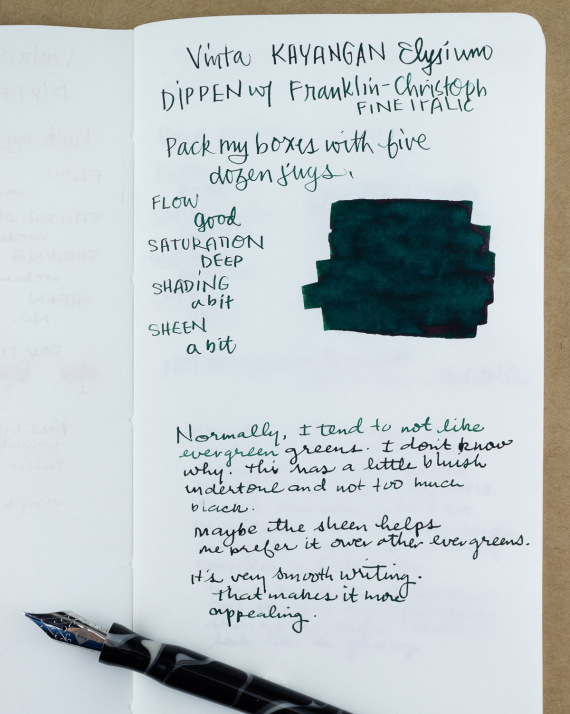
Finally, Kayangan Elysium is a deep evergreen green with a bit of sheen. The ink is smooth and the combination of sheen and deep green makes it an appealing dark green. As much as I love green, evergreens tend to miss the mark for me. Kayangan Elysium is an exception. There is a bit more blue in the color than most evergreen inks.

In comparison, Lamy Peridot is a darker ink, Interstellar Space is a little more saturated and bright and Diamine Holly is almost the same color except for the sheen.

This detail photo shows the color comparison a bit more closely. The sheen on Diamine Holly is very evident in this image.
These four colors continue to show that Vinta is capable of making well-behaved inks with a wide range of color properties. So, whether you are someone who likes shading inks, sheening inks, shimmer inks or traditional fountain pen inks, Vinta is making something to satisfy your needs.

Tools:
- Paper: Curnow Backpack Notebook with Ink Journal Ink Collecting Guide Sheet (FREE)
- Pens: Nib Holder or unknown origin and Franklin-Christoph with Fine Italic nib, Tachikawa dip nib holder ($7.75 and up) with Zebra G titanium nib ($33.50 per 10-pack) and Toronto Pen Company PENtastic CxPO Tester Pens (set of 2 for $40CAD) , Acrylic dip nib pen (Approx. $15),
- Swatches: Col-o-Ring Ink Testing Book ($10) & Col-o-dex Rotary Cards ($15)
- Brush: Princeton Watercolor Round #8 brush
- Ink: Vinta Inks Malayan Apple Makopa 1938, Terracotta Damili 1572, Elysium Green Kayangan 1967, Mulberry Ubi 1663 ($12.50 per 30ml bottle)
DISCLAIMER: The items included in this review were provided free of charge by Vanness Pen Shop for the purpose of review. Please see the About page for more details.
I understand why for testing purposes you want to use paper that shows off the ink in its full glory, but as someone who uses a fountain pen in “real life” — I.e. in a Leucchturm bullet journal or a Rhodia notepad — I don’t find such a review very useful for knowing how an ink is going to behave on more common paper types. I’m glad you did mention here that this ink feathers badly on Rhodia paper; I hope you’ll continue to at least mention ink performance on other papers than Tomoe in future reviews, even if you don’t show samples.
Thanks for the feedback! And yes, for our longer, more comprehensive reviews, I’m sure I will return to the Rhodia or some other “everyday paper”.
Thanks, that’s good to hear!
The serendipity dip pen is Australian,
https://pensivepens.com.au/products/serendipity-hybrid-pen
I got mine with some Robert Oster inks, I think he had a package with that on his site.
Shiri, I think my holder might be a James Finniss! I got it a long time ago but the pen and tube has no branding on it but it looks identical.
Great review — I adore Vinta inks! Curious about your experience with a regular FP nib in a dip pen holder. I tried a Jowo that way, but it gushed ink for 2 words, wrote beautifully for 2 more, and then ran out….So I’m back to Nikki G for testing. Any tips?
I’m using a holder similar to my Shawn Newton Esterbrook holder which is threaded to use the nib plus feed of a traditional fountain pen. You can work with a pen maker to create one specifically for your favorite nibs (schmidt, jowo, Esterbrook vintage, etc). The advantage of this method is that I get all the same behavior as a regular fountain pen but without having to clean out a converter as well as the nib unit each time I test a new color.
Interesting! So you still have to clean the feed, just avoiding a full pen bath Not as simple as a dip nib, but much more accurate reflection of ink performance. Great intermediate solution! I guess it depends on inky goals — and the volume of a swatching and testing process (I’m not usually about speed; but have 100 samples to run through …. not sure how that happened) . ANYHOO, love all the Inkmas comparisons!! Thanks for the best content around; even in a crazy-busy season.
It is a good midway solution. The fountain pen dip pen is more accurate to color performance and the clean-up is half the time of a traditional fountain pen. A glass pen is also a good option and clean-up is not as involved. There are lots of great new designs coming since they are so popular in Japan and Taiwan for ink sampling, shimmer inks and calligraphy.