This week we have more gift guides from around the pen community (and satellites) plus two posts about the Trigg Life Mapper, a new planner on the scenes. There are two new guides from JetPens blog this week, one for heavy handed writers and an overview of fountain pen inks. If you’ve never check out JetPens resources, I recommend clicking on one or both of these links!
All our regular favorites are here too: ink reviews, notebook reviews, and more. Once again, my apologies for the delay. Hope you got a chance to listen to the Pen Addict Gift Guide episode I recorded with Brad and Myke yesterday. There’s lots of great ideas plus a special coupon code* for listeners for The Well-Appointed Desk Shop!
Gift Guides:
- More Holiday Gift Ideas for Notebook Lovers (via Notebook Stories)
- 2018 Gift Guide: Gift Ideas for Creatives (via Oh So Beautiful)
- Gift Books for Notebook Lovers (via Notebook Stories)
- Our 2018 Stocking Stuffer List (via Tools and Toys)
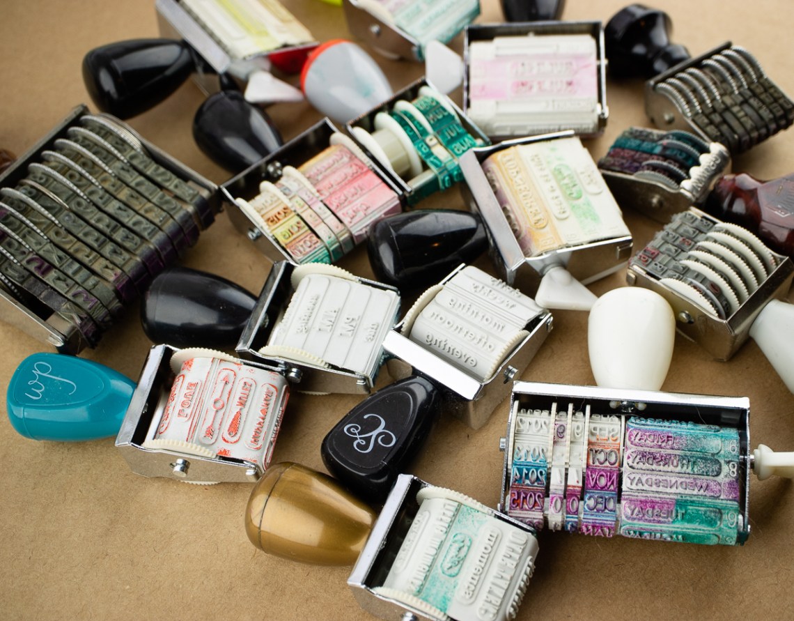
- Six Colorful Gifts to Brighten Someone’s Holiday (via Design*Sponge)
Pens:
- Highlights of Chinese Fountain Pens in 2018: n9 (via FrankUnderwater)
- Unboxing Wancher Dream Pen True Ebonite Fountain Pen (via Gourmet Pens)
- REVIEW: Stilform Kosmos Ti Pen (via The Pencilcase Blog)
- Changing a @TWSBI 580 Nib Unit @AppelboomLaren (via Gourmet Pens)
- The Best Pens for Heavy-handed Writers (via JetPens)
Ink:
- The Beginner’s Guide to Fountain Pen Inks (via JetPens)
- Ink Review #522: Taccia Momo Pink (via Mountain of Ink)
- review: kwz ink honey (via ink between the teeth)
- Review: Robert Oster Signature Hippo Purple (via Alt. Haven)
- Monteverde Moonstone (via Inkdependence!)
- Ink Review #515: Bungubox Piano Mahogany (via Mountain of Ink)
- Christmas Currently Inked (via Wonder Pens)
- Sailor Shikiori: Sakura-Mori ink review. (via The Finer Point)
Pencils:
- Palomino KUM Blackwing Automatic Brake Long Point 2 Step Pencil Sharpener (via The Pen Addict)
- The Kaweco Special 0.5 Push Pencil Black (via Bleistift)
- Sakura Sumo Grip Retractable Eraser (via Comfortable Shoes Studio)
- Rotrings In The Supply Room (via My Supply Room)
Notebooks & Paper:
- How Penny’s use of her Life Noted planner has evolved (via Quo Vadis Blog)
- Index Cards. What are they good for? (via The InkSmudge)
- Front Notebook (via Notebook Stories)
- Getting to Know…Trigg (via Nero’s Notes)
- Trigg Life Mapper: Initial Impressions. (via The Finer Point)
- Field Notes “End Papers” Edition (via Paper Girl)
- Leuchtturm 1917 Albums for Collectors (via Notebook Stories)
- Planner Plans for 2019 (and This Week in my Planner) (via Planner Fun)
- Why Is Japan Still So Attached to Paper? – The New York Times (via The Cramped)
- How to use your bullet journal to help make decisions (via Rhodia Drive)
Art & Creativity:
- Keeping a Daily Sketchbook (via Notebook Stories)
- Book Review: The Art of Crayon: Draw, Color, Resist, Sculpt, Carve! (via Parka Blogs)
- What Persimmons Taught Me About Watercolor Pencils (Three Mini-Reviews) (via Fueled by Clouds & Coffee)
- ConsumerCrafts: A New Resource for Art Supplies (via Doodlewash)
- The act of drawing something has a “massive” benefit for memory compared with writing it down – Research Digest (via The Cramped)
- BOOK – watercolor flowers by bley hack (via print & pattern)
- How to: fold your own gift bag (via Flow Magazine)
- ‘Color Problems’ by Emily Noyes Vanderpoel [2018 Edition] (via Tools and Toys)
- Daniel Smith Pan Watercolor Palette: A Quick Video Look (via RozWoundUp)
- Overcoming Imposter Syndrome with Sarah Neuburger (via Design*Sponge)
Other Interesting Things:
- Video: Fahrney’s Catalog Flip Through (via Inktronics)
- Video: Goldspot Pens Catalog Flip Through (via Inktronics)
- Tooting some horns: new type releases! (via Alphabettes)
- Mid-Week Mini: NaNoWriMo 2018 Conclusion. (via The Finer Point)
- Getting Ready for Travel Writing (via Letter Writers Alliance)
- The most valuable book on my nightstand (via Austin Kleon)
- ATTENTION: Public Warning Signs by April Soetarman Engage the Emotions of Unsuspecting Pedestrians (via Colossal)
- Ongoing Usefulness of Manual Portable Typewriters: Scriptwriting on the Hoof (via oz.Typewriter)
- The Typewriter Steals the Show at Canberra’s National Capital Orchestra Concert (via oz.Typewriter)
- Daily Journaling Prompts for December 2018 (via Quo Vadis Blog)
- Make Merry with Free December 2018 digital wallpapers (via Think.Make.Share.)
- Christmas freebie! (via love print studio blog)
- Video: Nib Newbs! A Very Newbie Christmas II! (via Anderson Pens)
*Okay… I can’t keep a secret. If you listen to the podcast, there is a 10% off all merchandise in our shop. The secret code is PENADDICT. Code is good through 12/15/18.