

Laura did her LA Pen Show recap earlier this week and provided the perspective of a first-time pen show attendee. Now its my turn to give my recap.
As Laura mentioned, we arrived in LA late on Thursday night and after some struggles trying to acquire an Uber, we switched to Lyft and managed to get a ride out of LAX and arrived at the hotel around 11pm. When we arrived a crew of familiar faces greeted us from The Tent so we quickly dropped our suitcases in our room and collected our roommate Jessica of BYOB and Vintage Pen Shop fame and returned downstairs for some snacks and refreshments. Laura got a crash course in pen show after hours.
For a full and colorful tale about the status of the hotel and it’s state of incomplete renovations, check out Ricky’s posts over on FPN. For the “YMCA” photo alone, its worth a look. And the volcano rice.
On Friday morning, I got to work. While I was planning to spend the whole show being just an attendee this time, when I arrived, I discovered that Brad wasn’t getting in until mid-afternoon on Friday so I agreed to lend a hand at the Vanness booth Friday until Brad arrived. Poor Laura would be left on her own Friday morning to experience her first day at a pen show on her own.
While Friday wasn’t super busy with attendees, I was able to help cover the Vanness tables and get things organized while Joey Feldman signed his signature show notebooks, everyone in the booth got a chance to eat a late breakfast in shifts and each of us made occasional runs around the show floor for various errands.
Once Brad arrived around 2pm, I handed him the proverbial baton in the form of the PayPal credit card reader and bolted for the main ballroom to check on Laura and Jessica and to do some shopping.
I bought a couple wonderful Esterbrooks from Jessica who is very bad for my wallet. I got a pastel blue purse pen and pencil set in a carrying case (with instruction sheet!) and a beautiful pink purse pen with pink jewels was well to add to my purse pen collection. The rainbow is growing!

My first stop was the Musubi table which was just inside the doors near the Vanness table. I wanted to buy one of their beautiful, handcrafted notebooks in San Fransisco last year but I couldn’t make a decision and thought I might order one online and still couldn’t make up my mind. Finally, in LA with Daryl describing each of the fabric patterns to me, I was able to settle on one though I wanted to buy several. I chose the Kiku-kikkou which is a chrysanthemum pattern on indigo fabric. Each of the notebooks is handmade by a craftsperson with a disability which is amazing. Daryl told stories about a seamstress who was employed who had lost the use of her legs and could no longer use an industrial sewing machine who now hand sews books at Musubi and another story of a blind person who could feel the grain direction of the fabric by touch who worked for them. It was mesmerizing. Each of the books comes in a beautiful box and is filled with 52gsm Tomoe River paper and includes a writing board and a signed card from the craftsperson who made the notebook. While some people might blanche at the price of the Musubi notebooks, I am inclined to compare the price of the notebooks to the price of many of the pens and inks I purchase and consider it comparatively. If I willingly spend hundreds on a pen, why would I skimp on the notebook?

I was lucky enough to find two more Sheaffer pens to add to my ever-growing Lady Skipsert collection. Both of them are from the later period — what I refer to as the “white dot” collection though I don’t think that’s the official term. Both of the pens feature the blunt ends of the Lady Sheaffers of the late-60s. The silver scalloped model featured a blue grip section and a 14K Triumph nib. I don’t know that the blue grip is standard but I’m not complaining. The Brushed Gold Plate model was a real surprise because when I removed the cap, I discovered a Sheaffer Stylist nib. I couldn’t throw my money at the vendor fast enough and run away with “my precious”. The Stylist nib is similar to the Parker 180 nib in that it can be flipped over and written on either side for a different writing experience. I think the nib is a little bent but I’m hoping my good friend Jeff at Powers Pen Company can give it a once over for me at the Arkansas Pen Show and get it back to full working order as these are pretty uncommon and it writes incredibly fine it just chokes up a bit.
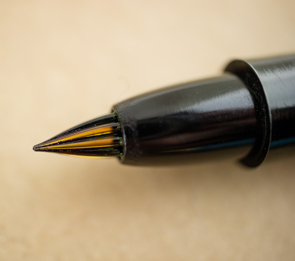
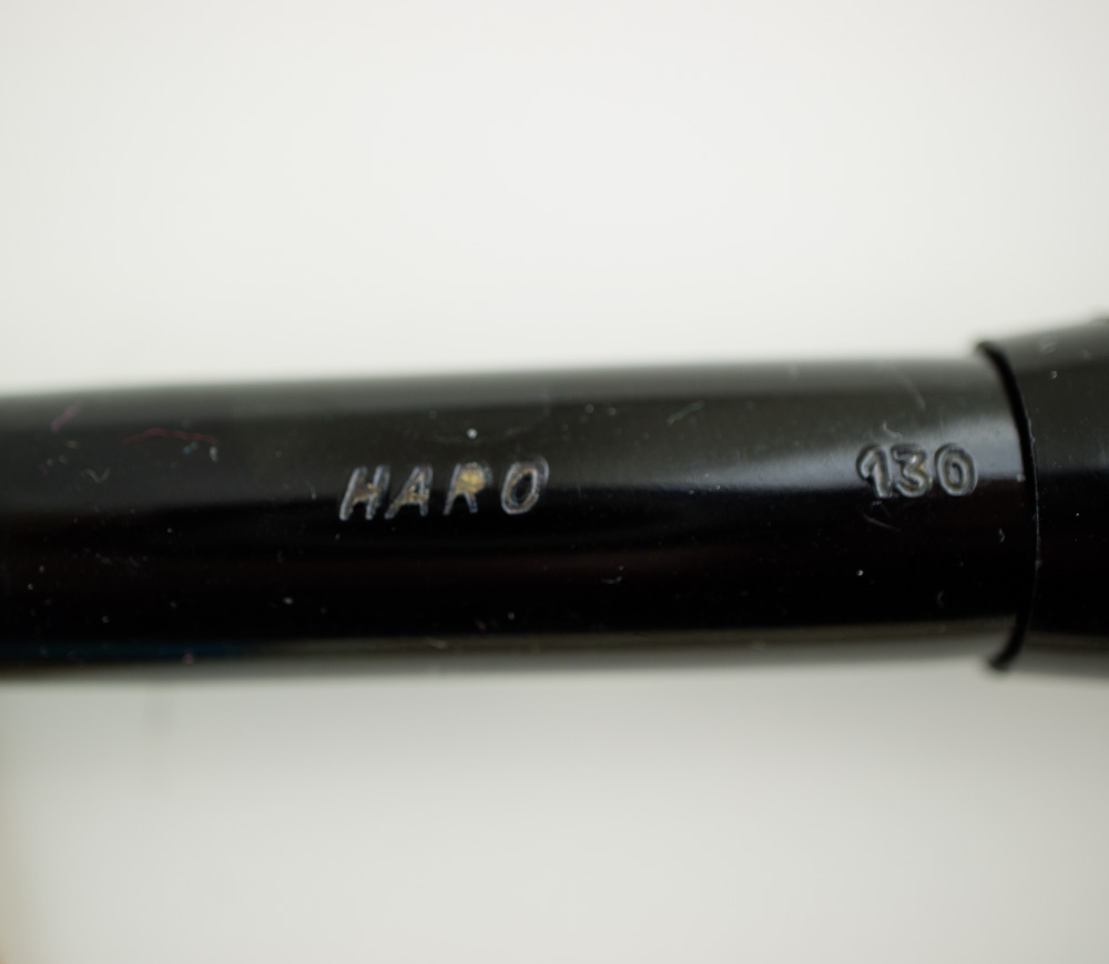
And disguised inside a plain black pen was one of my most treasured finds of the whole show. It is a glass nib pen that I purchased from Tom, AKA The Pen Man and Hong his co-vendor, who are mostly known for their exceptional collection of Pelikan pens. It is a Haro and it was essentially new-old-stock piston filler pen.
I think its glorious and writes like an extra fine. I’ll have a more in-depth review about it later if folks are interested in it.
I also got a SIG extra fine flexible nib from Franklin-Christoph to put on my Tibaldi Pocket 20 (which in my sleep-deprived haze I misidentified as a Pocket 45). Jim Rouse adjusted the nib perfectly for me which is, of course, why it is always so great to purchase a nib at a show. I wonder what Audrey slips into his Cokes that keeps him from killing people like me?
I picked up a couple bottles of ink because I need more ink like I need a hole in my head like an actual bottle of Lamy Vibrant Pink ($12 for 50ml bottle).

I can now say with a fair amount of certainty that there’s not that much difference between the cartridge color and the bottle color. While the ink, when wet, looks super sparkly from the bottle. When dry, they both look pretty similar. It’s especially true with the fine nibs.

I tested the bottle color on some different paper to see if it appeared brighter or more of the shimmer remained. The color did look lighter on the sketchbook paper and the sheen is more golden and less greenish but overall not hugely different. So, if you find yourself preferring cartridges or only able to acquire the Vibrant Pink cartridges, the color is consistent. Any variations are more likely a result of paper, nib size or flow rather than the actual ink. It’s also possible that the gold particles may not be distributed as evenly in the cartridges or may have settled in the cartridges so you may want to give them a little shimmy or roll.

I also purchased a couple more bottles of the Krishna inks. I’ll have a full review of this new collection of inks coming up. Clearly, I’m way behind on my ink reviews! And I got samples of Kobe #14 Maya Lapis, Kobe #12 Suma This Pink Hill and Robert Oster Black Violet.
I picked up a couple Nikko G nibs from Michael Sull. I usually use Zebra G nibs but I thought I’d try the Nikko G nibs as a change of pace.
I also grabbed one of the Nanuk notebooks to try something different. They are very simple stitch-bound notebooks with a light cream stock and card stock covers. I got the blank version with red stitching but they were available in grid or lined with red ruling or white stitching with blue ruling. I’ll have a full review soon as well.
Saturday I was able to attend a few of the seminar/classes which I seldom, if ever, get to do. Laura and I went to John Mottishaw’s class on pen tuning which was interesting. What came out of the session was that there are some little tweaks that can be tried “before you call the pen doctor” that are similar to things you might check before you take your computer to the repair shop — is there ink in it? is the nib and feed seated properly? has it been thoroughly cleaned? etc. And some tips to try if you are brave enough like micromesh and using your fingers and a good loupe to check that tines are aligned and no paper fibers are trapped.

A little while later, we attended Michael Sull’s class on Flourishing Your Capitals which was not traditional Spencerian lettering and was actually quite a bit of fun. I confess that I cannot actually confine myself to the rigors of traditional Spencerian Script. There’s too much whimsy in my lettering so getting to just play with embellishing the caps was just what I wanted.


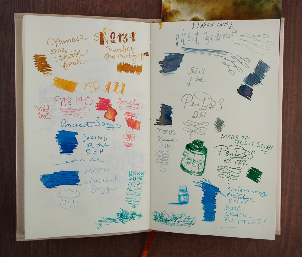
I keep a notebook for every pen show year and 2018 is no different. Last year, I used a Baron Fig Confidant. This year, I grabbed a Midori off the shelf. Inside is all the pens and inks I test at the bar from friends, new and old, and the notes from the seminars I get to attend. I write with the pens that I buy at each show and annotate them. I also stick my luggage claim stickers and other ephemera into the book. Its messy and janky and weird and wonderful and by the end of the year, I totally love it.

Laura and I spent some quality time at the Classic Pens table testing out all the Nakaya nib options. The scribbles above are from the test page they let me keep from my tests. So hard to choose!

This page was from Saturday night sitting at the bar after dinner. Cary of Fountain Pen Day & Kenro fame brought out his Nakayas for us to play with as well and then wandered off so I had to do my best to spell and describe the pens. I also got to try out a lot of the new-to-us PenBBS and Ancient Charm shimmer inks which I dip tested with my glass pen and dip nibs. The Strait Pens table was selling bottles and small sample bottles but they were selling super fast and I was incredibly indecisive so I didn’t buy any.
Sunday was the only official public day and I helped out at the Vanness tables which meant I stood in one place for about ten hours straight because it was so crowded I pretty much couldn’t move. We sold as many bottles of ink as we could and tried not to melt in the sun, beating down from the windows behind us. We taped black tablecloths to the windows to try to stave off the heat and impending “con funk”. It also made us look like the “Before Dark” vampires that we are. Though, we all know, I’m more iZombie than vampire. (More hot sauce!) I still don’t tan worth a damn.
Powered entirely by donuts (thank you, Rebecca!) and cold Starbucks coffee, Team Vanness worked tirelessly to pack up the remaining stock plus Lisa’s purchases from various vendors and then we all bonked. I headed out for ramen in Japantown with Kasey (AKA Punkey). It was the one chance I had to see a bit of LA. The ramen was delicious and we had a good time. I hope I wasn’t too big a blob. The rest of the gang ate a quiet dinner nearby and crashed.
Monday, Laura and I hung out nearby the hotel and drank copious amounts of coffee until our flight which ended up being delayed. I’m not sure I can ever recall being quite so tired but most shows are super busy on Friday and Saturday and tend to slow down on Sunday, not the other way around.
This was my first trip to the LA Pen Show and while it probably wasn’t entirely reflective of how the show is usually run, from what I was told, it wasn’t entirely different either. The organizer could have been more communicative with the vendors about the state of the hotel and venue. Many vendors said the hotel had informed him that they were not fully up and running and that they could get his event into another hotel but he did not accept this option. Was this because he was too lazy? Any craft show, or other event would have made considerably more effort to relocate their event to better facilities or even just move the sleeping accommodations for the vendors. Or given them the option to stay elsewhere. Especially if the hotel is giving you that option… wouldn’t you want both your vendors and attendees to be happy so they come back?
I’m not saying that people didn’t have a good time because most everyone I spoke to enjoyed themselves. Pretty much, if you put pen people together and let them talk about pens, they end up having a good time anywhere. However, given their other options and knowing that people have limited time and resources, folks on the West Coast might not choose the LA Pen Show next year.


 Recap by Laura Cameron


