Review: Marvy LePlume II Brush Markers

Guest review by Tina Koyama

Before I got heavily into colored pencils, watercolor brush pens were my coloring medium of choice. It’s hard to resist the huge range of intense, saturated colors many of them come in. Tombow Dual-Brush Pens were my gateway drug, and I managed to acquire quite a few of the line’s 96 colors before I discovered Kuretake Zig Clean Color Real Brush Pens. I decided that the “real” brush tips on the Kuretake pens were more variable and expressive, and they were my favorite for a long time (and yes, I acquired quite a few of those, too).

Eventually colored pencils suited my urban sketching needs better than markers, so except for black brush pens, I haven’t been using markers as much. Recently, though, I discovered Marvy LePlume II Double-Sided Watercolor Markers – and good golly, they come in an unbelievable 109 colors! Even more than the Tombows! Resistance was futile. I did, however, manage to resist getting all 109. In fact, my general tendency is to pick out all the brightest, most garish colors in any set, but I wanted to limit myself to about a dozen, so I showed some restraint and chose a relatively cohesive, subdued (for me) palette. I also got a blender pen.

1-marvy-leplume-ii-markers

Scribble and Wash Test

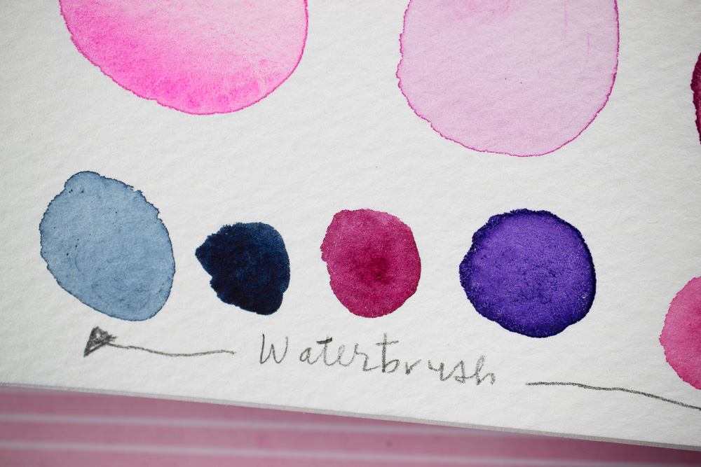
My initial scribbles were done on Canson 98-pound mixed media paper, which is sized for wet media. On the right I used the blender pen to test the wash properties and found the marks to be a bit scratchy looking – the blender brush pen’s strokes are apparent. On the left I used a Kuretake waterbrush and prefer the more watercolor-like effect of its wetter brush.

2-scribble-and-wash-test-on-canson-98-lb-mixed-media-paper

I have to say that I didn’t use the fine end of the two-sided Marvy LePlume pens except to write the color names and numbers on the left side of the page. The fine end is a firm tip suitable for writing and drawing, but not for coloring. When I’m coloring, I prefer the softer brush tip of the larger end, which is made of a compressed, slightly flexy material (not hairs). Like all brush pens, you can adjust the size of the mark the brush makes by changing the angle relative to the paper. I found it easy to color in larger areas quickly by using the broad side of the brush tip held at a sharp angle to the page.

3-two-sizes-of-marvy-leplume-ii-2-sided-marker-tips

Stillman & Birn Zeta Test

The next test was more fun. I’ve seen many adult coloring books lately with beautiful abstract patterns. To test out the markers’ blending properties, I did something I’ve been wanting to do for a long time: I made my own coloring book page. I did the line work first with a waterproof Sakura Pigma Micron pen in a Stillman & Birn Zeta sketchbook.

I’ve successfully used 180-pound S&B Zeta paper with traditional watercolors, so I assume the surface is sized for wet media. I tried to make gradient effects with single colors as well as with two or three shades, but they didn’t blend as well as I thought they would. On the Zeta paper, I found the blending effect to be better with the blender pen than the waterbrush, but when I scrubbed more to increase the blending, the Zeta’s surface started to pill a bit.

4-coloring-book-page-in-stillman-birn-zeta

Canson Mixed Media Test

I did a third test using Canson 98-pound mixed media paper (the same kind used for the scribble/wash test). This time I thought the Marvy LePlumes blended much more easily and with less scrubbing whether I was using water or the blender pen. The blender pen still shows brush strokes more than the waterbrush, but they are not necessarily objectionable – just a slightly different effect. It’s a matter of personal preference, but I like the look of these markers and their blending qualities better on the toothy Canson paper than the smooth Zeta paper. I’m not sure whether it’s the texture or sizing or both, but as usual, the particular paper used with a pen makes a big difference in the effect.

I know that brush markers are popular among coloring book enthusiasts, and I’ve sometimes wondered whether the types of paper coloring books are published on are suitable for wet markers like these (let alone blending their colors with a waterbrush). If you’re planning to use them in coloring books, I’d buy just a few pens and test them out before investing in all 109 colors (which is the kind of crazy thing I’d be likely to do without testing first).

One thing to be aware of is that some Marvy LePlume colors are much juicier than others, and when I pulled the caps off, they actually spattered ink on the page (I circled the spatters on the S&B Zeta page).

5a-marvy-leplume-ii-with-blender-pen-on-canson-98-lb 5b-marvy-leplume-ii-with-water-on-canson-98-lb-mixed-media-paper

Tombow Comparison

I didn’t intend this to be a head-to-head comparison review, but since I just happen to have a good supply of the afore-mentioned Tombow Dual Brush Pens, I decided to do a mini-test of their blending qualities on Canson paper, just for kicks. The Tombows are comparable in that they also have a broad brush end and a fine, hard-tip end. With a waterbrush, Tombow ink makes an almost seamless wash that looks very much like watercolor. With the Tombow blender, blending gradient colors was a bit easier to do and showed fewer brush strokes.

6-tombow-dual-brush-pens-on-canson-98-lb

Final Thoughts

While I found no fault with the Marvy LePlumes, they didn’t distinguish themselves much from other similar markers I’ve used, and I think I prefer the Tombows when color blending. (What a relief – now I won’t have to run out and get the rest of the LePlume colors!) They did remind me, though, of how much fun it is to use watercolor brush markers, and I’m going to get them out more often again.

tina-koyamaTina Koyama is an urban sketcher in Seattle. Her blog is Fueled by Clouds & Coffee, and you can follow her on Instagram as Miatagrrl.


DISCLAIMER: The items included in this review were provided free of charge by JetPens for the purpose of review. Please see the About page for more details.

Giveaway Winner: Write Your Own Adventure Planner 2017

write-your-own-adventure-2

Congratulations to the winner in the Write Your Own Adventure Giveaway. Our random number generator picked: Jenn Dee!

screen-shot-2017-01-07-at-9-36-12-am

Good luck on all your adventures, Jenn, great and small. A wedding in Korea sounds like it will be a blast. And Korean stationery stores will be on your itinerary too, right?

I hope everyone gets a chance to adventure a little bit in 2017, whether its a walk through the pages of a favorite book, a walk around the block or a walk around the world.

Fashionable Friday: Happy Hygge

ff-hygge

With the cold, (and in my case) snowy days and long, dark nights of winter officially settling in, the Danish concept of Hygge (pronounced “HOO-gah, like a football cheer in a Scandinavian accent” according to the NYTimes) seems a fitting, if slightly odd, topic for Fashionable Friday. However, the concept of Hygge is all about coziness and happiness, which I think goes nicely alongside writing and stationery. Also many start-of-the-year goals pair nicely like writing more, journaling, going for walks, spending time with family, stay home more, cooking, etc. So, I hope you find this inspiring. I just purchased the book The Year of Living Danishly: Uncovering the Secrets of the World’s Happiest Country which I hope will shed a bit of light on the Hygge phenomenon.

  • The Little Book of Hygge: Danish Secrets to Happy Living $11.75 (via Amazon)
  • Blue Border Letterpress Cards (Set of 50) $5 (via CuteTape)
  • J Herbin Spiral Glass Dip Pen in Sky Blue $20 (via Pen Chalet)
  • Noodler’s Georgia Peach Ink (3 oz Bottle) $15 (via JetPens)
  • Triangle Pennant Banner Washi Tape $2 per roll (via CuteTape)
  • Lamy Scala Glacier fountain pen (special edition 2016) gold nib € 215 (via Fontoplumo)
  • Mercury Moonglow Candle $40 (via Anthropologie)
  • CDT A5 Notepad $11 (via Fresh Stock Japan)
  • URPOWER Essential Oil Diffuser $21.95 (via Amazon)
  • Mimira Mug $14 (via Anthropologie)
  • London Fog Hot Chocolate + Mapled Whipped Cream Recipe (via Kitchen McCabe)
  • Diamine Chocolate Brown Ink (30 ml Bottle) $7.50 (via JetPens)
  • Diamine Beau Blue Ink (80ml Bottle) $14.95 (via Anderson Pens)
  • PIUMA Super Minimal Brass Fountain Pen starting at $55 (via Kickstarter)
  • Bookbinder’s Ground Rattler Snake Ink (30ml Bottle) $12.50 (via Anderson Pens)
  • EDK Pen starting at $60 (via Karas Pen Co.)
  • Retro 51 Tornado Limited Edition Twinkle PPopper Rollerball $45 (via Anderson Pens)

Book Review: Stationery Fever

Stationery Fever

Stationery Fever: From Paper Clips to Pencils and Everything in Between by John Z. Komurki is a large book reminiscent of a text book in size and format filled with articles about pencils, erasers, pens, notebooks and assorted office and stationery supplies. It is filled with beautiful photography of items, some provided by artful stationery compositionists, Present & Correct.

There are articles about great stationery shops across the globe in cities like Tokyo, New York, London, Paris, Milan, and Berlin. And some of our favorite stationery darlings like C.W. Pencil Enterprises, Erasable Podcast, David Rees and Rad + Hungry have features as well.

The book is definitely European-focused which is enlightening to read perspectives about Biros vs. Bics and Pritt Sticks vs. glue sticks and other cultural differences.

Throughout the book there are sidebar articles about distinctive items like Crayola crayons, Museo del Quaderno Italian student notebooks and many other fascinating items.

I learned that the classic 3M C-15 tape dispenser from the 70s could potentially be filled with radioactive sand as a ballast. There are several potshots at the US for being one of only three countries not to move to the ISO216 paper standard (along with Myanmar and Liberia).

The details about the inventions of highlighters, sticky notes, paper clips, envelopes, legal pads, scissors and sello/scotch tape were all fascinating and made me realize how incredibly ubiquitous they all are. So much so, that many of these items are icons, fucntions and even applications on our computers that some people may not even use in real life anymore. Weird to think about, isn’t it?

Overall, the book is a quick read but filled with information you are bound to refer back to time and again. Need to know the different types of pencil sharpeners? Who invented the paper clip? Who invented the felt tip pen or highlighter? Its all in this one volume and its beautifully presented and easy to read and reference.

Link Love: Resolutions & Round-Ups

Link artwork by Chris Grine, illustrator of the web comic Wicked Crispy.

For the stationery, pen and ink community, the end of the year means new planners, prepping for February’s InCoWriMo/LetterMo and of course, our own version of round-ups, resolutions and Top 5/10/whatever lists. They are all accounted for here this week, so pour yourself a hot cup of your favorite beverage and enjoy.

Looking Forward & Looking Back:

Pens:

Inks:

Pencils:

Art & Supplies:

Paper & Notebooks:

Planners:

InCoWriMo/Letter Writing Month:

Other Interesting Things:

Giveaway: Write Your Own Adventure Planner 2017

write-your-own-adventure-1 write-your-own-adventure-2

Several months ago I decided to back the Kickstarter campaign for the Emma Kate Co. Write Your Own Adventure Planner for 2017 but couldn’t decide if I wanted the grey or pink version so like the planner junkie than I am, I ordered both of them. And customs and international post being what they are, the planners arrived today. So, 2017 starts today for me. And for you. The fact that both the grey and the peachy pink planners are both beautiful I had to resort to crowdsourcing to make a decision which planner to keep. So, I decide to keep the peachy pink.

Bob made the reasonable call that the grey planner was much more neutral and respectable for either a lady or a gentleman to carry (Is he thinking he’s going to enter the giveaway? Am I going to have to add a stipulation to the fine print about family members not being eligible?).

write-your-own-adventure-3

Inside the fabric hard cover covers is creamy stock and really nice page layouts where Saturday and Sunday are given the most space on both the monthly and the weekly spreads.

write-your-own-adventure-4

On each page, there is a quote or an inspirational phrase.

write-your-own-adventure-5

At the bottom of the weekly pages is space for three items. You could use these for your three most important to-do’s; breakfast, lunch and dinner plans; or morning, afternoon and evening events.

write-your-own-adventure-6

Inbetween each month are two pages of dot grid paper as well as more sheets at the end of the book for additional notes.

write-your-own-adventure-7

At the back of the book is a gusseted pocket for ephemera.

write-your-own-adventure-8

The panner includes two matching grosgrain bookmarks. And finally, the book pages are about a half an inch shorter than the binding to accommodate the adhesive tabs included to mark the month. I love that the tabs fit at the bottom of the pages instead of the top or the sides.

I have not had a chance to do any pen tests yet but the paper feels substantial, creamy and a little toothy. So, the giveaway winner will get to test the paper and let us all know how well it performs too.

TO ENTER: Tell me what your adventure plans are for 2017 are in comments. One entry per person.


FINE PRINT: All entries must be submitted by 10pm CST on Friday, January 6, 2017. All entries must be submitted at wellappointeddesk.com, not Twitter, Tumblr or Facebook, okay? Winner will be announced on Wednesday. Winner will be selected by random number generator from entries that played by the rules (see above). Please include your email address in the comment form so that I can contact you if you win. I will not save email addresses or sell them to anyone — pinky swear. If winner does not respond within 10 days, I will draw a new giveaway winner. Shipping via USPS first class is covered. Additional shipping options or insurance will have to be paid by the winner. We are generous but we’re not made of money. US residents only, please.

My Favorite Inks for 2016

When thinking about my favorite inks for 2016, I couldn’t narrow it down to just one color or even 10. But I had ranges of colors that ended up being my favorites this year. Some were colors that I discovered this year and some were new lines that were introduced this year and some are long held favorites I just can’t shake. Robert Oster, the new Sailor Jentle Four Seasons line, the J. Herbin 1670 colors are all worth noting. Lamy Dark Lilac was a big hit this year as well. Sheening inks were on the rise in 2016, while shimmering inks seemed to be too high maintenance for many fountain pen users and may not be as popular in 2017. That’s my prediction.

Pink ink became a big winner among pen enthusiasts of all persuasions. Boutique inks have become popular with brands like KWZ, Robert Oster, Papier Plume, and many others becoming the must haves. Boutique inks are the craft brews of the pen world.

The Blues:

inks-2016-blues2

Of course, I had to mention the coveted J. Herbin Emerald of Chivor even though technically it was released in 2015. I used the heck out of it in 2016. In the same boat is my beloved DeAtramentis Pigeon Blue, the only ink that I’ve purchased a second bottle. It’s my “house ink”.  It’s just this smoky teal blue that I like. Everyone has to find their house ink. This one is mine. My close second is Kaweco Paradise Blue which is a slightly greener teal blue-green with a bit of a red sheen. So pretty and a very reasonably priced ink. Good stable, everyday ink. Then there’s Robert Oster knocking my socks off with Marine, Torquay, Fire & Ice and Aqua. All amazing teal and turquoise blues with sheen. Fab!

inks-2016-blues

Callifolio is another brand I got to know well this year and Omi Osun, Oliphants  and Equinoxe 5 are all inks I use regularly. Oliphants is the “Pigeon Blue” I keep at work. Its a bit more saturated. Equinoxe 5 is a good blue black, a bit more saturated than Bungbox 4B. Robert Oster Blue Sea can sheen almost magenta and Bookbinders Snake Ink Blue Coral has a similar sheen but is a bit lighter in color.

*There’s one more blue that accidentally escaped down into the Grey and Purples. It’s Bungbox 4B (or Blue Black). It’s not necessarily a new color this year but it was new-to-me this year. It’s a deep navy blue-black with a bit of a red sheen. You can read my full review here. If you’re going to buy a very expensive bottle of Bungbox, this is a pretty good one.

The Pinks, Reds and Oranges:

inks-2016-pinks, reds and oranges

Sailor Jentle Irori blows my mind with the gold sheen on my swatch. I don’t see it as much in writing but the edges of the letters do darken a bit so wow! Lots of people have been happy about the Kin-Mokusei being a lovely orange and Papier Plume’s Sazerac is a wonderful orange with just a hint of amber making feel grown-up and not candy-colored. The Kobe inks were crazy popular at the DC Pen Show and I was happy to snag two bottles: #12 and #41, both unusual pink colors to add to my Callifolio Andrinople and Papier Plume Garden District Azalea. I am now a well-rounded connoisseur of pink inks.

And I love the Sailor Jentle Sakura-Mori. Its such a smoky petal pink (the swatch above looks a bit more saturated than it really is, sadly, since most were looking accurate today).

The Greys and Purples (and a renegade):

inks-2016-greys and purples

I love grey inks and was happy to find two new grey inks this year: Sailor Jentle Chu-Shu which is a grey-purple and Bookbinders Snake Ink Ground Rattler which is a perfect neutral grey.

In regards to purples, Sailor Jentle Four Seasons introduced a vivd purple violet Fuji-Musume that satisfies any bright purple urges I might have had. And Lamy’s Dark Lilac is a good deep  usable purple-black with a gold sheen. Dark Lilac satisfied on all fronts, it was finally a dark-enough-to-be-usable ink from Lamy’s limited edition line, it sheens and its actually a nice color. Win-win-win!

*The details about Bungbox 4B is above in the Blues section.

The Green, Golds and Browns:

inks-2016-golds and greens

And finally, while not everyone was as thrilled with J. Herbin’s Caroube de Chypre, I really liked it. It was hot chocolate with gold sprinkles. How can that be a bad thing? Callifolio’s Huere D’Orée is the warm wheat gold ink that made a good substitute for a lot of people who decided that KWZ Honey wasn’t for them. I really prefer it. Once again, the new Sailor Jentle Four Seasons inks hit on all fronts… I love the Waka-Uguisu green AND the Rikyu-Cha brown too. Finally, as mentioned in my reviews, Robert Oster’s Khaki and Papier Plume’s Streetcar Green are both new favorites for me this year too.

Before you think every new ink I try is my new favorite, here are a few inks I tried that I wanted to like but didn’t: KWZ Grey Plum, Bungbox Ink of the Witch, Bungbox Tears of a Clown, KWZ Green Gold 2, and Lamy Charged Green. Keeping in mind, I play with color for a living so generally speaking I do like most colors but I like some more than others.