
Review by Tina Koyama
While urban sketching, I occasionally have need for an opaque white pen with a tip fine enough to make small highlights or write the lettering on a street sign. I’ve tried quite a few white pens, and many are either not opaque enough or not fine enough. Lately I’ve been using a Sakura Gelly Roll. Its opacity is so-so, but a larger problem is that gel ink is water-soluble, so if I use it over watercolor pencils or dried watercolor, it can activate the medium underneath, and they mix together.

I set out to find a better option. Two that I spotted recently are the Sailor Mini Correction Pen (1.0) and the Uni Posca Paint Marker (extra fine).

The Uni Posca has a firm, porous bullet tip similar to some brush pens I’ve used. It can make varying line widths depending on the angle that the tip is held to the paper. The Sailor has a metal sleeve around the tip like many technical pens. Both should be shaken vigorously before using (you can hear an agitator inside each). Both should also be primed a bit on scrap paper first to avoid getting a blob of ink that hasn’t mixed properly. Both pens get brownie points for being non-stinky!

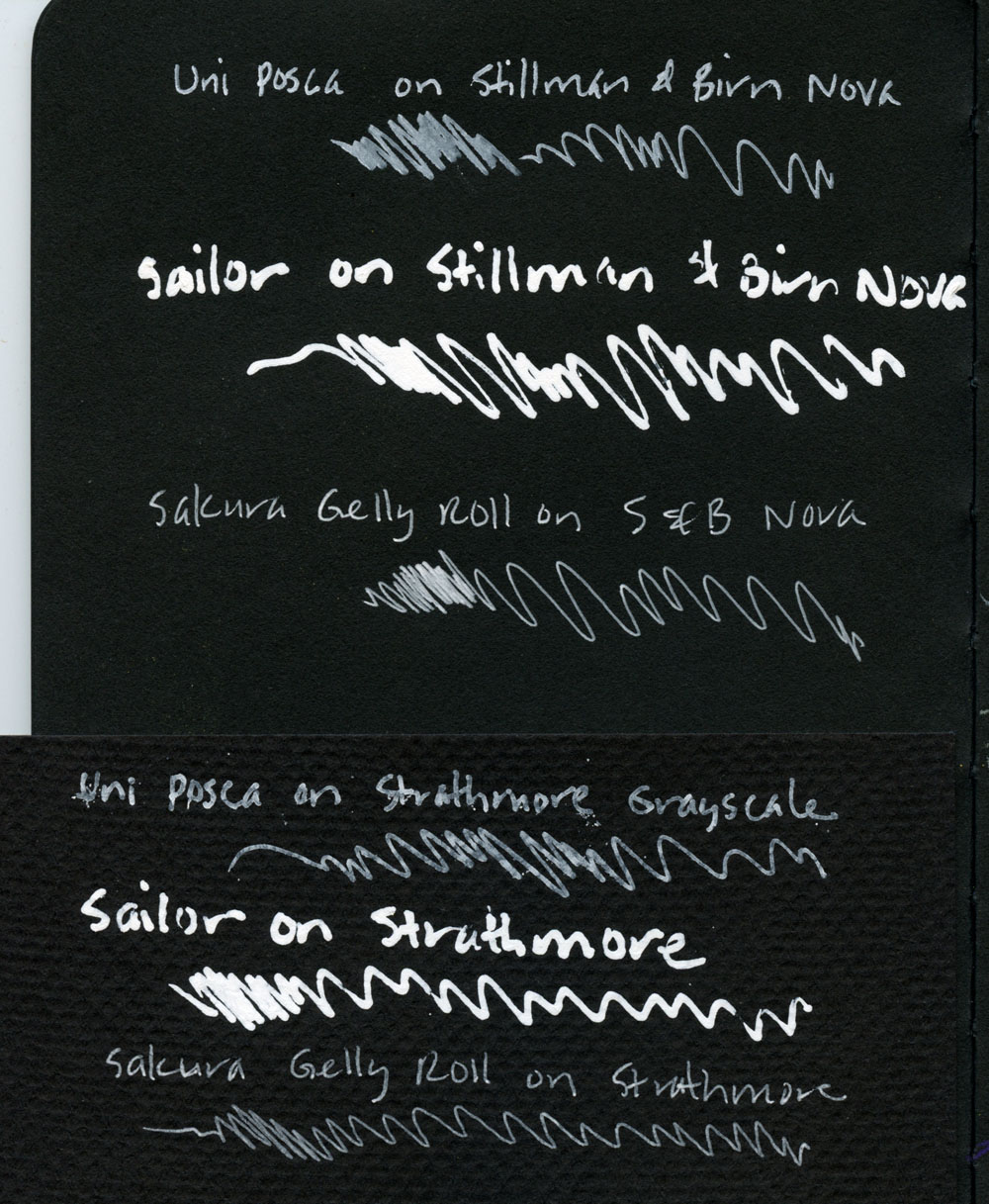
First I tested the pens against the Gelly Roll on two kinds of black paper: Stillman & Birn’s Nova sketchbook and Strathmore Grayscale paper. The two papers are sized differently – Nova is a mixed-media paper that can withstand some liquid; Strathmore is made for dry media – so the white inks appear subtly different. I think they are both slightly more opaque on the Stillman & Birn. The Strathmore Grayscale has a strong texture, which was a bit of a problem for the Posca’s porous tip. It occasionally snagged on the paper’s tooth, causing the ink to splatter.
As always, the kind of paper used with an ink can strongly influence its effect. Just for fun, I also tried the Posca on the black cover of a Field Notes Lunacy notebook. It looks slightly less opaque than it does on either of the other black papers I tested. (The moral of the story is that I may have prematurely rejected some insufficiently opaque pens by using them only on one type of dark paper or another. They might have had better effects on other papers.)

Next I made swatches of watercolor, waited for them to dry completely, and then scribbled over the swatches. Both are more opaque than the Gelly Roll, and the Sailor is the most opaque of the three. The Posca surface crackled – that was an unexpected result. Most important, neither mixed with the watercolor and turned pink as the Gelly Roll did. When I run a waterbrush over the two inks written on plain paper, they are both waterproof after they have dried.

Finally I made swatches of dry watercolor pencil and of watercolor pencil activated with water (allowed to dry completely). The Sailor again remained more opaque in both cases, and again, neither ink mixed with the medium underneath.

In terms of opacity, I prefer both the Sailor and the Posca to my old Gelly Roll. The Sailor, in particular, is probably the most opaque white pen I’ve used. Unfortunately, its tip is too large for most of my writing needs, but I will definitely be using it for other purposes where I want a broader mark. Though broader than the Gelly Roll, the Posca’s tip is fine enough for most of my writing needs (it helps that I have large handwriting).
As for that old Gelly Roll? I discovered that it has a hidden talent. It was nearly out of ink, so I used it to inscribe the paper. Then I applied colored pencil over it, and voila! The writing appeared magically. (Moral of this story: Test for hidden talents before throwing anything away.)

To learn more about pens with opaque white inks, be sure to check out JetPens’ informative Guide to White Ink Pens.
 Tina Koyama is an urban sketcher in Seattle. Her blog is Fueled by Clouds & Coffee, and you can follow her on Instagram as Miatagrrl.
DISCLAIMER: Some items included in this review were provided free of charge by JetPens for the purpose of review. Please see the About page for more details.


 Laura is a tech editor, podcaster, knitter, spinner and recent pen addict. You can learn more about her knitting and tea adventures on her website,


