Pen Show Recaps:
- Atlanta Pen Show 2016! (via Inkdependence)
- Atlanta Pen Show Recap (via My Pen Needs Ink)
- Atlanta Pen Show 2016 Prep (via Reverenced Writing)
- 2016 Seoul Pen Show (Spring) (via Inklode)
- Atlanta Pen Show: Thursday/Friday Recap (via Gentleman Stationer)
- Pen Show Primer, Volume 3: Tips for Surviving the Pen Show (via Gentleman Stationer)
Pens:
- Lamy Safari vs J. Herbin Fountain Pen (via Stationery Wednesday)
- Containing the Chaos of Pen Addiction: Pen Cases and Boxes (via The Pen Addict)
- Kaweco AL Special Fountain Pen (via Pens! Paper! Pencils!)
- Visconti Saturno Blue Titan (via Pen Habit)
- Felt tip face-off: Sharpie Pen vs. Sakura Pigma Micron (via Purl Bug)
- Inexpensive Pens That I Reach For Often (via Clicky Post)
- Kaweco Purple Liliput Quick Look (via Pens! Paper! Pencils!)
Ink:
- Introducing Pelikan 4001 Dunkelgrün Dark Green Ink (via The Gold Standard)
- Diamine 150th Anniversary Blue Velvet (via Gourmet Pens)
- Hieronymus Blue 01 (via Alt. Haven)
- Montblanc Leo Tolstoy Sky Blue (via Inkdependence)
- Tekker Ink Emerald (#226d15) (via Pen Habit)
- Flipping our lids (via United Inkdom)
Pencils:
- J. R. Moon “Big Dipper” Pencils (via Pencils and Other Things)
- A Week with the Blackwing 24 (via The Finer Point)
Notebooks & Paper:
- Understanding Common Paper Sizes (via Goulet Pens Blog)
- When to start a new notebook (via Quo Vadis Blog)
- TWSBI Notebook (via Office Supply Geek)
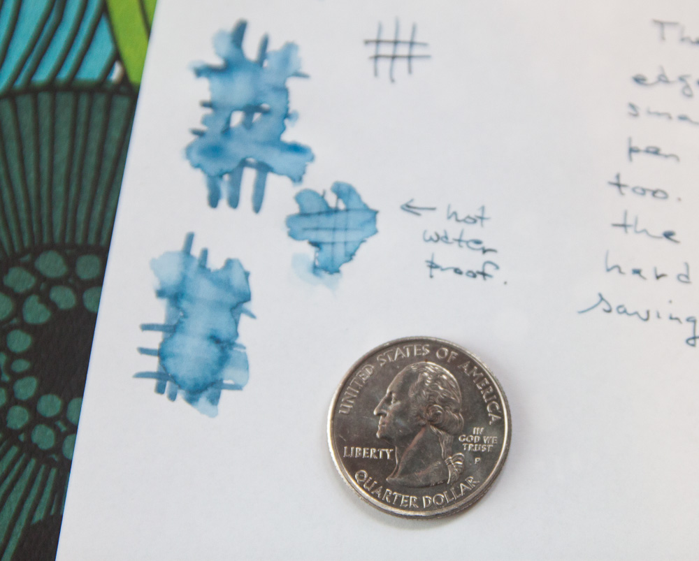
- How to Waterproof Paper (via The Postman’s Knock)
- New Camel TRAVELER’S Notebook (via Seaweed Kisses)
- Midori Travelers Notebook: why you should get one. (via The Ink Smudge)
- Inside a Student’s Bullet Journal with Sareena from Studyign! (via BohoBerry)
Planners & Organizers:
- The Hitch Hikers Guide to the Plannerverse – Episode 9 (via Philofaxy)
- Pomodoro Time Management for Lazy Planners (via Giftie Etcetera)
Other Interesting Things:
- Regis McKenna’s 1976 Notebook And The Invention Of Apple Computer, Inc. | Fast Company | Business + Innovation (via The Cramped)
- March Maker Monthly (via Sketches and Studies/S.Jane Mills)