Article(s) of the Week:
- At 92, Seattle’s Last Typewriter Repair (via Seattle Times)
A shoutout to Tina at Fueled by Clouds & Coffee for the tip. Tina creates gorgeous watercolor drawings with fountain pen ink. Definitely worth a peek!
And, in contrast to the recent “pens are dead” tirade,
- Creative Types From Manolo Blahnik to Milton Glaser on Their Favorite Writing and Drawing Instruments (via NYTimes)
Pens:
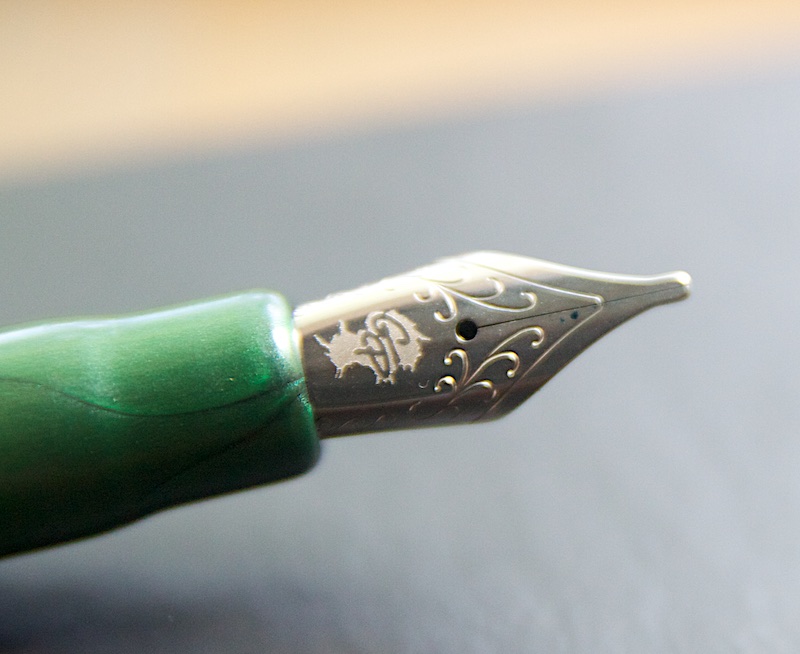
- [Guest Post] Pilot Custom 74 Fountain Pen Review (via Ed Jelley)
- Esterbrook Dip-Less Pen and #7550 Firm Extra Fine Nib (via Fountain Pen Quest)
- Retro 51 Tornado Touch (via From The Pen Cup)
- Pilot Knight Fountain Pen Medium Nib (via Gourmet Pens)
- Diplomat Traveller Fountain Pen (via Pens! Paper! Pencils!)
- Muji Fountain Pens (via Modern Stationer)
- How to Fix an Air Bubble in an Ink Cartridge (via Office Supply Geek)
- The five pens in your daily carry (via Fountain Pen Physicist)
- Kickstarter Pen Projects Watchlist (via Pen Pursuit)
- Pilot Falcon (via Pen Pursuit)
- Pilot Choose gel ink pen 0.7 green (via Pens! Paper! Pencils!)
- Sailor Pro Gear Colors Series Fountain Pen Orange Barrel M Nib (via Clicky Post)
Inks:
- A Comparison of Green Inks (via The Pen Habit)
- Comparison of 73 Bottled Fountain Pen Inks (via Unroyal Warrant)
- Kaweco Palm Green ink (via Pens! Paper! Pencils!)
- Sailor Kobe Inks Tamon Purple (via Write to Me Often)
- Pilot Iroshizuku Ina Ho (via Alt. Haven)
- Graf von Faber-Castell Hazelnut Brown (via Fountain Pen Quest)
- Private Reserve’s American Blue (via Inkdependence)
- Kaweco Elite Fountain Pen (via My Pen Needs Ink)
- Sharpie Metallics (via All Things Stationery)
- Montblanc Jonathan Swift Seaweed Green (via Inkdependence)
Pencils:
- Staedtler WOPEX Eco Pencils (via Office Supply Geek)
- A Proper Pencil Sharpener (via All Things Stationery)
- The Blackwing Slate: The pencil-optimized notebook (via Woodclinched)
Paper & Notebooks:
- Paper Notebooks Explained (via Jet Pens Blog)
- Clairefontaine Triomphe Stationery (via My Pen Needs Ink)
- Marie Curie’s Radioactive Notebook (via Notebook Stories)
- Ardium Classic Notebook (via Office Supply Geek)
- Rhodia Ice Pad (via The Pen Addict)
- Requested: Fountain Pen Friendly Sticky Notes (via Rhodia Drive)
- Nock Co. “Dusty Blue” DotDash Note Cards (via Clicky Post)
- Baron Fig Confidant (via The Newsprint)
- Tomoe River Paper Review (via FP Geeks)
Other Stuff:
- Nock Co. x Dudek Modern Goods Idea Dock (via Modern Stationer)
- Bostitch Executive Stapler (via My Supply Room)
- Does Writing Things Down Make You Smarter? (via Rhodia Drive)
- The Handwriting of Type Designers (via The Cramped)
- D.C. Pen Show 2014 Recap (via Gentleman Stationer)
- Isaac Asimov’s Typewriter (via To Type, Shoot Straight, and Speak the Truth…)