
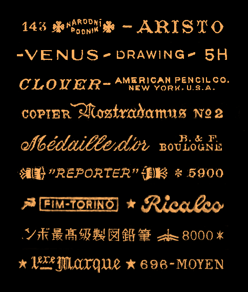
The logos and branding on pencils is quite amazing when you see it like this. Thanks to H&FJ for finding it. The original pieces were culled from Brand Name Pencils a vast array of vintage and modern pencil-nalia.
(via Hoefler & Frere-Jones)
The logos and branding on pencils is quite amazing when you see it like this. Thanks to H&FJ for finding it. The original pieces were culled from Brand Name Pencils a vast array of vintage and modern pencil-nalia.
(via Hoefler & Frere-Jones)

The very sudden acquisition of this ink can be entirely blamed on the folks over on App.net. We got to talking about green ink and voila! this ink ended up in my collection. It’s the Pelkian Edelstein Aventurine which is a deep green color. I love the Edelstein bottles and the posh packaging makes it feel like a true gift to myself and you know how I feel about green. So, of course, I had to give it a try.

I went ahead and tested it here at work using my more professional tools rather than my daily fountain pens and was quite pleased with how it performed. I used three different dip pen nibs on Borden & Riley 100% Cotton Rag Marker Paper with a rough finish.
(I included the Karas Kustoms Render K in anodized green aluminum because its an almost perfect match for the Aventurine ink color. “Hello, Pantone Color of the Year, I think your ink just called.”)
In a swab test, the color appears to be a true green with a little lean to blue but no black or grey overtones. In a stiff nibbed pen, the color is lighter, a nice evergreen green. With flex nibs, the ink pools into variations from a dark forest green to a light, true green. The wider variety of color differences in quite appealing for me and the fact that even in these flex nibs, I got no feathering, splining or blooping was mighty impressive.

The nib on the bottom in the Tachikawa nib holder is my favorite, is the Brause 66 Extra Fine Arrow. It’s a super flexy and requires a delicate touch and probably a little super fine grit sanding paper to polish the end before using.
The middle nib is a Tachikawa G series. It has a medium flex. The top nib is a Central School Supply House Roudebush Vertical No. 2 and is the stiff nib used in the sample writing. Its a vintage nib but some of the standard Speedball Student nibs might perform similarly.
If you’re curious the other nib holders are both wood with a cork grip area, one from General’s and the other is an old Koh-i-noor with a red lacquer finish. Versions of both nib holders can be found at John Neal along with some other awesome nib holder options.
Congrats to Lamont for winning the OfficeMax Mechanical Pencils Giveaway. I will pass your email along to OfficeMax to get you shipping address. Thanks to everyone who left comments!


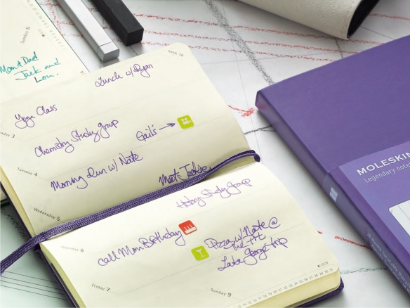
It was recently suggested that I try out the Miro brand of notebooks and I was happy to oblige. I purchased three different versions of their notebooks: a small lined journal (3.25×5.5″), a plain large journal (5×8″) and a set of utility notebooks (3.25×5.5″).

The Miro Journal Series notebooks are definitely going to get comparisons to Moleskines. They are hardcover and have black elastics running vertically, leatherette covers. They have ribbon bookmarks and even have a pocket in the back though its more of a slit than the gusseted pocket found in a Moleskine and other look-alikes.
The most notable difference in the appearance of the Miro notebooks is the colored edges. The Journal Series notebooks are available with either white or black leatherette covers with colored edges. They offer black, cyan, magenta, green or red edging with either cover option.On the covers and spines is a blind embossed logo which is subtle and tasteful.
I purchased the two most familiar sizes– small lined journal (3.25×5.5″), a plain large journal (5×8″)– but they also sell a larger 7×10″ size as well. The medium and large sizes are available in plain or lined versions but the small size is only available in lined. No grid or dot grid options for the Journal Series at present. Each book has 144 pages in it. The Journal Series sells for $9.99, $13.99 and $17.99 respectively.

The utility notebook is hopping on the Field Notes trend. Miro offers the traditional pocket sized (3.25×5.5″) Utility notebook but also a medium (5×8″) and large size (7×10″) which is more likely to be compared to the Moleskine Cahiers. All three sizes of Utility notebooks are available in blank, lined, gird or dot grid paper. They have the simple cardstock covers with either black, white, pink or green covers. Sets of two 68 page notebooks are $3.99, $5.99 and $7.99 respectively.

The lines on the Utility and Journal series notebooks look similar but when I double checked, the line spacing on the Utlitity notebook was 7mm and the Journal Series is 6mm in the same sized books. I don’t find this to be a big deal since the Utility notebooks are more likely to be used on-the-go so a bit more breathing room for the spacing is probably helpful where the Journal Series notebooks are likely to be used for longer form writing, meeting notes and such.
I also want to mention the difference in the papers. Both books feature a warm ivory color comparable to the Piccadilly I use at present. The lines on the paper are very fine but a medium/dark grey. The Journal Series paper is heavier weight (100gsm) than the Utility Series (no weight listed on the packagin). I wasn’t sure how the Utility notebooks would perform with inks.

The stitching on the Utility notebooks is exposed sewn stitching. It looks like a strong stitch and clearly visible. I like the stitching and is different to the staple-stitching on Field Notes. Again, its more consistent with the Moleskine cahiers.

I wanted to show the slit pocket on the back cover of the Journals. There is no gusseting so it won’t keep much, just a few scraps.

In writing samples, I was blown away with the paper quality for the price. I ended up testing a Sharpie at the end just to see if it could stand up to the challenge. None of my pens bled or feathered or splined at all. Even with the lighter weight paper of the Utility Notebooks, the paper still performed very well, especially for the price.
(The smudge on the Pilot Juice writing sample on the the Journal notebooks was a result of an exploding pen on my desk and not dry time on the paper, FYI)

There is a little show through on the reverse but I would definitely use both sides of the paper with almost all of my daily writing tools.
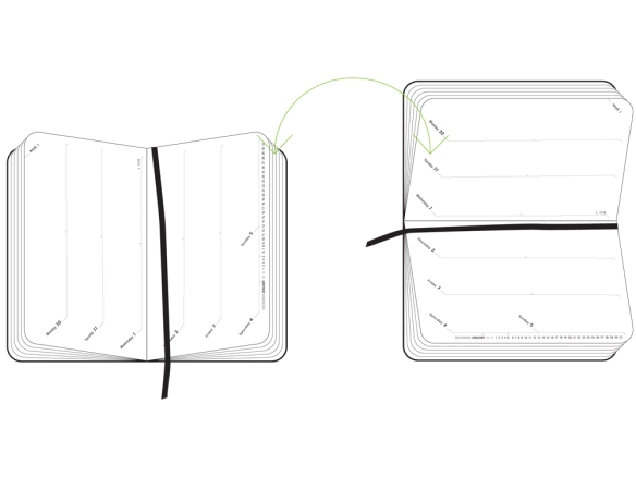
There are eight sheets in the back of the Journal series and four pages in the back of the Utility Series that are perforated so they can be easily removed.
Overall, I think these notebooks are a great value. I have not had time to fully abuse a Miro notebook to see how they hold up to long term use but I feel confident that they will be comparable to the Piccadilly or a Moleskine with great paper and intriguing colored edging. The Utility series is a great alternative to the Field Notes at almost half the cost. Miro also makes some wirebound notebooks with wood or felt covers which are visually more unique.

As the back-to-school season starts its roll forward, all the major manufacturers are releasing their 18-month planners as well as getting a head start on 2014.
Moleskine has released its newest planner format called the Turntable can be used in a vertical or horizontal format. Its available in a hardcover pocket-sized (3.5×5.5″) or large-size (5×8.25″) in several colors from great sellers like Jenni Bick (no, she is not paying me to say that but trust me, its a great shop) for $14.34 or $17.96 respectively.

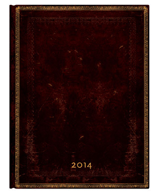
Paperblanks are also offering their planners in 18-month formats or, if you are preparing for 2014, you can choose your 12-month edition now. They have lots of sizes and configurations available and the paper stock is better than Moelskine though not up to Rhodia standards.I have been using the Verso Format Black Moroccan Ultra size for 2013 and will probably purchase another Paperblanks for 2014. Some of the new textures and cover designs are gorgeous.
(For more about my current planner, visit my review of the Paperblanks 2013 planner. I also plan to provide a post-review of my planner after six months of use in the next few weeks.)
I am sure there will be more planners, agendas and calendars in the next few months to share. Do you still keep a paper planner? Do you have a favorite brand?

I’m delighted to congratulate the Pencil Revolution and its founder Johnny Revolution (as I was first introduced to him as) for being one of the first pen/paper/pencil bloggers and one of the longest running blogs on the occasion of its 8th anniversary.
John and his fellow comrades have reviewed pencils, erasers, sharpeners and more with an attention to detail that even a fountain pen lover would find impressive.
To dip your proverbial finger into the world of graphite love, check out the From the Archives series:
Viva la Revolution!
