The very sudden acquisition of this ink can be entirely blamed on the folks over on App.net. We got to talking about green ink and voila! this ink ended up in my collection. It’s the Pelkian Edelstein Aventurine which is a deep green color. I love the Edelstein bottles and the posh packaging makes it feel like a true gift to myself and you know how I feel about green. So, of course, I had to give it a try.

I went ahead and tested it here at work using my more professional tools rather than my daily fountain pens and was quite pleased with how it performed. I used three different dip pen nibs on Borden & Riley 100% Cotton Rag Marker Paper with a rough finish.
(I included the Karas Kustoms Render K in anodized green aluminum because its an almost perfect match for the Aventurine ink color. “Hello, Pantone Color of the Year, I think your ink just called.”)
In a swab test, the color appears to be a true green with a little lean to blue but no black or grey overtones. In a stiff nibbed pen, the color is lighter, a nice evergreen green. With flex nibs, the ink pools into variations from a dark forest green to a light, true green. The wider variety of color differences in quite appealing for me and the fact that even in these flex nibs, I got no feathering, splining or blooping was mighty impressive.

The nib on the bottom in the Tachikawa nib holder is my favorite, is the Brause 66 Extra Fine Arrow. It’s a super flexy and requires a delicate touch and probably a little super fine grit sanding paper to polish the end before using.
The middle nib is a Tachikawa G series. It has a medium flex. The top nib is a Central School Supply House Roudebush Vertical No. 2 and is the stiff nib used in the sample writing. Its a vintage nib but some of the standard Speedball Student nibs might perform similarly.
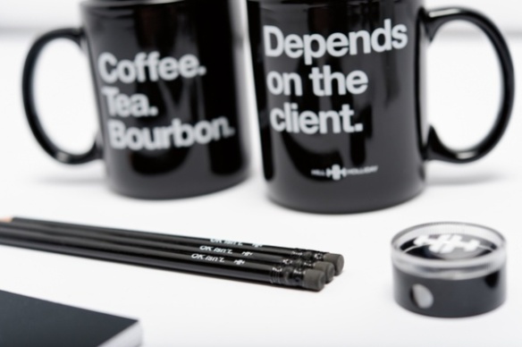
If you’re curious the other nib holders are both wood with a cork grip area, one from General’s and the other is an old Koh-i-noor with a red lacquer finish. Versions of both nib holders can be found at John Neal along with some other awesome nib holder options.