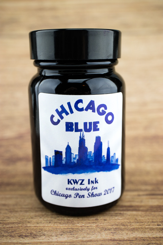
KWZ Chicago Blue (60ml, $15) is an ink color exclusively created for the Chicago Pen Show 2017 but luckily for you, it did not sell out completely. There are still a few bottles left for sale through Vanness Pens. So, even if you weren’t able to make it to the show, you can still feel like you were a part of the event.

The bottle features a watercolor portrait of the skyline and the tagline “exclusively for Chicago Pen Show 2017” so its definitely a collector’s bottle. For those familiar with KWZ ink, it has the signature aroma of lightly menthol-honey that I’ve grown to love when you open the bottle.

Whether you are inclined to associate the color blue with the Chicago Blues music, the Chicago PD (I think more of their black leather jackets there), the color your lips turn on the average February morning (this color may be right on the money there) or the stripes on the city flag (which are actually pale sky blue) – this blue color is the bluest of the blues. It’s practically pure indigo.
We did a few accidental chromographs in Chicago to discover that there was not a hint of red or purple or black in this blue. It’s blue through and through.
Chicago Blue is so dense and dark that it doesn’t shade nor does it have any sheen but its a very rich blue.

I had a tough time finding any other blues quite as vivid. The closest was Noodler’s Ottoman Azure. It was the only color even in the ballpark. I included some vivid blues just to show exactly how deep these blues are without being blue-blacks.
I do find KWZ inks to be viscous, not runny or watery (what other people might describe as “wet” inks). I’d say similar in consistency to Diamine inks rather than DeAtramentis if that helps to give you some sense of the feeling. I’m not a chemist so I don’t know if that consistency will work better for some pens over others but I do find that it makes KWZ inks denser and less luminous. The colors are rich but don’t shade as often as thinner inks do.
I used my Esterbrook #2442 nib in a Shwan Newton holder so I had to dip midway through my writing which resulted in some color differences. I suspect the variations reflect the differences between a medium/broad nib and a EF/F nib. I tested on Rhodia Uni-Blanc paper using 7mm guide sheets. The titles were done with Silver Black Velvet #6 Round Brush. Swatches were done using the Col-o-ring Ink Testing Book, of course.


All those wonderful blues! Do you have a favorite?
So hard to pick just one!
Wow that blue Pops! I like blues like this but with a bit more shading. Think “Private Reserve DC Supershow Blue”, another pen show ink – but one that made it into regular production. See here:
https://www.wellappointeddesk.com/2013/12/dc-supershow-blue/
$15 for a 60ml bottle of KWZ Chicago Blue? Well, now we know why it probably didn’t sell out at the Chicago show.
As for the “menthol-honey” aroma: If you have any, compare the odor with that of Pilot/Namiki Blue ink. Same/similar?
Thanks for the review, David
Hi Ana. I read your handwritten note about Chicago. I visit there often because my brother lives there.
Since you mentioned Italian beef, I thought I’d share this link to a recipe.
http://allrecipes.com/recipe/16427/slow-cooker-italian-beef-for-sandwiches/
If you make it, then I can believe I enabled you. I’ve bought at least one pen you reviewed, and now I want this ink.
Thanks for the recipe! Anything to keep me from getting it shipped from Portillo’s!