
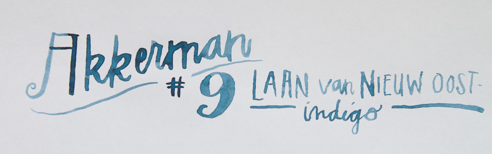
Akkerman #9 Laan Van Nieuw Oost-Indigo ($28 for a 60ml bottle) appears to translate to “New Eastern Indigo Avenue” which is not at all what I expected when I looked at the color. I thought it was like “new moon night sky” indigo or something like that since its such a deep blue color and has a fascinating reddish halo in the swatch.

I paired it with my Lamy Scala in blue black which seemed like a fitting match and the 14K gold nib let the ink color and shade beautifully. Yesterday in the comments, someone mentioned how Lamy pens tended to lighten inks overall which was such a wake up call for me. And I think it probably holds true for this Akkerman #9 too. The ink looks darker in the painted title and I suspect in a wetter pen, the ink would be darker overall. But I think the color is legible and shades nicely in the Lamy so its completely useable even in a drier pen.

Compared with several of my other deep blue black inks, its clear that the Akkerman #9 is bluer and more “denim-y” than most. Noodler’s Bad Blue Heron is probably the only one that’s more blue while maintaining the deep tone of a blue-black. Akkerman #9 seems quite similar in color to the Caran D’ache Magnetic Blue which is not quite as vivid and actually a bit more expensive, if you can believe it.
Are you a fan of blue-black inks? Do you like them more vivid or more subdued? I waffle between wanting a deeper blue-black and preferring a bluer blue-black. Either way, I love blue blacks and Akkerman #9 is no exception.
DISCLAIMER: This item was sent to me free of charge by Vanness Pens for the purpose of review. Please see the About page for more details.
I’m not a huge fan of blue-blacks — if they’re really dark I always think I might as well just use black. But I do like the ones like this one that veer toward the “denim” side of blue-black. That sort of dusty medium-dark blue is very attractive to me.
I’ve studied a bit of German, and Dutch is fairly similar (as is English, lol), so at a guess I probably would have translated this as “Lane of the New-East Indigo” or “New East Indigo Lane.”
But I guess Laan is a false cognate.
Google translate gives me “New Avenue of Eastern Indigo” which is…interesting.
Regardless, it’s a lovely ink! Reminds me of iroshizuku tsuki-yo.
Akkerman is a pen shop in The Hague, third city in size and seat of the Government in the Netherlands. All their inks have names referring to places in the city. This particular ink name refers to the Laan van Nieuwe Oost Indië (Avenue of the New East Indies, referring to the East Indies, or Indonesia, a former Dutch colony), which is one of the main avenues in The Hague.
Dank ya!
I love this ink. It has become one of my favorites. I always have a pen inked with it. Every pen writes beautiful with it.
Pilot Blue-Black. Not too blue, not too black – it’s juuuuust right. And it comes in big honkin’ 330ml bottles. Yum!
I have just bought a bottle of Pelikan Blau-Schwarz (blue-black) ink, which I like. It seems to write more in a blue-gray tone and dry into a much darker gray.
I don’t know if you’d call it a blue-black, but I’m very fond of Iroshizuki Tsuki-yo. It shades very darkly, and it also has a touch of teal in it. I’m a nut for teal, so a blue-black with teal is just awesome!