

Some days… you just think to yourself I can’t possibly have enough blue ink. Today was one of those days. So, of course, I bought Colorverse Supernova #14 and Colorverse Quasar #13. Because when you think you don’t have enough blue ink you tend to buy really expensive blue ink that come with two bottles in each box. Each set comes with a 65ml bottle and a 15ml mini bottle of each color. So, I’m loaded for blue!
(For more details about Colorverse ink, check out my overview post.)


I decided it would be best to line all the Colorverse blues up for a side-by-side comparison. Proxima B is by far the darkest, Saturn V is a tried-and-true workhorse blue. Crystal Planet is an out-of-this-world International Klein Blue. Supernova and Quasar introduce red sheen with Quasar being more like Saturn V with sheen and Supernova being Crystal Planet bit darker version with sheen.
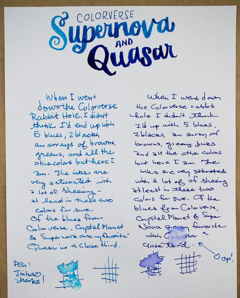
In writing, the sheen shows through, even with fine nib pens. Supernova shows more shading than Quasar and tends to look more turquoise than in initial swab samples. Water resistance? Nope.

Compared to other swatches, Supernova was similar colorwise to some favorites like Bay State Blue, Private Reserve Cosmic Cobalt and Kaweco Royal Blue but adds that fan favorite sheen to the mix which shifts the hue a tiny bit but the underlying color is that same bright blue. Sailor Jentle Nioi-Sumire has a similar sheen but is a bit more violet blue.

Quasar was a bit harder to match. Surprisingly, the new Krishna Moonview was quite similar in color but I’ve not been able to experiment with the Krishna inks much so I don’t know a lot about its overall performance yet, Those are next up in my queue to start reviewing. Interstingly, Organics Studio Nitoogen was quite similar in color so if you are looking for a similar color to Nitrogen with LESS sheen, Quasar might be a good alternative. Quasar has some sheen but not the dizzying sheen found in Nitrogen. Sailor Jentle Souten has a similar sheen but is a little lighter in color. It was not light enough to match Supernova but not as dark as Quasar. Ink colors are a constant game of degrees of difference. One ink has too much shading, one does not have enough. One is too dry, one is too wet. Ad we as ink consumers are always looking for the perfect pen-and-ink combination.
If you are still searching for the perfect blue, maybe one of the Colorverse blues will be the one for you. I’ve certainly enjoyed experimenting with them. I will definitely pull together a list of my favorites at the end of these reviews. I am discovering that the more inks I acquire, the more colors I like.
TOOLS
- Paper: Rhodia Uni-Blank No. 16 with 6mm guide sheet
- Pens: Midori bullet pencil modified dip nib holder with Zebra G titanium nib ($33.50 per 10-pack), Acrylic nib pen (Approx. $15), Jinhao Shark Pens ($17 for dozen pens)
- Swatches: Col-o-Ring Ink Testing Cards
- Brush: Blick Synthetic Round #0
- Ink: Colorverse Supernova #14 and Colorverse Quasar #13 ($36 for two bottles 65ml and 15ml each with same color ink in both bottles)
DISCLAIMER: These items were sent to me by Pen Chalet for the purpose of review. Please see the About page for more details.
You can never have enough blue inks–and these are amazing. I have really loved your Colorverse series… thank you so much!
Colorverse Supernova reminds me a little of Purepens’ Celtic Sea in some of your pictures! Lovely review, thanks for sharing.