
Review by Laura Cameron
I wasn’t able to attend this year’s LA Pen Show, but my favorite pen show attendee brought me back a bottle of the special show ink, Monteverde’s Coral.

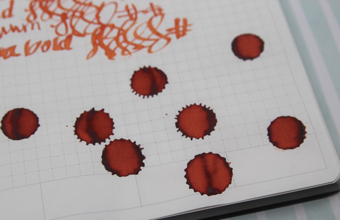
It turns out that Monteverde’s version of Coral is a very orange ink, leaning slightly red.

When I compared it to other ink swatches I had in my “stash” it looked pretty close to Robert Oster’s Red Orange or Monteverde’s Mandarin Orange. I had the special Papier Plume Heart of Gold ink ready to swatch at the same time and it has a bit of a reddish orange look as well.


When I compared the Monteverde to what I traditionally think of coral (like J. Herbin’s Corail de Tropiques) they don’t look similar at all.
In my other ink tests, I really found Monteverde’s Coral to lean very orange. I got almost no red in the regular writing experience, though I did get some really dark shading especially in the ink dots.


Overall, Monteverde Coral seems like a great orange, but I’m not sure it satisfies my need for the one true coral ink!
- Papers: Maruman Mnemosyne N182A Inspiration Notebook A5 ($10.50), and Crossfield Journal ($24.00)
- Pen: Delike Glass Signature Pen ($37.80)
- Swatches: Col-o-Ring Ink Testing Book ($10) and Col-o-Dex Rotary Cards ($15)
- Inks: Monteverde Coral (LA Pen Show 2019)
DISCLAIMER: Some of the items included in this review were provided to us free of charge for the purpose of review. Please see the About page for more details.
Nice. We picked up a bottle of the ‘coral’ from the monteverde booth this weekend at the Atlanta Pen Show!