

New ink!
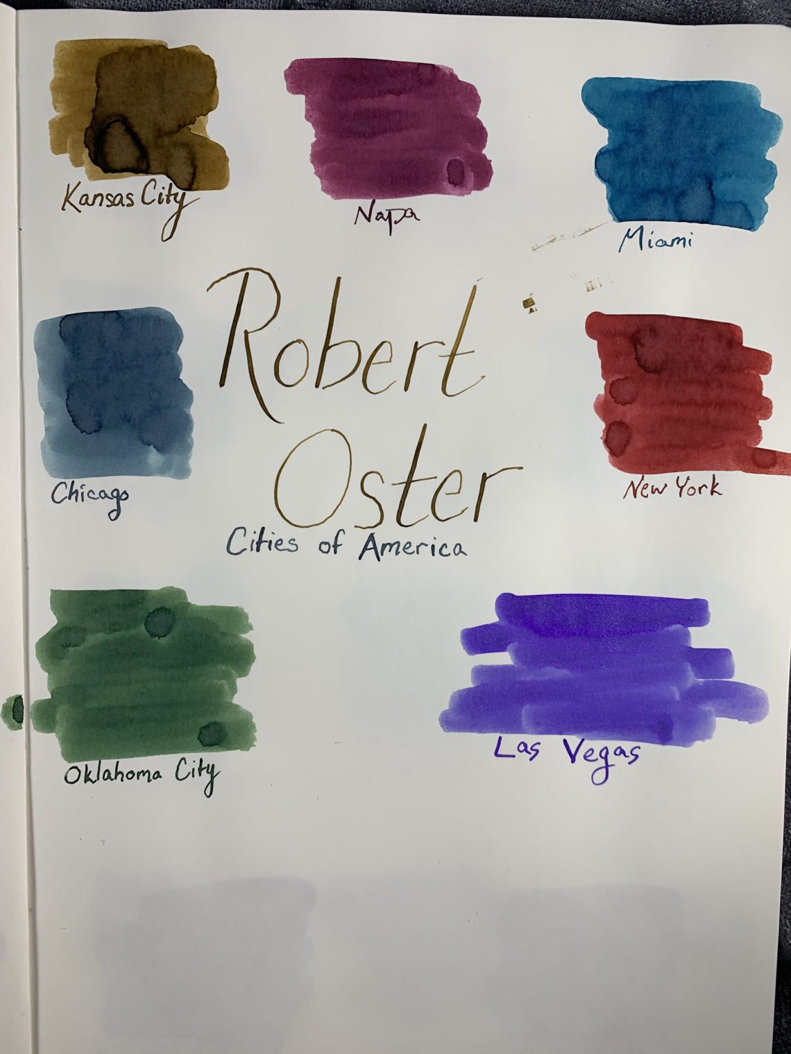
Robert Oster has started to release inks inspired by various cities in the United States. As of today, seven inks have been released:
Napa, California- a deep wine red
Chicago, Illinois- steely, snow-inspired blue
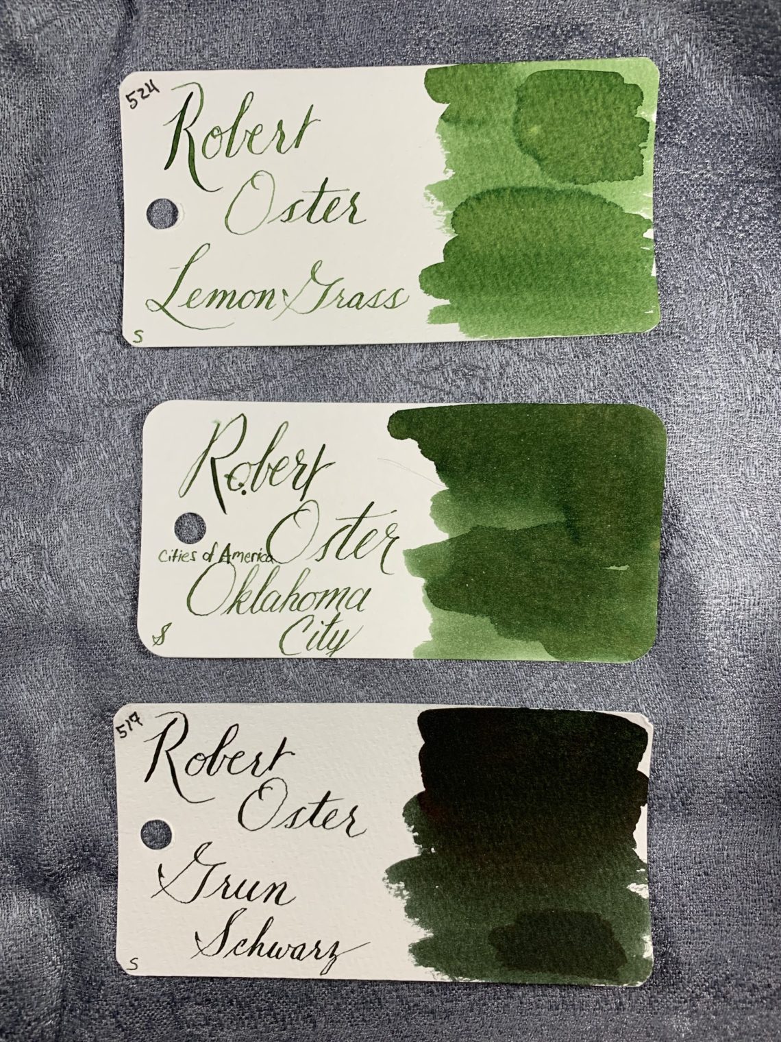
Oklahoma City, Oklahoma- a grassy plains green
Kansas City, Kansas- a golden brown inspired by the wheat belt
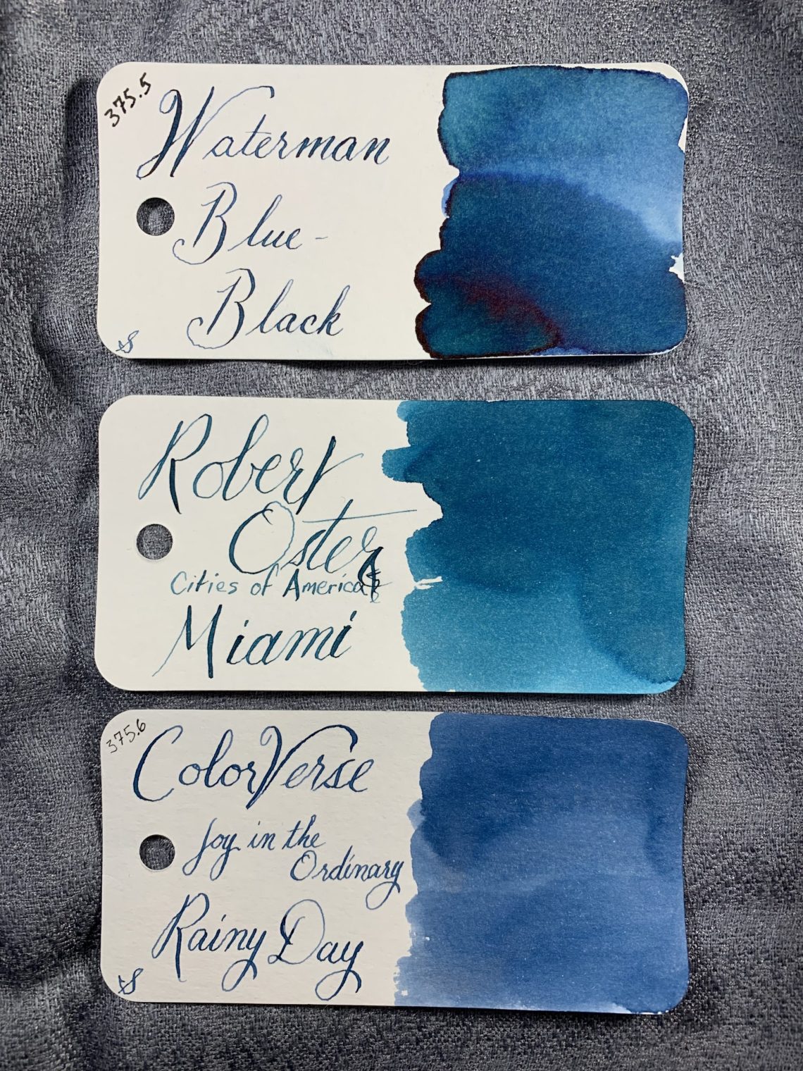
Miami, Florida- a blue-green inspired by the water
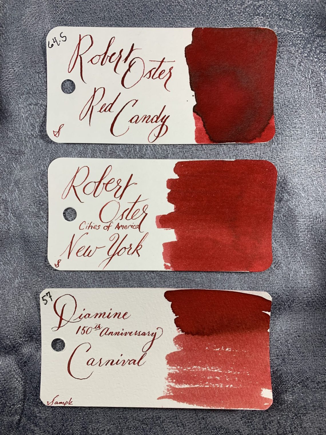
New York, New York- bright red for The Big Apple
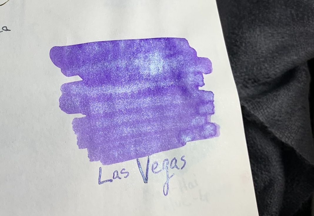
Las Vegas, Nevada- a shimmering purple inspired by the glitz of Las Vegas
I purchased my samples from Vanness where they were $3.00 ($3.75 for Las Vegas) for 4mL and the bottles run $18 for 50mL ($26 for Las Vegas).
Oklahoma City is a grassy green color, somewhere between Robert Oster Lemon Grass and Robert Oster Grun-Schwarz. This is going to be one that Ana likes!
Napa is a fabulous burgundy – very much a wine color.

Chicago. This one is probably my favorite (other than Las Vegas, because, of course, it’s purple)This is an ink that shows multiple layers of color – not quite multi-chromatic, but almost. It is very close in color to several vintage iron gall blue-black inks.

New York is a bold red lighter than Robert Oster Red Candy.
Kansas City is a great ink for shading. I would say ripe wheat is about right for this color description – a brownish gold.

Miami is an ink that I had expected to be more turquoise. Like Chicago, it is close to several vintage blue-black iron gall inks but it leans much more towards the blue side.
The swatches I had seen of Robert Oster Las Vegas looked nothing like the color that came out of this sample. Las Vegas is a mid-lavender with plenty of sparkle – either silver or a pale blue. Although the sparkle is hard to see in this photo, the second photo below is better.

WONDERFUL sparkle. Amazing purple. This ink makes me feel like I’m 8 years old again.

I mentioned that Chicago and Miami both looked like vintage blue-black inks – here they are side by side.

Below are swatches of the seven inks on Tomoe River Paper:

And Las Vegas shimmer close-up on Tomoe River paper:
The seven inks on Cosmo Air Light paper:
And the Las Vegas shimmer shot on Cosmo Air Light paper:

Tomoe River paper is on the left and Cosmo Air Light paper on the right. The difference in how color shows on the two paper types still amazes me – on CAL, Miami is darker but Chicago and Napa are lighter.

So there you have it! Robert Oster Cities of America inks:

DISCLAIMER: The items included in this review were provided at a discount for the purpose of review. Please see the About page for more details.
Jessica,
The difference paper makes always takes me by surprise as well. That's a nice palette of colours.
Ruth
I LOVE that Las Vegas ink. Such a beautiful colour!
How about a chrome-silver for Detroit? Maybe a deep reddish orange for the clay around Atlanta and a fuzzy, smoky brown for Houston’s smog?