
For those of us who living in states that don’t already have a Sailor Ink color, have you pondered what your state’s ink color would or should be?
My home state (where I was born and grew up), California, has already been done, and Jesi reviewed it previously:

But I’m still waiting for Kansas, so it’s fun to think about what it could be. Kansas’ state flower is the Sunflower, and I could totally go for a golden sunflower yellow (or would that be too close to New Jersey?) The Kansas state bird is the Western meadowlark, which has a bright lemon yellow belly. If we’re playing on the Wizard of Oz, the colorway could be Ruby Slippers?

Colorverse on the other hand, has their USA Special Series highlighting US cities. My personal favorite there is Fabulous Glistening Las Vegas. a sort of flamingo pink ink with shimmer. When I think about Kansas City, I think about fountains so I could easily see a watery blue. We’re also known for our BBQ (don’t get into a debate about which BBQ is the best – it will only end in a fight!) so we could be up for a burgundy color.
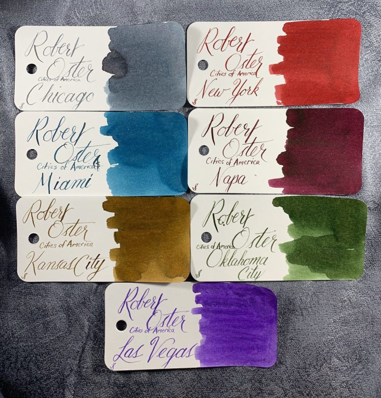
Robert Oster is also tackling Cities of America. According to Jesi’s review, Kansas City’s color has already been decided, along with a few others!
So do you have any thoughts about your city or state inks? If you live outside the US, I’m sure you want country/state/province/city inks as well right? What color do you think your geographical signature ink should be?
Iowa has also not been released yet. The state university colors are black and gold, but I think New Jersey has gold locked up (and it’s a nice version). The state flower is the wild rose, so maybe a pink? That would not excite me too much. The state bird is the Eastern Goldfinch (there’s that black and gold again!) The state tree is the oak, and I would love a great oaky brown. But given that we grow lots and lots of corn and soybeans, perhaps a green is in our future? It will be exciting to see.
Well, Kanas ought to be silver if we are going with the Wizard of Oz theme. Oz being the abbreviation for ounces and silver vs. gold monetary policy being the original target of the book. If I remember correctly, her shoes were changed from silver to ruby because Ruby showed up better on 1930s colour film technology.
Why importantly, what about an ink colour for Canada?
I could go for a nice ruby. A bright sunflower yellow wold be good too, something bolder than the Oster. Look, as long as it’s not purple for Kansas. Can’t have people thinking that KState is actually a thing. #rockchalk 🙂
I’m waiting for Missouri.
Seattle ink would be pale brown with a cool green sheen: coffee diluted with raindrops reflecting evergreen trees.
Oooo that sounds perfect!
Virginia is pretty cool, actually. Wine red with a cool, gold sheen. Great … now I have ANOTHER bottle of ink to buy. sigh