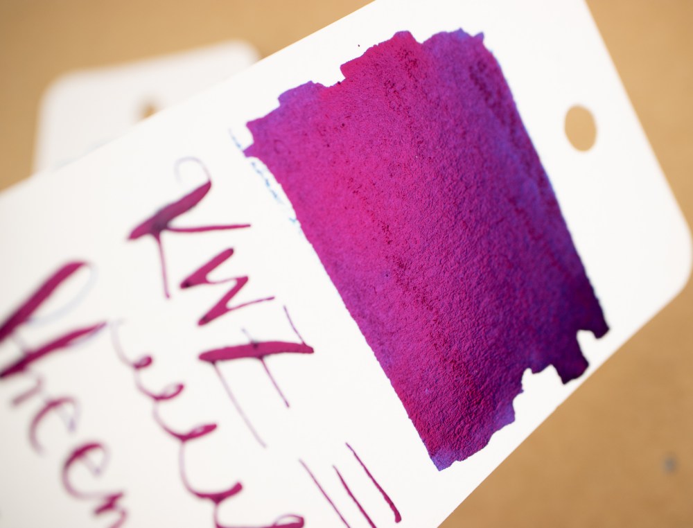
12 Days of Inkmas: Day 2 Van Dieman’s Styx Valley Forest Green

This year for Inkmas I decided to search out new-to-me ink brands in colors appropriate for the holiday season. The first of these is Van Dieman’s Styx Valley Forest Green (30mL for $12.95).

This rich, foresty green is a perfect winter holiday green. It reminds me of pines and holiday boughs on the mantle. The ink itself was lovely to work with, but the saturated ink blots took forever to dry – over 24 hours.

In terms of comparisons, I think it’s fairly close to Yoseka Origins #1. Colorverse Alpha Centauri is similar, but a bit more yellow in tone.


DISCLAIMER: Some of the items included in this review were provided to us free of charge for the purpose of review. Please see the About page for more details.

12 Days of Inkmas: Day 1 Colorverse Shiny Black & Ornament Yellow

12 Days of Inkmas: Day 1 Colorverse Shiny Black & Ornament Yellow

Welcome to The Well-Appointed Desk annual Inkmas. Inkmas was born before Inkvent calendars and other inky countdowns so we have decided to continue our tradition as it is — a mix of new inks and old favorites which may or may not have been reviewed here before (we’ve been know to review the same inks and products more than once — they are either that good or that ridiculous, you be the judge!) We hope you enjoy our countdown to the holidays and hopefully you’ll find an ink or two that you hadn’t seen and absolutely must add to your holiday shopping list.

As our annual Inkmas approached, I made a trip down to my office and took a quick glance over my ink collection with one thing in mind: What we’re the inks that had gone unused or that I had overlooked in the last year that deserved some love?

Two inks immediately jumped out to me for an obvious reason. I had purchased full bottles Colorverse Shiny Black and Ornament Yellow at the very end of 2020, and not only had they gone unused for all of 2021- they weren’t even opened!

In my mind, they made ideal candidates for an Inkmas review for a few additional reasons. Between the ink names and bottles (did you see those shiny silver trees though??) they are definitely rocking the holiday vibes. They also happen to be the colors of my alma mater- which rose to the number one basketball team in the land for the first time in history this week (and yes, they lost the very next game but in these times shouldn’t we take every opportunity we have to celebrate?).

And finally, yellow and black are two colors that I tend to overlook when I’m both buying ink and inking up pens. There’s a piece of me that tends to think yellows will be unreadable and blacks will be boring. Time to give these two inks a chance to prove my assumptions wrong.

Colorverse Shiny Black is a true jet black ink with silver shimmer, while Colorverse Ornament Yellow is a golden yellow ink with a pinkish shimmer and a bit of sheen.

In writing, Shiny Black continues to be- well- shiny! The silver shimmer distributes evenly throughout nearly every letter. It’s hard to capture fully in a photo- but wow this ink really sparkles in the light!

The shimmer of Ornament Yellow gives the ink a pink or almost rose gold tint especially in areas where the ink pools. The additional color almost gives the ink the illusion of shading- and makes the yellow very readable. One assumption de-bunked, and one to go.

Did I really say black inks are boring? The amount of character that was evident with all these black inks side-by-side really surprised me, and made me want to ink one up ASAP. Looking at Shiny Black specifically, the silver shimmer makes it a unique addition to my collection.

The yellow hues also have some really unique and complex characteristics. Comparing Ornament Yellow to a few of the other yellows and golds that I own- the yellow color is similar to others, but it is again the unique color of the shimmer that sets it apart. The shimmer is a little more subtle than the shiny black, but i think I’m a big fan of the rose gold color.

Overall, I re-discovered an anything-but-boring -black and a very readable yellow with impressive rose-gold highlights. Im glad I revisited these! What inks have gone under-the-radar for you this year that might be worth looking at again?

Ink Review: TWSBI Forest Green

Ink Review: TWSBI Forest Green

TWSBI released 5 new colors in their ink lineup – Grape, Tangerine, Navy, Crimson, and Forest Green. I purchased a bottle of each at Vanness where the 18mL bottles were $6.50 each, coming in around $0.40 per mL. Today I’ll be showing Forest Green. Don’t forget to read about Grape from last week!

Forest Green is a bit misnamed. I picture forest green as much darker, dustier. TWSBI’s take on forest green is a bright emerald green.

Forest Green fits right in with the standard green from several other lines – Lamy, Aurora, Monteverde, and Rohrer & Klingner are close matches.

The shading from Forest Green is great. I’ve used a medium nib from Narwhal for my writing samples and it produced the shading you see below.

Sheen! The best kind of sheen in my book – it only shows up occasionally and is never overwhelming. I’ve also never had smearing issues with this level of sheen.

As I showed with TWSBI Purple last week, the bottles are beautiful. They are made of thick, frosted glass and feel heavy for their size. Every bottle is clearly marked with the color and name.

I’ve included all five new TWSBI colors swatched on Tomoe River paper:

And on Cosmo Air Light paper:

The finish of Forest Green on the two paper types is quite different. Cosmo Air Light paper shows the ink as a bit chalky or dusty.

The entire set of new TWSBI inks can be purchased at most ink retailers. Even with the small bottle size, I’m glad I purchased a full bottle of Forest Green – a great standard green that looks even better with the shading and sheen.

DISCLAIMER: The items in this review were purchased by me and I was not compensated for writing this review. See our About page for more information


Link Love: Ink Aches

Link Love: Ink Aches

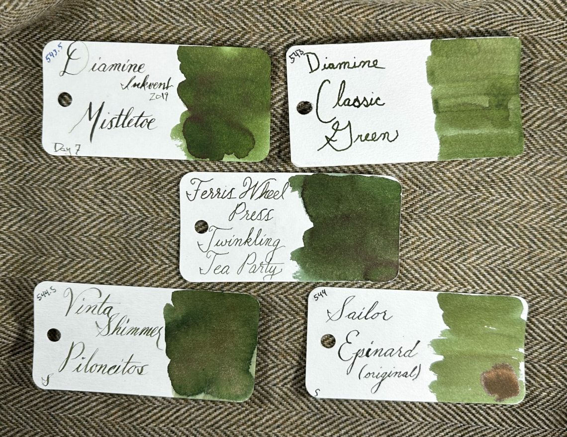
I had grand plans this morning to write about all the Diamine Inkvent inks — both this year’s set and the Fountain Pen Pharmacist’s post about the 2019 set. However, I got whammied with a headache today so you’ll have to believe me when I say I had great wisdom about the inks. Or maybe I didn’t. Go forth and click links. I’m going to lay down until my head stops torturing me.

Pens:

Ink:

Pencils:

Notebooks & Paper:

Art & Creativity:

Other Interesting Things:

We need each other. Please support our sponsors and affiliates. Your patronage will let them know you appreciate their support of the pen community. Without them, and without you, we could not continue to do what we do. Thank you!

Ink Review: PenBBS #140, Bloom

Occasionally I get a sample of something I must have a bottle of. Such was the case with PenBBS #140 Bloom (60mL for $16). If you’re looking for metallic dust, you CANNOT go wrong with PenBBS. They have the finest sparkle I’ve seen, and Bloom is a gorgeous orangey red with gold glitter.

The sparkle is actually incredibly hard to capture. It’s easily seen as you look at the ink swatches, but I have to turn the camera just right in the light to get that sparkle and shine there.

I think this one would be a fun one for the holidays; especially to address your holiday card with? It’s bright and cheerful and the hint of gold makes it feel super festive.

In terms of what it compares to in my ink stash, I was sure I had lots of comparisons and then didn’t find as many as I thought. It’s a little more orange than PenBBS #220, Watermelon Red, and parts of it actually look quite close to J. Herbin Corail des Tropiques which I really didn’t expect. I was eager to compare it to Papier Plume’s Heart of Gold, but I found that Heart of Gold was much more tomato/orange.

My only complaint about Bloom is that it comes out fairly lightly in writing – I wish I could get more of that color saturation. Maybe I’ll throw it in a wider, wetter nib and give it a try on this year’s holiday cards!


DISCLAIMER: Some of the items included in this review were provided to us free of charge for the purpose of review. Please see the About page for more details.

Well-Appointed Holiday Giveaway

Well-Appointed Holiday Giveaway

This year it seems appropriate to give a little back to our fabulously supportive readers. In the spirit of giving, I am giving away ONE (1) $50 spending spree to either our Big Cartel OR Etsy shop. (That’s right our international readers can enter this one too.)

TO ENTER: Leave a comment telling me (1) either what you have always wanted to buy from our shop or (2) how you are “paying it forward” this holiday. Play along and type in something. It makes reading through entries more interesting for me, okay? One entry per person.

If you have never entered a giveaway or commented on the site before, your comment must be manually approved by our highly-trained staff of monkeys before it will appear on the site. Our monkeys are underpaid and under-caffeinated so don’t stress if your comment does not appear right away. Give the monkeys some time.

FINE PRINT: All entries must be submitted by 10pm CST on Friday December 10, 2021. All entries must be submitted at wellappointeddesk.com, not Twitter, Tumblr or Facebook, okay? Winner will be announced on Monday. Winner will be selected by random number generator from entries that played by the rules (see above). Please include your actual email address in the comment form so that I can contact you if you win. I will not save email addresses or sell them to anyone — pinky swear. If winner does not respond within 5 days, I will draw a new giveaway winner. Shipping via USPS first class is covered. Additional shipping options or insurance will have to be paid by the winner. We are generous but we’re not made of money. US and APO/AFO only, sorry.