Review by Tina Koyama
For years, I tried every pocket-sized notebook on the market, hoping to find one with paper that I could use for both writing and sketching with fountain pens, water-soluble colored pencils, brush pens and maybe even watercolors. Frustrated, I even made my own for a while. Eventually, instead of continually being annoyed that notebooks intended for use with pencil or ballpoint couldn’t meet my demands, I asked myself: Why not just sketch with simple media that these notebooks were made for? I changed my attitude instead of my notebook. Most Field Notes Brand notebooks have met my needs adequately, if not ideally, and I’ve been adequately happy. I stopped shopping around.
Fast-forward several years, when someone who knew I enjoyed using red Field Notes Sweet Tooth edition notebooks (long out of production) contacted me: Did I know about Uglybooks?

Made in New York, Uglybooks are simple, staple-bound, pocket-size notebooks like so many others on the market – with two significant differences: They contain 48 pages of unruled, 80-pound paper, and the paper inside is colored. I had never seen a pocket notebook with 80-pound paper of any color! Excited about both features, I ordered cautiously (I’ve been disappointed too many times by other claims of high-quality paper).
The product description and main branding appear only on the plastic wrapper. When removed, the wrapper reveals covers that are entirely blank – an ideal blank slate for stickering or drawing on. The only branding that remains is a logo on the back cover.


The colored covers contrast well with their interior papers. While design is minimal, it’s clear that someone is having fun pairing paper colors and naming themes with appropriate titles.


The “No. 1 Tall” size I bought is 4-by-5 ¾ inches, which is just a smidge larger than the classic pocket size of 3 ½-by-5 ½ inches. Uglybooks are also available in a “No. 2 Wide” 8-by-5 ¾ landscape format. Although the classic pocket size is fine for thumbnails, I’ve always felt a little cramped otherwise. Uglybooks are an ideal size – a bit more real estate for sketching, yet small enough to fit in a bag pocket or my smallest fitness-walking bag.

At three books for $16, the pocket-size Uglybooks are priced competitively for a slightly larger size and heavier paper. The larger, landscape-format books are three for $30. (It’s worth noting here that when I had a minor shipping issue, customer service took care of me immediately. I don’t take good customer service for granted anymore – it’s worth a lot to me.)
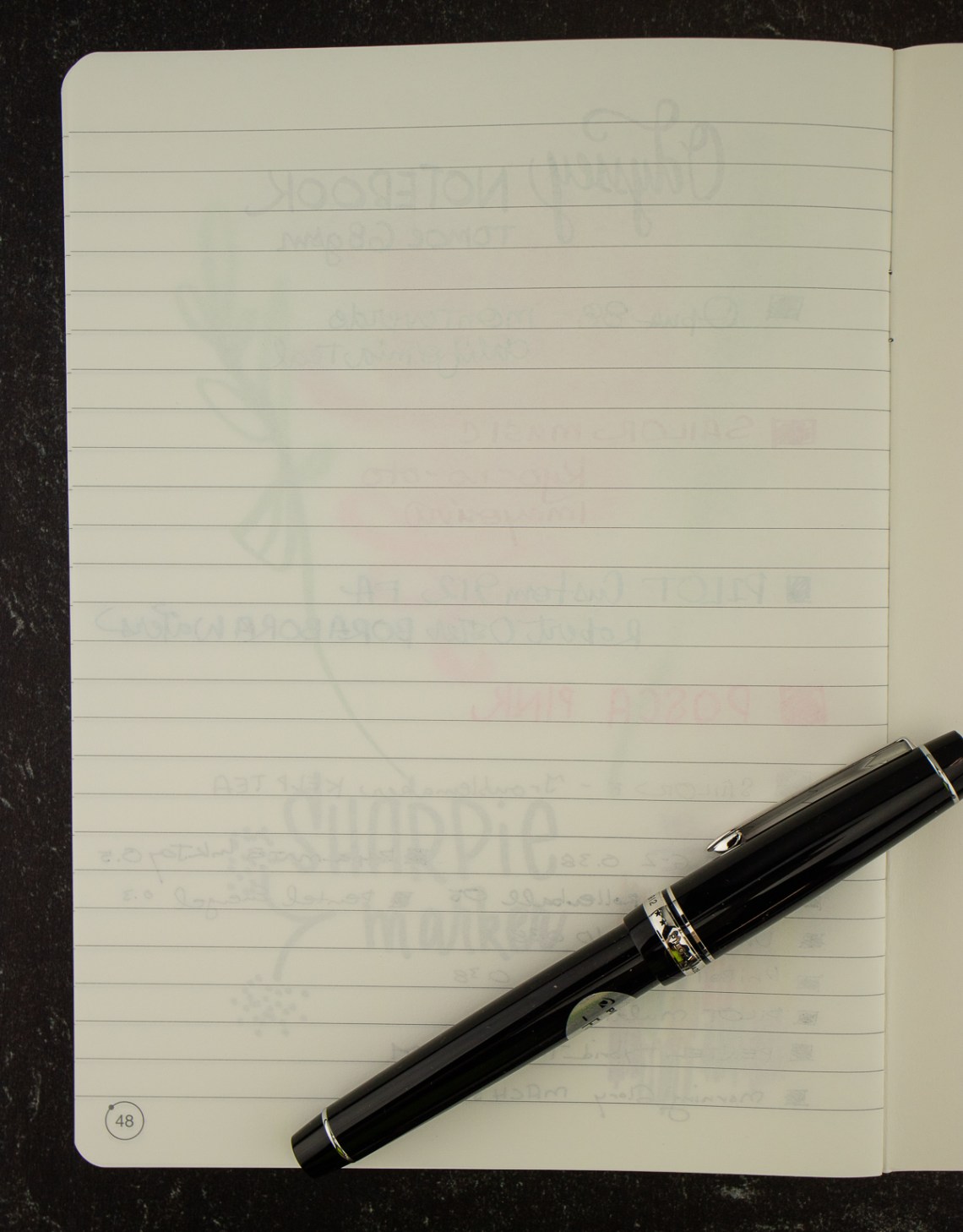
All books feature hefty paper inside and out: 80-pound interior paper and 111-pound cover stock. Gold staples are a nice touch. “Because the paper in Uglybooks are so colorful and durable, we encourage you to try out whatever type of mark-making utensil you have!” says Uglybooks. Challenge accepted! (The brown paper shown below is “Smores.”)


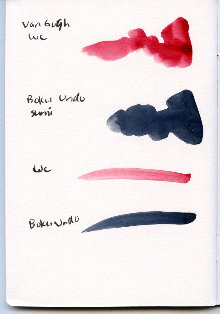

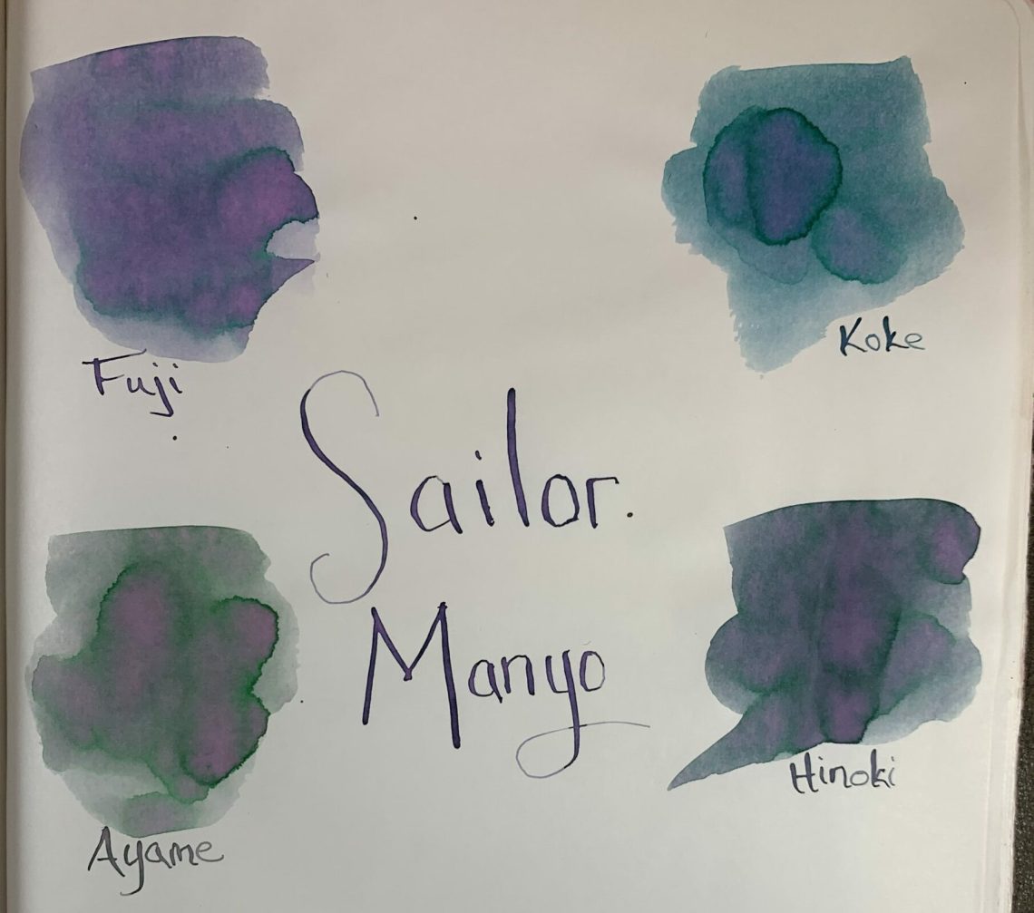
The paper surface is mildly toothy but has no visible pattern. Media tests yielded no surprises. The only materials that bled through were the Sharpie and juicy washes of watercolors. I wouldn’t recommend this paper for watercolor painting, but light, dry-ish washes are fine.
Long before I made the test swatch pages, I took an “Atlantic” book (navy cover with mossy green interior; the actual interior color is less blue than it appears in my photos) out for field testing. The green is just the right midtone for use with a black brush pen and a white pencil or gel pen, my favorite combo for quick urban sketches and value studies. My juiciest brush pens and Sailor Naginata fude fountain pen, which usually bleed through typical notebook papers, were no match for this 80-pound Uglybook paper! No bleeding at all.


The “Cane” book (red cover with white interior paper) became my field test for water-soluble colored pencils. As expected, the paper took light waterbrush washing better than other notebooks I’ve tried – no buckling or bleeding. Although the sizing is probably not intended for watercolors, it was enough to keep my Caran d’Ache Museum Aquarelle colors true. The only treatment the paper couldn’t handle was a heavy water spritz, which caused the color to bleed through to the reverse side, and the paper buckled.

I was impressed! In my next order, I didn’t hesitate to get all the colors I wanted, and it’s a good thing I didn’t. When I went back to the site a week or so later, all the color options had been changed – and the colors I had ordered previously were no longer available! Uglybooks are apparently limited editions, which means that if I really like one, I’d better hoard buy extras! (I’m guessing that white interior paper is always available.)
An interesting addition was the “Mystery” pack, which promised “cover and interior pages picked completely at random.” Who could resist that? Spoiler alert: Here’s what I got – that yellow looks very promising! I don’t know whether every Mystery pack purchase contains the same three colors, or distribution is truly random, but either way, it’s fun to get a surprise.

Just as I was working on this review, I learned that Uglybooks had recently acquired Word notebooks – an interesting development. I hope that doesn’t change Uglybooks’ current focus, which serves a unique niche. A great size, unruled, high-quality, 80-pound and colored paper – Uglybooks, where have you been all my life?
(These Uglybooks were purchased with my own funds.)
 Tina Koyama is an urban sketcher in Seattle. Her blog is Fueled by Clouds & Coffee, and you can follow her on Instagram as Miatagrrl.