Van Dieman’s ink line. Wow. Australia seems to have some amazing inks recently and Van Dieman’s is no exception. One thing I have noticed about these Australian ink makers is the huge number of inks they create, so I have been forced to believe that Australia is just a more colorful place that needs many inks to describe the variety.
Van Dieman’s has an incredibly large lineup at the moment so Ana and I have divided up the line in order to bring you a preview. Lisa and Davina from Vanness sent samples of these inks so I could review them – thank you ladies!
The first group I’m tackling is the Seasons.
I’m a big fan of Mountain of Ink’s palettes, especially those coordinated to the various months or seasons of the year. I love that these Seasons inks fit so well with each season.
Spring makes me think of new growing things and rain storms.

Summer gives me a feeling of bright water, violent storms, plentiful fish, rocks baking in the sun perfect for a snake.

The Autumn inks remind me of forests changing color and harvesting the last produce.

I found myself very drawn to the Winter inks in this line, especially Launceston Fog and Morning Frost. Morning Frost and Huon Festival are shimmer inks, with Huon Festival containing a lot of sparkle. I already have a full bottle of Launceston Fog ordered and on its way to me. Once I inked up two pens with very different nibs (one broad italic, the other a Japanese extra fine), I fell in love with the ink that can range from medium brown to light olive green to warm grey, all with a teal undertone.

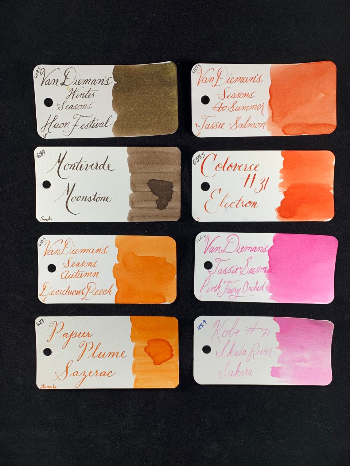
There are the four Seasons! To show a comparison of each ink to another ink (that way you can hopefully get a fairly accurate idea of the color) and sorted them by color groups.
Blue to Purple:

Green to Blue:

Yellow to Green:

Brown to Orange to Pink:
Some of the Van Dieman’s inks are somewhat watery when first going down on the page – not free flowing or lubricated. Somewhat like J. Herbin or Callifolio inks. They each darken as they dry. I found Pink Fairy Orchid and Swallowtail Butterfly to especially show this quality. Launceston Fog is nearly the same – darkens quite a bit as it dries. The wetness in writing is average and there was never feathering or bleed through – Launceston Fog and Deciduous Beech are both very easy to clean out of pens.
These are also amazing inks for using in art rather that just in writing. I’ve been told there are several artists specifically using Van Dieman’s inks.
The price for Van Dieman’s bottles is $12.95 for 30mL or $2.50 for 4mL samples at Vanness – a great price for these colors.
- Swatch Cards: Col-o-ring cards (100 for $10)
- Ink: Van Dieman’s Seasons ($12.95 for 30mL or $2.50 for 4mL sample)
DISCLAIMER: The inks in this review were provided free for the purpose of reviewing including the Col-o-rings which are provided to me by Ana because she knows she can keep me writing all the time in exchange for the wonderful cards. Please see the About page for more details.