
Once again, the SF Pen Show was so busy I forgot to take pictures. Luckily, so many other people did take pictures. If you want to see more photos, check out the hashtag on Instagram #SFPenshow2019. Here are some highlights. Most of them are of the people which are, of course, the best part of the show.
Many of the SF Pen Show attendees first welcoming sights was Kimberly and her PSUber and what a sight it was! For many of us, it was the only time we got 15 minutes to talk with her because after that, we were run off our feet.

This is the only photo that appeared of this power squad. Jesi and I are throwing each other some serious shade… who was threatening to steal a pen or ink? One wonders? Jaclyn (Inkpothesis) smartly keeps out of it. Bob shows off his latest finger painting.
These are two of my favorite people to see at a pen show: Julia Scott and Leigh Reyes. They both radiate passion and creativity.

The adorable pen show twins: Miroslav and Ray who dressed identically everyday of the show and kept Jesi thoroughly entertained.
What a fun photo of Kim and I — photobombed by Bob!

A panoramic view of the show from Jesi’s corner of the room.

A view of Stephen’s beard mostly.

A write-up in the SFChronicle about the pen show that looks like it was taken from the exact same angle as the photo above.
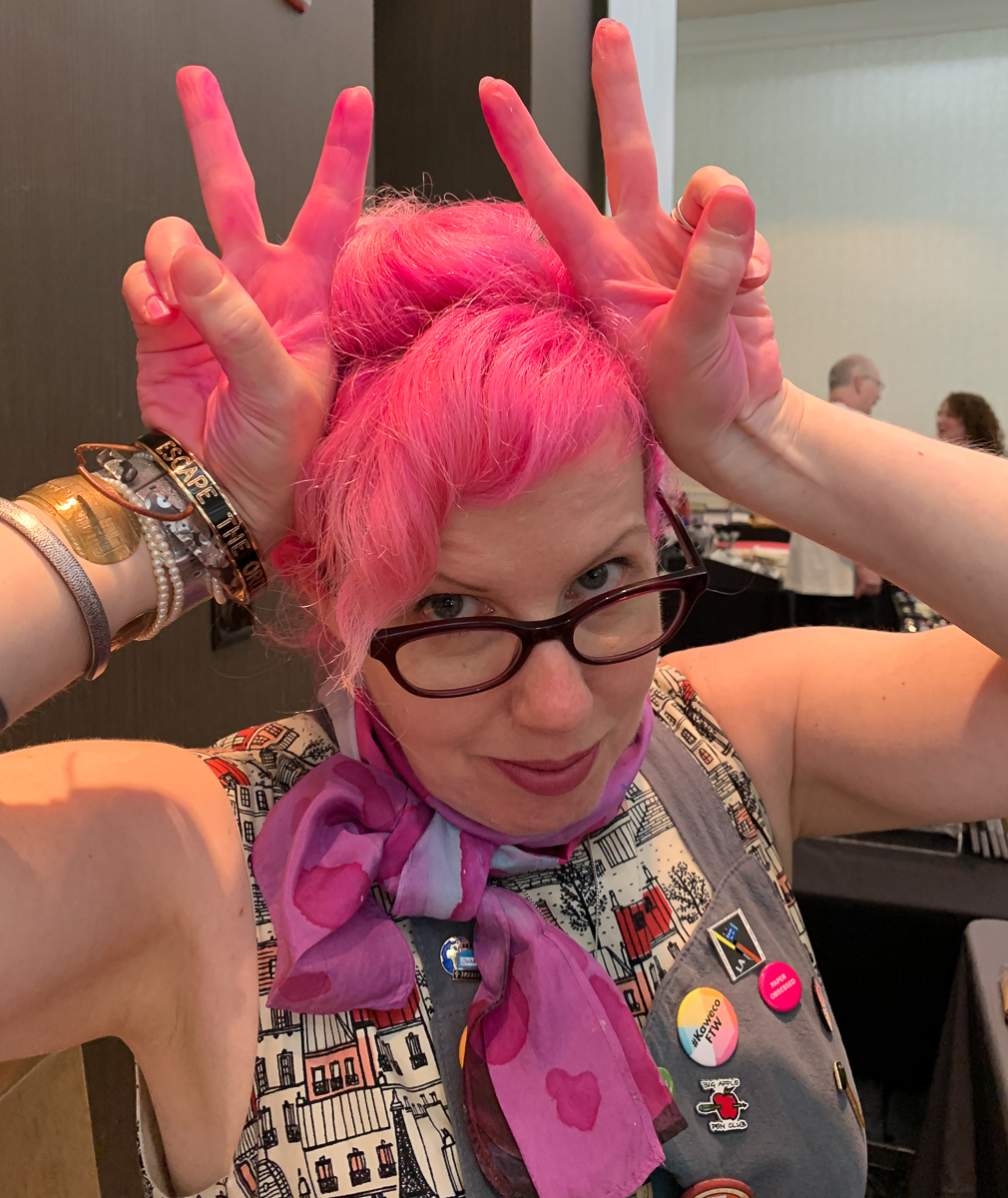
This was a notorious moment in SF. I was asked to show a customer at the Vanness table what color Organics Studio Unicorn Blood was. We didn’t have a swatch so we decided to open a bottle to do a quick little swatch. A little bit got on the lip of the cap and a bit got on my hands. I tried to wipe it off. It is really pigmented and when I used a handy wipe, it just went EVERYWHERE! So, now you know. Unicorn Blood is the same color as my hair.
Super hard-working Gena, AKA @customnibstudio, was tuning and modifying nibs all weekend. I wanted to get some nib work done but she was booked solid and when she had time, I was busy setting up or packing up our tables. I am going to have to just send her my pens.
One of the greatest things that was introduced at SF Pen Show was Alexander’s interactive vendor map. He released it using the information that was available as of Thursday night so there was some discrepancies but it was darn close. If other pen shows could nail down their vendor map a couple weeks before the show and make an interactive map available online, this could help attendees plan their visit and research who other vendors are before attending. Being able to add additional information to a map like this (links to web sites, Instagram, Facebook, etc) would make it easier for people to learn about each vendor while also figuring out where they are located on the show floor.
Oh yeah! I was also honored to participate in yet another live recording of the Pen Addict podcast. We interviewed Hugh and Karol from Kanilea Pen Company.

Myke took a turn holding the baby that made the rounds on Sunday and this photo is now legendary. We think Adina might either be thrilled or concerned with the enthusiastic way Myke took to childcare.

Jesi posed with Bungubox owner Kaoru. Jesi sold her an Esterbrook pen and also bought a San Francisco Sailor so the two had a lot to smile about.

As always, the best thing about pen shows are friends. Jesi and I never seem to get to spend enough time together but we enjoy every minute. We are tired but happy.
Despite working so hard, I did make a whirlwind shopping spree on Sunday and was able to leave with a handful of goodies. There was also a metric ton of ink that left with Bob and Mike in the van since trying to fly with ink if you don’t have to is pointless.
Once I got back to Kansas City, I succumbed to what I call “con crud”. Tuesday and Wednesday, I just thought my voice was scruffy from talking too much but by Thursday it was clear that this was officially “con crud”. Friday, I was down. My much-anticipated 3-day weekend was lost to the “crud”. I am still recovering but hopefully will be 100% myself by the end of this week.
So, don’t forget the key aspect of any good pen show preparation: Emergen-C! And lots of it. I took a ton of it but I still got sick. So, remember to practice good hygiene and get some sleep so you don’t get “con crud”.
Any photo not credited to an Instagram source came from Jesi or Jaclyn. Thanks for sharing your photos, ladies. I promise to make a better effort next year!


 Tina Koyama is an urban sketcher in Seattle. Her blog is


