Turns out, this is my fourth year attending the Chicago Pen Show and my first year as a vendor. The previous three years, I’ve worked as a helper for Vanness Pen Shop. This year, I had the table next to them and Laura and Matt Armstrong (you might remember him as the legendary Pen Habit) held down the fort with Lisa at Vanness Pen Shop. It was a new experience to have my own table and to introduce the Chicago community to The Well-Appointed Desk Shop and Skylab Letterpress product offerings as well as share a special Col-o-ring design we made especially for my hometown: The Chicag-o-ring. But what you are really here to hear about is everything else that was at the show.
Because I was working, it was hard to walk around and take photos but I was able to do it on Sunday. I wasn’t able to capture everything. If you want a thorough overview of the show, check out Mike Matteson’s Friday video which will have way more detail than I was able to capture.

Here’s Laura putting on her best “I’m not deliriously tired” happy face for me in front of the Vanness table.

It took me until Sunday to find where the organizers hid the ink testing stations but there were lots of folks using it so it was clearly easier for others to find it. Vanness brought current and past seasons of the Colorverse ink from Korea which is always a big hit. The ink display and wax from Papier Plume is also a feast for the eyes.
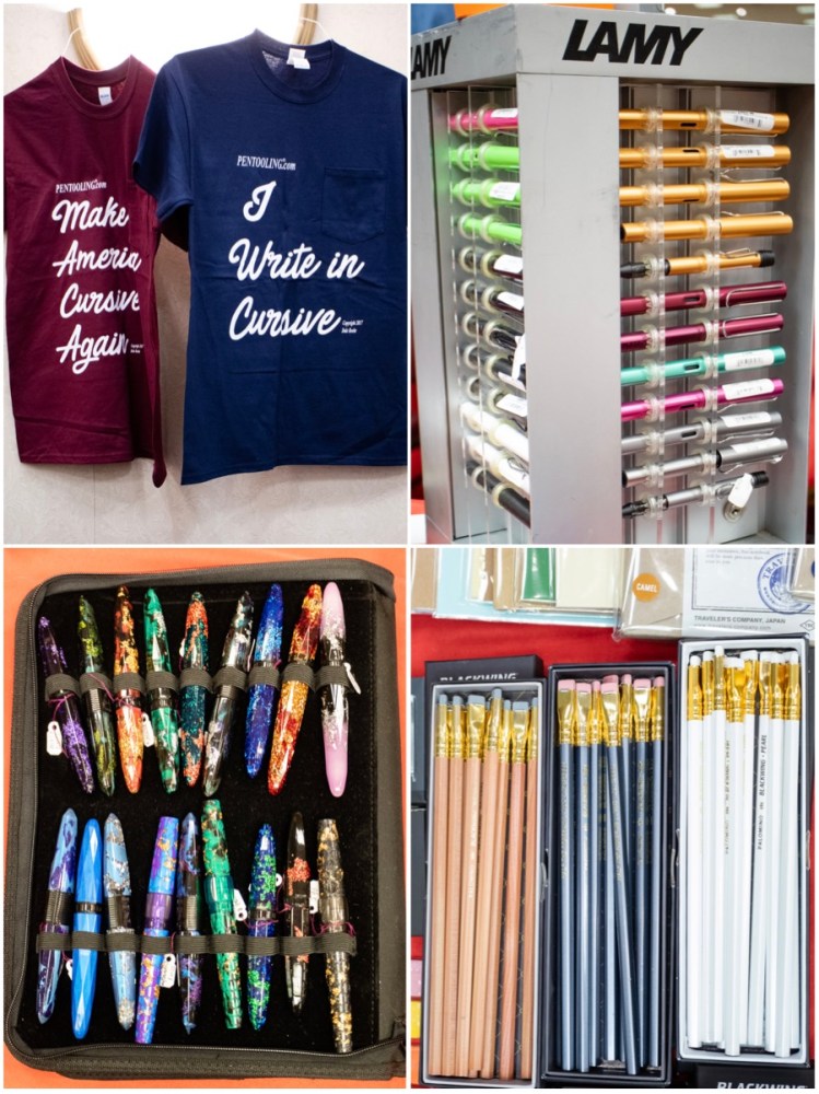
Above is the always amusing t-shirts from Pentooling and the array of product that Dromgoole’s brought all the way from Houston, TX. Yes, there were pencils at the pen show! Plus they brought an array of Lamy pens and lots of Benu pens.

This was the first year for Atlas Stationers from Chicago to have a table at the show and they arrived with lots of goodies including a rainbow of Sailor and Platinum Procyon pens. They also had the Caran d’Ache representative with them and all the eye-searing colors of the 849 fountain pen and new colors of the 849 ballpoint. Jonathan Brooks from Carolina Pen Company was pretty much sold out of pens by Sunday but he still had a few bottles of his Robert Oster Carolina Blue ink available. Pentooling had trays and trays of tools for repairing pens and a new vendor was on the scene with 3D printed pen holders and accessories. They were not at the table when I walked by but lots of kids came by over the weekend (and some adults too!) to show me the 3D skulls he makes and some of the other pieces. I think Brad may have gotten one of these in Atlanta too. I can’t believe I’ve missed him at two different shows.

Of course, there were tray after tray of pens. Above is Hirsch’s amazing vintage collection, Desiderata’s new turned acrylics and wood, Mario from Toys from the Attic and his collection (in the acrylic stand) and Sarj’s (#onemanpenshow) notebooks of prestige pens. There were treasures to be found at every corner.

Out in the Atrium, Edison Pen Co. was searing eyeballs with their candy box of colored acrylics and resins to choose from. So many options!! Then just across from Edison was Ryan Krusak and his beautiful rare wood pens and skrimshaw work. There was more eye candy in the form of Shawn Newton’s custom pens and the last photo above is from the Papier plume table (I think!).

Of course, one of the best things about the show itself is the people. I wasn’t able to get photos of all the people who I am always thrilled to see at each and every show but here are a few of the wonderful characters you can meet: Sarj Minhas (and his pal who I’ve met repeatedly but forgot his name! So sorry!!), Shawn Newton who is always ready to ham it up for a photo, Hirsch Davis who had the table just across from me and we talked on and off all weekend and finally the legendary Richard Binder, inky hands and all.
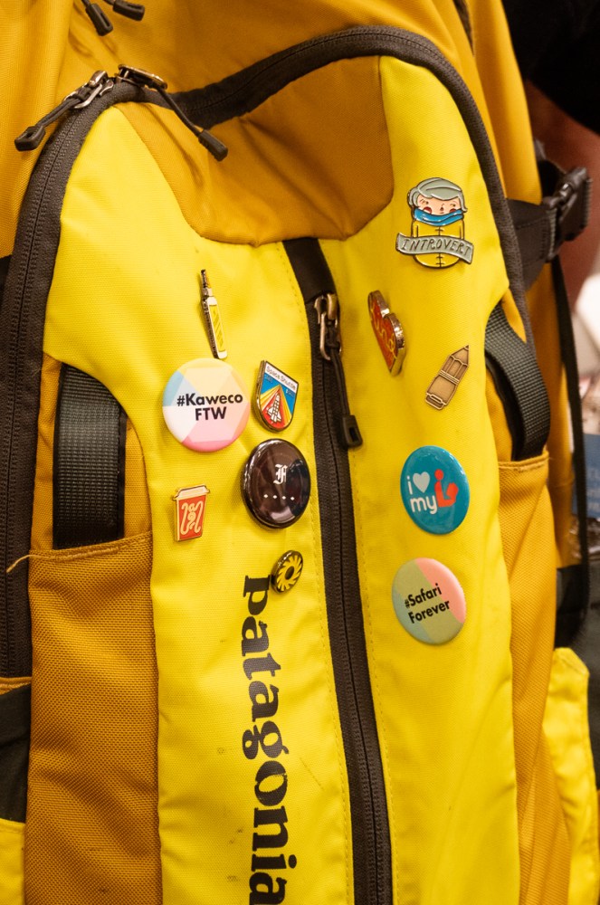
Ms. Tiny Badge allowed me to photograph her flair. I have that Introvert pin too.


The three photos above are from Taccia, some of the most spectacular pens at the show. They were in the Atrium under the skylight so they got all the best light which only enhanced the color and beauty. For the day I can afford one of their urushi pens! I even got to peek at some of their future designs that were not quite ready for the spotlight yet and they are gorgeous!

Speaking of gorgeous, and brilliant and sparkling in the sunlight, our very own Jesi was also in the Atrium with her table: Vintage Pen Shop.

She was doing a brisk business all weekend selling her restored Esterbrook fountain pens using her Esterbrook testing station and enticing passersby with the rainbow of color options.

Holding down the fort at the Franklin-Christoph table was the one-and-only Scott Franklin.

By Sunday, there’s not much left in the Franklin-Christoph prototype tray. Certainly not after Jesi and I get finished with it.
So now, onto my purchases (at least most of them… a few things always get forgotten in the bottom of a bag or suitcase that has yet to be unpacked).

I picked up a new Rhodia pad for my ink and pen reviews from Vanness, an Esterbrook Deskmater desk pen set new in the box (would you look at that packaging!!!), a bottle of Robert Oster Carolina Blue from Jonathan Brooks, and two bottles of Oster from Lemur Ink. I also picked up a bottle of MontBlanc Ladies Edition Pearl from the Dolives.

In regards to pens, I got one pen at the auction on Friday night. Its a Wahl with lovely orange colored resin, gold hardware and a slightly bouncy nib. I don’t know a ton about it as it was a bit of an impulse purchase as most my auction purchases are. I got two pens from Franklin-Christoph: a Pocket 66 in translucent pink with glitter and a Pocket 45 in gold pearl. They are forever to be known as Princess Sparklepants and Honey Bee. Oh, and that other pen… yeah. It’s a Sailor. It’s a 2015 Sapporo (Pro Gear Slim) Starburst Galaxy. I am sure I’m going to get no end of grief about it from Brad and Myke, but I won’t go on about it for 19 minutes, I promise.

And the coup de gras of the weekend was purchasing a whole tray of Lady Sheaffer Skripserts including several prototypes. The four designs in the middle are all alterations, prototypes or variations of production designs and there are variations of the Petit Points on each end plus a spare barrel.

I think it fleshes out my collection pretty well, don’t you?

Until next year, Chicago, peace out! (Thanks to Vanessa for this photo!)


 I saw a bit of variation in the larger nibs, but in general standard writing with a fine or medium nib resulted in a nice light gold that is fairly easy to read.
