Review by Tina Koyama
I’ve seen a few brush pens in my day, and most with bristles have the same average-size tip. Pentel’s Ultra Fine Artist Brush Sign Pen ($3.65) is a rare exception. (I chose black to test, but it comes in 12 colors.) On the outside, it has a basic plastic body typical of disposable brush pens.

Remove the cap, however, and the “ultra fine” part becomes obvious. If you were tasked with the proverbial job of painting the eyelashes of angels, this pen would get the job done. It has the finest brush tip of any brush pen I’ve used.

For comparison, the Pentel ultra fine is shown (on the right) next to the Kuretake No. 13 Fountain Brush Pen (left) and the Pentel Kirari Pocket Brush Pen (center) – two of my favorites when I want a brush pen with bristles.

In my sketch and writing samples, I was able to get a wide range of thick and thin lines. I especially like the lovely dry-brush effect that’s possible when held at its broadest angle. (Alas, I’m not a calligrapher, but if I were, I would put that dry brush to work.) The tip springs back nicely and retains its fine point.

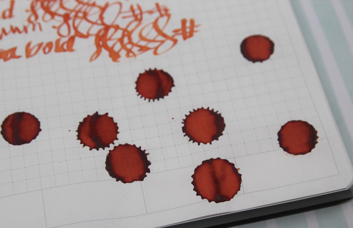
According to JetPens’ specs, the pen contains water-soluble, dye-based ink, so I knew it wouldn’t be waterproof, but I gave it a quick swipe of water anyway. I like the cool gray hue that results when washed. (Samples done in a Stillman & Birn Alpha sketchbook, which is sized for light washes.)

Final Impressions
I love this brush pen! The wide range of marks it can make from ultra fine to wide makes it fully versatile for writing, sketching and calligraphy. My only wish is that Pentel would come out with an ultra fine artist brush sign pen containing black waterproof ink, too.
DISCLAIMER: The items included in this review were provided free of charge by JetPens for the purpose of review. Please see the About page for more details.
 Tina Koyama is an urban sketcher in Seattle. Her blog is Fueled by Clouds & Coffee, and you can follow her on Instagram as Miatagrrl.