
Congrats to Diana! The winner of the MiGoals 2018 Diary by way of our random number generator.

May we all get a few more workouts in before the end of 2018. Thanks to everyone who entered and to MiGoals for providing the planner!

Congrats to Diana! The winner of the MiGoals 2018 Diary by way of our random number generator.
May we all get a few more workouts in before the end of 2018. Thanks to everyone who entered and to MiGoals for providing the planner!
 This week brings the first batch of reviews of Season 4 of Colorverse inks and more peeks at the new Karas Starliner and Galaxie pens. The Stifflexible notebooks have been revamped and improved and Bob at My Pen Needs Ink takes the new edition through its paces.
Review by Tina Koyama
I had never heard of Nagasawa, a stationery store in Kobe, Japan, but when I saw the bottle design for the Nagasawa Pen Style Inks on JetPens, I instantly thought, “Sailor.” Sure enough, the inks were developed by Sailor (one of Japan’s “top three” fountain pen manufacturers, along with Pilot and Platinum), and as a devotee of everything Sailor, I had to try some.

Choosing among the Nagasawa line’s 26 colors took lengthy hemming and hawing, but I managed to make relatively objective choices based on what was missing from my Sailor Shikiori collection (formerly called the Jentle line, which came in bottles that look identical to Nagasawa bottles but nothing like the current Shikiori bottles. Got that?).
While we’re talking about bottles, I noticed that the Nagasawa inks do not come with the little basket thingie inside the neck that is supposed to make it easier to fill certain pens. I always syringe-fill my pens and always have, so I don’t miss the basket thingie, which just gets in the way.
Now, on to today’s ink. Sannomiya, which means “panse” (that’s how it’s spelled on the box label, but I assume it’s the flower pansy), is a bright, cheerful violet. The closest hues I found in my collection are Iroshizuku Murasaki-Shikibu (slightly cooler), Sailor Jentle Shigure (much darker and cooler) and Diamine Majestic Purple (warmer). I filled one of my broadest-nibbed pens with Sannomiya, and I love the rich hue.

One reason I favor Sailor inks is that they are fast-drying (essential for this lefty), and the Nagasawa inks follow suit. I didn’t test for specific drying times, but writing relatively carefully, I didn’t smudge the page written on Tomoe River paper. (Mind you, I was writing this sample more slowly than I normally do, but I’ve also been writing with it in my Leuchtturm 1917 journal at my normal pace, and I’ve smudged only a couple of times – not bad at all, for me.)


Unlike most fountain pen users, who probably prefer their inks to be more waterproof than water-soluble, I look for inks that make an interesting smear when washed lightly with water because I enjoy sketching with fountain pens, too, and using the wash for shading. This is another reason I favor Sailor’s formula – the washes are often surprising and complex. I see hints of both pink and blue in Sannomiya – the wash is not just a diluted version of the full-strength ink. (However, you’ll see in another ink I review later that not all Kobe inks are as complex.)

Sannomiya is a lovely purple that I enjoy both writing and sketching with.
TOOLS
DISCLAIMER: The items included in this review were provided free of charge by JetPens for the purpose of review. Please see the About page for more details.

When I started collecting fountain pens and attending pen shows, people told me it would be the community that would keep me coming back to the hobby and the events again and again. I’ve met many people online through the hobby that have changed my life in their own way but what has been the most amazing discovery is the vast array of people I’ve met at pen shows.
What no one warned me about was how many people I would also have to say good-bye to.
Yesterday, the pen community lost one of its favorite diamonds-in-the-rough, Jim Rouse.
While I cannot accurately recount his full professional history in the pen community, I know he worked for decades with Bert Oser before he took on the job as nibmeister at Franklin-Christoph. He once told me his whole pen history, complete with anecdotes about his beloved family, and despite copious amounts of post-pen show food and alcohol, I recall all the details clearly.
Jim was a charmer and a friend to everyone who came up to the Franklin-Christoph table at a pen show, from the youngest child to the oldest pen collector. He was talented, with just the right amount of sass, and he will be missed.
I never thought pens (and pen shows) would teach me to treasure ever moment of life so much. Hug your favorite your nibmeister (or pen repairperson, vintage dealer, Black Pen Society Member, or pen community illuminati, et al)*. You never know when it might be your last chance.
*Remember to ask before touching any pens or people. Its just good pen show etiquette.
Earlier this week, I reviewed the amazing MiGoals 2018 Diary and now we have one to giveaway to you. This one. Brand new. Black softcover fabric cover. Still wrapped in plastic waiting for all your brilliance, class schedules, business meetings, coffee meetings or whatever you have planned for the next six months.
Blow. Your. Mind. Or walk your dog. But write it down. Get it done. And say thanks to MiGoals.

TO ENTER: Tell me one goal you would like to accomplish in the remainder of 2018. Big or little. Run a 5K. Clean out that closet. Be nicer to your sister. Leave you goal in the comments below. On the blog. Nowhere else. Do it once. Use your real email address. Do it by Wednesday night.
FINE PRINT: All entries must be submitted by 10pm CST on Wednesday, July 18, 2018. All entries must be submitted in the comments at wellappointeddesk.com, not Twitter, Tumblr or Facebook, okay? Winner will be announced on Thursday. Winner will be selected by random number generator from entries that played by the rules (see above). Please include your actual email address in the comment form so that I can contact you if you win. I will not save email addresses or sell them to anyone — pinky swear. If winner does not respond within 7 days, I will draw a new giveaway winner. Shipping via USPS first class is covered. Additional shipping options or insurance will have to be paid by the winner. We are generous but we’re not made of money. US and APO/AFO only, sorry.
Review by Jessica Coles

Last week I was handed the Monami Olika and asked to review it. At first glance, it seemed to be a pen that you could get at any major retail store that carried pens, but as I used it more, some of the features of this pen came to light.

The Olika has a unique color. At first glance, the pen is a neon yellow demonstrator. However, once the pen is seen out of the package, the color shows as a very light olive or a spring green. I was also surprised when I began writing. Normally, pens of this type come with a blue or black cartridge. Boring, but serviceable and pleasing to the majority of people who will use the pen.

The Olika comes with dark olive-green ink cartridges – three of them, to be exact. The color is close to KWZ Green Gold or Noodler’s Rome Burning and isn’t too far away from the amazing Rikyu-cha by Sailor. The color coordinates very well with the pen body. These cartridges are proprietary, so you do need to purchase additional cartridges in the Monami Olika line. But they do come in 10 different colors!

The shape of the pen body again surprised me. I took it to be a straight barreled pen, but as I was using it, I realized it was slightly hourglass shaped. This makes a pleasant spot to rest the pen between the thumb and forefinger. The cap snaps in place so there are no threads only a textured rubber section that cushions your fingers during longer writing sessions.

I did not try to eyedropper this pen, but the body is air tight with no exposed metal, so it should be easy to convert the pen if desired.
I did have two points on the negative side for the Olika. The included ink dries very slowly, so this might not be a great pen for those who want to quickly close a notebook or lefties who need a fast-drying ink. The second complaint is the nib – while the writing experience was smooth and never skipped, the nib is listed as a fine. I would actually peg the closer to a wet medium nib instead.
All said, for the price that this pen costs ($5.50 as of this writing at Jet Pens), the Monami Olika is absolutely worth the cost. Refill cartridges are available, also from Jet Pens, for $5.50 (also as of the writing of this blot). It is a fun pen; a smooth and consistent writer and the unusual ink color make this a pen worth adding to your collection!
The pen included in this review was provided free of charge by JetPens.com for the purpose of review . All opinions are my own. Please see the About page for more details.
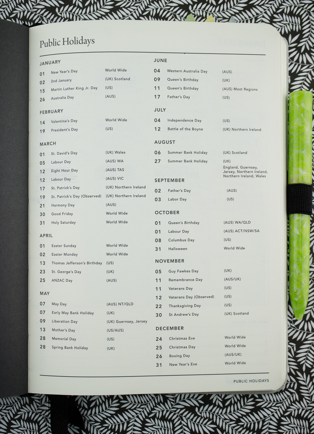
MiGoals is a notebook and stationery company from Australia that features a range of products to help people plan and organize. I see a lot of plain black and grey planners and notebooks so it takes a lot to get me excited. Sometimes, between plain covers, is something worth getting excited about.

Not everyone reviews planners in July, but here at The Well-Appointed Desk, we know that sometimes we have to make sacrifices for the betterment of ourselves, our goals and our futures. The MiGoals 2018 Planner was worth cutting ties with my previous planner. Even if the year is half over.
First, it has all the features expected of a planner: monthly and weekly planning pages on creamy A5 pages that are fountain pen friendly between linen softcover covers, complete with two ribbon bookmarks.

But then it adds a lot of other details to help set goals and track progress. Normally, that kind of stuff kind of makes me cringe a little. It all feels a little hokey. You know, it feels a little “new agey”. But with the MiGoals, instead of setting all the text in chalkboard, frilly text, its set in simple black and white sans serif lettering. It’s clean and sophisticated. It feels professional and classy. And you can take the goals and vision planning to heart, or you can skip over it. There are quotes from popular artists and celebrities that may seem unusual choices but are interesting. There are not a ton of them either, mostly in the front of the book with the goals.


There is even some demo pages for how MiGoals envisions laying out pages which is helpful if you aren’t quite sure how you might lay out a goal page, a monthly page or a weekly page. If you’ve never used a planner like this before, this will give you a good idea of how these pages might be used.

Are these pages really fountain pen friendly? I tested them pretty thoroughly.

These are the same two pages from the other sides. NO SHOW THROUGH AT ALL. Seriously.


Then, in actual usage, on both the monthly spread and weekly spread for July and this week, I tried using a daily writer EF pen appropriate for everyday work use, along with an office pencil, and another fountain pen I grabbed off my desk. There was no bleeding, feathering or show through issues.
You will also note that the ribbon bookmarks meet my strict standard of being long enough to reach the corner of the notebook while still being able to open the book completely. YES!

Of the modifications I wanted with the planner, I needed a pocket in the back for ephemera and a pen loop. But these were easy fixes. I glued an envelope into the back cover of the notebook using adhesive tape runner and added a Leuchtturm Pen Loop. Done and done. So, now its basically perfect.

While I personally like the idea of the pearl grey linen cover, I managed to pick up coffee stains in a matter of a week. The darker covers might pick up lint and dust so it’s probably just what kind of weathering you prefer.
This is one of the best planners I’ve ever used. I never thought I’d want a planner with goals and vision planning. The monthly pages have large Saturday and Sunday side-by-side which make up for smaller Saturday and Sunday on the weekly pages. There’s extra space for notes on the right hand pages and habit trackers which I also never thought I would use. And extra pages in the back for notes. With the addition of my pen loop and envelope, it’s pretty close to perfect and fountain pen friendly!
The remaining stock of MiGoals 2018 planners are on sale and there’s still six good months left in them to use plus the goal planning, monthly planning and notes. Get a jump start on your future and be prepared to kick 2019 in the butt.
Stay tuned… Giveaway coming soon!
DISCLAIMER: Some items included in this review were provided free of charge by MiGoals for the purpose of review. Other items in this review include affiliate links. The Well-Appointed Desk is a participant in the Amazon Services LLC Associates Program, an affiliate advertising program designed to provide a means for sites to earn advertising fees by advertising and linking to Amazon. Please see the About page for more details.