

I was so excited when Vanness announced they were finally importing Krishna Inks because I had been attempting to email Krishna directly since I had seen Nick Stewart’s post about the inks back in July of 2017. Since July though, Krishna has been creating even more inks, including some groundbreaking sheening inks.
The Krishna Inks come in 20ml glass vials and sell for $6 for the “Super Rich” line and $8 for the RC line. The RC line only features six inks at the moment and I don’t quite understand the division between the Super Rich and the RC line. I thought it was the super-sheening vs. the regular inks but it doesn’t seem to be that clearly divided. If you figure out the difference between the two lines, please let me know.

One of my favorite non-sheening colors is Pencil… why? Because who wouldn’t want a fountain pen ink trying to mimic graphite? It’s a little warmer in tone than actual graphite but I respect the efforts and the acknowledgement. Sea & Storm is a deep, dark plum color that was very difficult to capture in swabs and photos. I look forward to inking up a pen and seeing how it performs in real world tests.
Monsoon Sky is a deep blue that really spoke to me. Overall, these inks are all a bit more viscous, a bit drier. I think they will perform better on lower quality papers but may have some hard starting issues for some people.

This is a better image of Sea & Storm… there is a spooky undercurrent of green.

My absolute favorite sheener of the bunch is Myrtle hands down. If this ink is in a wide nib, there is definitely going to be evidence of the green halo effect around the luminous magenta pink. It will make my heart sing. I am wondering if I can buy this in a bottle the size of the those old Parker Quink school bottles? Makes me want to run around saying, “So I says to Myrtle I says…”

Look how glorious that sheen is!
Azaelia (Floral) is a good shading pink too if sheen is not your thing.

Much hullaballoo was made about Goldfish Gold and Jungle Volcano. I will grant you that Jungle Volcano is all that and an extra shot (photo DOES NOT do it justice) but Goldfish Gold is just a dark orange-y brown for me. But maybe it was just that it got over-hyped, like a summer blockbuster movie. Everyone tells you how awesome it is and you expect it to give you handwriting like Michael Sull and the hands of a supermodel but in the end, you’re still writing with a cheap shark pen from China with a bad manicure and your same sloppy penmanship. $8 ink isn’t gonna make you a superhero.

This is a better view of Jungle Volcano. Is it orange? It is green? Is it brownish? Who cares. Make me another Mai Tai and let’s get inky!
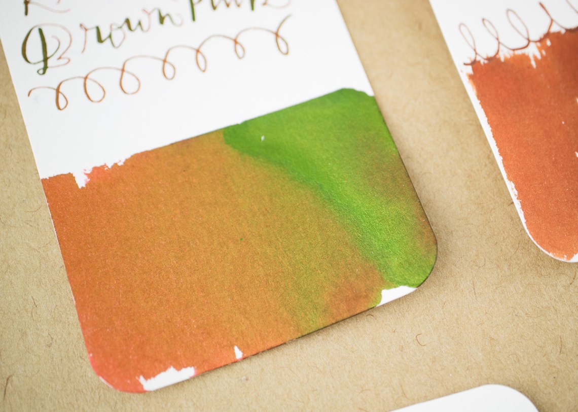
One of the most perplexing colors is Brown Pink. Its not really brown or pink and it sheens like the devil. It’s similar but different from Jungle Volcano and definitely worth consideration.
All in all, Krishna Inks have a lot to recommend themselves. They are trying a lot different types of sheening. The smaller bottles and low prices mean you are not committing to a huge volume of ink or making an enormous investment.
I have not run any of these through my pens yet but that will be my next round of testing. The colors are quite saturated so there could be some possibilities for staining or difficulties cleaning so I may run these through the Shark pens first before tempting fate and putting one of the darker colors in my Pelikan ghost. I’ll have more detailed reviews of individual colors in the coming weeks but I wanted to share the colors and brand with you now. Enjoy!
DISCLAIMER: Some of the items included in this review were provided free of charge by Vanness for the purpose of review. Please see the About page for more details.


 Laura is a tech editor, podcaster, knitter, spinner and recent pen addict. You can learn more about her knitting and tea adventures on her website,


 Laura is a tech editor, podcaster, knitter, spinner and recent pen addict. You can learn more about her knitting and tea adventures on her website,


