Just a quick reminder that The Well-Appointed Desk will be at the Arkansas Pen Show this weekend. Just to whet your appetite The Desk will once again have a table with the steadfast and true Skylab Letterpress and will be selling a variety of goods including:
Col-o-ring Ink Testing Books
Typewriters
Letterpress printed paper goods (fountain pen tested!)
Vintage office supplies
Vintage pencils
Oh, and I’ll be introducing an exciting new product (as Steve Jobs used to say, “There’s just one more thing…..”)
Credit cards and cash will be accepted!
Don’t forget to visit Vanness Pen Shop while you’re in Little Rock. They are hosting an Open House Friday Night, March 16th from 6pm until they kick us out after the Pen Show. Lisa, Mike and the gang are wonderful hosts and the shop is amazing! Brad, Matt and I will be there as well to help out so come celebrate St. Patty’s Day early.
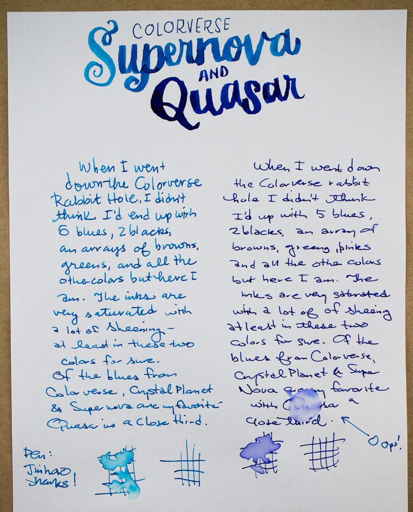
Some days… you just think to yourself I can’t possibly have enough blue ink. Today was one of those days. So, of course, I bought Colorverse Supernova #14 and Colorverse Quasar #13. Because when you think you don’t have enough blue ink you tend to buy really expensive blue ink that come with two bottles in each box. Each set comes with a 65ml bottle and a 15ml mini bottle of each color. So, I’m loaded for blue!
(For more details about Colorverse ink, check out my overview post.)
I decided it would be best to line all the Colorverse blues up for a side-by-side comparison. Proxima B is by far the darkest, Saturn V is a tried-and-true workhorse blue. Crystal Planet is an out-of-this-world International Klein Blue. Supernova and Quasar introduce red sheen with Quasar being more like Saturn V with sheen and Supernova being Crystal Planet bit darker version with sheen.
In writing, the sheen shows through, even with fine nib pens. Supernova shows more shading than Quasar and tends to look more turquoise than in initial swab samples. Water resistance? Nope.
Compared to other swatches, Supernova was similar colorwise to some favorites like Bay State Blue, Private Reserve Cosmic Cobalt and Kaweco Royal Blue but adds that fan favorite sheen to the mix which shifts the hue a tiny bit but the underlying color is that same bright blue. Sailor Jentle Nioi-Sumire has a similar sheen but is a bit more violet blue.
Quasar was a bit harder to match. Surprisingly, the new Krishna Moonview was quite similar in color but I’ve not been able to experiment with the Krishna inks much so I don’t know a lot about its overall performance yet, Those are next up in my queue to start reviewing. Interstingly, Organics Studio Nitoogen was quite similar in color so if you are looking for a similar color to Nitrogen with LESS sheen, Quasar might be a good alternative. Quasar has some sheen but not the dizzying sheen found in Nitrogen. Sailor Jentle Souten has a similar sheen but is a little lighter in color. It was not light enough to match Supernova but not as dark as Quasar. Ink colors are a constant game of degrees of difference. One ink has too much shading, one does not have enough. One is too dry, one is too wet. Ad we as ink consumers are always looking for the perfect pen-and-ink combination.
If you are still searching for the perfect blue, maybe one of the Colorverse blues will be the one for you. I’ve certainly enjoyed experimenting with them. I will definitely pull together a list of my favorites at the end of these reviews. I am discovering that the more inks I acquire, the more colors I like.
I’ve decided to dub this group of Colorverse inks the “goth collection”. When I started painting the names of the colors I realized that they all sounded like club nights or 90s goth clubs. I realize that’s totally dating me but what can I say? Out of context, Black Hole, Vortex Motion and Dark Energy all sound like the names of club nights — so does Sunspot now that I think about… Sunspot is definitely the trippy rave night though. “Bringing Ibiza to Inidianapolis… its Sunspot, every Wednesday night at Club Underground!” Black Hole is the goth night, Vortex Motion is the deep trance night and Dark Energy is the EBM night. C’mon, old timers, you know what I’m talking about…. now don’t you look at these ink colors in a totally different light?
(For full details about the Colorverse inks, check out my overview post.)
It totally makes sense now doesn’t it? Sunspot is the little black dress that goes to all the club nights. All purpose black. Works with everything. Black hole is epically, all-consuming, Morrissey level black. Dark Energy is tripped out, “did I take a bad tab of ectasy, is this ink black, green or red?” burgundy. And Vortex Motion is grey, no green, “no, don’t box me in, let me express myself!” free expression yet still art-school moody deep ink. It all makes sense now, doesn’t it?!
All of these Colorverse inks come with two bottles of matching inks, a 65ml bottle and a 15ml bottle of the same color. Sunspot is from Series One: Spaceward while the other three inks are from Series Two: Astrophysics.
In my writing samples, I used the same Jinhao Shark Pens for the three samples above. I did use an acrylic dip pen and switch to my Esterbrook dip pen at the bottom to see some line variation.
In writing samples, the inks remain clear to their intransitive natures… or black as their deepest depression, whatever the case may be.
When compared to other whackadoo green/black or sheening greens its really hard to get a clesr bead on exactly how odd Vortex Motion really is in a photo. I’d have to say that Sailor Jentle Miruai is probably closest but its more green and Vortex Motion reacts more greyish in some light.
Finding something comparable to Dark Energy was an act of futility. The closest I could find was actually J. Herbin Rouge Hematite if you can believe it? Sailor Jentle Rikyu-Cha was a close second (or vice versa) but honestly, this is another weirdo color that doesn’t really have a comparable comparison – at least not in my collection.
As for the blacks, Bookbinders Red-Belly Black is the closest to the all-consuming deep black of Black Hole. But Black Hole has an actual sheen to it like india ink that I’ve not seen in other water-soluble inks. Sunspot is a good middle ground black like Kaweco Pearl Black which is a third of the price. It was probably foolish to pay $36 for a bottle of black ink but I now have an excuse to go find some new playlists on Spotify while using Spotspot. Hello, Electronic Circus!
Overall, Dark Energy and Black Hole were the surprise hits for me. Black Hole is one of the coolest black inks I’ve seen. And Dark Energy is just so unusual as to be something you want to add to your collection. I wasn’t initially inclined to purchase another black after buying Sunspot originally. Vortex Motion is interesting but its so unusual and I already own all the Sailor Jentle oddball colors like Rikyu-Cha and Miruai and Epinard which I don’t tend to use a lot. If those dark, murky colors are your wheelhouse, than definitely consider Vortex Motion. Sunspot is a solid black but as someone who already owns a handful of other black inks, it was probably not entirely necessary other than being a completionist and buying the entirety of the first series.
So much goodness this week! I can’t pick one favorite but check out the Lamy Vibrant Pink ink reviews and The Lopped Square’s new URL and review of the Nanuck Notebook. The Cramped continues to find the best of stationery obscurities and there are many notebook reviews!
Colorverse Morning Star & Gravity Wave have to be two of the most anticipated ink colors in all of the colors offered in the line-up. Morning Star #11 is from Series One: Spaceward ($36 for two bottles 65ml and 15ml both the same colors) and Gravity Wave #15 is from Series Two: Astrophysics ($36 for two bottles 65ml and 15ml both the same colors). For full details on the packaging and details about the whole series, please refer to my overview post.
I gave Laura the little 15ml bottle of Morning Star because I’m nice. I bought 20 bottles of ink and I gave away one bottle of 15ml of ink – I am so stingy! Anyway, once the glow of the new wears off I will probably be more generous but right now, I’m very much Gollum about the Colorverse inks. “My Precious!”
Morning Star and Gravity Wave are similar. But different. In the swatches, they look almost the same, but in the writing samples, they look totally different. Gravity Wave is much darker with more evidence of red sheen. Morning Star is much lighter, especially in a finer nib and the distinct reddish/magenta sheen is all but lost in a fine nib.
When I used a brush, its easy to see a bit more difference in the color tones and in the longer writing samples, the subtle differences become more evident. I used the same size nib for both writing samples. I got more sheen in the Gravity Wave sample though it is not as easy to see in a still photo. The shading and luminous quality of Morning Star is also more evident in person than in a photograph. Both are beautiful but in their own ways.
Both colors are very saturated so they may have hard-starting issues as a result. I left them sit in my Shark Pens for over a week to see if there were any hard starting issues. The only problem I had was when I did not properly cap one of the pens thereby allowing too much air into the pen and causing it to dry out. A quick dip into a glass of water had it up and running again in a matter of seconds and the color was full strength in less than a word or two. I’m finding as ink manufacturers continue to try to outdo each other with even more saturated and sheening colors, we may find that inks may become more hard-starting on occasion as the pigment-to-liquid ratio becomes more extreme.
When compared to other inks, Monteverde California Teal is a very close companion at a very competitive price. The small 30ml bottle is just $8 and while its a shade or two darker than Gravity Wave, it is a similar hue with quite a bit of sheen as well. Robert Oster Marine ($17 for 50ml bottle) is similar in color to Morning Star and I suspect there is probably one or two other colors in the copious range of blues and teals in the Oster line that might appeal as well with some degree of sheen and shading.
That said, these are two of my favorite Colorverse inks thus far. But its so hard to pick favorites. Maybe when I finish my reviews I’ll do a top five list of the Colorverse inks.
When I first saw photos of the new Lamy Aion (€42.98 via Appelboom), I was actually quite excited about trying it. With no offense to Lamy Safari and AL-Star devotees, I have never found either pen to be comfortable in my hand because of the molded grip. So I was thrilled for a new pen that was sleek and modern, and most of all had a lovely round barrel.
I pestered Ana to order one for The Desk to try and she graciously ordered a silver Lamy Aion with an EF nib for me to try.
The Aion is a beautiful aluminum pen with a silver brushed matte finish. This gives the Aion both a smooth feeling body, and just a tiny bit of texture that makes for a lovely grip. The nib in the Lamy Aion has been redesigned to boast slightly different lines, but the feed can still hold your favorite Lamy nib from another pen if you wish.
The Aion is a metal pen with some weight to it. Empty, the body of the pen weighs in at 21g and the cap adds another 12g, so if you prefer the lighter weight Safari and AL-Star, this pen may not be for you.
As with other models, the Aion has a snap cap that is postable. The length of the Aion closed (with the cap on) is 5.6″ and posted is 6.4″. I found this to be a little long for my tastes and chose to use the pen with the cap unposted.
Left to Right: Pilot Metropolitan Pop, TWSBI Eco, Lamy Aion, Retro 51 Tornado Fountain, Sailor Pro-Gear Slim
Overall, I enjoyed writing with the Aion. I don’t think it’s a great fit for me personally, because I found it slightly too large for my hand. I like the weight of the pen but the barrel circumference, even with a slightly tapered section, still feels fairly large in my hands and after a bit my hand ached using it.
When I filled the Aion with ink, it was a little slow to fill the feed and nib, but once filled, the nib wrote super smoothly.
Overall, I enjoyed testing the Lamy Aion and I’m a little sorry that it doesn’t work for me. However, my loss is your gain!
THE GIVEAWAY: We are giving away this Lamy Aion Silver Fountain Pen with Extra Fine Nib. This is a tester model so it has been inked and tested here at The Desk but will be cleaned, re-boxed and shipped directly to you in like-new condition.
Please leave a comment below and tell us what ink you’d put in the Lamy Aion for your first fill?
FINE PRINT: All entries must be submitted by 10pm CST on Saturday, March 10th. All entries must be submitted at wellappointeddesk.com, not Twitter, Tumblr or Facebook, okay? Winner will be announced on Saturday. Winner will be selected by random number generator from entries that played by the rules (see above). Please include your email address in the comment form so that I can contact you if you win. We will not save email addresses or sell them to anyone — pinky swear. If winner does not respond within five (5) days, we will draw a new giveaway winner. Shipping via USPS Priority Mail is covered. Additional shipping options or insurance will be paid by the winner upon request. We are generous but we’re not made of money. US residents/APO only.
Laura is a tech editor, podcaster, knitter, spinner and recent pen addict. You can learn more about her knitting and tea adventures on her website, The Corner of Knit & Tea and can find her on Instagram as Fluffykira.
DISCLAIMER: The items included in this review were provided free of charge by Appelboom for the purpose of review. Please see the About page for more details.


 Laura is a tech editor, podcaster, knitter, spinner and recent pen addict. You can learn more about her knitting and tea adventures on her website,