Birmingham Pen Company is located on the Southside of Pittsburgh, which was once called “Little Birmingham” due to the fact that it was a manufacturing hub in the 1900’s, like Birmingham was to England . Today, the Birmingham Pen Company serves as a reminder of this tradition. At the moment, the Birmingham Pen Company is online only though they had a store front in Shadyside for awhile.
The Birmingham brand inks are all named for historic places, events or people from the Pittsburgh area. Each writing ink is bottled in Pittsburgh in a beautiful glass bottle, and labeled with a bit of a history lesson. The inks are manufactured in Germany.
All of the inks I tried performed well. Of this set, I think my favorite was the Lilac Wind and I confess I filled up my Sailor Pro-Gear Slim Cosmos with it.
Ana’s Perspective:
Laura and I split duties for the overview of the Birmingham inks. Over the past few weeks, we’ve tried eight of the 40 colors currently listed on the web site with new colors being added monthly. They have even announced an ink subscription option as well called The Pen Parcel. They are currently sold out of subscriptions at the moment but check back… its a chance to get their new ink colors, as soon as they are available.
Somehow, I managed to choose mostly dark, moody colors. I ordered my ink in the deepest darkest months of winter so they were the perfect antithesis to my normal eye-bleedingly, bright palette of spring and summer.
I think the colors are a reflection of the soot-stained history in and around the industrial landscapes of the working-class city of Pittsburgh, PA. Having lived for several years, just over the border in Ohio, in another steel mill town, I can appreciate these hues. They are seeped in a sort of history. There’s a depth to the color but also a richness.
And come on, anyone who immortalizes Jeff Goldblum in ink is a friend of mine.
So far, I’ve found the inks to be very well-behaved. Others might call them a little dry but I’d say they are right in the middle… not too wet, not too dry. I love the apothecary-style bottles and the elegant typography on the bottles is very appealing. The logo branding could be a little more apparent but at least its not overly ostentatious.
My hope is that there will be an Andy Warhol ink in the future (there is! But sadly its sold out!) and that there might be some women of note that will be immortalized ink!
Laura is a tech editor, podcaster, knitter, spinner and recent pen addict. You can learn more about her knitting and tea adventures on her website, The Corner of Knit & Tea and can find her on Instagram as Fluffykira.
DISCLAIMER: Some of the items included in this review were provided free of charge by Birmingham Pen Company for the purpose of review. Please see the About page for more details.
Just a quick reminder that I’ll be heading to the Atlanta Pen Show this weekend. Laura and Tina will be in charge so all y’all sticking around these parts be on your best behavior, okay? If you are going to be in Atlanta for the show, please come by the Vanness Pen Shop table and say hello or come find me at the bar after hours (good behavior is optional here).
I will, of course, be at the Pen Addict RelayCon recording on Saturday night. Details about the the recording schedule and such can be found on Episode 302 of the Pen Addict podcast. I was not able to attend the recording this past week sadly.
To get tickets to attend the live recording in Atlanta, stop by the NockCo table and pick up a ticket from Brad or Myke as soon as you can. Seating is very limited, Kickstarter backers get first dibs. We were standing room only last year. We had overflow space in another room where some of our tech-savvy friends set up laptops to run the live feed in order to let folks “listen live” in a shared experience environment.
Alexander and I are hoping to have Pen Addict Bingo cards printed and available so audience members can play along during the recording. Bring a pen (I hope you have one or two to choose from) to tick off those boxes. There might be more than just bragging rights should you BINGO during the recording (no promises just yet!). If you’re playing along at home, have your drink of choice and bingo card handy!
I will be attending the cookout on Friday night. If you are a vendor or weekend pass holder, be sure to join us out on the patio (weather permitting). It’s always fun.
And, as always, I will frequent the Waffle House. Day or night.
Eat, Sleep, Knit has relocated to the outer reaches of Atlanta so my annual sojourn to the fiber wonderland won’t happen this year but I have been informed that there’s a yarn shop not far from the hotel. If there are other knitters coming in who are interested in a hop over Thursday afternoon, let me know.
Can’t wait to see everyone again this year. Atlanta is always my favorite show. It goes by so fast. Please come say hello and get a sticker!
These pens have all the sparkle and shine you could want in their aventurescent resin with rhodium and gold plated brass trims. They are lightweight, and have standard Schmidt nibs.
Some of the pens above have been inked up and tested for review, but all pens are in like new condition and will be delivered to you clean and ready to fill with your favorite inks!
TO ENTER: Tell us which BENU fountain pen makes your heart sing? Please include which of the BENU models shown above you’d like to win. Only one of each model is available so in drawing a winner, we will select the first name and they will win the pen they have chosen. The second name selected will win the pen they have chosen, assuming it is not the same model selected by winner #1. If they picked the same model, we will select another name until we have selected someone who has chosen a different pen… and so on, until we have given away all three pens. Make sense?
FINE PRINT: All entries must be submitted by 10pm CST on Friday, April 13 , 2018. All entries must be submitted at wellappointeddesk.com, not Twitter, Tumblr or Facebook, okay? Winner will be announced on Monday, April 16. Winner will be selected by random number generator from entries that played by the rules (see above). Please include your actual email address in the comment form so that I can contact you if you win. I will not save email addresses or sell them to anyone — pinky swear – just email you if you win. If winner does not respond within 7 days, I will draw a new giveaway winner. Shipping via USPS first class. Additional shipping options or insurance will have to be paid by the winner. We are generous but we’re not made of money. US residents and APO/FPO only please.
Laura is a tech editor, podcaster, knitter, spinner and recent pen addict. You can learn more about her knitting and tea adventures on her website, The Corner of Knit & Tea and can find her on Instagram as Fluffykira.
DISCLAIMER: The Bird of Paradise and the Sublime 025 were generously sent to us for giveaway The Gentleman Stationer. The Nebula was part of the BENU Indiegogo campaign. Please see the About page for more details.
Sometimes, we discover there are great pens that have been around for quite some time that we never got around to reviewing. This is one of them.
There are some pens in the virtual pen cup that are tried-and-true or that just get overlooked at the office supply stores. The are so ubiquitous that they are forgotten, invisible or completely ignored. The PaperMate Flair is one of them. I decided it was time to bring them back into the open. Partially because I kept seeing them in new colors and because one of my favorite people, Mike Rohde of Sketchnotes fame, is a big fan.
I discovered that the PaperMate Flair has been steadily releasing new color options as well as making the UF (the ultra extra fine) more readily available as well as the more commonly recognizable medium tip edition. The UF is identitfiable by the silver plastic body compared to the medium tip which has a unified cap and body color. Overall, the PaperMate Flair pens are lightweight with a metal clip and the classic two-heart embossed logo mark on the clip. The look of the pen is a slim, cigar shape with blunt ends that is so classic a design as to be universally familiar.
I purchased the Paper Mate Flair UF 8-Color Set which came is a plastic sleeve and included a standard array of colors as well as a set of Paper Mate Flair UF 6-Color Limited Edition Candy Pop Set. I removed the Candy Pop set from the packaging and immediately forgot the name of the set and the colors so please ignore my writing sample names, I was totally guessing.
First thing to note is that the “Candy Pop” colors aren’t the least bit candy bright hence my inability to remember that they were supposed to be candy-inspired. The original color range are far brighter. In fact, the “Candy Pop” colors aren’t even as interesting as the coveted color tones of the Marvy LePens so I wouldn’t waste the money on them. The original 8-color range in both the medium and UF are far more vivid.
The medium tip PaperMate Flair pens are traditional felt tip pens and are prone to wearing down quickly but are reasonably priced. The UF tips are the pointed tips that are more prone to getting bent from pressure like the Sharpie Pen, Sakura Pigma Micron and other micro-tipped “felt-tipped” pens.
And since I mentioned the Sharpie pen, I thought I’d include a comparison of the PaperMate Flair UF ($11.82) and the Sharpie Pen “art pen” set. ($17.07). The Sharpie Pen set comes in a hard plastic case that can be folded into an easel stand if you are so inclined (pun intended). What have they done to the Sharpie Pen to make it the “art pen” rather than the standard “pen”? I have no idea. Even going to the official Sharpie web site does not include the new pen packaging or any clarification though they list the “art pen” and show the original “pen” so Sharpie may be rebranding the capped “pen” as the “art pen” overall. Regardless, the tip looks the same in the fine-tipped version to the Sharpie Pen we are all familiar with.
Overall, the plastic carrying case is quite durable and if that’s something you like, its a plus in the Sharpie column. The plastic case that the PaperMate pens come in is pretty flimsy and will probably split and degrade in a couple of months of regular use.
When compared to the PaperMate Flair UF, the Sharpie Pen tip actually looks slightly more bulbous though the housing seems a bit more solid and able to withstand the rigors of day-to-day use.
When compared side-by-side, the first six colors are fairly comparable in both sets. The black, blue, red, orange, green and pink are all pretty much similar. The PaperMate Flair green is a bit darker, as is the red and pink but overall the colors are comparable. The color sets diverge with the last two colors, however. With the PaperMater Flair set, the last two colors are purple and turquoise. With the Sharpie Art Pen set, the last two colors are brown and yellow. For highlights and coloring the yellow is a nice addition but its probably too light for legibility purposes.
While I prefer the color mix in the the PaperMate Flair set, the make-or-break point for many will be the water solubility and/or the price point. The PaperMate Flair set is $5 less expensive on Amazon while the Sharpie set is pretty much waterproof.
DISCLAIMER: The items in this review include affiliate links. The Well-Appointed Desk is a participant in the Amazon Services LLC Associates Program, an affiliate advertising program designed to provide a means for sites to earn advertising fees by advertising and linking to Amazon. Please see the About page for more details.
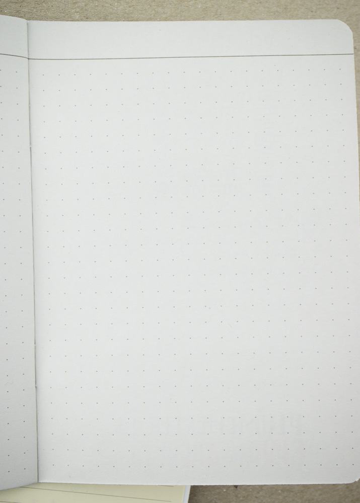
The Papier Tigre A6 3-Pack of Notebooks ($15.33USD) is simply packaged with a black bulldog clip that holds the paper wrap onto the books and is then reusable by the books’ owner. Handy! The set includes three A6-sized (105 x 148 mm or 4.1 x 5.8 in) notebooks, each printed with graphic illustrations in bold colors. Inside, there is a lined notebook on ivory paper in one, dot grid on a light grey paper in another and blank paper on a natural white stock in the third.
All three books have a nice, heavyweight textured, cover weight cover and the paper on the insides feel substantial but smooth.
Since each book had different stock, I decided I needed to test all the papers in case they were different. I went ahead and started with my fountain pens. I figured I needed to know immediately if this paper could withstand the “sharks” first. And it did. There was no feathering or bleed. So, then it was time to try the rest of the arsenal… And the paper even held up to my regular brush pen abuse.
I flipped the paper over and there was no showthrough either. Not even the brush pen. WOOT! On to the next book.
Lined paper survived the shark attack and all the other pens too!
There’s a little evidence of the brush pens from the reverse but it was more halo effect than showthrough. Another success.
Finally… the blank book was used to start my testing for my PaperMate Flair review that will run in a few days. The image above is closer to the actual color of the paper. It’s very warm and creamy.
Again, from the reverse, there is no real showthrough and no bleed at all.
I claim these pocket notebooks as a roaring success. The only reason I would be reticent to recommend them is if you weren’t inclined to want a mixed pack of lined, dot grid and blank paper. Or if the slightly uncommon size (by pocket notebook standards) was an issue for you. Otherwise, I find these notebooks to be a stellar option. I like that the paper colors differ from notebook to notebook and the covers are graphic but non-specific. The minimal-yet-useful “packaging” is an added bonus and the paper is top notch.
DISCLAIMER: The items included in this review were provided free of charge by Milligram for the purpose of review. Please see the About page for more details.


 Laura is a tech editor, podcaster, knitter, spinner and recent pen addict. You can learn more about her knitting and tea adventures on her website,


 Laura is a tech editor, podcaster, knitter, spinner and recent pen addict. You can learn more about her knitting and tea adventures on her website,