Didn’t I say yesterday it was a good month for subscriptions? No sooner did I get the Rad + Hungry USA Kit than the CW Pencils The Pencil Box Quarterly #3: Back to School Kit ($30, currently closed to new subscribers but can be added to email list when new slots are available) arrived. Wow! This is by far my favorite kit that CW Pencil Enterprise has put together so far. Don’t get me wrong, I’ve loved all the kits they’ve done but this one won my heart.
Back to School is always my favorite season far and away anyway. It’s all about office supplies, sweater weather and warm beverages. What’s not to love?

The kit included an assortment of awesome pencils (of course!) but this time, it also included some wonderful other items too like the Coccina glue stick, a clear pocket-sized ruler, a Kimberly square pink eraser, and a carrying case to keep it all in.
The pencils are a great assortment of useful, fun, classic and novel. I expect no less from the ladies of CW Pencils!
The Coccina glue stick is from Italy and smells like almonds which makes it clear why kids might want to eat glue. It smells fantastic. The squishy pink eraser is also delectable and made me want to put teeth marks in it. Clearly, I have a problem.

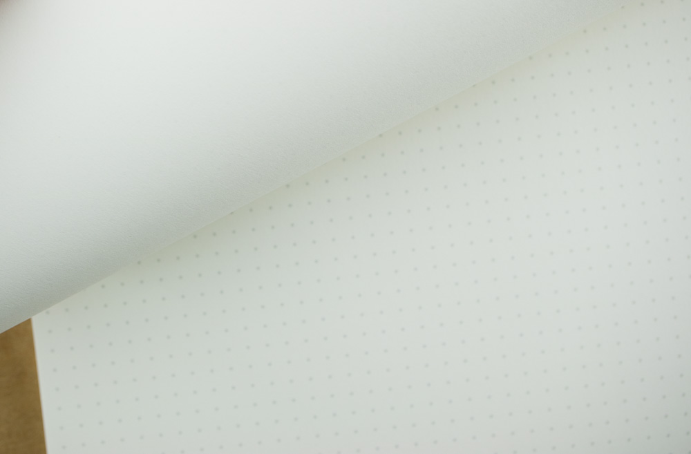
There was a wonderfully vintage grade school writing pad. If you don’t have kids or feel nostalgic about writing on lined paper, this makes great paper for writing small gifts, using for collage or making little notes or cards for gifts. Improvise!
The kit also includes the lovely “handwritten” note with details about each item in the kit and a postcard of the contents.
For me, however, the coup de gras was the repro Futura pencil. Why? Because I have a collection of original Richard Best Tryrex Futura pencils so I was excited to be able to do a side-by-side comparison. Later, I’ll do an actual writing test.


My number one pet peeve with these pencils aesthetically is the logo. I can’t believe I’m saying this, but “Make the logo bigger.” That logo is so spectacular and needs to be seen for miles. Not to mention the logo should be more dominant than the pencil grading data in the information hierarchy.
I don’t mind that the pink paint color is a bit more pink on the Moon Products repro. The original color is a little Clearisil beige. The original Futura pencils I have feature two different ferrules: one is gold with a pink painted ring and one is burgundy to match the logo stamping. There were also inconsistencies in the ink colors for the stamping between the two versions of the original Futura: the #3 has reddish ink and the F has more burgundy colored stamping so I really shouldn’t be so fussy except I thought I was one of the only people in the world with a soft spot for Futura pencils and I’m a big design nerd so I’m all about details and black ink is just not enough! As for the ferrule and eraser, the anodized pink is fun but matching the ferrule to a dark red or burgundy and a brown eraser would be awesome.

Finally, the paint is pooled around the end of the pencil. I don’t know the process for applying the color but I don’t often see this, even on less expensive pencils (Ticonderogas from Mexico, etc) so why is this one so gloopy?
I’ll do more thorough writing tests of these pencils in coming weeks but if you love subscription surprises in your mail box, I can’t recommend the CW Pencils Quarterly subscription highly enough. It is finely curated and worthy of the price. I find that a quarterly subscription is about as frequently as I want a subscription to arrive. It gives me time to genuinely appreciate and enjoy the contents.
I pay for this subscription with my own money so my recommendation comes knowing that my hard-earned paycheck goes to paying for it. I am in no way compensated for this recommendation. See my About page for more information.


 There were some WordPress updates and general upkeep and maintenance this week that somehow lead to the accidentally deleting a bunch of things – not that anyone noticed. Including me! But everything has been restored, including the link to


 Posts of the Week:


