Review by Laura Cameron (and Ana Reinert)
Since both Laura and I have ended up purchasing or acquiring several of the same products, we have decided to do some “tag team” reviews where we provide two points of view. Since our pen experience levels differ and our tastes differ, sometimes our opinions will be similar and sometimes they will differ. We hope you’ll enjoy these posts. This is the third in the series.
Ana:

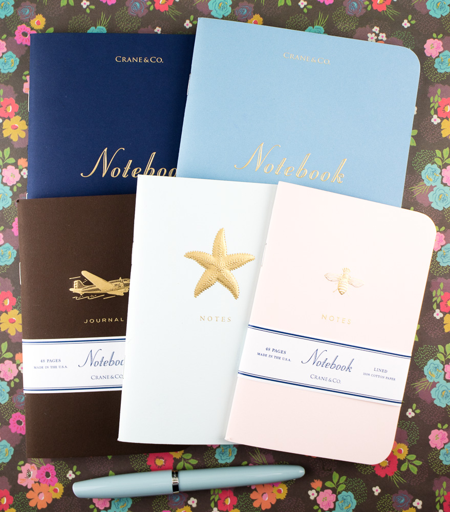
Crane and Co. recently sent us a beautiful box full of their small and medium engraved notebooks. First of all, these notebooks have actual engraving on them which is a printing technique few companies use anymore. Pretty much Crane is the only printer that still does it. It’s tactile and delicate and it looks amazing.
The cover stocks on each of these notebooks is particularly sturdy. The small books are 4×6″ and the medium books are 5.5×8″. I found that the medium size fit perfectly fine in my A5-sized Roterfaden Taschenbegleiter.

When I initially looked at the specifications for the paper stock, I was skeptical that 24lb. paper was going to be able to stand up to the abuse that I usually dish out. However, Crane and Co. offers up 100% Cotton Crane’s Crest paper and it was clearly up for the challenge.
When I flipped over my first test page, nary a dot bled through. There was a tiny bit of show through with the brush pen but you’ll have to strain your eyes to see it. The line spacing is fairly narrow, comparable to college ruled though I forgot to actually measure it.
I agree with Laura that the paper is toothy but I like my paper with a little feedback. I liked the super thick cover stock and I love the engraving. I especially liked the pastel pink with engraved gold bee which I snagged for myself.
Because of the unique size, the small notebooks pose a challenge finding a cover to carry them but since they are so durable, they may survive without a cover. The medium notebooks fit in A5 covers which make them more compatible with many existing notebook systems like leather traveler’s style notebook covers. Crane makes such beautiful engraved covers, I want to protect them and the paper quality is excellent. The only down sides are that they are only available in lined and their unique sizing. But, they sure are posh!
Laura:
Crane & Co. recently sent us a set of their engraved notebooks for testing and review.
These editions come in two sizes: 4″ x 6″ and 5 1/2″ x 8″. All editions have 48 lined pages on 100% cotton 24lb paper with rounded edges, and covers in 96lb paper (in Blush, Navy, Sea Glass and Dalton Blue). All editions feature an engraved design on the front in gold foil.
I had the opportunity to test the Engraved Starfish on Beach Glass Small Notebook and the Engraved “Notebook” on Dalton Blue Large Notebook. I found both to be sturdy notebooks. The paper was excellent quality and quite “toothy.” I ended up testing a variety of pens including fountain pens, gel inks, and brush pens, among others, and the paper took the ink very well. There was just a hint of ghosting on the backside, but no bleeding through. I really did appreciate the sturdy quality of the cotton paper; it felt like a cut above many of the notebooks I have tried recently.
The only thing I found unusual about the small notebook was that it departs from the standard pocket notebook size of 3 1/2″ x 5 1/2″, and therefore didn’t fit in my Chic Sparrow pocket leather cover that well. However, the Crane medium notebook fit nicely into an A5 Chic Sparrow cover.


 Laura is a tech editor, podcaster, knitter, spinner and recent pen addict. You can learn more about her knitting and tea adventures on her website, The Corner of Knit & Tea and can find her on Instagram as Fluffykira.
DISCLAIMER: This item was sent to us free of charge by Crane & Co for the purpose of review. Please see the About page for more details.