Review by Tina Koyama
Last winter I took a class in colored pencil drawing. On the first day, when students started pulling out their materials, I saw that everyone had brought their pencils in the flat metal tins that they had come in.
I have so many colored pencils that I had difficulty choosing a couple dozen or so “to start with,” as the instructor had suggested. Since I hate working out of those metal tins and always store my pencils upright in mugs, I simply grabbed several sets’ worth and dumped them all into a plastic storage bin to take to class. They rattled around a lot as I carried and dug through them. While our instructor advised us to transport our pencils carefully to avoid dropping them and shattering the cores, she glanced at my plastic bin through the side of her eye. Chagrined, I vowed to get a better case for them.
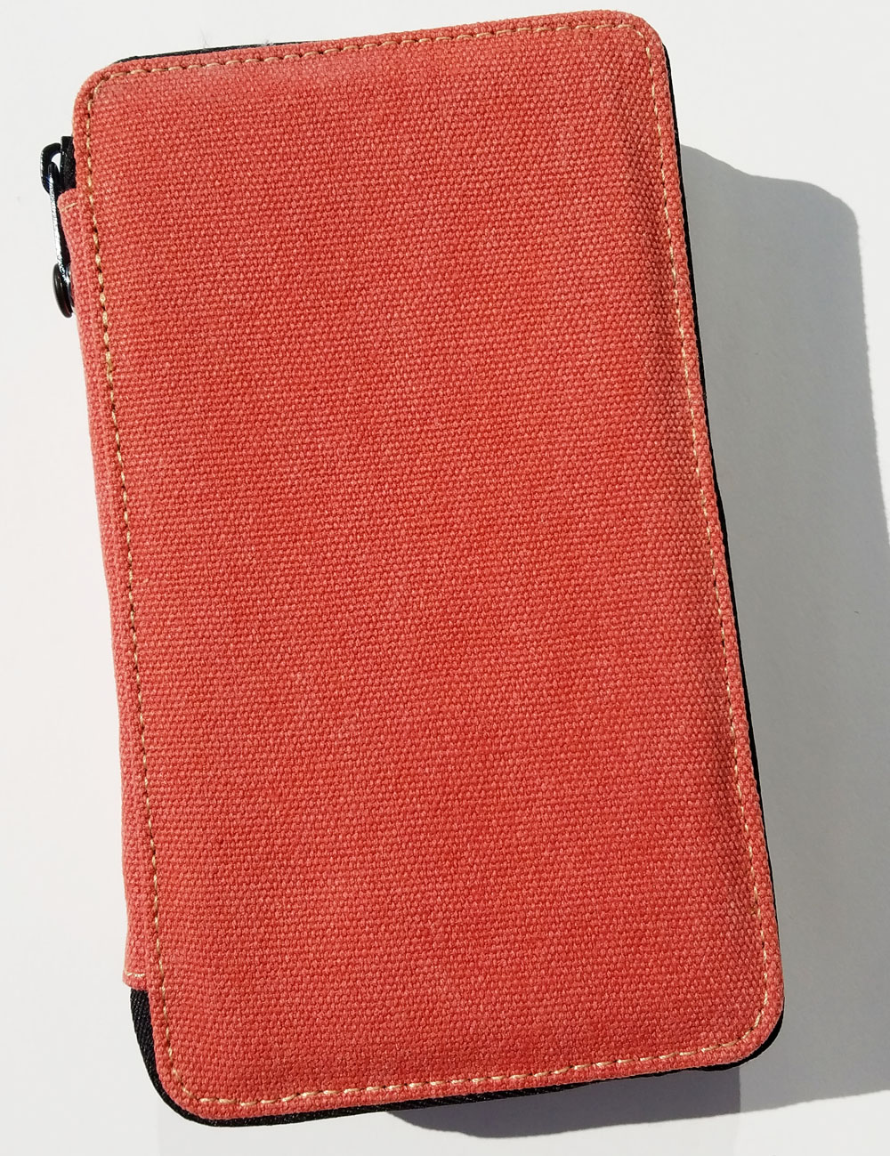
I finished the class still using the plastic bin, but fortunately, I never dropped it. Next time I take a colored pencil class, though, I’ll be ready, because I now have a Global Art canvas-covered pencil case.

I chose the 48-pencil capacity case in the Rose color. (It’s available in seven other colors and a 24-pencil capacity size, too.) The sturdy canvas fabric feels soft like a nicely worn jacket. The black nylon zippers move smoothly and easily around the rounded corners.
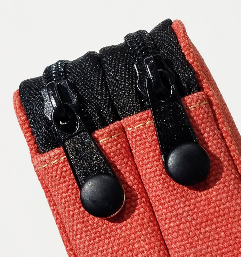
The zippers have an unusual detail that I’m not sure I’ve seen before on something like a pencil case: When zipped closed, the tabs can be snapped onto the spine. If I thought the zippers could slide open easily by themselves, I can see that the snaps might be necessary (the packaging says the snaps provide “security when traveling”), but I can’t imagine that happening. (Read on for another reason why the pencils’ security is never at risk.) Frankly, I can’t be bothered with snapping and unsnapping something I want to get at easily like my colored pencils, so just zipping is enough security for me. But if I were storing the case on a bookshelf, the snapped tabs would look neat and tidy.

Inside are two separate fabric-lined compartments, each with its own zipper. Each compartment has six wide elastic bands to hold the pencils.
I filled the first compartment with Caran d’Ache Museum Aquarelle pencils, which are slightly larger in diameter than average pencils. For a capacity of 48, each compartment should hold 24 pencils, but I couldn’t fit four Museum Aquarelles into each elastic band; even three are a bit of a squeeze. So if all I used were pencils of this size, I’d say the maximum capacity of the case is 36 – not 48.

Caran d’Ache Pablo pencils have an average pencil diameter, so I put some into the second compartment to test their size. I was able to fit four Pablo pencils per elastic band, but just barely; they are really tight and require a significant struggle to put in and take out. Three are comfortably snug. Perhaps over time the elastic bands will loosen, but until then, I recommend placing no more than three per band.
One thing I will never have to worry about with this case is my pencils falling out, ever – even if I were to leave the compartments unzipped. These bands are super-secure!

Some pencil cases I’ve used look great empty or with only a few items in them, but when filled to capacity, they look bulky and messy. The Global Art case, however, looks neat and compact with both compartments filled and zipped. There is no bulging or forcing of the zippers.

Final Impressions
The Global Art pencil case is designed well, looks and feels nice, and is probably the most secure pencil case I’ve ever used. Nothing is ever falling out of this baby! However, due to that extra-tight security, and depending on the diameter of your pencils, I recommend putting no more than 36 pencils into this case intended for 48. I just signed up for a graphite drawing class this fall, and I’ll need to bring several grades of pencils, so I’m looking forward to carrying them to class in this case (and avoiding that sidelong glance from the teacher).
 Tina Koyama is an urban sketcher in Seattle. Her blog is Fueled by Clouds & Coffee, and you can follow her on Instagram as Miatagrrl.
DISCLAIMER: The items included in this review were provided free of charge by JetPens for the purpose of review. Please see the About page for more details.

 Pens:
Pens:


 Laura is a tech editor, podcaster, knitter, spinner and recent pen addict. You can learn more about her knitting and tea adventures on her website,


 Posts of the Week: