

I cannot believe how quickly four days passed. The Atlanta Pen Show 2016 was four action-packed days of making tons of new friends, seeing old friends, and, of course, looking at all sorts of wallet-emptying pens, inks, paper and other wonderful goodies!
To give a quick timeline, we arrived in Atlanta on Thursday afternoon and got to mingle and hang out with all the early arrivers in the evening. I get the impression that the hotel bar staff doesn’t quite know what to do with us but they tolerate the inevitably ink-tinged water goblets without complaint. We ate, drank and chatted a good deal so I hope the wait staff tipped out well at the end of the night.
Friday, I got to walk around the show floor a little bit in the morning and then the wonderful folks at Goulet Pens asked if I would do an interview for their Q&A series live and in-person. It was both incredibly exciting and incredibly nerve-wracking but the best part was meeting Brian and Rachel and their wonderful videographer and video editor, Jenni. After the video, I got to visit with more folks and wander a bit more before the show closed and the evening carousing kicked into gear again. Friday night was the traditional Atlanta Pen Show hamburger cookout which was fun and filling even if the burgers were still mooing.
Saturday, I got to spend the morning testing out inks at the Vanness ink testing station and then the afternoon helping out at the NockCo booth with Myke (yes, they let us run the show for awhile!) before the big moment: the recording of the 200th episode of The Pen Addict podcast recorded in front of a live audience at the show! I cannot believe how epic it was to record a podcast (not in my pajamas) in front of 60+ people. I am so grateful to all the Kickstarter backers and Brad and Myke and the celebrity crew from Relay.FM for making it all happen and letting me be a part of such a historic event. Sitting here typing this, I have to pull that pack of tissues out again because I’m getting all verklempt again.
However, the one thing I forgot to do in all the excitement was TAKE PICTURES! So, I’m leaning on all the wonderful folks on Instagram who used the hashtag #ATLPenShow2016 and #AtlantaPenShow2016 to find some of my favorite moments from the show and share them with you. I hope the original photographer don’t mind that I’ve included their photos here (please let me know if you do, I’ll swap them out but I hope you know that I’m sharing them with love and best intentions!) Please go through all the awesome photos on Instagram and see all the great stuff people found, all the happy faces and I hope to see your face in Atlanta next year!

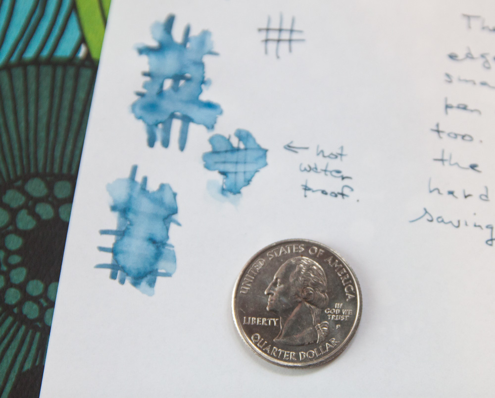
I’ll be doing another post with all the goodies I acquired and, of course, more in-depth reviews of inks and pens in the coming weeks so stay tuned!


 Pens:
Pens: