From The Archives: Pilot Envelope Pen

Pilot Envelope Pen Writing Sample

from-the-archivesI have been using the Pilot Envelope Pen in both the Fine and Extra Fine models for many years. These are rolleball pens. I’d most likely compare them in feel to a Pilot Precise V5 but a little bit slippier. The ink is silky smooth but because of the ink, the tip can get a little gunky. So why suffer a gunky tip? Because these pens are fine line AND waterproof and not prone to feather like a Sharpie Marker. In my writing test, the water test portion was wet with a water brush and dried. Not even a smudge!

The ink does have a bit of an odor but no worse than an alcohol-based markers and there may be some show through or bleed through on some papers but for envelopes or file folders, its not a big deal.

These do use ink quickly so buy two at a time. Stock up now before holiday card season.

Pilot Envelope Pen

I like the extra fine better for addressing envelopes since its easier to write long addresses small and neat. The fine is quite a bit broader.

Each model is just $2 and there is also a broad version and available from Jet Pens.

Feeling a Little Royal

Everything in Kansas City, and in my office, is swathed in blue and all things Royals so I see no reason why I should not inflict this on everyone else.
Here goes:

First, I wanted to show you this wonderful video of retired Hallmarker, Shannon Manning, talking about designing the Kansas City Royals logo. I found the article with the video on Todd Radom’s blog about the development of the Royals logo.

Then I wanted to show you this wonderful chalk mural created by the lettering staff at Hallmark this week:

And then there’s been a slew of doodles and messages of support:

#thatneighborkid #beroyal #crowntocrown #sharehallmark #danielmiyaresdoodles

A photo posted by @think.make.share on

Nice stuff, huh?

(file under “Plugging The Firm”)

Link Love: Picture This

instagramlove

Great images this week from Instagram. From the top:

  1. Row 1, left to right: Chalk Lettering by Josh Scruggs, Fountain Pen Day Swag by Ivan Romero, Roterfaden by Ian Hedley.
  2. Row 2: Baseball score sheet by Tim WasemHot Air Balloon Bunny Print by Two Tone Press and Vintage Perpetual Desk Calendar by Lila Symons.
  3. Row 3: J. Herbin 1670 Stormy Grey by FPGeeks, “I won’t take the easy road” lettering by Lila Symons, and Air Mail Envelope Security Pattern by Donovan Beeson.

Pens & Ink:

Pencils:

Paper & Notebooks:

Other cool stuff:

Ink Drop: So Long, Summer (September 2014)

Ink Drop: September 2014 So Long, Summer

Today was the perfect day to open this Ink Drop set. It was one of those Indian Summer days — warm and sunny but it would get a little chilly when the breeze would blow and the trees are starting to change. So, so long, summer. You’ll be dearly missed.

This month’s Ink Drop (I guess technically it’s last month’s Ink Drop) featured colors that hover between summer and fall. They are colors that are a little deeper than those bright sun-baked summer colors but not quite the jewel tones of late fall. Featured this month was Diamine Sepia ($12.95 for an 80ml bottle), Diamine Teal ($12.95 for an 80ml bottle), Pelikan Edelstein Mandarin ($22.40 for a 50ml bottle), Pilot Iroshizuku Fuyu-Gaki ($28 for a 50ml bottle) and Private Reserve Daphne Blue ($11 for a 65ml bottle).

The color difference between the Mandarin and the Fuyu-Gaki was pretty slight in the swatches but it might be more noticeable when actually writing. At best, I think the Fuyu-Gaki is a little more reddish than the Mandarin which was a vibrant orange. It might help to know that Fuyu-Gaki translates to “Winter Persimmon.” I do think Fuyu-Gaki is reminiscent of the color of a persimmon.

The Diamine Sepia is a golden, fall leaf yellow gold. I would have named it something like “Golden Wheat ” or “Raw Umber”rather than Sepia which I always assume will be a more reddish brown or grey brown. That said, its a pleasingly autumnal color and I’ll be curious to actually ink it up in a pen. Maybe my Kaweco Art Sport would look good with this color ink?

Private Reserve Daphne Blue is quite similar to the Naples Blue from the August Ink Drop. The Daphne Blue is just slightly more turquoise in the swatch than the Naples Blue. Both look like fabulous vivid blues.

The Diamine Teal is a wonderful sort of teal blue-black. I may not love black inks but blue-blacks and green-black and purple-blacks are all well-received at The Desk. I’m looking forward to doing a full review of this ink and probably buying a full bottle.

Which of these colors would you like to see as a full writing sample first?

Ink Drop is a monthly ink sampling service from Goulet Pens. Subscriptions are $10 per month (add $5 for international subscription), pre-paid or ongoing, and include five different colors of ink and discounts on purchases of full bottles of ink in the Ink Drops.

Swabs are done with a watercolor paint brush on Kyokuto Word Cards.


DISCLAIMER: This item was sent to me free of charge by Goulet Pens for the purpose of review. Please see the About page for more details.

Ink Review: MontBlanc Meisterstück 90 Years Permanent Grey

Mont Blanc Meisterstuck 90 Years Permanent Grey

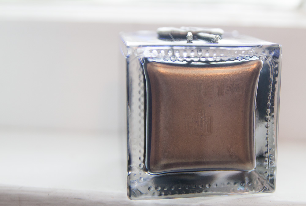
I was having one of those weeks at work where all I really wanted was a pick-me-up. So, at lunch one day, I ventured across the street to the Pen Place and bought a bottle of the MontBlanc Meisterstück 90 years Permanent Grey ($22 for a 60ml glass bottle). I bought it sight unseen (no test swab or anything), spurred entirely by how much I like the Daniel DeFoe ink and I wanted something new, different and special. I don’t know much about MontBlanc and their heritage but I was inspired by the moment, so I bought a bottle of this ink.

Mont Blanc Meisterstuck 90 Years Permanent Grey

The ink swabbed almost black so I was a little concerned that in writing, it would appear to be black. I was pleasantly surprised when I started writing with it that the ink is a watery grey-black with cool undertones (leaning a little green). Because of its lighter coloring, there is some nice shading when writing. I suspect in a finer nib pen, some of the shading might be lost. I definitely recommend using this ink with a medium nib or wider to get the full benefit of its color quality.

I don’t normally look for or purchase black inks. There are so many color options with fountain pen ink that I can’t bring myself to buy plain ol’ black. But I really like grey so I make an exception for grey inks. There aren’t a lot in my ink library so the Meisterstück Permanent Grey is an excellent addition. It is also a fairly water resistant color so it would make a good option for signing documents or addressing envelopes or anything else that might be exposed to the elements. When wet, there was a little grey washing around the writing but it stayed pretty true, enough to withstand getting caught int he rain or spilling some coffee.

This ink was tested on a Rhodia Uni-Blank No. 18 pad with my Lamy Studio with a 1.1mm stub nib.

Winner: Knock Knock “Dress Your Desk” Giveaway

Knock Knock Notecards

Thanks to everyone who entered the giveaway for the Knock Knock “Dress Your Desk” Essentials.

Congrats to our winner, Kristy!

Screen Shot 2014-10-21 at 11.42.16 AM

Screen Shot 2014-10-21 at 11.40.07 AM

I will contact you via email to make arrangements for delivery. Check your inbox.

For everyone else, remember that Knock Knock has two special offers available:

  1. Sign up for the Knock Knock newsletter and get 20% off a future order over $50.
  2. Get 20% off any order with the code DESK20. But hurry, this code is only good through 11/1/14.

And don’t forget about the Dress Your Desk Campaign:

Then submit photos of your desk to Knock Knock. If selected, your desk could be the “Featured Desk of the Week” on the Knock Knock blog and our social channels. To share with your photos, just tag Knock Knock on FB, Twitter, or Instagram and use hashtag #DressYourDesk for your chance to be the “Featured Desk of the Week”.

Go forth and Dress Your Desk!