I’ve had good experience with every Private Reserve ink I’ve used up to this point so I had no concerns about the quality of the ink. My goal was to find a purple that I loved and Ebony Purple was recommended to me buy the fine folks at Goldspot Pens as a color I might just love. I got the 50ml bottle of Diamine Ebony Purple for $10. While its not the prettiest bottle in the world, its easy to use with a simple, cylindrical shape and a wide mouth that makes it easy to refill pens.
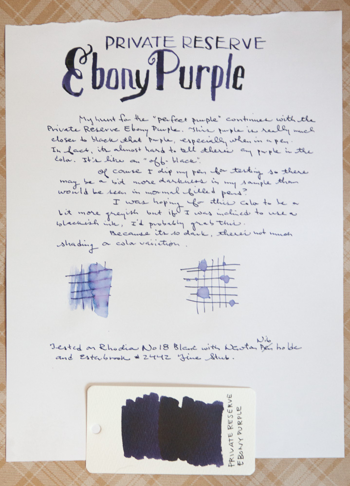
Ebony Purple definitely lies on the the darkest end of the spectrum and more violet than purple. Because the color is so dark there’s not a lot of shading. In my waterproof tests you can see the blue and the red undertones in the ink. The ink is definitely not waterproof but makes it easy to clean out of the pen.
I’m not a huge fan of plain black inks so Ebony Purple is a good alternative for a dark ink that’s respectably blackish but with some personality. I like it for this quality but my search for the “perfect purple” continues.
DISCLAIMER: This item was sent to me free of charge by Goldpost Pens for the purpose of review. Please see the About page for more details.
I took a lot of ribbing from readers after I reviewed the Pilot Varsity awhile back. I had a particularly bad experience so when I spied the newly repackaged Pilot Varsity ($3), I decided it was as good a reason as any to give the Varsity another try.
The new pen design is the same shape as the original pen but features a black, grey and silver diamond pattern on the barrel and a small yellow “Varsity” logo on one side. The clip is a little larger and bulbous and too plasticky but the pen is comfortable in the hand and the cap is easily postable. The nib is labelled as a medium and its definitely equivalent of a European medium nib.
I’ve been writing with this pen on and off for over a month and I’m quite pleased with its performance. It writes smoothly and starts as soon as I remove the cap. There are no hard starts or need for priming. The nib is wider than I generally prefer for an everyday writer but its a pleasing medium nib with some nice line variation and requires the lightest of touches to put ink on the page. Even writing upside down, sideways and just grabbing the pen to quickly write down a number presented no problems for me.
This is one of the best values in fountain pens. While the Platinum Preppy is available in a much finer nib and refillable, the Varsity will put a smile on anyone’s face. “Three dollars for this?!?! What a good deal!” I’m willing to admit that my previous experience with the Varsity might have been a fluke, one bad apple in the bunch. If you had a bad experience with a Varsity, I recommend you give it another shot. At $3, quality control is probably not a top priority but it also means it won’t break the bank to buy two.
With many stacks of notebooks, sketchbooks and blank books I’ve acquired, and the fact that my day job is about making pictures, I thought it was time to get back into the regular habit of keeping a sketchbook or visual journal of some sort. I figured that I couldn’t possibly be the only person who might need a little inspiration and creative idea to get me started so I thought I’d share some of the prompts, ideas and tips I found.
First, I found this great 15-day set of prompts from Wit & Whsitle. Usually I find prompt lists too long and usually full of things I think are silly or pointless but this set was only 15 days worth and fairly open to interpretation.
Then I remembered the awesomely inspiring site, Illustration Friday. Every Friday, they offer a prompt that is both simple and open to interpretation. Folks will upload their art to the site if you want to see what other people do. You are not required to submit your sketch or drawing but its a great source of inspiration and a one-drawing-a-week prompt is a low bar to hurdle. This week’s prompt is “pet” and was submitted by my friend and co-worker Terry Runyan. She illustrates both digitally and on paper so don’t feel that you have to limit yourself to just the pile of sketchbooks and notebooks you’ve accumulated. Illustration Friday also has a blog and podcast for even more inspiration.
I love Lisa Congdon‘s art and she freely shares pages of her sketchbook as well as a video class on Creativebug that walks you through how she creates several sketchbook drawings. She uses layering and simple drawings to create designs that are easy to try yourself and she even shows how she creates variations on each technique to give you even more ideas.
Danny Gregory‘s Everyday Matters Manifesto for drawing your life was a huge inspiration for me. Consider purchasing one of his books. I particularly like The Creative License. He’s even started a Sketchbook Skool video class if you want a multimedia experience.
Austin Kleon and his Steal Like An Artist Book is super liberating. You should probably read it. Better yet, borrow it from the library and write down all your favorite bits in your sketchbook.
you need to jump in and get over the intimidation part — by messing up a few pages, ripping them out if need be. Waste all the pages you want by drawing a tic tac toe schematic or something, painting them black, just doodle. — Gary Panter
After my Fashionable Friday: Purple Rainy Day, I’ve been itching to add more purple inks to my stash. I started hoarding various shades of purple and taking recommendations from friends and shop keepers. The first color that was brought to my attention was Montblanc Lavender Purple (60ml bottle for $19) thanks to Matt over at The Pen Habit.
I don’t usually dwell on the bottle designs of inks but I’m finding as I accumulate more inks, I’m becoming more opinionated about bottle shapes, sizes and graphics. Lavender Purple is one of the “standard” Montblanc inks and comes in one of the most useful and interesting bottles in my collection. Its a long oblong glass bottle with a divot on the bottom of the bottle just behind the cap. This creates a divided chamber in the bottle. By tipping the bottle forward, ink in the back chamber can fill the front chamber making it easier to refill a pen as the ink volume is depleted. Ingenious! And except for the slightly too-modern label on the top of the bottle, its a really aesthetically-appealing bottle overall. Its such a nice bottle that I could see buying an empty Montblanc bottle and transfer some of my inks in difficult-to-dip-my-pens bottles into this little gem.
Montblanc Lavender Purple is not really lavender nor purple, at least not to my eyes. Its reminds me a bit of Grape Kool-Aid. Its a warm, purplish-black with a bit more red in the color than any of the other purples I tried in my hunt for the “perfect purple.” I like purples and violets that have a duller, deeper tone rather than garish, bright jewel tones. Its not to say that a vibrant purple isn’t beautiful, I just find that I don’t reach for such “showy colors” on a regular basis.
The color has a little shading and depending on how wet the nib or feed is, the color can look almost purple-black or a softer, muted black cherry. I had no issues with drying times though I’m not very scientific about dry times. If the ink dries before I get my hand over it, then it dries fast enough. On the Rhodia paper, drying is slower than most and I had no issues.
When I put the swab swatch next to some of the other purples in my collection, its easy to see how much rosier Montblanc Lavender Purple is to the other colors in my stash. I’ve had a couple days to admire it and the more I look at it, the more I like it. This is definitely a color that will be moved into my regular ink rotation.
Our dear pen friend, Mary Collis has received some sad, scary health news and posted about it this week, Curveball (via From The Pen Cup). Please take the time to leave a message for her.
I confess that I have a huge soft spot for metal-tipped, felt-tip markers. Marvy Le Pens were one of my middle school “gateway drugs” into the wonderful world of pens. I like the slight grippiness of the felt tip that helps me slow down and write a little bit neater than with the smooth-as-glass experience I get with some rollerball and gel pens. I love the wide array of colors for taking notes and color-coding my planner and calendars so a large set of colored, felt-tip markers thrills my inner 12-year-old. If I get anymore excited about this little mini bottle of markers, I might start drawing rainbows, kittens and unicorns.
The pens are shorter than the regular Point 88 Fineliner 0.4mm marker pens but the cap posts nicely so that it feels like a full length pen in use. Since I tend to wear the tips of these sorts of felt-tipped markers out long before they run out of ink, the shorter pen seemed like a reasonable option. I can also fit a lot more of these shorties in my travel case, which is a bonus.
(via JetPens)
The pens are the same width and shape as a standard hexagonal pencil. Even the color of the barrel is reminiscent of a classic yellow Ticonderoga pencil but with classy white pinstripes. The cap snaps snugly on the pen cap or the base for posting the cap.
The individual Point 88 mini pens do not have color names written on them so I made up some descriptive names as I went along. Jet Pens lists official names if you’re curious. The colors were all bright and clean colors. The point size is in my “sweet spot” for nib sizes at 0.4mm and exactly the same line width as the Le Pens.
(I lost to my inner 12-year-old and drew a panda. You forgive me, right?)
My first reaction when I started testing the Point 88 minis is how much the writing experience and colors reminded me of the Marvy Le Pens. I’m don’t have a complete set of Le Pens here but was able to cross-reference the writing experience and color with at least a dozen colors and there are some very comparable shades between the two brands.
The inks are not waterproof but neither are the LePens. The Stabilo pens are designed to allow for a long cap-off time without drying out. I didn’t test this out but hope that they live up to the hype and provide me a long life of colors over the next several months.
When posted, the Stabilo Point 88 minis are a tiny bit longer than the Le Pens full length but unposted.
The same Stabilo 88 mini Fineliner marker pens are available in a soft plastic wallet instead of the goofy “water bottle” but it costs $0.75 more for the envelope rather than the bottle. My Stabilo mini Fineliner pens will end up being dumped into my regular pen case so I’m okay with the $0.75 savings. The full-sized set of Stabilo Point 88 Fineliners includes all 25 standard colors for $21.50. I might go ahead and order the full set so I can have the greys, browns and the midnight blue color which are some of my favorite shades to use. Individual pens are $0.80 each so its worth adding a few to your next order if you’re not sure you want a full set or you need to “complete” your set.
The Staedtler Triplus Fineliner 20-color set is a little bit more expensive ($25) but a little bit finer at 0.3mm. I know the Staedtlers are quite popular as well so if you find the 0.4mm to be a bit too wide, these might be a good alternative. I’m going to stick with the Stabilo Point 88s.


 Post of the Week:


