
Now that I’ve settled on the Filofax Original personal-sized planner in dark aqua as my planner for the year, I was ready to add my inserts and customize it to be mine. I’m not inclined to be too craftsy with it because I want to use my planner to get organized. I don’t want it to be another “project” I have to do each week. I just want to plan out all the projects I want to do (and need to do), but I wanted to add a little “me” to is as well. I thought I’d share the little details I added to make this my planner.
It’s not “finished” yet but I’ve been using for over a week and its meeting all my needs so far.

As you can see, I’ve stuffed it full already with pages and some other bits. Because its really just a leather cover, the bulk of the bulk is the content and not a big planner.

The pen loop is on the let side which a lot of people have complained about. As a lefty, this couldn’t be more perfect! Its the first time ever that the pen loop is on the proper side. There are a couple business card-sized slot pockets on the inside of the cover and the elastic is stitched in two places so there is theoretically room to slide other things under the elastic but I have discovered that the more stuff I stick in the inside front cover, the less pliable it becomes. Since its already pretty full, the stiffer the cover, the harder it becomes to snap the cover shut. So, for me, no junk in the inside front cover.
There’s a clear plastic flyleaf on the front that I’ve been paper clipping coupons to. It keeps them front and center to I remember to use them. Under that is one of my handmade, laminated dividers. I drank my own kool-aid here and bought a budget priced Amazon Basics laminator for about $20.

I’ve been collecting bits of pretty paper for years and this seemed like the perfect use for some of it. I used the stock tabs that were included with the Filofax as guides and cut out the tabs, ran them through the laminator and then trimmed and punched them. I used an electronic Dymo to print sticky labels on clear film and cut them to fit on the tabs.
Right now, I have five tabs:
- Calendar
- Lists
- Addresses
- Post Log
- Blank
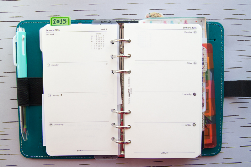
Inside, I upgraded to the Filofax Cream Cotton week-on-two-pages inserts for 2015. I use these pages to write things I need to do in a given day, be it “stop at library” or “get gas” to “project due”. For activities that need to happen in a given week, I’ve been hole-punching a smaller card and inserting it in between the week. These can be things like a list of topics for the blog or “call the dealer to schedule car maintenance”. If the tasks don’t get completed, the card can be moved to the next week.
I’ve heard that the Cream Cotton paper is thicker and better quality than the standard Filofax bright white paper. I haven’t done any comprehensive ink tests yet but, in general, I think the best course of action with a planner is to keep a multi-pen filled with fine tipped gel inks rather than to try to make it work with my fountain pen collection. I’m willing to sacrifice some fountain pen time to not have slow-drying, smudging, bleeding, etc issues with my planner. Besides, my multi-pens frequently get neglected in favor of fountain pens so this is their chance to shine. At present, I have a Pentel i+ in the elastic pen loop but I’ve also used my Uni Style Fit pens (4 colors plus a pencil) and they both easily fit in the elastic loop.

I printed a year-at-a-glance fold-out calendar from What She Was on Etsy which is super clean and simple and gives me quick access to the whole year. I might also add a month-on-a-page calendar for tracking longer projects, holidays and birthdays.

Behind the “Post Log” tab is only a little glassine bag that I punched and filled with an assortment of stamps. This will eventually include the PenPal Mail Log sheets I purchased from Holiday Notes on Etsy but I am waiting to print them on a good color printer rather. Hopefully, I’ll have a few sheets in place by next week.

The addresses section is also the Cream Cotton pages from Filofax. I used a page or two for all my contacts. It took me awhile to transcribe them from my old address book but I love having all the addresses in one place, along with my post log.
In the Lists section is just a few sheets of the Filofax sample To-Do List pages but I plan on downloading and printing some To-Do Lists soon. I’d like a slightly different format than what is offered on the Filofax sheets but will have to shop around on Etsy and My Life All in One Place in hopes of finding a better option.
In the Notes section, I have it filled with the multi-colored paper samples that came with my Filofax. I am burning through this paper so I suspect I will need to order more soon. I do like the colored paper and the lines so I might buy some from KiddyQualia or Yellow Paper House.

Behind the black tab is a vintage air mail envelope that I’ve been tucking receipts into. It fit perfectly, I just needed to punch holes and voila!

Behind the envelope is the clear plastic sleeve which I’ve slid some loose papers into and stuck a large sticky pad to the back. Eventually I might swap out the large pad for a smaller pad but I had this one, so I’m using it for grocery lists and what not. Then there’s another clear flyleaf sheet. In the back slit, I placed a plastic pocket folder that friends brought back from Japan for me. Tucked into it are some calendar stickers that also came from Japan, some sticky fold-over tabs, business cards and other paper detritus.
So, there you have it. A tour of my planner for 2015. I’m sure, over the year, things will be added and other things will be removed. The nice thing with the Filofax is I can move things around, take out pages that aren’t getting used or add in more pages where I need them. I can even change the binder completely and move all the pages, tabs and all, with no issues. So maybe in the spring, I might try a more summery binder. For now, I am in love with how flexible and aesthetically appealing the dark aqua Filofax Original is.


