Last week was my birthday and my darling husband found the perfect gift for me: the limited edition Chicago version of the Timbuk2 messenger bag. This was a version limited to just ten bags for the grand opening of Timbuk2’s Chicago store. It would never have occurred to me to call the store and see if there were any left following the grand opening at the end of May. I would have just assumed that they sold out of these gems in a day or so. I also had no idea just how limited they were. Only TEN were made and when he called last week, they still had two left. Can you believe it?
So, the staff at the Chicago store kindly sent him one. And voila! The ex-pat Chicagoan can proudly carry a Timbuk2 bag inspired by the flag of her hometown — a city so grand its flag is emblazoned on shirts and bodies and just about anything else you can think of.
What makes this design unique from the build-a-bag option on the Timbuk2 website? First, the sky blue cordura nylon is not a color currently offered through Timbuk2. This might not be an issue for anyone else since Timbuk2’s build-a-bag offers dozens of solid cordura fabrics as well as prints, waxed canvas and more but for they put the idea of a Chicago flag themed bag in my head and nothing less would do for me.

I haven’t bought a new Timbuk2 bag in a long time and there are some new features and some things have been upgraded, moved or modified. A lot of the changes seemed like really smart improvements too while keeping the elements that make a Timbuk2 bag so durable.
The new things include:
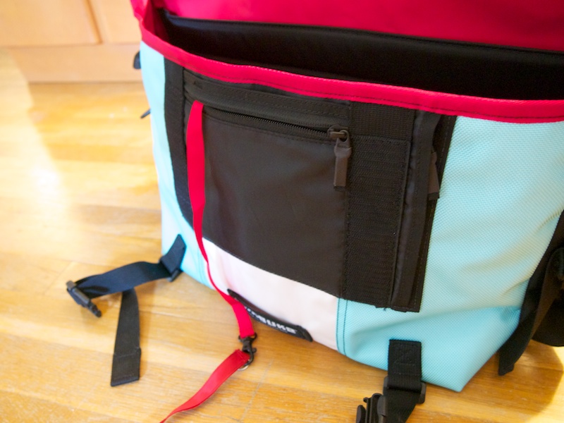
- A padded grab handle to make it easier to pick up the bag like a briefcase
- Clips to close the bag are now under the flap to create a more streamlined front panel
- Clips are connected to straps under the bag that can be used to hold a jacket, an umbrella, a poster tube or yoga mat or used as compression straps to keep contents from flopping around
- The pocket under the panel now has a side zip pocket for wallet, phone or other items that need to be handy but kept secure
- The key leash is now attached inside the front pocket (it used to be inside the inner pocket)
- A stiff piece of plastic has been added to the top edge of the large inside slashpocket to keep it from being flimsy. Earlier versions had a slash pocket plus a pocket with velcro which never got opened because the velcro was too sticky
- Speaking of velcro, previous versions of the messenger bag had two vertical slashes of velcro on the inside flap. Now there is a horizontal swath of velcro on the inside flap guaranteeing that the bag will stay closed no matter how the flap is aligned and without the added security of the clips. The velcro is super sticky too.
- There are also water bottle sleeves inside on both the right and left sides, one is mesh and the other is solid (this is an upgrade feature on the build-a-bag)
- The shoulder strap is softer, more flexible webbing material which is less likely to rub skin raw or gouge a groove in your shoulder. However, I still recommend investing in the velcro strap pad cover. I’ve been using the same one for over 15 years — I just switch it from bag to bag as needed. Best $15 I ever spent.
- There are reflector tabs at the end of the compression straps for late night biking and the small horizontal loop on the center strip is designed to hold a blinky bike light.
Stuff that stayed the same:
- The red key leash is still there and one of my favorite features even though the placement changed its still super useful. I added an extra leash to the leash so I can clip my keys and then throw the whole thing into the depths of the bag rather than trying to squeeze my giant car key/alarm doodad into the small front pocket.
- The lining is still waterproof and now there is an extra bit of fabric at the flap fold to eliminate potential water from getting in on the sides. Did I ever tell you about the soaking one of my Timbuk2 bags got a few years ago? I got caught on my scooter in a torrential downpour with no place to pull over and get shelter. When I got home, I was drenched from head to toe — so much so that I took my shoes off and literally poured water out of them like a cartoon. The whole time, all I could think was that everything I owned of value was in the TImbuk2 bag on my back and the exterior Cordura was drenched. I worried that my phone, camera, and all the other paper goods in my bag would be drenched. When I opened the bag though, the only thing that was even damp was the corner of a magazine that had been sticking out of the exposed corner of the bag. So, no more exposed corners with the new design so get out there and ride without fear of anything being damaged in a monsoon.
- There is still an inside pocket with slashes on the outside of it that hold pens, business cards and other sundries. The pocket itself is a bit smaller than previous models but perfect to stash earbuds and the like.
- A crossbody strap is included for additional support when carrying the bag on a bike
- The build quality is still excellent. Ends are nicely folded and finished. Everything feels well constructed and durable.

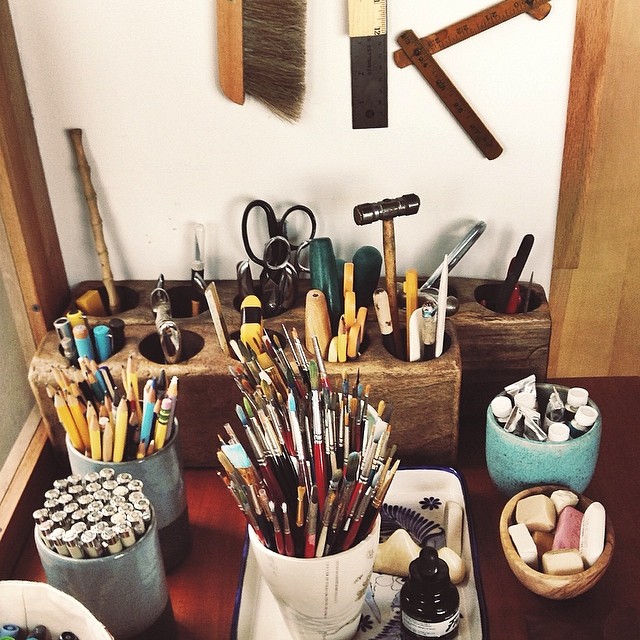
Pictured above is all the stuff I dumped out of my previous bag and need to fit into the medium Timbuk2 messenger:
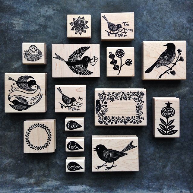
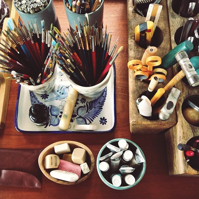
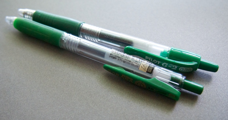
- massive assortment of pens, stored in a LWA member pouch and a NockCo Lookout
- also in the LWA pouch is rubber stamps, mini stamp pad, retractable X-acto, letter opener, bone folder, eraser, pen refills, washi tape, glue stick and Tombow adhesive roller.
- notebooks: Palomino Blackwing Luxury Notebook and Zenock Leatherworks Field Notes Cover
- camera and extra camera lens
- knitting project of the day with retractable tape measure and nautilus needle gauge (even knitters have nerdy tools!)
- Coach Heritage wallet/wristlet
- reusable shopping bag or two, usually folded into a pouch or tied with a rubber band
- iPhone
- iPad mini
- business card case
- misc. personal effects like lip gloss and asthma inhaler in an Blue Q airmail tyvek zip pouch

It all packed into the Timbuk2 neatly with plenty of room to spare for other things that pop up like a book to return to the library, my mail reply kit, a sack lunch, etc. There’s also more than enough room to use this bag to carry my 13″ laptop should the need arise. The top photo is actually the bag fully packed.
Timbuk2 messenger bags start at $109. If you have an old bag you’d like to replace, Timbuk2 does offer an option to recycle an older bag called LifeCycle. You can recycle an old bag by sending it to Timbuk2. If you recycle a bag, you’ll receive a 20% off coupon for your next bag purchase. If you love your Timbuk2 bag but its seen its better days, Timbuk2 can help you get it repaired.
Have you ever used a Timbuk2 bag? Do you like it?